Introduction
Recently, Microsoft's PowerPoint has come under a series of brutal
attacks. Critics have accused the software of promoting simplistic
thinking, dumbing down presentations, and constricting interactions
between presenter and audience (Schwartz 2003;
Parker 2001; Thompson
2003). One detractor went so far as to label PowerPoint
“technological cocaine” and another demanded a ban on the software,
urging that “Friends Don't Let Friends Use PowerPoint” (Keller 2003; Stewart
2001). The most coherent exposition of PowerPoint's
weaknesses has come from Edward Tufte, Yale Professor and visual
presentation guru. Tufte (2003) argues that
PowerPoint is format—rather than content—or audience-oriented, and thus
“turn[s] everything into a sales pitch.” His list of grievances against
the software is long. PowerPoint replaces serious analysis with
chartjunk, logotypes, and corny clip art. It breaks information into
small arbitrary fragments and stacks it chronologically in a manner that
inhibits analysis through comparison. It “messes up data with systematic
intensity” through bad resolution, thin graphics, and low-information
charts. PowerPoint's “inherent defects,” so says Tufte, are “making us
stupid, degrading the quality and credibility of our communication,
turning us into bores, wasting our colleagues' time.”
In the following pages, I argue that the very same limitations for which
slideshow programs have been castigated entail potentially beneficial
side effects for political science speakers and their audiences. The
design of slideware media, such as PowerPoint, Keynote, and Impress,
forces speakers to address weaknesses common to political science
presentations, such as the tendency to present overly intricate
arguments that are either overwhelming in detail or excessively
abstract. Contrary to conventional wisdom, I recommend that presenters
use programs such as PowerPoint to forge their papers into slideshow
presentations before writing the text of their presentation. I conclude
by discussing some common transgressions committed by slideshow users
and suggest strategies for avoiding these pitfalls. The recommendations
included in this paper should prove useful to political science speakers
and lecturers from all backgrounds and levels, particularly those
advanced graduate students who face the arduous task of translating
their research into a successful job talk.
Talks and Their Pitfalls
Our discipline has developed a wide array of tools for training scholars
to write strong papers suited for publication. It has yet to develop
such tools to teach the skills necessary for giving a good talk. Most
talks delivered by political scientists, whether in the form of
lectures, presentations at conferences, or job talks, are based on
previously prepared papers. The differences between these two forms of
communication are, however, significant. Because written arguments
permit readers to set their own pace, add their own commentary into the
body of the text, or re-read difficult sections, they can communicate
ideas at a higher density and complexity than during talks. Members of
the audience in a talk depend entirely on the speaker's voice for
information and are at the mercy of the speaker's information delivery
pace.
This disparity is exacerbated by differences in length between the
standard 30-page paper and the average 30-minute talk, the former often
exceeding 8,000 words while the latter permits 4,500 words at most.
Faced with this discrepancy, authors confront the twin temptations of
condensing as much information as possible from the paper into the talk
or inadvertently offsetting the balance of the original argument by
removing crucial theoretical or empirical segments.
The difficulties of translating papers into talks without resorting to an
intervening medium give rise to several pathologies, well-familiar to
audiences of political science talks. Many of these talks are too dense,
containing information that is too complicated for the audience to
absorb given the format and time allotted for presentation. Often these
talks contain reasoning that branches out, like nested clauses in a
sentence, diverting the listener away from the core line of
argumentation time and again. Intricate orations have been known to
shift the audience two or three levels of reasoning away from the
central thesis before returning abruptly to the matter at hand. Speakers
who forget how badly written arguments translate into spoken arguments
pepper their talks with anecdotes, apropos, and non-sequiturs which,
while hard to bear in writing, make coherent listening
near-impossible.
When authors decide to sacrifice large blocks of their argument in
preparing a talk, the result often lacks the balance between theory and
evidence that characterized the original work. This results in talks
that are either too concrete or too abstract. Talks in the first
category are mired in detail, overwhelming the listener with data, case
studies, and empirics as the speaker rambles on with one illustrative
narrative after another. Talks in the latter category sacrifice evidence
for theory, offering insufficient data to substantiate far too abstract
argumentation.
The Advantages of Slideware
Because slideware programs contain limitations that force the user to
adapt his or her ideas to a particular format, slideware can provide a
valuable means for creating talks that are neither too complex, too
concrete, nor too abstract. Three qualities that distinguish slideware
parallel the common pitfalls of presentations mentioned above.
First, by virtue of presenting single slides in strict consecutive order,
programs like PowerPoint suggest a linear logic. The first and most
difficult stage an author faces when creating a slideshow presentation
for a talk is to untangle the logic of her or his argument so that it
can be divided into the concise and coherent blocks of data that fit on
each slide. Writers who try to use slideware to present a jumble of
parallel, interspersed, and overlapping fragments of riddles,
conclusions, evidence, and hypotheses soon run into trouble. The
sequential format in which slides are projected makes it exceedingly
difficult to present branching or nested arguments.1
For classroom technology that permits the display of
nonlinear arguments, such as multimedia or Internet software,
see the Special Issue on Web-Based Teaching in PS: Political
Science and Politics, Vol. 31, No. 3 (Sep. 1998), pp.
568–590 and the Special Issue on “Teaching and Technology” in
PS: Political Science and Politics, Vol. 33, No. 4
(Dec. 2000), pp. 826–852.
More often than not this
results in a well-tried presentation formula, such as
riddle-hypotheses-evidence-conclusion. Although this process tends to
promote some degree of uniformity across presentations, the outcome can
be a useful first step in a junior scholar's progress towards delivering
coherent verbal arguments.
There is a second obvious implication to using a slideshow program to
present an argument. Slideware permits and even encourages the user to
breathe life into her or his argument through photo, film, chart, graph,
color, and sound. Educators across disciplines have noted the power of
slideware in helping students cut through complex clusters of
information by providing representations of abstract or complex ideas
(Musselwhite 1999; Schultz 1996–1997; Alster 2002).
Teachers in our discipline have lauded the software's ability to provide
physical representations of abstract or complex ideas, thus improving
students' attentiveness, information absorption, and even information
retention (Harknett and Cobane 1997; Bradley 1997; Yanarella
1998). Over 93% of political science students surveyed by
Kenneth R. Mayer and John J. Coleman (2000)
found lectures accompanied by multimedia more effective and reported a
marked improvement in the ease of taking notes.
The geopolitical situation of a state as evidenced by its location on a
regional map; a leader's policy as documented in a voice recording; or
the terrible landscape of destruction in the aftermath of a devastating
war; these are some examples in which the proverbial picture is worth
the proverbial thousand words. In other cases the visual imagery seeks
merely to illustrate, emphasize, or contextualize an element in a talk.
Slideshow software gives the speaker an opportunity to display complex
data in graphs, diagrams, or charts; visually highlight the most
relevant section of a document on display; or exhibit a headshot of the
political actor whose statements are now invoked. Moreover, visual
effects supplement the speaker's voice, and engage and lure the audience
into the talk. The broader the array of information sources on which the
listener can draw, beyond the inevitable monotony of the speaker's
voice, the greater his and her level of alertness, interest, and
receptivity.
A third, and perhaps most important, advantage of slideshow programs lies
in the limit they place on the amount of information displayed on each
slide. The resolution of slideware projectors and the font sizes visible
to audiences, as well as obvious aesthetic restrictions, limit the
number of words, images, or data components per slide. Tufte's overly
strict calculation of 40 words per slide provides the lowest boundary of
this range with, say, 80 words per slide setting a reasonable upper
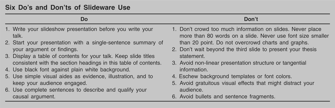
limit. Even speakers who intend to click their way through a slideshow
at a breakneck speed of one slide per minute will discover that the
software limits their total projected word count to 2,400 words.
This word limit places slideshow software in an excellent position to
mediate between the 8,000 written words of a paper and the 4,000 spoken
words of a talk. Speakers who choose to translate the former into the
latter through the medium of slideware will find the task of carefully
selecting and phrasing their statements surprisingly painful (cf. Mayer and Coleman 2000, 598–9). PowerPoint
slides simply cannot accommodate verbose causal statements, large block
quotations, overly intricate graphs, or charts with more than 40 (or by
Tufte's count, 12) components. Users must think hard and long about how
to best express complex ideas in simple and direct language.
The key to resolving this dilemma involves a decision over what
information to present visually and what information to relay verbally.
Speakers who use slides as prompts or in order to mirror information
that is already being presented verbally, forget the sole purpose behind
slide shows: to add value to the presentation by enhancing audience
comprehension. The only types of information that fulfill this
requirement are visual evidence and condensed summaries of complex
arguments. The first category involves information that cannot be
conveyed verbally with ease, such as elaborate data display, complicated
text or detailed figures, copies of original documents, informative
images, or sound recordings. The second category involves occasional
synopses designed to bring core arguments to the audiences'
attention.
For example, in my lecture on territorial disputes, I discuss three
processes that characterize dispute entrenchment, each driven by a
handful of mechanisms. I detail these mechanisms verbally and offer
empirical evidence to substantiate the dynamic relationships between the
20-odd components of my argument, but most of this information does not
make it onto the slideshow. Indeed, this part of the talk, which lasts
nearly 10 minutes, occupies only three sparsely filled slides, one for
each process described. I use the slides to complement my verbal
explanation, first, by displaying a concise summary of the relevant
process, and second, in the bottom half of the slide, by offering a
visualization of this process. The slide entitled “II.3: Increased
Cohesion over Time,” for example, starts with a précis: “The extension
of homeland infrastructure into the disputed territory enhances
perceptions of territorial cohesion by linking various parts of the
disputed territory with one another and by integrating the disputed
territory with the homeland.” These 34 words are the only text in the
body of the slide. The bottom half of the slide shows a map of the Golan
Heights on which I have superimposed time-lapse animation of the
creeping extension of road, electricity, and communication networks and
the gradual expansion of settlements over the course of 30 years, based
on previously collected data. The slide does not detail the long list of
intricate mechanisms, already mentioned verbally, that my students
cannot (and need not) remember. Instead, it displays a summary of what I
am saying and a piece of evidence that doubles as a stimulating
visualization of my argument.
The Dangers of Slideware
Slideware places constraints on, and provides opportunities for, improved
order, content, and style. This is not to say that the critique leveled
at the software is entirely unwarranted. It is merely misdirected. Blame
for the inferior quality of PowerPoint presentations should be placed on
the shoulders of those users who try to ignore or circumvent the
limitations of slideware. Three specific offenses deserve close
scrutiny, matching the three qualities of slideshow software examined
above. Users can easily avoid these faults by observing a handful of
basic guidelines.2
Searls (1998) and Godin (2001) provide additional guidelines on designing
effective PowerPoint presentations. Resources for designing
effective public presentations short of PowerPoint are available
at www.edwardtufte.com and in Tufte (1997).
First, many users seek to maintain the complexity or length of their
original argument by forcing it onto a slideshow, in spite of the
natural restrictions posed by the software's design. These are speakers
who cram endless block-quotations onto single slides or display lists
running into the dozens of lines, bullets, or chart items. Others seek
to convey non-linear arguments via slideware by convincing their
audiences to read slides in non-sequential order: Slide number 16 in
their talk may follow on slide 15 but is logically or causally related
to slides 4 and 18. Both cases exemplify speakers that have transposed
rather than translated their talk from paper to PowerPoint.
Given the difficulty of distilling a written article into a slideshow,
these tendencies are not all too surprising. There are four ways to
counter them. Speakers must avoid stretching the intrinsic limits of
slideware as regards font size and word count. Moreover, every strong
presentation should begin with a slide displaying the thesis of the talk
in the most concise form possible. Phrasing this thesis statement poses
a significant challenge, especially for junior speakers, but it bears
invaluable benefits for the audience. By placing the thesis at the
beginning rather than in the body or at the end of the talk, the speaker
“reveals his hand”: The audience is no longer expected to evaluate
fragments of evidence bearing on an unfamiliar goal but can weigh each
and every element of the talk in relation to a now familiar core
argument.
The thesis statement should be followed by a table of contents that
outlines the structure of the talk, again for the benefit of the
audience. In presenting this outline to the audience, the speaker would
be well advised to explain how the structure she or he has chosen for
the talk undergirds the argument: Why has she chosen to present this
evidence before examining existing arguments in the literature? Why has
he chosen to begin his talk with a case study, followed by a series of
competing hypotheses?
Finally, no matter how simple the structure of the talk may seem to
speakers, they would do well to use consistent and numbered headers for
all their slides. These should correspond in phrasing and numbering to
the titles employed in the table of contents at the outset of the talk.
In transitions between segments of the talk, presenters can and should
provide their listeners with information they would otherwise glean from
the sub-header of a written text, namely the subject of the upcoming
part of the talk, its relation to the preceding section, and its
function in the talk as a whole.
A second mistake often made by slideware users involves the
overutilization of the visual effects toolkit.3
The negative impact of irrelevant imagery on the
effectiveness of PowerPoint presentations is documented in
Bartsch and Cobern (2003).
Instead of drawing the audience closer to the speaker, the misuse of
color, sound, and movement risks distracting listeners from the most
important element of the talk, namely the argument. Two particularly
noxious habits stand out among visual effects abusers. The first is the
use of background templates that PowerPoint provides for the benefit of
speakers in business or marketing circles (although their advantage in
those settings remains as much of a mystery as the intentions of
political science speakers who employ these templates). These
backgrounds often involve some combination of mesmerizing shapes
slashing across the screen, flamboyant decoration, and camouflage-like
font colors. Because these templates do nothing to promote an argument
and everything to obscure it, the rule on this front is simple: don't.
Speakers should stick to black font against a white background.
Presenters who overindulge in PowerPoint's visual prowess often abuse the
ability to animate text and image. PowerPoint provides users with the
ability to fly, drop, fade in, or twirl information onto the screen,
rather than simply making it appear sequentially. But should they?
Animation is a tool and should be used as such. Its only effective use
is for revealing information gradually, a valuable capability in one of
three scenarios: When displaying text all at once might distract or
confuse the viewer (a multi-part argument, for example, in which a stage
needs to be understood before the next stage is shown); when the
audience might profits from having layers of information introduced
gradually in a dense graph or chart; or when information benefits from
contextualization (when, for example, the speaker zooms in on a document
or map to focus on a relevant segment.) In other words, where slideware
poses too strict a limit on the amount of information the speaker can
relay on a single slide, animation can be used to cautiously stretch the
boundaries of the software's range. All other uses of animation are
redundant, at best, or just plain silly, at worst.
A third and final offense committed by many slideshow users is the misuse
of bulleted lists. This habit arises because slideware demands
parsimonious phrasing and because the precise yet simple rendition of a
complex argument can prove a daunting task. Yet bulleted lists are just
that: lists. Bullets are useful for presenting inventories or catalogues
of items (such as lists of places or dates, authors and texts in a
bibliography, or the names of participants in a committee). Because
bullets cannot convey priority or relationship, they should not be used
if the items listed bear a causal link toward one another (such as
interrelated events, elements in an argument, or a list of necessary or
sufficient conditions). Such ideas are best presented in full sentences,
replete with active verbs and qualifications. If a slide provides
insufficient space for such statements, authors would do well to follow
the implicit advice of the software designers, rephrase their thoughts
in a more parsimonious manner, or eliminate redundant elements. Ask
yourself: Does my audience need to see this information in order to
better understand my argument, or am I already conveying this
information verbally? As a last resort, numbered lists are always
preferable to bulleted lists because they encourage the author to
consider priority or logical sequence in presenting the items.
Peter Norvig's notorious PowerPoint presentation of
the Gettysburg Address provides an opportunity for examining
the differences between a condensed summary and a bulleted abstract. The
penultimate slide of this parody, entitled “Not on Agenda!” consists of
five bullet points: “Dedicate,” “Consecrate,” “Hallow (in a narrow
sense),” “Add or detract,” “Note or remember what we say.” Norvig's
presentation is silly because it is gratuitous. It adds nothing to the
verbal delivery beyond displaying every other word the speaker is
uttering, offering neither substantiation nor summation. A more useful
slide, at this point in the address, could have displayed a summary of
the argument, such as: “Lincoln noted the tension between the contrived
consecration of the site by the ceremony of November 1863 and its innate
consecration by the events of July 1863.” Alternatively, the speaker
could have substantiated the argument by displaying two contrasting
images: A photo of the dignitaries, seated in formal attire, attentively
listening to Lincoln's address, and one of the same site five months
earlier, a battlefield strewn with the heroic dead. Finally, the speaker
could have reversed the order of evidence and summary by displaying a
copy of the speech (preferably in Lincoln's original handwriting),
permitting the audience to read it for themselves, and then commenting
verbally on the meaning of each passage. All three options share a
characteristic that sets them apart from the bulleted list in the
original parody: They require the speaker to invest time and effort in
helping the audience better grasp the arguments presented.
The three faults mentioned above—the overcrowding of data on slides, the
excessive use of animation effects, and the abuse of the bulleted
list—emerge whenever presenters design slideshow presentations with
themselves rather than their audiences in mind. When a slideshow is
created as a hasty afterthought to an existing talk the roles of speaker
and visual aid are reversed: Instead of accompanying the talk by
providing illuminating background information, the software comes to
dominate the talk by directing the speaker when to say what. It is here
that speakers commit the cardinal sin of PowerPoint use: reading out the
text on their slides to their audiences word by word. Participants in
these talks have repeatedly expressed their revulsion with this practice
not only because it insinuates that they are illiterate but because it
sends the clearest possible signal about who is in charge during the
talk. If the slideshow runs the talk, their attendance is a waste of
time. They would be better off watching the presentation from the
comfort of their own desktop computer.
Conclusions: Is Slideware Right for Me?
Slideshow software cannot be expected to replace speakers and should not
be employed to guide speakers. Its purpose is to add value to a
presentation before and during the talk by streamlining complex
arguments and by providing valuable visual information for audiences.
Designed to be as user-friendly as the simplest word processing
software, programs such as PowerPoint should appeal to academic speakers
from all backgrounds.
Yet many political scientists resist the proliferation of this technology
either out of principled technophobia or out of fear that the software
will abandon them at their greatest moment of need. Such fears are by
and large exaggerated. Conference venues are increasingly providing the
hardware necessary not only for displaying but also for electronically
transmitting and backing up slideshow presentations. Backup versions of
presentations are easy to print on overhead transparencies. Speakers who
use slideware to enrich rather than dominate their presentations are
certain to survive even the worst case scenario of total systems
collapse.
Even those who insist on eschewing this technology entirely have no
excuse for depriving their audience of three helpful pieces of visual
information, printed on overhead transparencies or handed out in paper
format. Speakers should always provide an opening slide with the title
of their talk and their personal information, a second slide that states
their argument, and a third slide, visible throughout the remainder of
the talk, that presents a detailed outline of the presentation.
PowerPoint software can also be used prior to a talk to create detailed
handouts displaying sophisticated graphs, charts, models, and other
illustrations of complex data. Lecturers can place their PowerPoint
presentations online or hand out copies of slides in class for their
students' benefit.
Speakers should also realize the advantages of slideshow technology
compared to overhead transparencies. Overheads eliminate animation as an
option and create costly disincentives against using color. The
awkwardness involved in finding, placing, and replacing overheads on the
projector reduces the slide replacement rate significantly compared to
slideware's single-click speed. With no more than 10 slides, at most,
per talk compared to a maximum of 20 or 30 slides in digital format,
overheads create an obvious incentive for illustrating talk segments
selectively and incompletely. In other words, transparencies fail in
emulating the one slideware quality that this paper has prized above all
others: the comprehensive distilling, streamlining, and balancing of
complex arguments as they transition from paper to talk format.
At one of many high points in his attack against PowerPoint, Edward Tufte
(2003, 24) compared the PowerPoint to a
school play: “very loud, very slow and very simple.” This is bad news
for slideware users who, like Tufte, prefer their visual information
served like thick slices of richly layered Viennese coffee cake with a
double shot of espresso on the side. I have argued that the limitations
of PowerPoint and programs like it are good news for political
scientists whose talks are muffled, too fast, and too complicated.
Speakers who use this software to translate their papers into concise
verbal presentations while taking care to avoid the dangers that arise
from misuse will find the results rewarding.