

As art and design librarians, we are constantly in touch with the visual aspect and the meanings and implications of things. But, as humans, we tend to naturally put form over function and focus on aesthetics by overlooking the ‘invisible' objects that can affect our decision-making process without us noticing: much like good signage.Footnote 1
There is plenty of academic research that determines how certain information needs to be designed or worded to be put up as signage in libraries. Visual communication in libraries is important to the library user experience and can make or break the perception of what a library can offer its users.Footnote 2 Amateur graphics and signage can also potentially harm the marketing efforts of libraries that, in this digital age, are highly reliant on such strategies to keep the physical library popular. The effects of visual clutter caused by signage include ‘signage blindness and confusion’.Footnote 3 The frustration associated with a bad wayfinding experience can give patrons library anxiety.Footnote 4
These can also inhibit the library user's experience with online services as well. In an environment where most information-seeking is done online, it is easy for frustrated patrons to walk out and lose trust in the physical library, and it is of particular concern in art and design libraries where the percentage of patrons looking for images is higher and browseability is key.
Why design thinking?
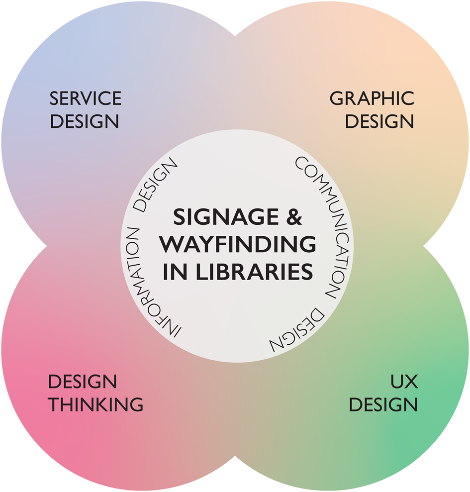
Service design, user experience design, and design thinking are all bound by the very same principles and can therefore be applied to libraries from every perspective.Footnote 5 The core of design thinking revolves around the end user. How is this product or service going to serve the user? How will the user respond? In order to get the most out of our signage, it is necessary to understand how wayfinding works. Per Mollerup, in his book Wayfinding > wayshowing, has broken down the term ‘wayfinding’ as ‘…a problem-solving process’. The process involves ‘seeking information – searching for an appropriate route, deciding which route to take, and moving along that route’.Footnote 6 The roots of good design lie in good problem solving, and this becomes the common factor here.
How other fields of design relate to Signage and Wayfinding in Libraries. Illustration courtesy of the author.

Further, good design, is able to anticipate and cater to the user's needs without the user realizing what happened.Footnote 7 Wayfinding experts also agree.Footnote 8 If this sounds like magic, it certainly isn't. The trick is to observe patrons well, followed by the 5-step design thinking process:
1. Empathize
2. Define
3. Brainstorm/Ideate
4. Prototype
5. Test
Luca and Narayan give an excellent introduction and adaptation to the design thinking process for libraries and their wayfinding systems.Footnote 9 Certain steps can be repeated until a solution is arrived at that works well. Bear in mind that sometimes ‘the process may not take place in the exact order according to the guidelines’.Footnote 10 It is all about managing the patron's workflow within and across both the library's physical and digital ‘interfaces’. For our purposes, doing signage well and catering to wayfinding needs makes doubly sure that all our services are reaching our patrons whenever and wherever they need it.
The connection with graphic design
Library signage becomes a reflection of how well the library space is organized. In graphic design, information is put together meaningfully as a narrative to be presented,Footnote 11 while in librarianship, this presented information is then given a platform to reach the end user.Footnote 12
There seems to be a general misconception that graphic design only deals with art and artists, but librarianship and graphic design share ownership within the realm of information sciences. Librarians undertake responsibilities around designing signage, social media posts, brochures, informational handouts, web pages, and promotional and instructional documents every day as part of their jobs. Hence, ‘librarians are in the business of graphic design, even if they have not been formally trained in design’.
‘Effective communication in libraries is tied closely to effective graphic design; yet as a profession, librarians rarely discuss it’, points out Diana K. Wakimoto.Footnote 13 Think of it this way: signage is essentially the meta-information about the library. Clearly designers and librarians are not strangers to one another's roles, as sometimes, the roles described above can be interchangeable, and our end goal is shared: we want to connect the user with information.
The truth is that in whatever graphic design aims to create, there is always a pragmatic or poetic, and persuasive attempt, at conveying a message; it has a practical function — to make a target audience respond in a particular way by offering cues that trigger an action. The library user experience requires a touch of human-centered design worked into its wayfinding core.
Empathizing: Who are the real experts here?
A designer will always concede that the patron, being the end user, is the ultimate expert on the topic of wayfinding, as they are going through the wayfinding process constantly in their minds to complete tasks. The patron attempts to characterize cognitive phenomena in terms of a generalizable constituent process.Footnote 14 How they perceive this experience matters both online and offline.
As librarians that are constantly in touch with art and design, we require the perspective of these same experts in designing signage solutions. It is necessary in order to gain a full understanding of the types of considerations to be made while evaluating a signage system. While conducting research into well-funded academic libraries and how they treat signage, I found several creative solutions that were arrived at by librarians that always sought to keep their patrons ‘route’ in mind.
One library even provided a large and appealing jar of candy on their circulation desk where the new books and other lucky day collections are stored on the shelves just underneath the jar. Patrons naturally would stop to casually chat with the librarian about the books in the collection while browsing and enjoying the candy. This seemingly unnecessary pause in the patron's experience becomes reason to engage more deeply and personally with the library by helping build a ‘routine’ as repeat patrons begin to do this more often.
With the exit door of the library being so close at hand, the obvious consequence of ineffective signage and a confusing wayfinding experience would be the patron walking out as they assume they would not be able to find what they need. How we as librarians view and empathize with the wayfinding experience of the patron will ultimately define and show them how much we value the patron's time, and so your patron community will naturally respond to this as well.
Defining: ‘Signage’, ‘wayfinding’ & the problems
‘Signage’ refers to various types of cues in the form of objects or markers that can either inform or call to action. ‘Wayfinding’, as defined earlier, is a problem-solving act where a user relies on informative signage objects to communicate to them how they need to proceed. By empathizing with the patrons, then identifying and articulating the problem (or problems) well, it is possible to optimize the rest of our design thinking process by using this as a guide. Otherwise, we risk getting lost in the details of the whole process.
Both the terms ‘signage’ and ‘wayfinding’ belong to separate fields. Wayfinding finds its roots in urban planning and architecture. In 1960, Kevin Lynch defined wayfinding as the ‘process of forming a mental picture of one's surroundings based on sensation and memory’.Footnote 15 Successful wayfinding occurs when a patron, who realizes (or doesn't) that they have a need, finds some visual vernacular, i.e., a sign, that narrates a process to assist in satisfying the need in a logical and practical manner.
As early as 1953, the field of psychology had successfully determined that visualization and the ability to retain that visual information to work out where things were in a complex spatial arrangement were important factors in wayfinding. Signage offers the user visual cues to formulate a ‘mental picture’. It does this by augmenting a user's knowledge of the space via maps, signs, and other aids (visual or otherwise) to help a user navigate themselves to achieve a goal. As librarians, we need to put ourselves in the user's shoes to completely understand the problems they will eventually face.
Brainstorming: What makes up signage? Who are we trying to talk to? Why are our users here?
Signage can take several forms in a library and can help the patron form their own ‘narrative’ as they navigate the interface of the library space. It is mostly visual, but can sometimes be audio, verbal or, in special cases, tactile, which is often used to augment or replace the visual signage. It is typically a one-way communication: guiding a user through stacks, updating the user on activities, events, providing directions and safety instructions.
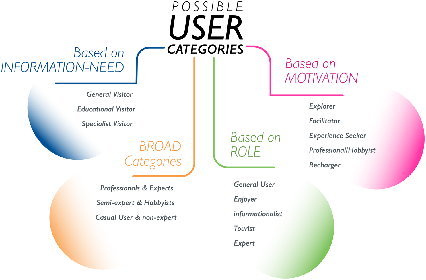
Walsh et al's ‘User Categories for Digital Cultural Heritage’ can also be used to categorize library users. Illustration courtesy of the author.

'Unless the library infrastructure (collection and services, facilities, staff and technology) and customers come together in a way that is both interesting and meaningful to customers, the library is nothing more than an expensive warehouse’.Footnote 16 In smaller libraries and online services, the pressure on being marketable, flexible, and patron-oriented is much higher, given that they may also serve a smaller community that needs to be kept regularly interested. So, a need for advanced and successful placeshowing that does not place heavy loads on a patron's mental capabilities is justified.Footnote 17
The first step here would be to correctly identify all groups of possible patrons and decide which ones make up the primary patrons. The article ‘User categories for digital cultural heritage’ discusses several ways of doing so, and I do recommend giving this a read.Footnote 18 Figure 2 is a chart of the categories described in that article. Library signage needs to be clear enough to communicate with several types of users. These can include, but are not limited to, frequent and infrequent patrons of all ages and needs, library employees, and safety personnel from outside the facility.
Prototyping: Where do we begin and where do we end?
Effectively prototyping requires an understanding of the state of the current signage and then some experimentation and play to determine where it will go. The start point is a critique of the old signage describing what about it made it work, and what did not work. The ‘soft’ end point is a critique of the new signage that will hopefully address the needs of the patrons better. I say ‘soft’ end point because this prototyping process can never truly have an end. As new problems arise, the end point seems to move a little further away. This is something quite natural as ‘libraries are growing organisms’ and will continue to grow to evolve with the patrons.Footnote 19
Taking inventory
Before creating any signage, it may be a good idea to assess what currently exists by self-auditing all the signage in a library and associated website. John Kupersmith in his 1980 article ‘Informational graphics and sign systems as library instruction media’ thoroughly defines six categories of signage that are easily applied to both the physical library and websites or online services.Footnote 20 Luca and Narayan also suggest the same method and extend the definitions to contemporary practice.Footnote 21 These same definitions can also apply to website navigation; webpage breadcrumbs, navigational sidebars and links to external content like social media can all be considered signs on a website. Academic librarians Amy F. Stempler and Mark Aaron Polger give an overview of how to thoroughly conduct a library signage audit.Footnote 22 The results can be compiled and compared via a simple spreadsheet.
The audit should reveal how many of each type of signage exist and where they are located. The inventory is also useful because it provides clearer picture of the overall visual language currently in use. All of the signage can be grouped into categories, and the ‘overall quality’ can also be described.
Making signage
Sometimes, academic and art or museum libraries are not the same as independent libraries in that they are part of a larger framework and therefore have less say in how they want something (a wayfinding system, for instance) designed. The dominance of the number of locally-printed signs in all of these academic libraries goes to show that librarians have a tendency to be self-reliant. Although, often times, the regulatory signage solutions would come from multiple departments in the same facility that are formally responsible for the building and such visual communications.
Abigail Carr states in her master's thesis that a ‘layperson-friendly approach’ is necessary when addressing patrons’ wayfinding needs.Footnote 23 Clarity comes with simplicity. The signage design process requires some considerations to be made before, during and after the process as described below.
Language, legibility and typography
Using clear, simple language with shorter sentences that are easy to understand yields faster recognition of meaning for the target user group. Oftentimes, if your library is part of a larger organization, it may be that your communications or marketing department has official guidelines on how to phrase your language, and already has fonts and font hierarchies set up and ready for use via templates and brand guidelines.
Negative language: Beginning a sign with restrictive or negative language like “do not…” does not help the user understand why something is not allowed, and they would be less likely to comply or even notice the sign if it sounds like something they have read several times before. They could subconsciously ignore the sign without realizing it.
Monolingual vs. bilingual and trilingual: Find fonts that are visually similar to each other. Google fonts offers free fonts in different languages.
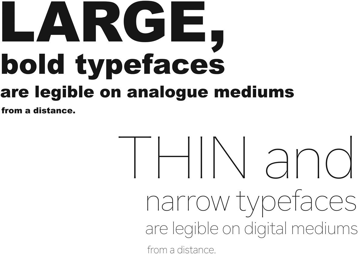
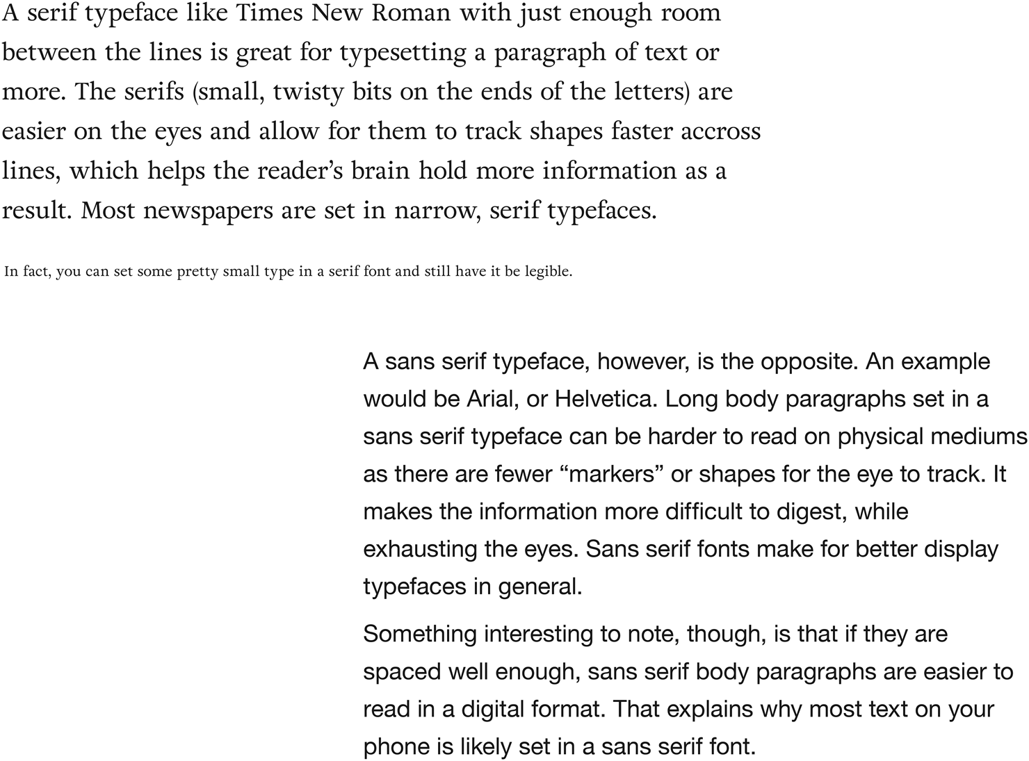
Display vs. body copy fonts: A display font is usually a bit more decorative and set large. It is used only for a few words within a line, while body copy fonts are meant for setting paragraphs or smaller text. It is possible to differentiate between one and the other by making the text very small to check for legibility. Display fonts are not as legible at small sizes. Refer to figures 3 and 4.
Free vs. paid fonts and licenses: There are free and paid fonts that are licensed for private, personal, organization, and commercial use. Some fonts come with licenses only authorized for web use, while some are only authorized for single users versus multiple users.
Sometimes, you might even find that popular fonts, like Helvetica Neue, now have companion fonts in other languages designed by professional type design companies. These are usually expensive; prices can go from 50 USD to even a 1000 USD for a well-designed font family designed by a professional font foundry.
Again, it may be that your organization already has purchased fonts and has guidelines set up for your convenience. Consistency and unity across the organizational brand is important for your users and how they view our library.
Systems
When graphic designers prototype something, the focus is on coming up with design elements (shapes, points, lines, text, fonts colours, grids, layouts, etc.) and creating rules for their interaction that will be shared across the entire system. A system, consists of constants and variables. The constants are the elements of a design system that do not change over different iterations, and the variables are the elements that do change.
Essentially, a visual or design system can be comprised of single or multiple constants and variables and uses predefined rule structures that dictate how the constants and variables interact and drive the visual language of the system. A single visual system for wayfinding can be comprised of several smaller sub-systems. A typographic system details what fonts will be used, for which language, and in what hierarchy on grids and layouts. The placement of a typographic system is defined by a grid system, and all the colours used within the complete wayfinding system are dictated by the color system. As long as a hierarchy is clearly maintained, it is possible to be fairly consistent across the system as a whole.
Display fonts and legibility when typeset within analogue and digital mediums. Illustration courtesy of the author.

Sans Serif and Serif fonts and legibility when typeset within analogue and digital mediums. Illustration courtesy of the author.

It serves as the bridge between the wayfinding and the signage and enables them to work together to create a recognizable visual identity for the library.Footnote 24 Official company brand guides usually come with a full design system and can help you breeze through the signage creation process.
After the users are identified, their behaviour in different areas, awareness, and their level of visual literacy needs to be considered.Footnote 25 Signage systems that are too complex, or even too simple, for that primary audience may ultimately fail as a result, even if they were visually well-designed. Higher levels of visual literacy can green light a higher complexity of signage design. This is especially relevant with online services as different age groups and other user groups have different, sometimes opposing, needs.
Mounting and materials used for display
The inexpensive plastic mounts and A4 paper are popular and reliable choices for mounting any signage. However, it is not the most effective solution, particularly when the signs are mounted far above average eye levels, and closer to light sources. Clear plastic is highly reflective and can obstruct legibility. According to the new ADA guidelines, reflective materials are not allowed. Instead, the guidelines have provided a formula to use to maintain a ‘70% contrast between the background and lettering’.Footnote 26
A better option would be to use matte stickers. This would be an inexpensive solution, and is far easier to replace. Printable labels are available in stationary stores and can be printed on and changed infinitely without having to wait for permissions, approvals, and unnecessary drilling courtesy of the building facilities department. A more professional option would be to order matte vinyl cuts. Digital displays are also a great idea for advertisements and any signage that is current and needs to be rotated constantly.
Placement: Visible vs. invisible signage
Thinking of the interior layout of your library as the mis-en-scene is a good way to think about visibility of any necessary signs.Footnote 27 Floor or wall stickers to indicate map sections or to label an area or call number ranges near stacks, for example, can help with orientation and are non-intrusive to the patron's library experience. How visible or invisible a sign is also plays into the visibility hierarchy, meaning which sign a patron notices or reads first.
A “decision plan” is a library user's mental map to navigating the library space as an interface. This plan includes directional signage and can be flexible in nature, and so probabilities can be projected to anticipate at what point the user will want to know something.Footnote 28 Layout complexity and familiarity with the library can be factored in as well.Footnote 29 The reference desk must not become the only option for successful wayfinding, so ‘signs should be located where they are needed’.Footnote 30 This means that signage should be placed where the need for the signage is conceived in a patron's mind, giving patrons the information they need before they get there, for example, providing directions to where the non-fiction area is in advance of its physical location in addition to labelling it within its location.
ADA compliancy and special needs patrons
Addressing special needs patrons, especially the visually impaired, and their expectations can sometimes offer us unique challenges with regard to wayfinding, particularly in the cases of libraries with younger patrons where so many of their activities are reliant on using colours.Footnote 31 The “Dyslexie” font developed by Christian Boer is a great alternative for dyslexic patrons on web platforms.Footnote 32 There are several other plugins created by developers and backed by educational research like Beeline Reader that are ready to work with academies to provide solutions for their patrons. Beeline reader ‘uses a simple cognitive trick’ to speed up and ease the strain of reading on the eyes.
The ADA guidelines were recently updated to improve the quality of service for the visually impaired to include those patrons wearing glasses or contact lenses.Footnote 33 The end of the Humrickhouse article lists some rules for accessibility and includes a workshop to help train librarians to serve the visually-impaired. One of the main requirements is the non-glare finish on all surfaces.
Testing
The issue with user testing signage is that some user motivations and behaviour can be so fluid due to trends that it becomes difficult to trust the results of practical user testing. Further, because we are dealing with ‘invisible’ design,Footnote 34 it becomes increasingly difficult to measure actual success.
Li and Klippel's article ‘Wayfinding in libraries: Can problems be predicted?’ uses the term ‘space syntax’ to describe special characteristics of their library to help predict wayfinding problems within their multi-level library.Footnote 35 The article discusses ways to address visibility and layout complexity, among other issues. It also addresses the role of spontaneity in individual patrons as a factor in determining whether signage is ‘successful’ or not. A similar attempt is made by Lauren H. MandelFootnote 36, Footnote 37 and Melissa P. JohnstonFootnote 38 who have developed a system to help understand what quantity of signage is necessary.
In the case study of a redesign of the signage at the library of the College of Staten Island at the City University of New York, the author goes into detail offering recommendations for signage from the style of language used to the materials being used to create and mount the signs while keeping in mind the perceptions of patrons who might navigate these kind of stacks. In conclusion, she mentions that it is ‘difficult to measure the outcome’ of the redesign project despite the improvement in circulation numbers.Footnote 39
Abigail Carr's library science master's thesis attempted three different iterations of signage each one for three weeks at a university library in order to study the effects of the changes on patrons.Footnote 40 However, the responses and results from surveying patrons cannot be considered accurate over long periods of time.Footnote 41 Of course, wayfinding projects need to be successful long-term.
Librarians are information professionals, not communication professionals, but a huge part of being a librarian is picking up various skill sets from other fields. Results of the surveys conducted in Wakimoto's article note that several librarians are self-taught graphic designers and that there was no formal approval process for the design work. She states that ‘committees and formal approval processes may help improve the quality of graphic designs in libraries, but only if the committee members and those who have approval rights are knowledgeable about graphic design practices and standards.’Footnote 42
The whole problem is complicated even further when we extend this to online services. How many times can you iterate options before republishing? Are the skills and permissions to do so online (depending on what type of organization you are working for) even available? Perhaps the answer can be found in ‘user experience’ (UX, as it is commonly referred to); research techniques like ethnography, usability, and service design, can help librarians study complex users and deliver effective solutions.Footnote 43
The impact of well-designed signage & its evolution
As previously stated, the impact of signage is difficult to measure. We, as librarians who spend so much time and effort in managing the library space, are in the best position to know how to help ourselves and empathize with our patrons using their feedback. Signage is an extension of the librarian, after all. However, neither a well-designed signage system nor the designed signage objects will remain the way they were created. Their intended purpose may very well evolve, which will create new problems to be defined and solved once again via design thinking.
Moreover, the way we iterate our signage information will also change gradually over time as we accommodate changes in language, technology and user habits. Therefore, we need to be open and willing to repeating these practices - the overall design thinking process, and especially the processes of empathizing and prototyping - if users do not respond favorably to change over time. These processes become a lot faster with practice, and more creative solutions will also emerge as we gain confidence in our own abilities as graphic designers.