

A question that has generated increasing interest in the past years is whether the default interletter spacing currently employed in word-processing software, books/e-books, or newspapers is optimal for reading (Gori & Facoetti, Reference Gori and Facoetti2015; McCandlis, Reference McCandliss2012; Montani, Facoetti, & Zorzi, Reference Montani, Facoetti and Zorzi2015; Perea & Gomez, Reference Perea and Gomez2012a, Reference Perea and Gomez2012b; Schneps, Thomson, Chen, Sonnert, Pomplun, Reference Schneps, Thomson, Chen, Sonnert and Pomplun2013; Schneps, Thomson, Sonnert et al., Reference Schneps, Thomson, Chen, Sonnert and Pomplun2013; Slattery & Rayner, Reference Slattery and Rayner2013; van den Boer & Hakvoort, Reference van den Boer and Hakvoort2015; Zorzi et al., Reference Zorzi, Barbiero, Facoetti, Lonciari, Carrozzi, Montico and Ziegler2012). We must keep in mind that font designers have not chosen the settings for the default interletter spacing based on empirical evidence from reading experiments.
As the recognition of objects (i.e., letters) is impaired by the presence of nearby objects (i.e., crowding effects; Bouma, Reference Bouma1970; see Moores, Cassim, & Talcott, Reference Moores, Cassim and Talcott2011), when letters in a word are too close (i.e., as in judge), the process of letter/word identification is hindered (i.e., Chung, Reference Chung2002; also see Gori & Facoetti, Reference Gori and Facoetti2015, for a review reading and crowding). Alternatively, when there is an exceedingly large increase in interletter spacing (i.e., as in judge), the words’ physical cohesion would break, thus hindering the process of word recognition (see Risko, Lanthier, & Besner, Reference Risko, Lanthier and Besner2011; Vinckier, Qiao, Pallier, Dehaene, & Cohen, Reference Vinckier, Qiao, Pallier, Dehaene and Cohen2011). But is the default interletter spacing optimal for reading? Data from a number of visual single-word recognition experiments have revealed that a small increase in interletter spacing, relative to the default settings, may help the process of word encoding. For example, in a lexical decision experiment (i.e., “is the stimulus a word or not?”) with adult skilled readers, Perea and Gomez (Reference Perea and Gomez2012a) manipulated parametrically the interletter spacing of words (–0.5, 0.0 [default], +0.5, +1.0, and +1.5 points [pt] to default; i.e., judge, judge, judge, judge, judge) using a 14-pt Times New Roman font. They found that word response times were faster for the conditions with extra spacing than for the conditions with condensed (–0.5) or default interletter spacing (0.0) (i.e., in terms of response times, judge > judge). To determine the locus of this phenomenon, Perea and Gomez (Reference Perea and Gomez2012a) conducted fits on a mathematical model, the diffusion model (see Ratcliff, Gomez, & McKoon, Reference Ratcliff, Gomez and McKoon2004). Perea and Gomez (Reference Perea and Gomez2012a) concluded that the facilitative effect of interletter spacing was due to letter/word encoding rather than to decisional processes.
While the findings obtained from laboratory word recognition tasks are important to unveil the process of lexical access, there is a caveat: readers rarely encounter isolated words; instead, they read words in the context of text forming sentences and paragraphs. Indeed, it is not straightforward to generalize the effects of interletter spacing found with isolated words to a normal reading scenario. While an increase in interletter spacing can help an early encoding stage—as deduced from the data from Perea and Gomez (Reference Perea and Gomez2012a); see also Perea, Moret-Tatay, and Gomez (Reference Perea, Moret-Tatay and Gomez2011), it may also have a deleterious effect during text reading. Visual acuity from the fixation point decreases very quickly, and hence, an increase in interletter spacing may produce a potentially detrimental effect: nearby words will be farther apart from fixation thus reducing the amount of parafoveal processing that is available during reading Footnote 1
Therefore, to answer the question of whether or not the default interletter spacing is optimal for reading, it is essential to consider the effects of interletter spacing during normal (silent) reading. The literature on this issue is scarce. In an unpublished study conducted by Tai, Sheedy, and Hayes (Reference Tai, Sheedy and Hayes2009), a group of adult skilled readers were asked to read a novel presented in various conditions ranging from of –1.75 points (compressed) to +2.0 points (expanded) with a 10-pt Verdana font. Tai et al. (Reference Tai, Sheedy and Hayes2009) found similar total reading times in all interletter spacing conditions. This null effect was the net result of two opposite effects that cancelled out each other: 1) the text with an increased interletter spacing received shorter fixations; and 2) the text with an increased interletter spacing received more fixations. Unfortunately, Tai et al. (Reference Tai, Sheedy and Hayes2009) did not indicate the precise details on the procedure they employed (i.e., the design of the experiment) and, furthermore, there were no indications that they measured reading comprehension. To carefully examine this issue, Perea and Gomez (Reference Perea and Gomez2012b) conducted an experiment to examine eye movement control during sentence reading while manipulating three interletter spacing conditions using the 14-pt Times New Roman font: sentences with the default interletter spacing (0.0), sentences with an expanded (+1 pt) interletter spacing, and sentences with an expanded (+1.5 pt) interletter spacing. Neither sentence reading times nor comprehension scores differed significantly for the three types of sentences. As occurred in the Tai et al. (Reference Tai, Sheedy and Hayes2009) experiment, fixation durations were shorter for the sentences with expanded interletter spacing than for the sentences with the default interletter spacing (228, 221, and 216 ms for the 0.0, +1.0, and +1.5 interletter spacing conditions, respectively). However, the number of fixations was higher in the sentences with a +1.5 interletter spacing than for the sentences with the default interletter spacing (9.9 vs. 9.5 fixations, respectively), and the net effect was a null effect of interletter spacing in total reading times. Likewise, Slattery and Rayner (Reference Slattery and Rayner2013) conducted a sentence reading experiment in which they manipulated four conditions of interletter spacing (–0.5, 0.0, +0.5 and +1.0) using Verdana and Times New Roman fonts. They found a quadratic trend of interletter spacing, in which the faster sentence reading times corresponded to the default spacing condition (1923, 1862, 1911, and 1909 ms, for the –0.5, 0.0, +0.5 and +1.0 conditions, respectively). As in the Perea and Gomez (Reference Perea and Gomez2012b) experiment, Slattery and Rayner (Reference Slattery and Rayner2013) found a linear trend in the average fixation durations (253, 247, 241, and 240 ms, for the –0.5, 0.0, +0.5 and +1.0 conditions, respectively) and more fixations in the sentences with extra interletter spacing (7.6, 7.6, 7.9, and 8.0, for the –0.5, 0.0, +0.5 and +1.0 conditions, respectively).
Other recent experiments have examined the role of interletter spacing when reading aloud a short story in developing readers (Perea, Panadero, Moret-Tatay, & Gomez, Reference Perea, Panadero, Moret-Tatay and Gomez2012; Zorzi et al., Reference Zorzi, Barbiero, Facoetti, Lonciari, Carrozzi, Montico and Ziegler2012)—note that the participants’ eye movements were not registered in either of these two studies. Perea et al. (Reference Perea, Panadero, Moret-Tatay and Gomez2012; Experiment 3) examined two interletter spacing conditions: default spacing (0.0) vs. increased spacing (+1.2) using the Times New Roman font. They found similar response times and comprehension rates in the two conditions for developing readers in Spanish—none of them had a reading disability diagnosis. Interestingly, an extra increase in interletter spacing did facilitate processing in children with developmental dyslexia (i.e., faster reading times and higher comprehension rates for the text with extra interletter spacing than with the default settings). Zorzi et al. (Reference Zorzi, Barbiero, Facoetti, Lonciari, Carrozzi, Montico and Ziegler2012) reported a similar pattern in French and Italian: they found an advantage of extra interletter spacing in reading times and comprehension rates when reading aloud short texts with dyslexic children, but not with two groups of normally developing readers—note that unlike the Perea et al. (Reference Perea, Panadero, Moret-Tatay and Gomez2012) experiment, Zorzi et al. (Reference Zorzi, Barbiero, Facoetti, Lonciari, Carrozzi, Montico and Ziegler2012) used two control groups (reading-level controls, and age-level controls). Thus, the data from Perea et al. (Reference Perea, Panadero, Moret-Tatay and Gomez2012) and Zorzi et al. (Reference Zorzi, Barbiero, Facoetti, Lonciari, Carrozzi, Montico and Ziegler2012) suggest that interletter spacing may be a relevant factor to add in future implementations of e-books (besides font, letter size, or background color) for readers with dyslexia—and possibly for readers with low vision (see McLeish, Reference McLeish2007).
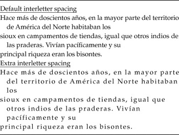
The aim of the experiment is to examine the role of interletter spacing during normal silent reading with adult skilled readers in a more ecological scenario than in previous research. In the Perea and Gomez (Reference Perea and Gomez2012b) or Slattery and Rayner (Reference Slattery and Rayner2013) experiments, participants were asked to silently read isolated sentences. This is a very common procedure in eye movement research, as it may unveil when and where the eyes move—in particular when there are target words embedded in the sentences (i.e., high- vs. low-frequency words). However, one might argue that registering the eye movements from a set of unconnected sentences may not reflect the same processes as those occurring when one reads a text for comprehension. In the present experiment, participants were asked to read for comprehension two relatively short stories (367 words each) taken from a standardized test. One of the stories was presented with the default interletter spacing, whereas the other was presented with an expanded interletter spacing (+1.2 pt)—note that this latter interletter spacing condition was effective in previous research with isolated words and sentences (Perea et al., Reference Perea, Moret-Tatay and Gomez2011, Reference Perea, Panadero, Moret-Tatay and Gomez2012; Perea & Gomez, Reference Perea and Gomez2012a, Reference Perea and Gomez2012b) (see Table 1). All participants read the two stories of similar difficulty and length in a within-subject design. The participants’ eye movements were registered and the main dependent variables were the following: average fixation times, total reading times, and number of fixations. Comprehension scores were also examined.
Excerpt of one of the two texts with the two interletter spacing conditions

The predictions are clear. If the findings from sentence reading experiments (i.e., Perea & Gomez, Reference Perea and Gomez2012b; Slattery & Rayner, Reference Slattery and Rayner2013) can be generalized to text reading, one would expect shorter fixation durations when the text is presented with extra interletter spacing than when the text is presented with the default spacing; nonetheless, this effect may vanish when one considers the total reading times, as more fixations may be executed in the extra spacing condition. Alternatively, if eye movement guidance can readily adapt to an extra interletter settings during text reading while keeping an early word encoding advantage, one would expect not only shorter fixation durations in the text with extra interletter spacing than in the text with the default spacing, but also a parallel effect in the total reading times. This latter outcome would suggest that the default interletter spacing is not optimal for text reading.
Method
Participants
Sixteen undergraduate students from a public university in Spain participated voluntarily in the experiment. All participants were native speakers of Spanish, with normal or corrected-to-normal vision. None of them had been diagnosed with reading disabilities or reported having reading difficulties.
Materials
We selected two parallel texts from the “Test de Procesos de Comprensión” (TPC-R) (Martínez, Vidal-Abarca, Sellés, & Gilabert, Reference Martínez, Vidal-Abarca, Sellés and Gilabert2008). The texts were presented in 14-pt Times New Roman font (i.e., the same font as in the Perea & Gomez, Reference Perea and Gomez2012a, Reference Perea and Gomez2012b; Perea et al., Reference Perea, Moret-Tatay and Gomez2011, Reference Perea, Panadero, Moret-Tatay and Gomez2012, experiments). The two texts were presented left aligned and included two inter-letter spacing conditions (see Table 1): standard and expanded (+1.2 pt) in 14-pt Times New Roman. The two texts had similar difficulty and number of words (Text A = 367 words and Text B = 367 words)—note that the two texts were slightly edited to match for number of words. The number of lines and the number of words per line was the same in the two interletter spacing conditions. We employed six comprehension questions from the TPC-R test after each text.
Procedure
Subjects were individually tested in a quiet room. An Eyelink-II eyetracker (500 Hz) was employed to register the participants’ eye movements, in conjunction with a Windows-OS computer running Eyetrack software Footnote 2 and a 22-inch ViewSonic CRT monitor (Professional series P225f). A chinrest was used to minimize the participants’ head movements. The distance between the participants’ eyes and the CRT screen was 70 cm. At this distance, 1° of visual angle corresponds approximately to 3.7 letters for the default interletter spacing and 3.3 letters for the +1.2 interletter spacing when using 14-pt Times New Roman. Participants were asked to read for comprehension as they normally read. They were also told that they would need to respond to several comprehension questions after reading each text. After the initial phase of calibration, each participant was presented with the first text passage, and was asked to answer six questions. After a small break a new calibration/validation phase, the participant was presented with the second text, and had to answer the six comprehension questions corresponding to this second text. Each text occupied three screens; participants were asked to press a button to move to the following screen, but they did not have access to the previous screen. All participants received the two interletter spacing conditions in a counterbalanced manner: 1) Text A with the default spacing, and then Text B with expanded spacing; 2) Text A with the expanded spacing, and then Text B with default spacing; 3) Text B with the default spacing, and then Text A with expanded spacing; and 4) Text B with the expanded spacing, and then Text A with default spacing. Four participants were randomly assigned to each group. The entire sessions lasted for around 14–18 min.
Results
The eye movement data were analysed with EyeDoctor 0.6.5 software Footnote 3 Extreme fixation duration times (beyond the 90–800 ms cutoffs) were excluded from the analyses (less than 1% of the data). We examined four dependent variables: average fixation time, total reading time, number of fixations, and comprehension scores. The participant’s means and standard errors in each dependent variable are presented in Table 2. In the statistical analyses, we included Group (list 1, list 2, list 3, list 4) as a dummy factor to remove the variance due to the counterbalanced lists—the outcome was virtually the same had this variable not been included in the analyses.
Measures for each of the conditions in the experiment: Total sentence reading time (in sec), mean fixation duration (in ms), number of fixations, and comprehension scores. Standard errors are presented between parentheses

Note: 95% CI refers to 95% confidence intervals.
We performed the statistical inference not only using the standard tests of null hypothesis testing (i.e., F-tests and p values), but we also computed Bayes Factors in JASP Footnote 4 . Bayes factors offer an estimate of the support for a model (i.e., the model of the null hypothesis) relative to another model (i.e., the model of the alternate hypothesis) (Rouder, Speckman, Sun, Morey, & Iverson, 2012; see also Gomez & Perea, Reference Gomez and Perea2014). This allows us to obtain an estimate of the likelihood of the null vs. the alternate hypothesis. The expression BF10 refers to the probability of the data given the alternate hypothesis (Model 1) relative to the probability of the data given the null hypothesis (Model 0): p(H1|Data) / p(H0|Data). For instance, BF10 = 8 implies that the data are 8 times more likely under the alternate hypothesis than under the null hypothesis. Conversely, the expression BF01 refers to the probability of the data given the null hypothesis (Model 0) relative to the probability of the data given the alternate hypothesis (Model 1). There are guidelines in the literature on how to interpret Bayes Factors (i.e., Jeffreys, Reference Jeffreys1961, p. 432): 0–3 would reflect “evidence [...], but not worth more than a bare mention”; 3–10 would reflect “substantial” evidence; 10–32 would reflect “strong” evidence, 32–100 would reflect “very strong” evidence, whereas values over 100 would reflect “decisive” evidence.
The average fixation duration was shorter for the text with extra interletter spacing than with the text with default spacing (237 vs. 245 ms, respectively), F(1, 12) = 8.38, MSE = 48.48, η2=. 41, p = .013, BF10 = 4.18. The effect size was similar to that obtained in previous sentence reading experiments (i.e., Perea & Gomez, Reference Perea and Gomez2012b) and the Bayes Factor (BF10 = 4.18) reflects reasonably substantial evidence in favor of a facilitative effect of interletter spacing (i.e., the alternate hypothesis). In addition, the number of fixations was only slightly higher in the text with extra interletter spacing than in the text with default spacing (375 vs. 371, respectively)—note that this effect did not approach significance (F < 1; BF01 = 3.75). Finally, total reading times were only slightly shorter in the text with extra interletter spacing than in the text with default spacing (89.1 vs. 90.2 seconds for texts with extra vs. default interletter spacing, respectively, F < 1; BF01 = 3.66). That is, the total reading data offer evidence for the null hypothesis (i.e., BF01 > 3 in Jeffreys’, Reference Jeffreys1961 guidelines). We also inspected whether the lack of an effect of interletter spacing in total reading times was due to a small subset of participants showing the opposite effect. However, the percentage of participants who showed faster reading times in the extra spacing text than in the default spacing text (7 out of 16; 43.75%) was similar to the percentage of participants who showed faster reading times in the default setting than in the extra spacing text (9 out of 16, 56.25%) (sign test: p > .70).
The comprehension scores were 4.9 vs. 4.3 for the texts with extra vs. default interletter spacing; this difference did not approach significance, F(1, 12) = 1.61, p = .22.
Although the main focus of the analyses was on the total reading times and the fixation durations, we also collected other potentially informative eye movement variables. However, none of them approached statistical significance. For instance, the saccade length (both progressive and regressive) was similar in the texts with extra vs. default spacing (progressive saccades: 8.4 vs. 8.4, respectively; regressive saccades, 5.5 vs. 5.9, respectively; all ps > .25).
Discussion
The present experiment examined whether or not a small increase in interletter spacing produces shorter reading times during text reading relative to the default interletter settings. Results showed that fixation durations were shorter when the text was presented with a small increase in interletter spacing than when the text was presented with the default settings. This finding is consistent with previous reports of a benefit of extra interletter spacing with isolated words (i.e., Perea & Gomez, Reference Perea and Gomez2012a; Perea et al., Reference Perea, Moret-Tatay and Gomez2011, Reference Perea, Panadero, Moret-Tatay and Gomez2012). This outcome is also consistent with previous experiments that reported faster fixation durations with small increases of interletter spacing, relative to the default settings, when using single sentences (Perea & Gomez, Reference Perea and Gomez2012b; Slattery & Rayner, Reference Slattery and Rayner2013).
The key question behind the present experiment was to examine whether the default interletter spacing is optimal for text reading. We addressed this question in a text reading scenario in which participants had to read two short stories for comprehension; one of the stories was presented with the default spacing, and the other was presented with an extra interletter spacing (+1.2 pt) that had produced a beneficial effect in previous experiment with isolated words and single sentences. The results are clear: At early stages of word processing, there may be some advantage of having some extra interletter spacing, as deduced from the presence of shorter fixation durations for the text with extra spacing (see also Perea & Gomez, Reference Perea and Gomez2012a, Reference Perea and Gomez2012b; Slattery & Rayner, Reference Slattery and Rayner2013). However, this facilitative effect vanished in the total reading times (i.e., see also Perea & Gomez, 2002b; Slattery & Rayner, Reference Slattery and Rayner2013, Tai et al., Reference Tai, Sheedy and Hayes2009). Bayes Factors confirmed this claim, as the null hypothesis was 3.67 times more likely than the alternate hypothesis. Indeed, only 44% of the participants showed faster reading times in the text with extra spacing than in the text with default spacing. The null effect of interletter spacing in total reading times is consistent with previous silent reading experiments using single sentences with skilled adult readers (i.e., Perea & Gomez, Reference Perea and Gomez2012b) and with previous experiments using a reading aloud task with normal developing readers (Perea et al., Reference Perea, Panadero, Moret-Tatay and Gomez2012; Zorzi et al., Reference Zorzi, Barbiero, Facoetti, Lonciari, Carrozzi, Montico and Ziegler2012). It is also consistent with the outcome reported in the unpublished study of Tai et al. (Reference Tai, Sheedy and Hayes2009) with a longer text. The disappearance of the (small) advantage of extra interletter spacing that occurs in fixation durations vanishes in the total reading times because the text with extra interletter spacing received slightly more fixations than the text with the default spacing, thus cancelling out the effect of interletter spacing in total reading time. While the effect of interletter spacing effect in the number of fixation durations was not significant in the present data, it was significant in the sentence reading experiments of Perea and Gomez (Reference Perea and Gomez2012b) and Slattery and Rayner (Reference Slattery and Rayner2013) as well as in the text reading experiment of Tai et al. (Reference Tai, Sheedy and Hayes2009). Finally, the comprehension scores did not vary as a function of interletter spacing (see Perea et al., Reference Perea, Panadero, Moret-Tatay and Gomez2012; Zorzi et al., Reference Zorzi, Barbiero, Facoetti, Lonciari, Carrozzi, Montico and Ziegler2012, for a similar finding in a reading aloud task with normal developing readers).
Do the present findings imply that interletter spacing plays no (or little) role in text reading? The more diagnostic dependent variable (i.e., total reading times) did not show any clear signs of an effect of interletter spacing in adult skilled readers, and one might conclude that manufacturers of e-books do not need to add an option to modify the interletter settings, and that “font designers are doing a relatively good job at selecting these default intraword spacing values” (Slattery & Rayner, Reference Slattery and Rayner2013, p. 1283). As a reviewer indicated, if one assumes a 7-ms benefit on base of 245 ms (i.e., about a 3% benefit), and even ignoring whether any counteracting forces exist (i.e., adding a bit of space increases the number of fixations), the potential benefit in total reading time would be expected to also be very small. That is, a basic question is whether the expected 3% benefit is worth changing interletter spacing. For example, if we take the median length of a book (i.e., around 64,000 words according to Amazon’s great Text Stats feature) Footnote 5 , a 3% savings equals almost 10 minutes of time savings. Further research using longer texts is necessary to examine whether the small effect in the fixation durations can be obtained in the total reading times. That is, after reading a substantial portion of text, the participants may adjust their eye movements so that the potential counteracting effect from the number of fixations would be negligible. At the same time, it is important to examine how the effect of interletter spacing can be modulated by individual differences (see Perea et al., Reference Perea, Moret-Tatay and Gomez2011).
However, this may not be the whole story: interletter spacing may play a greater role in populations other than adult skilled readers. Perea et al. (Reference Perea, Panadero, Moret-Tatay and Gomez2012) and Zorzi et al. (Reference Zorzi, Barbiero, Facoetti, Lonciari, Carrozzi, Montico and Ziegler2012) found that, when reading aloud a text, children with dyslexia benefitted from extra interletter spacing: they showed faster reading speed and higher comprehension rates with extra spacing than with the default spacing. In contrast, normally developing readers did not show an effect of interletter spacing (Perea et al., Reference Perea, Panadero, Moret-Tatay and Gomez2012; Zorzi et al., Reference Zorzi, Barbiero, Facoetti, Lonciari, Carrozzi, Montico and Ziegler2012). Taken together, the Perea et al. and the Zorzi et al. findings are consistent with the idea that attentional deficits may be at the basis of dyslexia (Facoetti, Corradi, Ruffino, Gori, & Zorzi, Reference Facoetti, Corradi, Ruffino, Gori and Zorzi2010; Franceschini, Gori, Ruffino, Pedrolli, & Facoetti, Reference Franceschini, Gori, Ruffino, Pedrolli and Facoetti2012; Franceschini et al., Reference Franceschini, Gori, Ruffino, Viola, Molteni and Facoetti2013; see also Gori & Facoetti, Reference Gori and Facoetti2014; Vidyasagar & Pammer, Reference Vidyasagar and Pammer2010, for reviews). In particular, the extra interletter spacing space seems to produce reading improvement in individuals with dyslexia as a consequence of the reduced amount of attention necessary to perform the task (Schneps, Thomson, Chen et al., Reference Schneps, Thomson, Chen, Sonnert and Pomplun2013, Schneps, Thomson, Sonnert et al., Reference Schneps, Thomson, Chen, Sonnert and Pomplun2013 ; Zorzi et al., Reference Zorzi, Barbiero, Facoetti, Lonciari, Carrozzi, Montico and Ziegler2012; see also Gori & Facoetti, Reference Gori and Facoetti2015, for a review). Keep in mind that the attentional network is included in the magnocellular-dorsal pathway, and this pathway is known to be impaired in individuals with dyslexia (see Gori & Facoetti, Reference Gori and Facoetti2014; Stein & Walsh, Reference Stein and Walsh1997; for reviews) even in comparison with reading level controls—note that there is a genetic association between these elements (see Gori, Cecchini, Bigoni, Molteni, & Facoetti, Reference Gori, Cecchini, Bigoni, Molteni and Facoetti2014; Gori et al., Reference Gori, Mascheretti, Giora, Ronconi, Ruffino, Quadrelli and Marino2015). Therefore, as a reviewer suggested, it is possible that the reason of a lack of improvement in reading speed in normal readers could be related to the fact that these readers have already a well-functioning attention orienting system and magnocellular-dorsal stream, thus implying that the extra help provided by larger interletter spacing is negligible for them.
In conclusion, when adult skilled individuals read a short text for comprehension, total reading times are similar when the text was presented with some extra interletter spacing and when the text is presented with the default interletter spacing in a standard font (Times New Roman). A question for future research is to examine whether interletter spacing does play a greater role during silent reading in individuals from special populations, such as individuals with dyslexia. The reviewed literature that reported a facilitative effect of extra increases of interletter spacing in dyslexics featured tasks that explicitly required the activation of phonological codes (i.e., reading aloud a text) and did not register the participant’s eye movements (see Perea et al., Reference Perea, Panadero, Moret-Tatay and Gomez2012; Zorzi et al., Reference Zorzi, Barbiero, Facoetti, Lonciari, Carrozzi, Montico and Ziegler2012)—note that Spinelli, de Luca, Judica, and Zoccolotti (Reference Spinelli, de Luca, Judica and Zoccolotti2002) found that, in a reading aloud task with isolated words, naming times for individuals with dyslexia were substantially lower when the words had some extra interletter than when the words were presented with the default settings. Therefore, a more conclusive demonstration of a facilitative effect of interletter spacing during text (silent) reading in individuals with dyslexia would require a silent reading task.
The research reported in this article has been partially supported by Grants PSI2014-53444-P and BES-2015-07414 from the Spanish Ministry of Economy and Competitiveness.