

1. Introduction
Successive studies have shown that inequalities are deeply embedded in the UK economy. Even though closing the gap, or “levelling up”, is now high on the political agenda, these inequalities manifest themselves in different ways—through educational attainment, health, wealth, causes of death and so on [Sasson (Reference Sasson2016), Public Health England (2018)].
One particularly telling indicator is the gulf in life expectancy (LE) of 12 years between the top 1% of the population in the least deprived districts and those in the bottom 1%, or most deprived [Mayhew et al. (Reference Mayhew, Harper and Villegas2020)]. Comparable findings using different metrics can be found in Mayhew and Smith (Reference Mayhew and Smith2019) and Villegas and Haberman (Reference Villegas and Haberman2014).
How to count the cost of inequality is more complicated than simply cherry-picking a few statistics on why some areas perform better or worse. Is it due to poor health, economic deprivation or other factors? This paper offers more meaningful measurements in an inclusive framework that builds on actual evidence.
Why is this important? In 2018, the Secretary of State for Health and Social Care stated an ambition to increase healthy life expectancy (HLE) in England by at least five years by 2035, while also reducing the gap in LE between the richest and the poorest groups. A delay in providing the details is not surprising given the intervention of Covid-19; however, the pandemic also highlighted public health inequalities.
Others have added their voice. For example, the All Party Parliamentary Group (APPG) on longevity, in a report published in April 2021 [APPG (2021)], asserts that the UK has the worst health outcomes in Europe and that this is a drag on economic growth. It argues for a political commitment to level up health and says that “whatever the evidence shows” needs to be done should be done. The newly established Office for Health Promotion is expected to play a major role in this.
We can be sure that focusing on improving HLE will make a positive difference. People would be able to work and save for longer and health services would be under less pressure. What is missing is the interaction between HLE, economic activity and income levels, and how to put a value on the related causes of disadvantage—or on the benefits of tackling them.
We include the state pension in our analysis as it is funded out of taxes, suggesting some intriguing interactions between healthy lives on the one hand and longevity on the other. For example, do people in poorer health lead shorter lives and if so how does this affect pension costs. If there is none then it follows that a greater proportion of life will be spent in unremunerated activity and the cost to the tax payer will be higher.
An unhelpful trend is that income inequalities are firmly entrenched and, indeed, have increased slightly in recent years. There has long been evidence of the downward trend in labor's share of GDP, with globalization and technological change as the oft-cited causes [e.g. OECD (2015)]. The higher share accruing to capital has been associated with higher income inequality and by extension with inequality of health outcomes [e.g. Piketty (Reference Piketty2013)].
Inequality in sharing the benefits of GDP growth has affected geographic areas and socio-economic groups differently. We can see this, for example, among the large number of adults aged over 50 but yet to reach state pension age (SPA) who are economically inactive through redundancy, long-term sickness or disability, or as a result of skill gaps. Such disadvantages are felt most acutely in “left behind” areas—especially where wages and benefits are the main sources of income.
In this paper, we introduce a new way of measuring the scale of this disadvantage. We imagine a situation in which each local area is responsible for financing its own public services out of taxes and that the tax base is local people's earnings. A local tax would be levied to cover healthcare costs, welfare benefits for those sick and unable to work, and state pensions. Clearly, areas where the general level of health is good and where economic activity levels are higher would require lower tax rates to support the sick and elderly. Equally, the reverse would be true for areas of poor health, lower economic activity and an ageing population.
It is, we believe, the first time this kind of metric has been used to measure the cost of inequalities. We use a cost accounting approach similar to how the UK Treasury approaches the estimation of public expenditure [for example, see Mayhew (Reference Mayhew2009)]. It is not suggested that the local tax itself should be implemented as it is basically an indicator for differentiating areas. For example, it excludes government expenditure on items such as education and law and order. Its value lies more in “what if” calculations such as quantifying the impact of a one-year increase in health expectancy on tax rates.
The paper is organized as follows. Section 2 sets out the framework in more detail which links three measures—LE, health expectancy and working life expectancy (WLE). Since we are concerned with working lives, we use a start age of 20; in particular we introduce the concept of life, health and works spans. For example, life span is the expected age of death and equals LE at age 20 plus 20 and work span is the expected age when a person stops work.
Section 3 shows how the tax rates are calculated using UK averages based on the annual per capita cost of health care, disability benefits and the state pension. As a first approximation, these are based on the life time consumption of public services and the state pension divided by life time earnings. Section 4 demonstrates the empirical relationship between inequalities in life, health and work spans and tax rates using data from 150 English local authorities.
Section 5 evaluates the challenge of meeting the government target of increasing health life expectancy by five years. Regression analysis is used to estimate the marginal impact of a one-year increase in health expectancy on life and work span using local authority data. Extensive use is made of ONS life and health expectancy data at local authority level and data from the Labor Force Survey (LFS) on labor participation rates focusing on male workers. Scenarios address changes in GDP and tax rates consequent on changes in health.
A concluding section compares the possible achievement of a five-year improvement with comparable improvements in other countries over a similar time period and areas for further research. The basic conclusion is that, although it is noble aim and should not be discarded, a five year improvement by 2035 is extremely challenging and unlikely to succeed, in part because of the recent stalling in LE and the effects of the COVID pandemic. Local action will be required to transform and improve the most left behind areas.
1.1 Conceptual justification for intended approach
It might seem cold-blooded to put a cost on poor health rather than simply to call for more spending on services. But by measuring the financial impact of poor health on welfare payments, pensions and earnings, policy-makers can turn their attention to preventative action, as well as reacting more effectively to immediate needs. To give an illustration, higher labor participation generates more output, more consumption and a larger tax base, but only if the workforce is in good health. In an ageing population, this is challenging since declining health limits labor activity rates and increases healthcare costs and welfare payments.
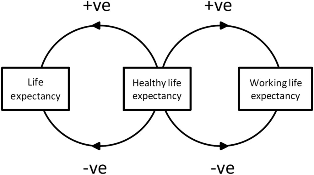
We can think of the cost of inequality as the required size of the tax base in each area to fund these areas of public expenditure. If this were funded locally, inequality would be exacerbated by the adverse impact of high taxation on living standards. Equally, there would be a financial, as well as social, “dividend” if avoidable inequalities for example in ill health could be eliminated and the savings re-invested. The hypothesized interactions between the three measures of expectancy including feedback loops are summarized in Figure 1.
Impact (positive or negative) of rising or falling healthy life expectancy on life expectancy and working life expectancy.

It is important to note that increases in LE are not always matched by health improvement. Indeed, there is evidence that the gap between LE and HLE is widening [Villegas and Haberman (Reference Villegas and Haberman2014), Mayhew and Smith (Reference Mayhew and Smith2019), Mayhew et al. (Reference Mayhew, Harper and Villegas2020)]. This means that the cost of providing healthcare, social care and financial support to the elderly, relative to the rest of the population, will increase unless health improves, although it is possible that there will be some off-setting savings from reduced pension payments. Furthermore, economic resources will be diverted from wealth creation into care provision.
In summary, there are four main arguments for this approach:
• Identifying the main contributors to the cost of inequality provides a rigorous basis for the “levelling up” agenda.
• Human capital is a primary driver of well-being and wealth, and so priority should be given to promoting productivity, healthy behavior and investment in education and skills.
• Reducing the wealth gap between different areas of the UK should reverse the phenomenon of people, resources and investment gravitating to more affluent areas.
• Assuming one can establish a direct relationship between output and health, the use of a tax metric provides a better basis for redistribution.
2. Life, health and working lives defined
LE is defined as the number of years a person is expected to live and is usually measured at birth. However, since we are interested in working lives, it is more appropriate for us to use a starting age of 20. Healthy life expectancy (HLE) is defined as the number of remaining years that an individual can expect to have in “very good” or “generally good” health. HLE is strongly correlated with the number of years an individual can expect to live without a long-term limiting illness or disability. This is formally defined as disability-free life expectancy (DFLE). Although it is theoretically possible for HLE and LE to be the same, in practice most people die after a long or short illness. The gap between LE and HLE is the number of years spent in greater or lesser ill health at the end of life.
Working life expectancy (WLE) is the expected number of years spent being economically activity between entering work and retirement. If we assume, for the sake of argument, a post-education starting age of 20 with a conventional end point of 65, then a person who is active for the whole of that period has a working life of 45 years. For many, the age of 65 corresponded with the UK's State Pension Age (SPA), but with the raising of the SPA to 66 (and further increases planned), this no longer applies. Because of the scrapping of the default retirement age, SPA is increasingly redundant as a proxy for retirement age although it remains a reference point for welfare and other administrative purposes.
There are practical reasons why any single “retirement” age should be treated with caution. Labor force data show that economic activity reaches a maximum of between 80% and 90% between the ages of 20 and 55. Activity rates slowly decline from about age 50—in other words, long before 65—for reasons such as poor health, redundancy and age discrimination in staff recruitment and retention. This trend continues into old age and accelerates, so that that the availability of potential workers falls sharply beyond age 70 Mayhew (Reference Mayhew2018). To give an example, suppose the average activity rate between 20 and 65 is 0.8, this would equate to 0.8 × 45, or an average 36-year working life in the steady state. In theory, labor market data could be extended to whole life with some small tweaks to current labor market statistics but the extra working years generated post-65 would be quite small in this numerical example due to the much lower activity rates in old age.
2.1 Local variations in life, health and work span
It will be recalled that we calculate LE, HLE and WLE from age 20; therefore, to determine the expected ages of death, the onset of ill health or when work ceases, we need to add 20 years to our data. We call the new figure “life span” or “expected age of death”, which is simply LE at age 20 plus 20 years. Its main purpose is to enable us to present results in chronological age, rather than in terms of future years of life. Thus, if LE at age 20 is 60 years than the expected age of death would be 80; if HLE at 20 is 50 years, then the expected age at which poor health kicks in would be 70; if WLE is 40 years then the expected age when a person ceases to be economically active is 60.
To analyze local variations in LE, HLE and WLE, we need a dataset that covers each domain in every local authority area in England, without overlap. Fortunately, there is such a set, made up of unitary authorities, metropolitan boroughs, London boroughs and counties.Footnote 1 In total, our list comprises 150 districts covering the whole of England. The analysis builds on data available from the Office for National Statistics (ONS) which is responsible for all official demographic data at national and local level in England (ONS, 2021). ONS calculations of health and LE are available by 5 year age bands at local authority level for 150 local authorities in England, known as Upper Tier Local Authorities.Footnote 2
The methodology for calculating health expectancy is publicly available from the ONSFootnote 3, whilst the raw data used to calculated health expectancies is from the Annual Population Survey. Data on economic activity (i.e. labor force participation rates) in the same geography as life and health expectancy is available from the LFS and can be downloaded from the nomis website.Footnote 4
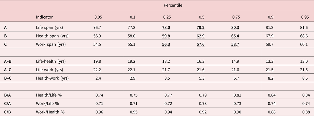
Table 1 splits districts into five-percentile steps, from districts with the shortest life, health or work spans to those with the longest. For illustrative purposes the analysis is based on males, but it would be straightforward to include females in further work. It shows:
• A widening gap in life, health and work spans between the lowest 5% of districts and the 95th percentile which is indicative of significant inequalities.
• Wide variations within individual measures—for example, a 19.8-year gap between life and health spans in the lowest 5% compared with a 13-year gap in the 95th percentile. It means only 74% of lifespan is spent in good health in the former compared with 85% in the latter.
• Comparing health and work span, it shows that in the 5th percentile 96% of a much shorter health span is spent in work compared with 88% in the 95th percentile.
LE, HLE and WLE by percentile of districts ranging from the 5th percentile (lowest) to the 95th percentile (highest)

Note: bold figures are the median lower and upper quartile values.
There are other important implications that can be drawn from this table. For example, it is reasonable to conclude the following:
• A widening gap between health and life spans implies that more years of life are spent in ill health and economic inactivity, with negative implications for health, social care and welfare costs.
• Work span is lowest in districts with the shortest health spans, and is always less than healthy life span. The gap tends to zero in the lowest percentiles, but in the highest percentile it is 8.5 years. We may therefore infer that shorter healthy life spans are a key obstacle to longer working lives.
• Increasing the number of years spent in good health increases consumption whilst healthy people receive less in benefits and health care funded out of public expenditure. They also add value through volunteering and looking after the sick.
• Although longer lives potentially increase pension costs the question is whether these costs are offset by other effects such as increases in SPA and increases in disability benefits.
These patterns are also borne out, virtually without exception, if we drill down to individual local authority level and are broadly consistent with measures of economic performance such as Gross Value Added which tend to favor districts in the higher percentiles.
3. Imputation of local tax rates
Which combinations of life, health and work span are most advantageous? If we knew this we should be able to devise policies that accentuate positive rather than negative outcomes. For example, policies that require people to spend their whole lives working would be hugely unpopular. Policies that prioritize life span over health span would potentially bankrupt the healthcare system by subsidizing poor health—a sensitive issue, but one that puts a clear value on the cost of poor health. Similarly, policies that do not look after the welfare of workers would be disastrous for the economy in the longer run. If it were possible to show the financial impacts across a range of scenarios, policies could be developed to promote more favorable outcomes leading to fewer inequalities.
We need a mechanism to compare districts based on LE, HLE and WLE, and a second to put a value on inequalities. Since there are 150 districts in our database, it makes sense to group like with like. How we do this is explained below. In the introduction, we posed the hypothetical question of what tax rates would be required if each district (or group of districts) were held responsible for its own public services. These are usually demand-led rather than capped which means spending authorities and service providers have relatively little control over the outcomes, but their budgets will have been calibrated on the basis of historical and other factors.
To keep it manageable, we include only the cost of providing healthcare, state pension costs and disability benefits in our calculations. As a further simplification, we also levy our hypothetical tax solely on income; although this could be changed to include other taxable revenue streams in future applications. An obvious criticism of this approach is that it does not take into account the value of other outputs, such as profits and rents, and non-remunerated activities such as care and volunteering. However, our aim is more limited– it is to understand a set of financial effects based on a few important factors, so that we can isolate the economic value of healthy ageing and working longer.
Although we can treat each district separately, we have chosen to put each district into sub-groups. This simplifies the presentation of the results and enables us to observe patterns and trends. We assign to each district a code according to whether life, healthy life or WLE is High (H), medium (M) or low (L) using quartile cut-off values (these are emboldened in Table 1). For example, a district with the code “HML” has a life span in the top quartile (>80.3 years), health span between the 25th and 75th percentile (between 59.8 and 65.4 years) and work expectancy in the bottom quartile (<56.3 years from birth, or <36.3 years from age 20). A district with the code “LLL” would be among the most deprived, in all three senses, and one with “HHH” among the most advantaged. With three outcomes per category, “H” “M” and” L”, there are 27 different types of area.
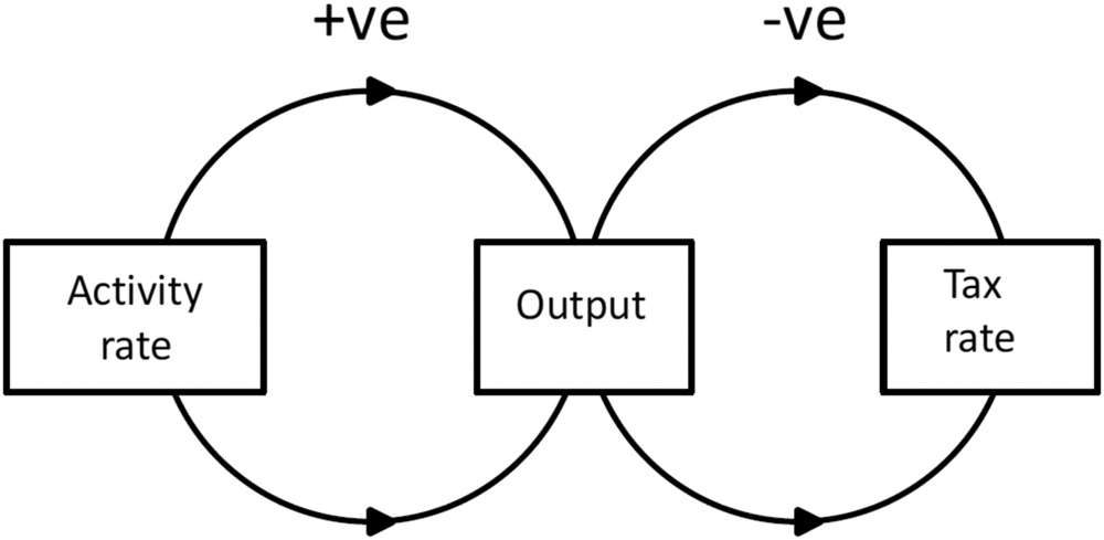
The treatment of taxation is more complicated. Take the state pension, which is not directly affected by a person's health, employment status or LE. A PAYG system, it is paid for out of general taxation and is in continuous payment until death, so the age at which it is set will affect the tax rates, but the duration of payment will be determined by district level life expectancy in our case. The general relationship between activity rates, total income and taxes is shown in Figure 2. The more economically active the population, the greater its productivity in the form of higher wages and higher output. Higher output, in turn, increases the tax base to pay for healthcare, welfare and pensions, and so the tax rate would accordingly be lower. Lower output would, of course, have the reverse effect—fewer goods and services, and higher taxes.
The positive/negative relationship between activity rates, output and taxes.

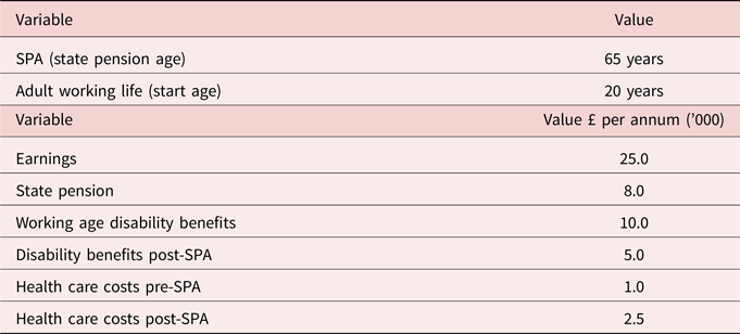
The next step is to put values on each of the variables in the framework in order to estimate outcomes in tax terms for a representative adult. This section and the assignment of costs follow closely the methodology set out in [Mayhew (Reference Mayhew2009, and Reference Mayhew2011)]. A person could be in good health or bad, pre- or post-SPA, and in work or not. It is known that health costs rise significantly in old age, so we approximate this by assuming different rates of expenditure depending on whether someone is aged above or below the SPA (the model uses the conventional age of 65 DWP (2017)Footnote 5]. This seems reasonable since pension age is determined by a range of factors averaged out over the population, the costs of which vary by health and disability as well as by age.
We then split remaining life into the following quantities expressed in this identity:

The next step is to attach financial quantities to each element of the relationship. Lifetime income is defined as being equal to WLE times average earnings. In the same way we can calculate lifetime adult healthcare costs and the cost of disability benefits using the expected number of years in ill health (i.e. life span minus health span) multiplied by the going rates for each cost category [e.g. see UK Health Accounts (2019)]. We can then calculate a representative local, hypothetical tax rate for an individual in any of our districts over life span, as follows:

Where
1. Lifetime earnings (output) = average earnings × work span
2. State pension received = (life span-SPA) × average value of state pension
3. In-work disability benefits received = (SPA-years spent in good health from age 20) × average in-work disability benefit rate
4. Post-SPA disability benefits received = (life span-SPA—healthy years post-SPA) × average post-SPA disability benefit rate
5. Healthcare costs pre-SPA from age 20 = years spent in poor health × average health costs per annum
6. Healthcare costs post-SPA = years spent in poor health to the end of life × average health costs per annum
Most of these definitions are easy to comprehend. SPA was set at 65 in the base case, its value pre-December 2018, but it is a parameter that can be varied to show the effects not only of changes in health and life span but also taxes.
The final step is to insert values for each parameter such as average earnings. These values are summarized in Table 2. They are assumed for the purposes of illustration but are consistent with actual UK averages. Note that in further research these would be disaggregated by district—a step that is feasible but involves a large amount of prior work to assemble the data (see section 6).
Values of each variable used in the illustrative case

For long periods, the representative tax rate is likely to be fairly stable. Assuming a broadly constant number of births and deaths, the tax rate for the population will be the same as for the representative individual at any point in time. We exploit this result later when we link output to GDP and productivity.
4. Variations in Life, health and work span by local authority
The results are set out in Table 3. This table allocates each district to one of the 27 district types using the H, M and L convention. Each row includes the number of districts allocated to each category and the imputed tax rate, based on the methodology set out above. A final column provides examples of districts allocated to particular categories. The most common categories are HHH, MMM and LLL, accounting for 42% of the districts analyzed. The HHH category mostly includes districts such as Wokingham, Bromley and Oxfordshire in the wealthier south-east of England. The MMM category includes districts such as Leeds, Medway, Greenwich and Cornwall, and is more spread out. The bottom row gives examples of the 18 districts in the LLL category, including Manchester, Birmingham and Liverpool. A full list can be seen in the Appendix.
Districts ranked on life, health and work span

Note a: Letter order is life, and then health followed by work span; note b, see also next section.
Some of the least common combinations may indicate special circumstances. An example is MML with medium life and health spans but a low work span. This includes districts such as Bournemouth, Brighton and the Isle of Wight, which are holiday destinations with seasonal work. If the labor market were more robust, would that improve health and life spans? Another interesting category is HHL for which there is only one example—Kensington and Chelsea, the richest borough in the country with well above average levels of economic inactivity. Is that because it is a popular destination for the wealthy retired, or is there an above average proportion of the population living on unearned income, or is the average resident simply able to retire early?
Just as intriguing are the eight null categories for which there are no identifiable districts. These have unusual combinations, such as high health span coupled with a low life span (or vice versa), cases with two “Ls and an “H” such as rows 9, 21 and 25 and so on. These cases signify, for example, the incompatibility of having long life spans coupled with poor health and shorter work spans. In other words, a person with low health expectancy will tend to have a low or medium life span and vice versa. If we test the hypothesis that work and health spans are correlated, we find this to be highly statistically significant (p < 0.001), vindicating the theory that work is good for health and that health is good for work—obvious perhaps but good to see it confirmed in the data.
Turning to the imputed tax rates in the next column, we see that these range from 22.5% to 30.4% with an all-district average of 26%Footnote 6. Areas taxed at higher rates are effectively paying the price for poor health and work spans relative to other areas. For example, towns and cities such as Hartlepool, Birmingham and Manchester in the LLL category have tax rates at the high end of the range while those at the head of the table in the HHH category have the lowest tax rates. There are a few outliers: Derby, for example, with a tax rate of 25.6% is the only representative in the LMH category.
The map in Figure 3 shows the tax rates by individual district: the darker the color, the higher the tax rate applying. Values range from 21–22% (cream) to 33–34% (dark green). Prominent clusters of imputed high tax rates are the north-east (cells F3 to H3), northwest (E5 to F6), West and South Yorkshire (G6 to H6), Nottinghamshire (H6 to H7), West Midlands (F8 to G8), Hull (I5), Isle of Wight (G12 to H12) and parts of central and east London (see map inset). There are sporadic clusters elsewhere such as Plymouth (C13), Telford (F8) and Stoke-on-Trent (F7). These tend to be in or near urban areas, though sometimes they are on the coast. If it were available, more granular data would be able to pinpoint sub-districts better. But, in general, the map gives a good picture of deprivation.
Map of England showing imputed tax rates by district.

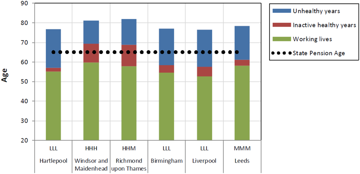
Figure 4 shows six individual districts from four categories—three in the LLL group, and one each from MMM, HHM and HHH. It shows average periods spent in each state—working lives, inactive healthy years and unhealthy years. (A hatched line from left to right shows the base pension age of 65.Footnote 7) The chart shows, for example, in which districts inhabitants are more likely to reach pension age in good health (Windsor and Maidenhead and Richmond upon Thames), and in which they are not (i.e. the rest). In all cases, the average age at which economic activity ceases is lower than the SPA—and, in the case of Hartlepool, there is hardly any difference between health and work span.
Examples comparing individual districts based on work, health and life span. The hatched horizontal line shows state pension age.

To summarize, the characterizing of districts on this basis are a useful way of representing inequalities whilst the assignment of a representative tax rate is indicative of the burden on public finances. This is important for applications in which such a measure could be used for comparative purposes alongside a dashboard of other outcomes. One common measure for capturing inequality is the standard deviation, which is a measure of dispersion relative to the mean: high value signifies greater inequality and low value the opposite. In our illustration the mean is 26% and the standard deviation is ±3%. If tax rates are distributed normally—which approximately they are—it means that 68% of all values fall within one standard deviation of the mean—in this case 26% ±3% i.e. between 23% and 29%.
5. Effects of changes in health on LE and WLE, public expenditure and GDP
There are several ways to use this analytical framework. Broadly these entail investigating changes in LE, HLE and WLE and their impact on the imputed tax rate, productivity and the cost of providing pensions and welfare. How will tax rates alter if any or all of these variables change? The framework makes this easy to calculate. Take the impact of a future rise in longevity on tax rates. In this case (and with no other changes), we would expect taxes to increase to pay for pensions and higher spending on health and disability benefits. This is because the years spent in ill health would increase, causing higher health and welfare payments, unless there was a compensating improvement in health span.
Clearly, the policy goal of improving HLE by five years speaks directly to the issues addressed in this paper, but current policy does not appear to build from an empirical base. New policies are needed that explicitly draw the link between health, work and economic growth. Increases in LE and hence life span has faltered in recent years, and that immediate prospects for further increases have been negatively affected by the Covid pandemic. As long as rises in life span are accompanied by an increase in health span, prospects are much better—especially if they create headroom for longer working lives.
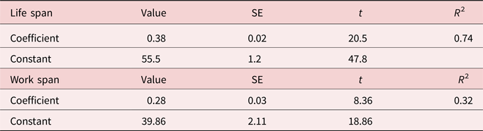
Empirical evidence suggests that a one-year increase in health span would translate, on average, into an approximate 4.5 month increase in life span or 0.378 (±0.02) of a year using cross sectional analysis of local authority data. This can be seen from the chart in Figure 5(a) which shows that the gap between adult health and life span at age 20 decreases with increasing healthy years. It also gives a sense of the level of inequality with a predicted vertical gap between life and health span of 21 years at age 56 (P) falling to 12 years at age 70 (Q). Regression results showing the impact on life span from improvements in health span are given in Table 4. With an R 2 value of 0.74 the relationship appears robust.
(a) The relationship between adult healthy life span and life span based on a cross-sectional analysis of 150 English local authorities; (b) between healthy life span and work span.

Regression results for of life span and work span on healthy life span in English local authorities

Figure 5(b) and Table 4 show the equivalent results for the impact of health improvements on work span. Here the effect of a one year improvement in health span on work is less than for life span at 3.4 months or 0.28 (±0.03) of a year. A key finding seen in Figure 5(b) is that work span is always less than health span confirming what we already know that poor health is a barrier to work (point S). Another finding is that improving health does not translate directly into greater economic activity—if it did work span would increase in step with health span. Instead it leads to a longer healthy retirement (PQ). The chart shows that someone aged 56 not in good health ceases to be economically active (point P) but someone aged 70 would be economically active on average until age 60 (point Q).
Two conclusions we can draw from this analysis is firstly increasing healthy years is beneficial on several measures since it both reduces and defers health care costs in later life and secondly it allows people to work longer, although the labor market effects are not as great or robust as they are for increased life span. This confirms that health has a positive effect on LE and because the gap between them reduces it means fewer years spent in ill health at the end of life. Improving health has a positive effect on working lives but a greater effect on the number of years spent in good health on ceasing to be economically active i.e. in retirement.
5.1 Long run effects of improvements in health on taxes and other measures
The government's aim is to improve healthy life expectancy by five years. What would be the effect on taxes, working lives and inequalities? We base our analysis on the assumption that the cross-sectional relationship between health, life and work span we observed in the previous section continues to apply. If there were a rise or fall in health expectancy at a national level of, say, 1, 2 years etc. we are able to estimate the effects on the main variables of interest—life, work span, taxes and inequality.
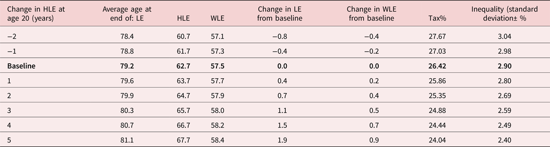
The results in Table 5 show the effect of a change in HLE ranging from −2 to +5 years with no other changes to framework parameters (such as pension age, health costs or welfare payments). Note that it is reasonable to include a scenario showing the effects of a fall in health expectancy as well as an increase as this has a reasonable chance of occurring given the effects of the Covid pandemic. In general, we find that inequalities, as measured by the standard deviation (see last column), are reduced less than taxes, suggesting that improving general levels of health may require more targeted measures in individual districts.
Illustrative examples of changes in life and work span, tax rates and inequalities from general increases in HLE based on figures from birth

Given a health span baseline of 62.7 years, the results show that life span increases as expected, but by less than the rise in HLE. WLE also increases, but by less than LE as was anticipated from the previous results. The impact on taxes would be considerably greater if there were accompanying changes in the SPA. Assume for the sake of argument that the improvements in HLE in Table 5 were matched by increases in the SPA. A one-year improvement in HLE, along with a one-year increase in SPA, would reduce the tax rate to 25.3%, a three-year improvement to 23.0% and a five-year improvement to 20.8%.
5.2 Economic activity, productivity and GDP
We have seen that a rise in HLE and hence health span tends, on its own, to have only a modest effect on work span and, therefore, on tax rates, without accompanying fiscal measures (such as increasing the SPA), which would reduce pension costs and taxes by greater amounts. For increases in HLE to have a more substantial effect, especially on output, there would need to be incentives to convert more of the extra healthy years into work. Sluggish productivity growth and early retirement have long been seen as the Achilles' heel of the UK economy and are a priority for review. An increase in HLE can be viewed as a kind of enabler to capture the higher productivity potential of experienced older people who would like to work for longer.
The same sort of analysis can be applied to GDP but only in crude terms—where GDP is defined as the final value of the goods and services produced during a specified period of time, normally a year. The GDP growth rate is an important summary measure of how well an economy is performing. It can be split into two components—one generated by earnings and the other representing income generated by profits, dividends and rents. Assume initially that GDP is represented only by wages and salaries, we have the further identity:

The first term on the right is another way of expressing work span and equates to levels of economic activity; the second term is a measure of productivity; and the third term is related to LE in a steady state population. For GDP to increase one or more terms to the right must also increase—for example, a 10% increase in productivity without any other changes would raise GDP by 10%. The same applies to increases in the proportion of the population in work and in the size of the adult population.
We have already noted that health is a barrier and healthier people have longer work spans which suggest that proportion of people in work would be facilitated by general improvements in health. Of course this is necessary but not sufficient condition because of the complex relationship between earnings and work and so would require further analysis. Crudely, GDP per capita is found by dividing both sides of the equation by the adult population. It implies that the population becomes better off the higher the proportion of adults that are in work and the higher productivity is. This is a gross figure before taxes are levied and the imputed tax rates rise with the cost of welfare, healthcare and pensions. The tax rate is determined as follows:

The relationship is, therefore, one in which output per capita depends on work span and productivity but in which net earnings depend on the cost of healthcare, welfare and pensions—all of which are met through taxes as set out previously.
Putting the above into context, assume that two thirds of adult life is spent in work and that annual earnings are £25,000, plus 20% employer's social contributions. With an adult population of 50 m people in England this produces a reasonably accurate value of the share of labor in UK GDP of around £1 trillion. However, this ignores the second component of GDP, based on profits, dividends and rents. ONS data shows that this has remained relatively steady since 2000 at around 50% of GDP. Adding the two components implies a total GDP of £2 trillion, which is reasonably close to the 2020 value of £2.1 trillion according to ONS estimates. This correspondence means that our demographic accounting framework can be considered reasonably realistic.
6. Conclusions
There is intense interest in tackling the scourge of inequality in society and closing the gap between richest and poorest areas in terms of income, health, housing, education and job prospects. It is increasingly accepted that narrowing the current discrepancy in HLE is a necessary step forward. This is a tough challenge and, if anything, the gaps are growing wider. At the moment all these considerations—work, health, pensions and welfare—subsist in different policy silos. Thus, it is hard to calculate the effect of one on another. For example, what would be the economic value of a one-year increase in HLE on GDP versus a one-year increase in LE? Would this increase or decrease inequalities?
The aim of this research has been to put a price on inequality and an economic value on good health. This has two implications—the first is that good health is a precondition for a longer working life and healthy retirement, and the second is that good health reduces the cost of services such as health and social care. If each district is treated as autonomous and responsible for funding its own health, welfare and pension provision, we can quantify these effects explicitly. Those districts with the fewest working years would pay most taxes and those with the best health and longest working lives the least. Based on simple assumptions we estimated the national average hypothetical tax rate to be 26% of earnings, but this varied by 10 percentage points between the richest and poorest areas, demonstrating the way in which some districts subsidize others through fiscal transfers.
The results show that people in areas with the lowest LE spend more years, on average, in poor health than areas with higher LE. Areas with the lowest WLE also have the lowest HLE, meaning that poor health is likely to be the biggest obstacle to working longer. Such areas enjoy far less time spent in healthy retirement than healthier districts, and they face more health challenges and income deprivation in later years. Healthier areas gain from more social capital—for instance for the purposes of volunteering or caring for relatives—as well as offering inhabitants the flexibility to work up to and beyond the SPA (Mayhew, 2020). Areas with fewer years spent in good health show more people needing social care as well as healthcare and financial support. This also exacerbates labor shortages in the care sector.
Overall, the analysis suggests that good health is a necessary (although not sufficient) condition for reducing inequality. We showed that improvements in HLE translate into longer working lives and also longer LE. A one-year increase in HLE would lead to an approximate 3.4-month increase in WLE and a 4.5-month increase in LE. The increase in HLE should result in more retirement years spent in good health, a smaller gap between HLE and LE and hence reduced demand for health and social care. However, the impact on inequality does not change and so benefits all areas equally and so more targeted methods are needed to address the most left behind areas.
To address the potentially negative link between an ageing population and economic sustainability three actions are needed:
– Encourage (and enable) more people to work for longer. An increase in the SPA could achieve this but a precondition is that health must improve, not just LE. If the SPA increases and health is unchanged, any saving will be diluted by the increased costs of health and welfare.
– Some of the extra years spent in good health need to be translated into productive work, but this does not have to mean working in arduous occupations or full time. The effects would be beneficial for both GDP and public expenditure, and healthy retirees make a huge contribution through volunteering.
– Lift historically low levels of productivity in the UK, as compared with international competitors, by increasing output per worker through investment in modern production methods, skills training and technical innovation—all of which would translate into higher earnings.
6.1 Further implications and prospects
Higher returns on investment through profits, dividends and rents would also boost GDP, so the country as a whole would be better off. This would have the effect of reducing tax rates but not necessarily inequality. That would depend on how the extra output is distributed between areas and, by extension, socio-economically. For example, automation could dispense with some labor altogether. Without any changes in WLE, HLE and LE nationally and locally the effect would tend to concentrate wealth rather than disperse it. The challenge is, therefore, to blend these different levers to optimal effect to achieve the greatest prosperity for the greatest number.
How is it possible that areas with the lowest LE could rise to the level of the highest? We have noted that for HLE to increase by five years by 2035 (which is the government target), LE would rise by about two years to 81.7 years—a level currently reached in only 5% of English districts. In some other countries there is evidence of progress, but not on this scale. Of the G20 countries, only South Korea, India and Russia improved their HLE by more than five years between 2000 and 2015—and all started from a lower base. In the UK, the increase was only 2.9 years and in Japan, the country with the world's highest HLE, it was 2.3 years [ILC-UK (2021)]. Closing the gap will be a long-term process requiring locally targeted, as well as universal, adjustments in policies.
What are the immediate prospects? The data on the full impact of Covid-19 on LE, HLE and WLE will not be available for a year or two, but we should expect falls in LE. We know from other research that there is a strong relationship between health and deprivation in the UK and that the health gap between the richest and poorest is widening [Bennett et al. (Reference Bennett, Pearson-Stuttard, Kontis, Capewell, Wolfe and Ezzati2018), Mayhew et al. (Reference Mayhew, Harper and Villegas2020)]. We also know there are limitations on how long people can be expected to work, as well as affordability problems (from a public spending point of view) regarding the future of the state pension. The achievement of the government's five-year health improvement target depends on unprecedented progress being made in HLE—hence the enormity of the levelling up challenge.
Appendix
English districts coded according to life, health and work expectancy (H, high; M, medium; L, low)