

Introduction
A dash of black and white text and images addresses you from a copied slip of paper.Footnote 1 Posted, handed out, collected or discarded, the flyer is a small, economical medium – usually ranging in size from a quarter to a full sheet of standard paper – that has to make a big impact. Designed to communicate through and beyond the written word, music flyers, at their best, are compact promises of multi-sensory events. Aside from the specifics of date, time, place and performer, the flyer must convey the ethos of the show. Sometimes exchanged at the entry for a discount or free admission, the flyer is, in itself, a kind of portal – the first glimpse of the scene, the first indistinct hint of the music – a two-dimensional doorway that leads to the real entrance of the venue, whether it is at a local high school or community centre, a roller rink or a disco.
Born on 17 July 1958, Lemoin Thompson designed his first flyer under the pseudonym Buddy Esquire in November 1978.Footnote 2 Self-proclaimed but also widely acknowledged as ‘The Flyer King’ in the early 1980s, Buddy Esquire's status is upheld in the present day in part because many of his flyers, unlike those of some of his contemporaries, have defied their ephemeral nature.Footnote 3 Between 1978 and 1984, his career coinciding with the first flourishing of the Bronx scene, Buddy Esquire designed over 300 of the first hip hop flyers (Smith Reference Smith2001; Carayon Reference Carayon2006, p. 51). During this period, hip hop shifted from a community-based collection of disparate arts to a full-blown commercial phenomenon: by the early 1980s, graffiti-as-art was shown in galleries, the first hip hop albums were recorded and b-boying was documented in films. But by the mid-1980s, live hip hop shows in the Bronx had all but faded away.Footnote 4 Along with photographs and a handful of live audio recordings (these audio recordings are battle tapes created as by-products of live events, as opposed to the studio albums produced for sale and radio play beginning in 1979), these flyers are among the relatively few artefacts of the Bronx's live hip hop culture. This study, then, centres on two ephemeral things – the hip hop flyers of Buddy Esquire and the Bronx hip hop scene of the late 1970s and early 1980s – and what one can tell us about the other.
Buddy Esquire maintains that, in his flyer designs, he was not ‘actually demonstrating […] the music with the graphics and all of that. But […] they do, in a way, signify the time’ (Esquire Reference Esquire2011). His prevailing design aesthetic, which he eventually referred to as ‘neo-deco’, depicts the early hip hop era through (and as, which I address at the end of this paper) a vibrant stylistic mixture of elements old and new. Signifying an update or modernisation of the Art Deco stylings of the 1920s and 1930s, ‘neo-deco’ marries Art Deco-inspired borders and Letraset or Prestype fonts stemming primarily from the Deco era with neutralised graffiti and disco motifs.Footnote 5 While the juxtaposition of a 60-year-old style of print design with these more of-the-moment elements might seem jarring, the early 20th-century futurism that lies at the root of Art Deco design principles makes the coupling work. Based on streamlining objects and shapes, an aesthetic that was spurred on by new understandings of aerodynamics, Art Deco design uses geographic shapes and strong contrasts of colour or shade in its representation and celebration of the mechanised modern world (Heller and Fili Reference Heller and Fili1995, p. 6; Ambrose and Harris Reference Ambrose and Harris2006, p. 28).
Although it might be tempting to ascribe this mix of fonts and shapes to chance and a chaotic design aesthetic, Buddy Esquire has demonstrated his self-taught graphic design knowledge in several interviews. Beyond naming his style ‘neo-deco’, he has discussed his font choices, in particular citing his frequent use of the Broadway font family and calling attention to its Art Deco origins (Carayon Reference Carayon2006, p. 56). Nor were his choices a matter of necessity: although Buddy Esquire's early flyers from 1978 and 1979 indicate that he was able to create precise and varied hand-drawn alphabets, he elected to begin using transferable lettering in 1980. Perusal of the Letraset catalogues from the early 1980s confirms that the use of this type of lettering did not limit his options either, as the type company produced a multitude of fonts in different styles. Just as it is problematic to suggest that the creators of hip hop had to invent a way to make new music with voices and turntables because they had no access to traditional instruments (Schloss Reference Schloss2004, pp. 28–9), so too would it be diminishing to suggest that Buddy Esquire's style was born out of necessity.
The intentionality with which Buddy Esquire designed his flyers also demands that the viewer consider his decisions. Since hip hop does not exactly cause Art Deco to spring to mind, their confluence in the flyers of Buddy Esquire raises the question of what the artist's intentions may have been. What, then, do these flyers – dynamic in their mixture of styles, yet enigmatic in their seemingly anachronistic use of Deco elements – communicate about the status of shows and live hip hop in this culture? In order to compete with disco and the new bloom of commercial hip hop, live shows needed an enhanced image. For Buddy Esquire, the ‘neo-deco’ aesthetic was intended to promote shows (and his own services as a flyer artist) by elevating the status of the events. The flyers’ Deco-inspired frames acted metaphorically as facades for the often nondescript spaces in which the shows actually took place: as the flyers indicate, many shows were hosted by high schools or community centres.Footnote 6 Buddy Esquire frames it this way: ‘That's what I tried for, you know: give it a level of class even though it was just a ghetto jam’ (Esquire Reference Esquire2011).
Elements: graffiti
To make hip hop into a movement and, above all, a new movement, rather than a coincidence of older art forms jumbled together with the technology of the late 1970s, scholars often overemphasise the unity of the ‘four elements’ in early hip hop culture (emceeing, b-boying, writing and deejaying). These elements, they argue, may have existed before, but they never coexisted in a symbiotic relationship so tightly woven that the movements of breakers could be compared to the writing thrown up on subway trains.Footnote 7 If the rallying cry of the early hip hop scene was Afrika Bambaataa's motto ‘Peace, love, unity, and having fun’, then it might seem like sacrilege to question the unity of the four elements.Footnote 8 When Jeff Chang asks, ‘If graffiti was hip-hop's visual art form, what happened when the aesthetic hit the mimeographed party flyer?’. He seems to imply that they uphold the style, transforming it only insofar as the medium demands (Chang Reference Chang and Chang2006, p. 55). But Buddy Esquire's flyers, in their suppression and transformation of graffiti-style imagery, seem to deny the sanctity of these elements.
This stylistic leap seems all the stranger – but more mindful – when Buddy Esquire's artistic formation is taken into account. In several interviews, he expresses respect for graffiti and identifies himself as a practitioner (Smith Reference Smith2001; Carayon Reference Carayon2006, p. 51; Esquire Reference Esquire2011). He recounts his early history of tagging trains with the aliases ‘Phantom 1’, and ‘ESQ’, beginning in 1972, but seems to view it as a stepping-stone in his artistic development: ‘I kept practicing and eventually I got better at handling letter form’ (Carayon Reference Carayon2006, p. 51). Conscious that his appraisal of this style might be controversial, Buddy Esquire addresses the rejection of graffiti style in his flyers in an interview with Troy Smith of oldschoolhiphop.com:
I just wanted to get away from the […] graffiti style type of flyers that I had seen. […] I admit to being a writer and I still love the art [,] but at the same time [ – ] and this could cause X amount of controversy right here – […] I did not feel that graffiti art was really a good presentation for what I was doing. (Smith Reference Smith2001)
Although Buddy Esquire seems uncomfortable specifically stating why he avoided graffiti style for his designs (for both the lettering and the overall aesthetic), his responses imply that the considerations included legibility and neatness. This rationale demonstrates his savvy mastery of the flyer medium in which, unlike graffiti, instant recognition and communication is crucial: since flyers are disposable advertisements, a message not immediately conveyed risks being discarded. In addition, by distancing himself from the graffiti aesthetic, he aimed to distinguish his style from that of other flyer artists, such as Doc la Rock and some anonymous artists (Esquire Reference Esquire2011).
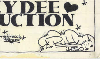
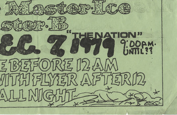
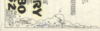
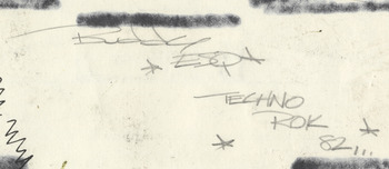
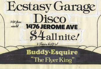
Both the need to reject graffiti in order to create an original style of his own and the process of this artistic struggle are documented in Buddy Esquire's words and flyer art. He explains, ‘[…] I would never make a flyer using the graffiti style, that's one of the things I tried to get away from when I started making flyers. […] It took some time [,] but I eventually created my own style’ (Smith Reference Smith2001). In his designs, this process is most evident in the transformation of his signature. In Buddy Esquire's early flyers from 1979 (see Figures 1 and 2), the artist's signature is a tag-like scrawl, featuring the graffiti hallmarks of decorative stars, curlicued arrows, cloud-like borders and the occasional effect of spray-paint imitated by the dotting of a pen.Footnote 9 By 1980, this style seems to be all but obsolete, with the exception of a rare hangover on a flyer from 14 March 1981, also featuring a self-portrait of the flyer king as a crown-wearing, dancing, smoking stick figure (see Figure 3). After this date, none of Buddy Esquire's flyers in the Cornell University Hip Hop Collection features this style of signature. It can, however, be found on the reverse of rare original copies (not reproductions), such as the flyer from 17 July 1982 (see Figure 4), in which we can see the bleed-through of the front's markered-in blocking.
Detail of a Buddy Esquire flyer from 16 February 1979. A colour figure is available in the online version.

Detail of a Buddy Esquire flyer from 7 December 1979. A colour figure is available in the online version.

Detail of a Buddy Esquire flyer from 14 March 1980. A colour figure is available in the online version.

Detail of reverse of a Buddy Esquire flyer from 17 July 1982. A colour figure is available in the online version.

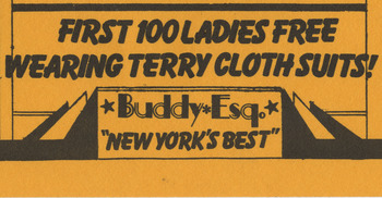
In early 1980, this style of signature is replaced with one rendered in Prestype or Letraset transferable lettering. In our discussion of his style, Buddy Esquire emphasised that his motivation was an appearance of professionalism, and that he was ‘trying to go for something more uniform’ (Esquire Reference Esquire2011). It is also around this time that his title ‘The Flyer King’ or ‘The King of the Flyer’ (depending on whether or not a rhyme would enhance the text) begins to appear alongside his signature (see Figure 5). Buddy Esquire also experimented with the tagline ‘New York's Best’ and, on one flyer from 7 April 1979, ‘The Ghetto Kid’, but ‘The Flyer King’ proved the more durable title (see Figure 6). In collaborations with Martin Williams, a visual artist who occasionally contributed illustrations of stylish women or galactic scenes to the border and typeface designs by Buddy Esquire in 1980 and 1981, the pair went by the straightforward designation, ‘The Professionals’.
Detail of a Buddy Esquire flyer from 22 February 1980. A colour figure is available in the online version.

Detail of a Buddy Esquire flyer from 1 August 1980. A colour figure is available in the online version.

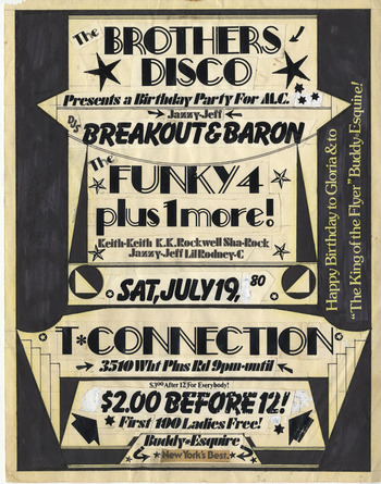
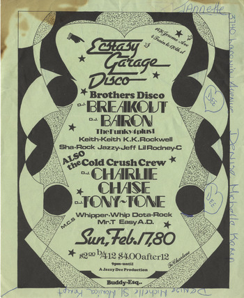
Although Buddy Esquire claims that he was purging graffiti style from his designs, many of the features of graffiti (stars, arrows, cloud-like borders and spray-paint textures) still feature strongly in the flyers. Rather than expelling these symbols, he presents the viewer with a fresh and clean interpretation of graffiti design, where the blur and bleed of the felt marker is often traded for the crisp lines of pre-made Letraset symbols. In a flyer from 19 July 1980, both Buddy Esquire's ‘signature’ and the flyer as a whole are strewn with a variety of decorative stars and arrows (see Figure 7). The use of Balloon extra-bold (for the text of DJs Breakout & Baron) – an all-caps font reminiscent of graffiti lettering done with a Sharpie pen – adds to the effect. In another design, from 17 February 1980 (see Figure 8), pointing hands appear as a transformation of the arrow motif. In this flyer, the hard-line geometrics of many of his flyers are replaced by a border composed of an array of bubbly shapes, some filled with a pen-dotted stippling that mimics spray paint. Present, too, are the ubiquitous stars.
A Buddy Esquire flyer from 19 July 1980. A colour figure is available in the online version.

A Buddy Esquire flyer from 17 February 1980. A colour figure is available in the online version.

Although Buddy Esquire's style, stable and immediately recognisable by mid-1980s, is entirely distinct from actual graffiti as practised by street artists and taggers, elements of his style can be read as neutralised reinterpretations of graffiti motifs. Perhaps reflecting the professionalism he strove for, Buddy Esquire may have cleaned up these familiar symbols, transforming them into a more neutral style so that they would fit in with the ‘neo-deco’ aesthetic that dominates his flyers. Disassociated from their street-art (or vandalism) context through this graphic tidying – and therefore also shedding their associations with the street in favour of recalling sophisticated nightlife – these transformed motifs illustrate hip hop shows’ aspiration to stylishness and professionalism.
Certainly, the appearance of professionalism and legitimacy was a central concern for the Bronx hip hop music scene in the late 1970s and early 1980s, as the flyers demonstrate. Beyond Buddy Esquire's self-billing as a professional and his cleaned-up aesthetic, the flyers sometimes advertise the credentials of the sound systems and performers as signs of legitimacy. In a flyer from 26 October 1979 for a show at the T-Connection featuring the Brothers Disco and The Funky 4 Plus 1, the flyer boasts the presence of ‘New York's No.1 Professional Sound System … The Mighty Mighty SASQUATCH!!’ Once artists began recording in 1979, professionalism was communicated through the inclusion of recording credentials and promises to perform their hits. For instance, a flyer for a show at the T-Connection on 1 November 1980 promises DJ Breakout and the Funky 4 Plus 1 ‘performing their new hit recording “That's the Joint”’. When Bronx artists travelled to Norwalt, Connecticut on 7 August 1981 to play at the Carver Foundation Community Center, they were billed as ‘Sugar Hill recording artist Grandmaster Flash and the Furious 5 singing Superrappin, Freedom, Birthday Party Rhyme, The Adventures of Flash’ and ‘Paul Winley recording artist DJ Afrika Bambaataa, DJ Jazzy Jay, DJ Red Alert, Cosmic Force singing their hit recording Zulu Nation Throwdown’.
In a culture where a flyer artist creates his own persona through a self-given alias, and even a sound system requires an impressive title, it is clear that the ritual of naming influences creativity and status. As William Eric Perkins describes it:
Central to the DJ verbal style was the elaborate rite of passage of naming, of creating an identity and personality that could not be matched. This naming ritual is another essential element in rap's structure. African American rappers adopt names that confer identity and separate them from the horde, while celebrating attributes that embody the personality the name gives. (Perkins Reference Perkins and Perkins1996, p. 5)
What the flyers demonstrate, though, is that this culture of naming extended far beyond the personas of the DJ and the MC in early hip hop. In addition to the titles of the flyer artists and sound systems, the flyers show that production company names were also widely in use.Footnote 10 Most flyers prominently feature the production company at the very top of the layout, often in a text box incorporated into the border. Aside from the purposes that Perkins identifies, naming a production company serves to give the music prestige and creates the illusion that the producer is a distinct entity, which is especially crucial in the instances where the production company and the featured artists are essentially one and the same. Afrika Bambaataa, for example, often performed in shows presented by Nubian Productions, an establishment that he created with Kool Herc.Footnote 11 For Bambaataa, naming was a way of making the banal seem more attractive or professional, such as when he renamed Junior High School 123 ‘The Funky 3’, or when he operated under a distinct production company name (Bambaataa Reference Bambaataa2012). While the flyers make some concessions to practicality (for example, on flyers where Junior High School 123 is the event venue, it is referred to by its regular name), on the whole their content, like their design aesthetic, depicts a music scene aspiring to shed its amateurishness.
Elements: disco
The prominence of disco imagery and vocabulary in hip hop flyers from the late 1970s and early 1980s is startling in the context of both what precedes and follows it: the events of Disco Demolition Night in 1979 and mid-1980s hip hop. Kevin Young addresses this oddity in The Grey Album: The Blackness of Blackness, quipping that in the early 1980s ‘if disco was dead, the news hadn't reached the South Bronx – either that or they were throwing one hell of a wake’ (Young Reference Young2012, p. 326). Due to the received conceptions of these two genres and their conflicting orientations in terms of race, class, gender, sexuality and musical aesthetics, the relationship between early hip hop and disco is approached very cautiously in hip hop histories.Footnote 12 The flyers by Buddy Esquire, though, suggest that for a brief period of time hip hop and disco could be something other than antithetical.
In his graphic design choices, Buddy Esquire sometimes subtly evokes disco motifs. Although the stars discussed earlier link most closely to their suppressed source in graffiti, such a common symbol cannot be limited to representing only one movement. For disco, too, the star and starburst (often representing a glimmer of light reflected from a disco ball) were prominent images, as disco album covers confirm. Buddy Esquire also drew on disco font styles. For example, in a flyer from 17 February 1980 (see Figure 8 above), the Gillies Gothic bold font used for ‘Ecstasy Garage Disco’ closely resembles the writing style of the Disco Nights album cover.
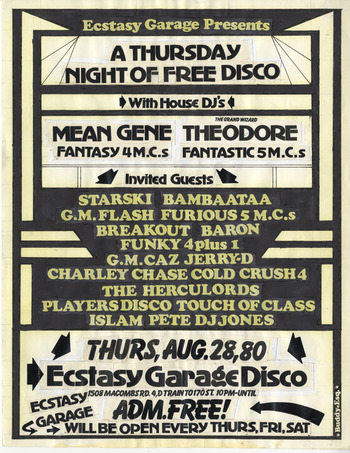
In the content of the flyers the invocation of disco is even more evident. The term ‘disco’ is commonly included in the names of venues, performers or groups, such as Ecstasy Garage Disco, Touch of Class Disco, Disco Bee, TNT Disco, Players Disco and The Brothers Disco. For a time, live club hip hop even seemed to identify closely with disco, as a flyer from 28 August 1980 suggests (see Figure 9). The main heading of the flyer reads: ‘Ecstasy Garage Presents A Thursday Night of Free Disco’. The guaranteed entertainment at this show is mainly house DJs (hip hop artists Mean Gene and Grand Wizard Theodore), and the list of invited guests features nearly all of the Bronx's most prominent hip hop artists.
A Buddy Esquire flyer from 28 August 1980. A colour figure is available in the online version.

As the hip hop group name ‘Touch of Class Disco’ suggests, disco allusions could be depended upon to build a classy image – or one of ‘pseudosophistication’, as Cheryl Keyes would have it (Keyes Reference Keyes1996, p. 227). Emphasising the disco elements of hip hop music and shows (as in the instances of the performers mentioned above) would have reflected disco's sheen of status and extravagance on the emerging hip hop scene. The aspiration to sophistication is confirmed by the lavish wording of some flyers. For instance, a flyer from 29 February 1982 anounces ‘Mellow Beat Productions brings the show of all shows to Uptown Bronx! You are cordially invited to a sensual experience … Come see, hear, touch, taste and experience New York's most exciting Disco[:] The … Stardust Ballroom’, before listing a standard roster of Bronx hip hop performers, including the Cold Crush Brothers and the Jazzy Five MCs. Unlike more casual shows at venues like the T-Connection or high schools, events at the Stardust Ballroom and a few other clubs often had a suggested dress code, inviting audiences to turn up in ‘fashionable attire’, or advising: ‘No sneakers, just freakers[:] dress to impress’.Footnote 13 These events also demanded slightly higher entry fees in the four to seven dollar range, as opposed to the three to four dollars usually charged.Footnote 14 The closest that more casual venues came to having a dress code were attempts to entice women to dress a certain way for free or reduced admission (‘First 100 ladies free wearing terry cloth suits!’; or a discount for ‘ladies wearing shorts’).Footnote 15 Even though these venues promised different atmospheres, the featured performers and the message of the flyers’ graphic design were nearly identical, suggesting that sophistication was not merely associated with fancy dress.
The presence of disco allusions in Buddy Esquire's flyers runs counter to Cheryl Keyes’ claim that hip hop's ‘ideology totally rejected the mainstream dress code, middle-classism, and alternative culture that disco seemingly promulgated in lieu of rawness, streetism, and unadulterated blackness’ (Keyes Reference Keyes1996, p. 243). While this statement is representative of hip hop in the mid-1980s, in the late 1970s and early 1980s hip hop was far more interwoven with disco and its suave brand of showmanship.Footnote 16 In addition to the disco-inspired design elements of the flyers and the omnipresence of the term ‘disco’ in performers’ names and elsewhere, hip hop's attraction is evident in the use of disco instrumentals in early recordings. In ‘The land of somewhere else: refiguring James Brown in seventies disco’, Alice Echols suggests a convincing pre-history to this moment, recasting James Brown as a pioneer of not only funk, but also disco, rather than pitting the genres against each other. It is a lineage like this one, where a musician can aspire to be both funky and sophisticated (Echols Reference Echols2008, pp. 28–9), that makes it possible for early hip hop to embrace disco and its conceits without losing the immediacy and grit that is hip hop's core.
Elements: Art Deco and ‘neo-deco’
The use of Deco elements, seen primarily in Buddy Esquire's borders and font selections, but also extending to his flavouring of the poster's language with retro colloquialisms (such as ‘guys and gals’), seems disruptive at first, especially given Buddy Esquire's claim that his flyer designs ‘signify the time’ – the era of the early hip hop movement. How can the Deco era be used to capture the hip hop generation? One reason for their success, of course, lies in Buddy Esquire's unique mixture of Art Deco with other elements: if the posters were purely Deco, they would have been anachronisms with little appeal and relevance, but Buddy Esquire's Deco components, surrounding contemporary elements, seem to wink. On the other hand, in making Deco embellishments a hallmark of his style, Buddy Esquire's aim was to promote a classy image, both of his own work and of the shows he was advertising.
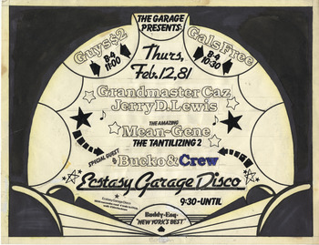
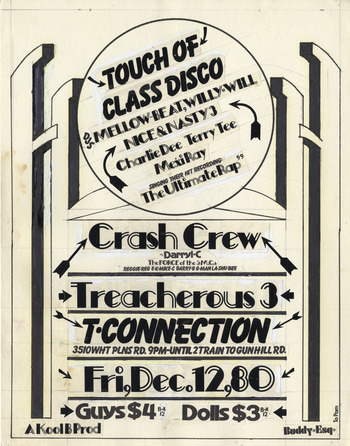
In its clean shapes and blocks of shade, the Art Deco frame provides a structured border for the assortment of fonts and symbols that it contains. A flyer from 12 February 1981 uses an abstract stage, all semi-circular puffs of curtain and radiating lines, to present an upcoming show at the Ecstasy Garage Disco (see Figure 10). Within the border, a high-energy collision of disco fonts (for the date and the venue, the Ecstasy Garage Disco), graffiti fonts (such as Balloon font for ‘The Garage Presents’), neutralised graffiti/disco symbols (the stars and arrows, as discussed above), and more indeterminate elements interact to promote the event. Cleverly, Buddy Esquire uses the border's theatre design to regulate the presentation of the fonts: ‘Ecstasy Garage Disco’ forms the ‘stage’, on which the performers (Grandmaster Caz, Jerry D. Lewis, etc.) take their positions, surrounded by a halo of stars. In another flyer from 12 December 1980 the same Balloon font (‘Touch of Class Disco’) and graphic symbols appear, this time set off by a variation on Broadway Engraved font, (‘Crash Crew’, ‘Treacherous 3’, etc.), one of the ultimate Art Deco fonts (see Figure 11). Here, these elements are contained by an abstract gateway that manages at once to be evocative of the 1920s and 1930s and of a futuristic alien landscape.
A Buddy Esquire flyer from 12 February 1981. A colour figure is available in the online version.

A Buddy Esquire flyer from 12 December 1980. A colour figure is available in the online version.

Although Buddy Esquire's flyers and their Art Deco stylings are distinct from those of the other flyer artists (Phase 2′s flyers share some of Buddy Esquire's sharp graphic qualities, but his hallmark is the use of concentric circles that evoke the lines of an LP more than Deco design aesthetics), they are not the only evidence of a fascination with the Deco era in the early hip hop movement. If we look to other aspects of the hip hop scene, including its vernacular, fashions and even music, we find echoes of the Jazz Age. The incorporation of Jazz Age fashions and musical styles into early hip hop culture is so blended with other elements that it makes little sense to discuss it in isolation. I will return to these facets of hip hop later, when I examine reflections of Buddy Esquire's overall aesthetic.
Jazz Age slang was most notably present in the ubiquitous use of ‘jazzy’ as part of the titles of individuals, groups or songs (see, for example, Jason ‘Jazzy Jay’ Byas, Afrika Bambaataa and the Jazzy Five MCs and ‘Jazzy Sensation’). This practice continues in such names as Jay-Z, in part a transformation of jazzy. Obsolete terms like copacetic – a slang word that the Oxford English Dictionary traces back to its African American origins in the 1920s and 1930s, and which appeared in such publications as Underworld & Prison Slang of 1933 – were also enjoying a revival.Footnote 17 A handwritten annotation on the back of a copied flyer in the Cornell University Library Hip Hop Collection reads as a quick definition so that the word could be adopted into someone's speech repertoire: ‘copasetic [sic] – cool, all right’. The use of Jazz Age slang, the verbal counterpart to Art Deco design practices, links hip hop in the late 1970s and early 1980s to that earlier storied era of American stylishness.
Looking back
While this paper's first purpose is to offer an in-depth study of Buddy Esquire's hip hop flyers, his fascinating design aesthetic raises questions about their relation to early hip hop culture in general. Is Buddy Esquire's style uniquely his own, a reflection of his personal artistic sensibility, or did his flyers succeed in presenting a microcosmic view of hip hop in the Bronx, ‘signifying the time’, as he suggests they were intended to do? In the remainder of this paper, I search for echoes of Buddy Esquire's style in the early hip hop movement and propose new areas of enquiry for early hip hop scholarship. Asking more questions than can be answered in a brief study, I suggest that Buddy Esquire's flyers invite a new assessment of early hip hop's relationship to self-documentation and history.
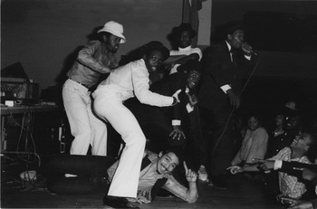
Buddy Esquire's flyer designs display a vital mixture of elements. In terms of visual aesthetics, reflections of his style are apparent in the fashion choices of some performers. In music, too, his sensibility finds its sonic echo in accounts of early live hip hop practices and the recordings of Afrika Bambaataa and the Soulsonic force, with their strange synthesis of jazz, funk and electronic music influences. In early hip hop fashion, the 1920s and 1930s emerged as an element that could be mixed with the styles of the present to create intriguing looks. Among his photographs of hip hop performers and audiences, Joe Conzo captured images of the Cold Crush Brothers that document this trend. In one photograph, the group members sport fedoras and carry tommy guns – vintage weapons favoured by gangsters of the 1920s. Although these accessories, combined with the crisp uniformity of their suits, may create the impression of deliberately assumed costumes, in another photograph (see Figure 12), this stiffness is replaced by the loose incorporation of retro styles with contemporary fashions: homburg hats appear beside bucket hats; bowties and cropped vintage suit jackets coexist with shiny synthetic shirts, wide 1970s collars and turtleneck sweaters; sneakers are seen alongside patent-leather lace-ups; and pants of all sorts share the stage – jeans, white 1970s flares and the bottoms of a three-piece suit. Through their fashion choices, the Cold Crush Brothers display an aesthetic similar to that of Buddy Esquire's flyers: both draw on the flashy disco-era mode of the 1970s, the crisp lines of the Jazz Age, and the new street-influenced styles: old and new are effortlessly intermingled.
Photograph of the Cold Crush Brothers by Joe Conzo.

The hip hop fashions of the 1990s and early 2000s are acknowledged as referencing their own past, as well as a broader African American panoply of styles: Robin M. Chandler and Nuri Chandler-Smith describe hip hop in the 1990s and the beginning of the 21st century as a ‘fashion elder complete with its own vintage apparel, its “throwbacks”’.Footnote 18 But the mixture of past-referentiality and freshness in the styles of the Cold Crush Brothers and Buddy Esquire's flyers suggest that this orientation towards stylistic borrowing, recycling and reinvention is not something that hip hop stumbled upon once it came of age, but rather an integral part of its aesthetic from its earliest days.
In some early hip hop music, too, the visual aesthetic of Buddy Esquire's flyers finds its sonic counterpart. No one would contest that early hip hop borrowed heavily from the music of the recent past, but the extent to which a deep engagement with 20th-century music was foundational to early hip hop has received little attention. According to Grandmaster Caz, the expansion of musical awareness in early hip hop can be attributed to Afrika Bambaataa's fervent eclecticism, which pushed the generic and temporal limits of what could be heard during a hip hop show:
Bambaataa's the first one to say: ‘hey, hey hey, hey, hey, why don't y'all look outside of the scope of where you're looking now? Look into some Calypso music. Why don't y'all check out some of this jazz music?’ […] So he's the one who really made us look outside of our normal scope of music, even though we already had a better view of music than most, because we looked back, and today, people don't look back in music, they look forward. And so we were enriched …Footnote 19
Fellow Cold Crush Brother Tony Tone agrees with Grandmaster Caz about the historical range of music that early hip hop DJs drew on at their shows, emphasising that DJs’ awareness of older music – and audiences’ enjoyment of that music – is not recognised at present:
People are so caught up on [sic] the now and they don't do their history to understand the music that we was playing. [They might think:] ‘Oh, well, that's your grandmother's music.’ But when people was back in the hip hop parties they didn't look at it as old people's music: ‘oh that's jazz.’ No, they just looked at it like: ‘Yo that's funky, I got to go out and get that.’Footnote 20
Both Grandmaster Caz and Tony Tone mention the incorporation of jazz music into the hip hop vernacular, and Tony Tone's objection to others dismissing it as ‘your grandmother's music’ further suggests that he, at least, is referring to the jazz of the early 20th century. Afrika Bambaataa's narrative of the prehistory of rap in the KRS-One song ‘Rap History’ (2004) also points to early jazz, specifically Cab Calloway and his ‘Hi De Hi De Ho’, a reference to the chorus from Calloway's ‘Minnie the Moocher’ (1931). Of course, first Bambaataa goes right back to the beginning, envisioning God rapping before coming back to the 20th century.
In scholarly histories of hip hop, this specific citation is transformed into a vague affinity between jazz and hip hop as and African diasporic genres. William Eric Perkins notes Bambaataa's acknowledgement of Cab Calloway, but interprets the influence of Calloway's scatting quite generally, finding its reflections in the improvisational qualities of hip hop and the MC's use of call-and-response techniques to excite the crowd (Perkins Reference Perkins and Perkins1996, p. 3).Footnote 21 Similarly, John Szwed contends that ‘you'd be hard-pressed to find any new electronic effects that don't have their older African-American acoustic equivalent’, further claiming that electronic drum machines belong to the lineage of scat singing (Szwed Reference Szwed2005, p. 176).
A more explicit relationship between jazz and hip hop, wherein the latter borrows the music and original techniques of the former, is usually not recognised until the late 1980s. Cheryl Keyes notes that Grandmaster Flash describes including jazz breaks in his mixes in the early years of hip hop, but nevertheless depicts the DJs of the 1990s as beginning to experiment with the sonic potential of extended jazz breaks, creating a fused style which resulted in some rappers developing a ‘quasi-scatting manner’ of performance. Keyes gives the example of ‘Innercity Boundaries’ (1993) by Freestyle Fellowship, in which Mikah Nine puts this style into practice (Keyes Reference Keyes1996, p. 241; Reference Keyes2002, pp. 149–50).
Early hip hop does not feature a jazz/hip hop fusion to rival the new sub-genre of the late 1980s and 1990s – perhaps because hip hop in the 1970s and early 1980s was little more than fusion – but this does not preclude the inclusion of jazz as one of the ingredients of that larger mixture. The nature of the era's live musical culture means that we have to take the words of Grandmaster Caz, Tony Tone and Grandmaster Flash as evidence of the use and appreciation of jazz music in early hip hop. In the instance of Afrika Bambaataa inserting Cab Calloway into the history of rap, however, the hip hop artist's claim is confirmed by two recorded songs by Afrika Bambaataa and Soulsonic Force – ‘Planet Rock’ (1982) and ‘Frantic Situation’ (1984). In each of these songs, the delightfully weird hip-hop-electro-funk amalgamation makes room for an even stranger moment of verbal dissolution: a scat solo on the sound ‘zih’ in ‘Planet Rock’ and a scat-like chorus on the syllables ‘zing zang’ in ‘Frantic Situation’.Footnote 22 The scat passage in ‘Planet Rock’ follows a synthesised instrumental solo and responds to it, in the manner of an early scat singer trading off with an instrumental solo. Kevin Young aptly likens the scratching of a DJ to a jazz singer's scat solo: ‘Much as scratching or dancing in the breaks of a hip-hop song, scat often serves as the literal bridge in a jazz song, especially an instrumental. Scat serves not just as break but as bridge between instrument and voice’ (Young Reference Young2012, p. 209). The scat solo in ‘Planet Rock’ takes this analogy one step further: it is a bridge not only between instrument and voice, but also invokes the turntable-as-instrument in its rhythmically abrasive ‘zihs’.
Of course, to establish the wider relevance of scatting and early jazz to hip hop in the 1970s and early 1980s, we need look no further than the term ‘hip hop’ itself, which is widely acknowledged as originating in the scat-patter of DJ Hollywood, DJ Kool Herc, Lovebug Starski or Keith Cowboy, and which found its way into the first line of the Sugarhill Gang's ‘Rapper's Delight’ (1979): ‘hip hop, a hippit, a hippit to the hip hop hop and you don't stop’ (Green Reference Green2005, p. 717; Jackson Reference Jackson2008, p. 147; Pabon Reference Pabon and Chang2006, p. 19). The way Afrika Bambaataa tells it, though, hip hop could have been given any number of names, many of which evoke scatting. Bambaataa lists ‘scat-rap’, ‘b-bop’ and ‘boi-oi-yoing’ as possible alternatives to ‘hip hop’.Footnote 23
When Grandmaster Caz emphasises that what made early hip hop great was that the movement ‘looked back’, he captures the same ethos that Buddy Esquire depicts in his flyer designs. Early hip hop looks back in its use of popular and jazz music genres from the span of the 20th century, its recycling of clothing styles from a range of previous decades, and its incorporation of deep-rooted slang and terminology to form the names and identities of performers and the hip hop genre itself. What Grandmaster Caz does not mention, but what the music and other aspects of the hip hop movement demonstrate, is that looking backwards does not necessarily mean losing forward momentum.
Documenting, mythologising, historicising
In Born in the Bronx, collector and historian Johan Kugelberg writes that in early hip hop, in contrast to the punk and skateboarding movements, the impulse towards self-documentation is not present, because ‘[t]he tyranny of the new in the ghetto creates a climate where the acts of looking, writing, or thinking of past times can be considered counterproductive’. Kugelberg depicts early hip hop as the most ephemeral of musics and movements: since it is all about Saturday night's party (Kugelberg Reference Kugelberg and Kugelberg2007a, p. 31), by Sunday morning the previous evening's flyers are scattered in the gutter and last night's improvised combinations of vinyl fragments and rhymes have dissolved, waiting to emerge again next weekend in new configurations. Given this culture of ephemerality, Kugelberg believes that the preservation of Buddy Esquire's flyers is nothing short of miraculous (Kugelberg Reference Kugelberg2011).
When I ask Buddy Esquire whether he thought, back in the late 1970s and early 1980s, that the hip hop shows his flyers promoted were part of history, he laughs and replies: ‘To be honest with you, no’. And yet, he also maintains that his designs attempt to ‘signify the time’ of the early days of hip hop (Esquire Reference Esquire2011). Beyond their primary purpose of attracting audiences to shows, these flyers also hint at their self-documenting qualities. For instance, Buddy Esquire's flyers feature the uncommon inclusion of the year of the show, as well as the month and the day – an especially odd detail when one considers that the flyers were usually distributed only a week or a few days before the show.Footnote 24 Regarding this feature, Buddy Esquire comments:
When I started making flyers, I didn't put the year on them. And I thought about it, and I said, well, why not put the year? […] I thought it was better to do it that way, and, as far as I'm concerned, I feel like that's correct. (Esquire Reference Esquire2011).
The addition of the year to the date gives a weight to the event and can be read as a marker of significance. In another promotional move, Buddy Esquire also conspicuously signed each of his flyers, an identifying mark that was largely unnecessary once his highly individualised style was realised. Nor did he need to continue the self-mythologising work of calling himself ‘The Flyer King’ when his mastery of the medium and his prolific output made the title self-evident. The motives for all of these decisions are based on promotion and aggrandising of the event or the artist, but at what point do promotion and mythologisation in the present make a claim on history?
While I do not want to downplay the early hip hop scene's primary interest in the improvised, the temporary and the new, I want to challenge the idea that the early hip hop movement is entirely lacking in the historical impulse. When Kugelberg acquired many of these flyers from Buddy Esquire, they had been preserved in the artist's own haphazard archive in his mother's basement (Reagan Reference Reagan2011). In these flyers’ blend of Deco, disco and graffiti styles with a hint of futurism, Buddy Esquire creates a representation of the early hip hop years that pays as much homage to the old made fresh as it does to the brand new. The flyers find their aesthetic counterparts in the clothing styles of the Cold Crush Brothers, in the music's incorporation of borrowed disco beats, scatting and African American oral traditions. Hip hop glances backwards even as it moves forward, borrowing from layers of pasts and bringing them, in new combinations and alongside new inventions, into the future.
To return to the question at hand: at what point do self-promotion and mythologisation merge with documentation or verge on historicisation? At what point do artists’ motivations for speaking or writing their names evolve from seeking attention to staking a claim on history? Choose me, know me, remember me. In a culture so centered on competition, allusion and borrowing, longevity is achieved through creating something worthy of emulation and reinterpretation. Buddy Esquire is well aware of this: in our interview he told me with pride that his work has been imitated. Through branding, boasting, achievement and appropriation, Buddy Esquire moves beyond self-promotion to the stuff of mythology. The flyers are the documents that make his name known and, by writing himself into their story, he escapes ephemerality. By making himself the star in the tiny corner of his preferred medium, he ensures that he will be known and remembered as New York's Finest: The Flyer King.
Acknowledgements
The author would like to express her gratitude to Buddy Esquire for granting her such an insightful and informative interview and for allowing her to publish reproductions of his flyers. She thanks Joe Conzo for granting permission to include his photograph of the Cold Crush Brothers. She is grateful to Johan Kugelberg for putting her in touch with Buddy Esquire and for giving his own views on these issues. Katherine Reagan of the Rare Books and Manuscripts Library was generous with her time and help. Afrika Bambaataa was kind enough to grant Amanda Lalonde a few minutes during a fully-scheduled day. Finally, she would like to thank Steve Pond of Cornell University and the reviewers at Popular Music, whose suggestions towards the revision of this paper were invaluable.