

1. Prevalence and Importance of Diagrams in Biology
If you walk into a conference talk or journal club and do not know beforehand whether the topic is philosophy or biology, a glance at the speaker’s slides will provide the answer. Philosophers favor text, whereas biologists shoehorn multiple images and diagrams into most of their slides. This reflects a fundamental contrast between philosophers and biologists: their affinity for text versus diagrams is not just a matter of how they communicate once their work is done but shapes every stage of inquiry. Whereas philosophers manipulate sentences to construct, evaluate, and revise arguments, biologists employ diagrams as essential tools in putting forth, evaluating, and revising their accounts of phenomena in nature and of the mechanisms responsible for them.
Diagrams play these roles in science generally, but we focus on biology—in particular, research on circadian rhythms—to begin to get traction on this understudied aspect of the scientific process. Circadian rhythms are oscillations in organisms with an approximately 24-hour cycle (circa = about + dies = day). They are endogenously generated but become entrained to the local day-night cycle. They have been identified in numerous organisms—animals, plants, fungi, and even cyanobacteria—and characterize a vast array of physiological processes (e.g., basic metabolism and body temperature) and behaviors (e.g., locomotion, sleep, and responding to stimuli).
2. Diagrams and Mechanistic Explanation
Diagrams play a central role in biology because they are highly suited to two key tasks: (1) displaying phenomena at various levels of detail and (2) constructing mechanistic explanations for those phenomena. Philosophers of biology have increased their attention to these tasks over the past 2 decades, construing mechanisms as systems that produce a phenomenon of interest by means of the organized and coordinated operations performed by their parts (Bechtel and Richardson Reference Bechtel and Richardson1993/2010; Machamer, Darden, and Craver Reference Machamer, Darden and Craver2000; Bechtel and Abrahamsen Reference Bechtel and Abrahamsen2005). To advance a mechanistic explanation, biologists must characterize the phenomenon of interest (e.g., circadian oscillations in activity), identify the mechanism they take to be responsible (e.g., a molecular “clock”), decompose it into its parts and operations, and recompose it (conceptually, physically, and/or mathematically) to show that the coordinated performance of these operations does indeed generate the phenomenon. Early in the discovery process scientists may identify few parts and operations and hypothesize a relatively simple mechanism that can be recomposed by mentally imagining a short sequence or cycle of operations (e.g., a single gene expression feedback loop was initially posited for the molecular clock). In biology, further research generally uncovers additional parts and operations with complex organization and dynamics (e.g., multiple interacting feedback mechanisms constituting the overall molecular clock mechanism).
While a simple mechanistic account might be presented linguistically as a narrative describing how each part performs its operation in turn, diagrams provide a particularly useful medium of representation for conceptualizing and reasoning about mechanisms.Footnote 1 By displaying just a few common graphical elements in two dimensions, a diagram can visually depict a phenomenon or the organized parts and operations of the mechanism proposed to explain it (Bechtel and Abrahamsen Reference Bechtel and Abrahamsen2005; Perini Reference Perini2005). Available elements include line drawings, iconic symbols, noniconic symbols (shapes, colors), labels, and—the device most often used for operations—various styles of arrows. The spatial arrangement of these elements can convey spatial, temporal, or functional relations that characterize a phenomenon or mechanism. Deploying our spatial cognition on diagrams has certain advantages over language-based reasoning in constructing mechanistic explanations. Notably, scientists can mentally animate (Hegarty Reference Hegarty2004) a static diagram to simulate the succession of operations by which a simple sequential mechanism produces a phenomenon. When a diagram includes simultaneous, interacting operations, mental animation no longer suffices, and researchers often turn instead to computational modeling and the tools of dynamic systems analysis to understand how the mechanism will behave, producing what Bechtel and Abrahamsen (Reference Bechtel, Abrahamsen and Hooker2011) characterize as dynamic mechanistic explanations. Jones and Wolkenhauer (Reference Jones and Wolkenhauer2012) provide a valuable account of how diagrams contribute to the construction of computational models.
Diagrams of mechanisms are comparable to the plans a designer develops before building a new machine. These are used not just to tell those actually constructing the machine how to make it; they also figure in the design process. Before producing the final plans, the designer tries out different designs and evaluates whether they are likely to result in a working machine. Often the initial designs reveal serious problems that must be overcome, prompting revisions. The biologist is not creating the machine (except in such fields as synthetic biology) but is trying to reverse engineer the actual mechanism present in a biological system. Still, she needs to go through many of the same processes as a designer—sketching an initial diagram, identifying ways in which it is inadequate, and modifying the diagram repeatedly until it is judged a satisfactory mechanistic account of the targeted phenomenon. In what follows, we examine how diagrams are put to work in two key tasks in biology: delineating phenomena and constructing mechanistic accounts to explain them.
3. Diagrams to Delineate the Phenomenon
An initial delineation of the phenomenon to be explained is a crucial step in mechanistic research (even though, in the course of discovering the mechanism, researchers may revise their understanding of the phenomenon). Many philosophical accounts of mechanistic explanation have focused on linguistic descriptions of phenomena (e.g., “in fermentation, sugar is converted into alcohol and carbon dioxide by means of a series of intermediate reactions within yeast cells”). Scientists, however, often seek quantitative accounts of phenomena. Numerical data involved in characterizing a phenomenon may be presented in tables. As Bogen and Woodward (Reference Bogen and Woodward1988) made clear, however, explanations are directed not at the data but rather at the pattern extracted from the data—the phenomenon. Some data patterns can be captured in one or a few equations, such as the logarithmic function relating stimulus intensity (e.g., amplitude of a tone) to the sensation evoked (e.g., perceived loudness). By plotting these values on a graph, the phenomenon of a nonlinear relation between amplitude and loudness is immediately evident. The graph takes advantage of spatial cognition, whereas the logarithmic equation makes explicit a very precise claim that can and has been challenged (e.g., by those who argue for a power function). Scientists move deftly between linguistic descriptions, diagrams, and equations when all are available, using each to its best advantage.
Diagrams are especially useful for thinking about dynamic phenomena—patterns of change over time. Most diagrams conveying circadian phenomena thus incorporate time in some way (e.g., as the abscissa on a line graph or the order of arrows in a sketch of a mechanism). Moreover, research on circadian oscillations often targets the interaction between endogenous control (by an internal clock) and exogenous timing cues, commonly referred to as zeitgebers. In conceptualizing these phenomena, early chronobiologists needed a way of diagramming the activity of an organism that revealed at a glance its rhythmicity and the impact of zeitgebers.
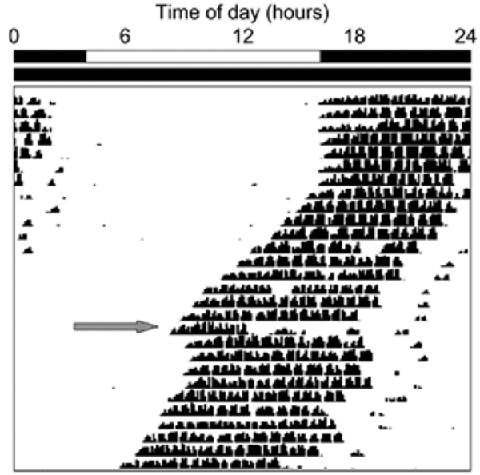
They settled on a distinctive format, the actogram. Figure 1 illustrates the diagrammatic devices that satisfy the desiderata. Time of day is represented horizontally, and successive days are represented vertically (one line of data per day). Activity is tracked along each line by placing a hash mark for each time unit in which activity occurred—here, rotation of a running wheel by a mouse, with the height of the line indicating the number of rotations. The white and black bars at the top represent the 24-hour light-dark conditions. Here the mouse was exposed to light from hours 4–16 during the first phase of the study (specified elsewhere as days 1–7). During the other 12 hours of days 1–7, and all 24 hours beginning day 8, the mouse was kept in darkness. On day 18, 4 hours after onset of activity, the mouse’s rhythm was perturbed by a pulse of light. The large gray arrow directs the reader’s attention to the effects of this isolated zeitgeber.
Basic actogram in which the top bars indicate a normal light-dark cycle for the first phase of the study (days 1–7) and constant darkness thereafter. The gray arrow identifies the day a light pulse was administered. (Source: http://www.photosensorybiology.org/id16.html.)

The actogram offers a relatively transparent representation of the animal’s behavior: readers who have learned its conventions are able to see through the diagram to multiple behavioral phenomena that it visually depicts (regarding semantic transparency, see Cheng Reference Cheng2011). Figure 1 offers this kind of access to at least four circadian phenomena. First, in rows 1–7 it can be seen that the marks occur in consolidated bands bounded by the black segments of the upper bar. This indicates that when zeitgebers are present (light alternating with dark), virtually all wheel-running occurs in the dark: the animal is nocturnal. Second, the fact that the hash marks continue to appear in consolidated bands after row 7 (when the animal is free-running without zeitgebers) indicates that the animal endogenously maintains a robust division between periods of rest and of activity. Third, these later bands of hash marks ‘drift’ leftward, indicating that the animal begins its activity a bit earlier each day. Maintenance of a free-running period of about 24 hours is the core phenomenon of circadian rhythmicity. Fourth, the pulse of light on day 18 (see gray arrow) brings an abrupt cessation of activity and inserts a phase delay (a rightward “jump” in the bands of hash marks) into what was otherwise a continuing pattern of phase advance (leftward ‘drift’) under constant darkness. This reset phenomenon is one aspect of the more general phenomenon of entrainment.
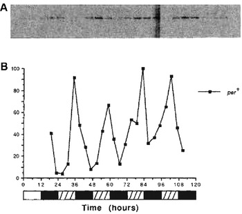
Thus, actograms make circadian rhythmicity in an animal’s activity visually accessible. But when chronobiologists attempt to understand the molecular mechanisms that produce such macroscopic rhythmicity, they are confronted with new phenomena that call for different diagrammatic formats: notably, the concentration (relative abundance) of many types of molecules within cells oscillates. For example, Hardin, Hall, and Rosbash (Reference Hardin, Hall and Rosbash1990) demonstrated the circadian oscillation of period (per) mRNA in Drosophila melanogaster (fruit flies).Footnote 2 In figure 2 we reproduce a pair of displays of the same data from their paper, illustrating how the two formats offered different perspectives on per mRNA oscillation. Flies had previously been kept for 3 days in a light-dark cycle of 12 hours light, 12 hours dark. Starting on the fourth day (hours 24–48 in fig. 2), the flies were placed in constant darkness. Every 4 hours a batch of flies was sent for processing to determine per mRNA abundance via the Northern blot technique. As shown at the top of figure 2, the blots across all 4 days produced a combined image on x-ray film in which optical density (darkness) tracked the relative abundance of per mRNA.
Two displays from Hardin et al.’s (Reference Hardin, Hall and Rosbash1990) original report of circadian oscillation in per mRNA levels in Drosophila melanogaster. On top is a series of Northern blots (from different flies every 4 hours). Below this is a line graph of the corresponding numeric values. The zeitgeber schedule is shown at the bottom: white hatched bars depict the intervals in which lights would have been on if the initial light-dark cycle had continued. Reprinted by permission from Macmillan Publishers Ltd.

Another technique, densitometry, translates optical density into numeric values. Plotting these values on a line graph makes the oscillatory pattern of per mRNA abundance immediately apparent. A quick check of the horizontal scale confirms that the period of oscillation is circadian: there are four peaks in 4 days. Closer examination reveals that the peak occurs noticeably earlier on day 4, indicating a short free-running period. Variations in period are even easier to see in actograms, but for variations in amplitude it is line graphs that excel compared to either Northern blots or actograms.
4. Diagrams to Identify the Parts, Operations, and Organization of a Mechanism
A major use of diagrams in mechanistic science is to present proposed mechanisms. Such diagrams typically utilize a two-dimensional space in which elements representing different parts and operations of a mechanism can be laid out so as to depict key aspects of their spatial, temporal, and/or functional organization. Typically multiple working versions of a diagram will precede the one published, as the scientist seeks to envisage how the parts might work together to produce a phenomenon of interest. Different parts can be distinguished by choosing from a great variety of graphical elements in the diagrammatic tool kit (Tversky Reference Tversky2011), while the operations performed by those parts most often are represented by one or more styles of arrows. Labels can serve as elements in a diagram, alone or appended to a more visually distinctive element.
An early working diagram of the circadian mechanism was published by Hardin et al. (Reference Hardin, Hall and Rosbash1990). Their research had revealed circadian oscillations in the abundance not only of per mRNA but also (at a lag of several hours) of the PER protein (italics are commonly used for genes and uppercase roman type for proteins). Combining this with their knowledge that negative feedback is a mode of organization capable of producing oscillations, they proposed three variations of a molecular mechanism whose oscillatory dynamics could be responsible for, and thereby explain, the observable oscillations in an organism’s behavior. In all three variations, PER served to inhibit per transcription or translation in a negative feedback loop. These are diagrammed, somewhat idiosyncratically, in figure 3.
Hardin et al.’s (Reference Hardin, Hall and Rosbash1990) representation of three proposed molecular mechanisms for circadian oscillations in terms of negative feedback loops. Question marks indicate points of uncertainty as to the origin and termination of the feedback operation. Reprinted by permission from Macmillan Publishers Ltd.

This diagram illustrates our contention that diagrams offer crucial representational tools for several kinds of reasoning about proposed mechanisms. First, a diagram can be used to envisage how a particular mechanism functions to produce a phenomenon. In this case, the phenomenon involves regular oscillations. To understand how the mechanism produces such oscillations, a viewer would begin at the upper left, where the known operations of transcription into mRNA and translation into a protein are portrayed. These result in the accumulation of PER molecules, represented in the diagram as a small line drawing of one molecule. Once PER accumulates, feedback must inhibit either transcription or translation, thereby stopping the accumulation of PER. The existing PER will gradually degrade (an operation not explicitly represented but that molecular biologists would readily infer). As it degrades, the concentration of PER will decline. This will release the inhibition, and synthesis of PER will begin again. When repeated, this cycle will result in the observed pattern of rhythmic oscillations in both per mRNA and PER. The diagram provides a representational resource that can be repeatedly consulted in mentally working through these dynamics.
A second major way in which such a diagram supports reasoning is by making clear where there are uncertainties about a mechanism’s operations. Note how little of figure 3 is put forth as a depiction of previous discoveries concerning the mechanisms of per regulation. The bulk of the diagram serves as a simultaneous depiction of multiple possible mechanisms (sketched only in bare outline) that could explain oscillations of per mRNA and PER. The diagram is in large part an invitation to explanation, not a record of it. The possible mechanisms sketched here as (1)–(3) each have the potential to account for the observed oscillations. In (1), PER interacts with some biochemical substrate or process X, which then somehow regulates either the per gene itself (transcriptional regulation) or the transcribed mRNA (posttranscriptional regulation). In (2), X interacts with some further substrate or process Y, which then does the same. In (3), the behavior of the organism provides the necessary feedback. What is known is only that the mechanism(s) at work in Drosophila must eventuate in regulation of per mRNA abundance.
Third, the diagram provides constraints and affords possibilities for inference that influence hypothesizing about and investigating further elements of the proposed mechanism. Indeed, both the unknowns represented by the question marks in figure 3 and the hypothesized operations became the focus of subsequent research. Researchers sought not merely to determine where PER fed back to inhibit formation of more PER but how it did so. This and other inquiries quickly led to the discovery of many additional components of the mechanism: by the end of the 1990s at least seven different genes, as well as their transcripts and proteins, were viewed as parts of the clock mechanism in both Drosophila and mammals. Many of these were also shown to oscillate but at different phases than PER.
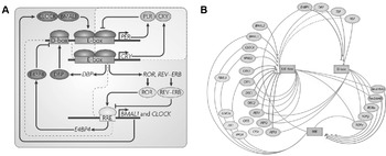
As the list of clock parts expanded and researchers proposed multiple feedback loops, it became ever more crucial to be able to represent how individual parts and their operations interacted in the clock. On the left in figure 4 is a fairly typical contemporary diagram of the mammalian circadian oscillator. Key parts are indicated by uppercase labels, which are italicized for genes versus enclosed in colored ovals for proteins. Those proteins that serve as transcription factors are shown attached to the relevant promoter region for each gene (E-box, D-box, and RRE).Footnote 3
On the left is a typical format for representing the molecular mechanism of the mammalian circadian clock (Zhang and Kay Reference Zhang and Kay2010). Each gene is indicated in italics and its expression by an angled black arrow. Genes’ promoters are in boxes, and the proteins activating, inhibiting, or produced by them are in ovals. Operations, which together form feedback loops, are represented by arrows or (if inhibitory) by lines terminating in crossbars. Reprinted by permission from Macmillan Publishers Ltd. On the right is an alternative representation (Ukai and Ueda Reference Ukai and Ueda2010), which emphasizes the three promoters (E-box, D-box, and RRE). Here ovals represent genes, and there is no explicit representation of proteins. Lines sweeping out from each box identify the set of genes relying on it for their expression. Lines into a box indicate which genes produce proteins that activate it (arrowheads) or inhibit it (crossbars). Reprinted with permission of Annual Review of Physiology.

In using this kind of diagram to reason about the mechanism, researchers follow individual proteins and the ways in which they activate or repress the expression of specific genes. At the top right is a further-articulated version of the feedback loop first proposed by Hardin et al. (Reference Hardin, Hall and Rosbash1990) in which PER inhibits its own transcription: it does so by dimerizing with CRY (Hardin et al.’s substrate “X”) and preventing the CLOCK/BMAL1 complex (Hardin et al.’s substrate Y) from upregulating per transcription at the E-box promoter site. A second feedback loop is responsible for synthesis of CLOCK and BMAL1. A second promoter site on the per gene (the D-box) has been identified, along with its activator (DBP) and inhibitor (E4BP4). It should be obvious that as the understanding of the mechanism became more complicated, diagrams became ever more crucial both in representing the mechanism and in reasoning about it. We note that research on this mechanism is far from complete; the inhibition operations, in particular, are the focus of important ongoing inquiry. Diagrams such as these serve not just to facilitate reasoning about the mechanism but also guide attention to those particulars that require further investigation (even if these are not always explicitly signaled by question marks).
Once a diagrammatic format is developed and researchers become familiar with its conventions, other researchers may introduce relatively minor modifications to capture specific features of a given account. The choice of a diagrammatic format is not neutral, however, so occasionally a researcher instead designs a new format that offers a different perspective on the mechanism. Ueda, for example, has introduced the alternative representation shown on the right side of figure 4. It presents essentially the same information about parts and operations as the diagram on the left but shifts attention away from genes and proteins to promoters—the three boxes arrayed around the center of the figure. Ovals depict genes at the periphery, and their proteins are assumed but not depicted. The lines indicating relationships are explained in the figure caption.
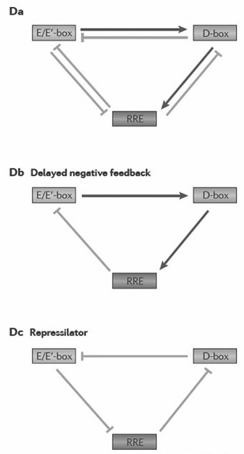
Ueda adopted this format as part of his argument that the relations between the three promoters are fundamental to the temporal dynamics of the clock. Transcription factors bind to particular promoters at different times of day: to the E/E′-box in morning, the D-box in midday, and the RRE at nighttime. For Ueda, the individual genes and proteins involved are just vehicles for promoter interaction. He made this even more explicit in the three skeletal diagrams reproduced in figure 5. These show only the promoters and the downstream effects of their activity on each other: activation (arrows) versus inhibition (crossbars). He shows all of these interactions in the diagram on the left and then partitions them to arrive at two kinds of functional circuits (motifs). In the middle is a delayed negative feedback motif, an abstract representation of the fact that the morning activity of the E/E′-box helps the D-box reach peak activity by midday (via the protein products not shown) which, in turn, helps the RRE box reach peak activity by nighttime. The inhibitory effects of that activity on the E/E′ box slows the circuit. On the right is a repressilator motif, in which products of each promoter inhibit (repress) further activity of the preceding promoter. Experimental, computational, and synthetic biology investigations of these motifs have shown how they generate oscillations (Ukai-Tadenuma et al. Reference Ukai-Tadenuma, Yamada, Xu, Ripperger, Liu and Ueda2011).
Hogenesch and Ueda’s (Reference Hogenesch and Ueda2011) diagrams of promoter interactions in the circadian oscillator, which abstract away from the genes and proteins involved. From the overall causal circuit (left) Ueda extracts two motifs (center and right) that are regarded as explaining the oscillatory behavior of the mechanism. Reprinted by permission from Macmillan Publishers Ltd.

Again, choice of diagrammatic format is not neutral. By emphasizing the system organization of the mechanism, figure 5 makes the overlapping feedback loops more salient at the expense of detail about the proteins involved in regulatory processes. These different contents provide different constraints on the reasoning that can be performed by interacting with the diagram and can lead to different insights about the mechanism itself, thus helping to provide a more complete explanation of the phenomenon.
5. Conclusion: Diagrams and Mechanistic Explanation
A major explanation for the prevalence of diagrams in biology is the role they play in mechanistic explanation. We have focused on their role in two pursuits—delineating a phenomenon of interest and constructing mechanistic accounts to explain the phenomenon. A number of diagrams may be generated in making progress from an initial account to the one proposed in public. Each specifies the current conception of the mechanism’s parts, operations, and organization. Diagrams also play other roles in mechanistic explanation. For example, even modestly complex mechanisms, such as those involving negative feedback loops, challenge the ability of theorists to figure out their behavior by mentally simulating their interactions. To visualize dynamic phenomena, scientists often resort to other types of diagrams, such as phase space plots in which oscillations appear as limit cycles. Such diagrams abstract from mechanistic details to portray how the overall state of the mechanism changes over time.
Having identified important roles diagrams play in biology, we conclude by noting three ways in which analysis of diagrams contributes to philosophy of science. We have begun to address the first: from diagrams we can gain a (partial) understanding of how scientists reason about a phenomenon, specifically by encoding the understood elements of a mechanism in a diagram and simulating their dynamics to see if they are adequate to explain the phenomenon. Second, diagrams can serve as a vehicle for understanding scientific change when we analyze how the diagrams within a field evolve, find acceptance, and are eventually discarded. Third, identifying the cognitive elements of diagram use, including their design and the learning processes required to interpret them, can provide insight into the cognitive processes involved in scientific reasoning more generally. By directing attention to the importance of diagrams in biology, we hope to have set the stage for more sustained philosophical inquiry.