


‘Baptismus est ianua omnium et fundamentum, sine quo impossibile est intrare regnum celorum’: Obsequiale secundum ecclesiam Constantiensem, 1478.Footnote 1
Over the last twenty or so years there has been a resurgence of interest in the ecclesiastical furnishing of the font, especially in its high and later medieval incarnation, as both a ritual prop and a site of the artistic imaginary.Footnote 2 While exploring different groupings of monuments, virtually all of the recent studies centre on the analysis of the figural, epigraphic and ornamental programmes of font basins and their supports, and their relationship to contemporaneous theological and liturgical developments and concerns, folkloric beliefs and modes of patronage and self-representation. Far fewer efforts, however, have been devoted to the often breathtaking microarchitectural frameworks that enclose these fonts or soar above them, or both. Save for a substantial chapter in Francis Bond's now classic Fonts and font covers (1908),Footnote 3 a few passages in J. Gordon Davies's Architectural setting of baptism (1962),Footnote 4 a section in Silvia Schlegel's Mittelalterliche Taufgefäße (2012)Footnote 5 and a few articles of my own published between 2001 and 2007,Footnote 6 no concerted attempts have been made to recover the multifarious roles that miniaturised architecture played in the later (as well as post-) medieval choreography of the first of the sacraments. The following represents an attempt at a first outline of a history of what could be termed the microarchitectural stage-management, the mise-en-scène, of the rite and site of baptism. Taking its cues from a brief introductory case study, the font ciborium of St Peter Mancroft in Norwich, the discussion revolves around a diachronic, pan-European parcours of relevant artistic and cultural landscapes that begins in the decades bracketing the Fourth Lateran Council (1215) and concludes in the century or so that came after the Council of Trent (1545–63).
A few words about the sacrament and ritual of baptism itself are in order. Enacting and effecting nothing less than the casting out of Satan and original sin, and involving a number of liturgical performances, including the insufflation and triple exsufflation of the baptismal candidate in modum crucis and the eventual lighting of the candle, baptism was a rite of passage par excellence. It served four important functions in the life cycle of individuals and communities. The first was to incorporate a new infant member into an existing social group, the communitas christianorum. Another was the initiation of the child's parents into a new social status – that of parents. A third was to provide ‘a ceremonial gathering place for the parents, godparents and close friends to affirm the infant and the parents and to accept partial responsibility for assisting in the tasks of child rearing’.Footnote 7 Finally, a fourth unfolded within the liturgical cycle of the ecclesiastical year: baptism emphasised the roles of both the bishop in the church building (his consecration of the water) and of the priest as well as the parish church itself (their granting of the sacrament).
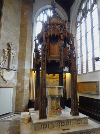
A font ciborium like that in the nave of the market church of St Peter Mancroft in Norwich (see Figure 1; c. 1510–20) choreographs the ritual, significance and experience of baptism in a number of pertinent and striking ways.Footnote 8 Extrapolated from a series of concentric squares and octagons, the edifice furnishes both a raised platform and an enclosure for an eight-sided font originally adorned with figural sculpture, scenes of the seven sacraments possibly originally among them. In elevation, the ciborium consists of three principal storeys: a four-sided stone plinth of two traceried steps; the equally four-sided colonnade around the font, which would have provided just enough space for the priest, the infant and his or her parents and godparents; and the eight-faceted superstructure, which while visually magnifying, indeed celebrating, the salvific import of baptism also contained the mechanism for the heavy, octagonal cover that was lowered onto the font after the conclusion of the ceremony. Impressive to behold from a distance, this veritable micro-theatre also invites and rewards closer inspection, as its angled and curved surfaces are bedecked with an abundance of ornament that delights, teases and makes one pause on the brink. The four supporting corner piers are thus richly profiled and carry mock-statue niches crowned by crocketed and finialled canopies. In the eight-sided superstructure these piers are joined by four others like them, except that these are stunted and strangely suspended in mid-air. Much of what follows is Victorian, though other than serving up yet more ornamentation the original pyramid would also have exhibited a cycle of statuary that complemented the understanding of the ritual performed at this site. With the upper part of the elevation changed perhaps beyond recognition, today the greatest visual surprise is revealed when one enters the font enclosure and upon looking up discovers that one stands beneath a wondrously miniaturised net vault that comes complete with decorated bosses and intersecting ribs and liernes.
Parish church of St Peter Mancroft, Norwich, font ciborium, c. 1510–20. © Achim Timmermann.

It is my contention that the microarchitectural canopy of St Peter Mancroft – and others treated in this article – theatricised the sensory experience and symbolic importance of baptism as a transitional rite in three significant ways: (1.) As a wonderwork of carpentry emblazoned with ornament and imagery the structure beckoned to be explored by the viewer; it stimulated visual and intellectual curiosity, and therefore became an especially resonant and productive space within the interior of the church; (2.) As a partially open enclosure the ciborium generated its own interiority while also remaining a tentative in-between space that was poised between the external and the internal, between the explicit and the implicit, and by extension, between the familiar and the alien; and (3.) With its sequence of stepped socle, colonnade, font rim and font basin, the monument deployed a whole series of concentric physical thresholds that, just like the manifold embellishments of the ciborium proper, invited further probing and negotiation, if at times only in the eye and mind of the beholder. Osmotic, porous and enveloped in different degrees of opacity, the font ciborium of St Peter Mancroft was like an optical magnet whose constantly reversing polarities denoted and translated into powerful visual language the ideas of mystical death and rebirth in and through Christ, and the subsequent transition to new social and religious ontologies.
Creating a multiplicity of gaze vectors, a font ciborium like that of St Peter Mancroft was of course more than a theatrical machine. It was also a vehicle for self-promotion and billboard for the advertisement of elite identities; where better to showcase these identities after all, than on a hulking micro-tower decorated with the all the clever finesse of its age that parishioners had to pass by every time they entered or exited the church building? By tying their own memoria to the salvation of the entire community, the now anonymous financiers of the structure effectively ensured that their names and generosity would pass down to posterity, at least for a little while.
From Gotland to Gelderland: baptismal microarchitecture from the Romanesque to the Renaissance
Ciboria like that of St Peter Mancroft and their tower-shaped peers, which sat directly on the rim of the font and which here are called font pyramids, pyramid covers or steeple covers, were to a large degree erected to add dramaturgical acumen and visual theological depth to the performance of baptism. The only practical purpose of these microarchitectural structures was that of protection, and involved the use of bolts, doors, lockable lids and tractable basin covers. Prompted in part by the Fourth Lateran Council (1215), which gave particular prominence to the sacraments of the eucharist and of baptism,Footnote 9 but perhaps also spurred by a growing paranoia about heresy, the secure and decorous reservation of the consecrated font water became a principal item on the agendas of virtually all thirteenth- through early sixteenth-century synods in the British Isles and on the Continent. The statutes drawn up by Richard de Wich, bishop of Chichester (1242–52), are exemplary of this trend, for they not only mandate that all fonts in the diocese be covered and properly protected ‘against witchcraft’, but also threaten delinquent priests with suspension from office (‘Item fontes cooperiantur et honeste custodiantur propter sortilegia … sub pena suspensionis eis infligenda’).Footnote 10 Similar decrees additionally called for padlocks, and for fonts made from stone. In 1287, for instance, Bishop Quivel of Exeter enjoined that each church in his diocese should have a ‘baptisterium lapideum bene seratum’, while in 1305 Robert, bishop of Winchester, stipulated that his parishioners provide both font and lock – ‘fontem cum serura’ – for their churches.Footnote 11 Such appeals continued to be launched well into the century of the Protestant Reformation, not only in England, but also in western and central Europe, the Italian peninsula and Scandinavia.Footnote 12
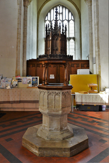
At their most basic, the font covers demanded by the councils and synods – also known as coopercula or cooperturae – assumed the form of circular lids decorated with painted ornament and secured to the top of the font by iron bars, staples or bolts.Footnote 13 Once a cover was raised and given solid geometrical form it could be used in different ways to draw attention to the locus of baptism and gloss on the various meanings of this particular sacrament. Adorned with images or architectural motifs, elevated covers could also provide a kind of visual compensation for the actual ceremony, which was performed only intermittently, often on Sundays. Various forms of architectural detailing, too, could at least partially make up for the absence of ritual. Even a modestly proportioned font canopy like that of St Nicholas at Dersingham in north Norfolk (see Figure 2; c. 1450),Footnote 14 which resembles a miniature version of the famous Octagon of Ely Cathedral, some sixty kilometres to the south, offers some visual ‘food for thought’. While more educated and well-travelled parishioners might have delighted in the recognition of the similarity, others would at least have passed this font with a fleeting sense of wonderment. In addition to furnishing some static kind of Ersatz, font covers, especially when turriform and lowered or raised by means of winches, counterweights and other mechanisms, became an integral part of the kinetic drama that animated the interior of countless late medieval churches: images and altarpieces were moved and manipulated with the cycle of the church year, shrines and tabernacles were opened and closed, Lenten hangings revealed and concealed, thresholds were negotiated, crossed, re-crossed and their secrets momentarily disclosed.
Parish church of St Nicholas, Dersingham, font canopy, c. 1450. © John Salmon/Wikimedia Creative Commons.

From about 1200 onwards, separate traditions of decorated raised font covers or other kinds of superstructures emerged in various parts of Europe. On the Baltic island of Gotland, for instance, a group of thirteenth-century fonts was fitted with cooperturae accentuated by microarchitectural canopies whose staggered and compact silhouettes of spires, gables and aedicules were probably intended to connote St John's vision of the Heavenly Jerusalem.Footnote 15 Meanwhile, in northern Germany, the magnificent bronze fonts of St Mary's at Hildesheim (possibly by a Master Wilbernus, c. 1220–5) and St Mary's at Rostock (1260) were given tall conoidal lids with sophisticated programmes of narrative, typological and allegorical imagery.Footnote 16 In the northern archdioceses of Bremen and Magdeburg in particular, bronze fonts with historiated and increasingly microarchitectural canopies continued to be commissioned well into the second decade of the Protestant Reformation. Notable examples of this trend are the intricate steeple covers of St Mary's in Frankfurt an der Oder (Master Arnold, 1376),Footnote 17 St Catherine's in Brandenburg an der Havel (see Figure 3; Dietrich Molner, 1440),Footnote 18 St Sixti in Northeim (Heinrich Mente, 1509–10)Footnote 19 and St Mary's in Salzwedel (1520–2).Footnote 20 Cast by Hans von Köln, who had received his training in the ambience of the Vischer workshop in Nuremberg, the latter baldachin unleashes above its font a proliferation of showy Gothic-Renaissance ornament – including ‘spiritual vegetation’ in the form of vines and tendrils – before reaching its climax in the figure of the apocalyptic Virgin, the ‘woman surrounded by the sun, and the moon under her feet’ (Revelation xii.1).
Parish church of St Catherine's, Brandenburg, font canopy by Dietrich Molner, c. 1440. Wikimedia Commons.

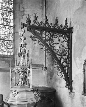
If bronze was the material of choice for high-end fonts and their covers in northern Germany, their upscale counterparts in the neighbouring Netherlands, which belonged to the archdiocese of Cologne, were commonly cast from copper or brass, a technique known since the fourteenth century as dinanderie. Beginning with Renier of Huy's famous font at St Bartholomew in Liège / Luik (1107–18), whose coopertura was lost during the French Revolution,Footnote 21 Dutch, Flemish and Brabantine dinandiers produced a whole succession of magnificent covered fonts that culminated in the fifteenth and sixteenth centuries with the opulent doopvonts of St Martin at Halle / Hal (Guillaume Lefèvre, 1446), St John's Cathedral at s'Hertogenbosch (Aert van Tricht, 1492), St Walburgis in Zutphen (Gielis van Eynde, 1527) and Our Lady in Breda (Joost de Bakker, 1540).Footnote 22 In contrast to their German counterparts, whose pyramidal covers are fitted directly onto the rim of the font, Netherlandish fonts are often capped by a tall profiled or otherwise cupoloid lid that then supports the microarchitectural baldachin. Aert van Tricht's masterful work of red copper in St John's Cathedral, s'Hertogenbosch, is exemplary of this (see Figure 4).Footnote 23 The calyxiform, dodecagonal font bowl is covered here by an equally twelve-sided hood in the form of an inverted chalice from which rises the tapering, hexagonal pyramid. The latter impresses more through its inventive ornamental and iconographical detailing than through its actual size. Completing the font ensemble is a large crane for lifting the cover, which juts out from the adjacent chapel wall. Decorated with delicate tracery motifs and crowned by a crest of candle holders, the crane, like the cover, vies for the viewer's attention, inviting closer inspection and a sort of vicarious animation, thereby literally turning the font into a machina mentis.
Collegiate church (now cathedral) of St John's, s'Hertogenbosch, font canopy by Aert van Tricht, 1492. Photograph G. J. Dukker, 1972. Reproduced by kind permission of the Collection Rijksdienst voor het Cultureel Erfgoed, no. F&D-20310806.

Cranes, pulleys and other hoisting devices were also employed to great theatrical effect in late medieval England, especially in East Anglia, where wooden microarchitectural font covers became almost de rigueur for cathedrals and larger parish churches, particularly in the century leading up to the Protestant Reformation. Given the richness of the English font cover landscape – Bond counts some two hundred examplesFootnote 24 – and the extraordinary artistic solutions that carpenters, joiners and polychromers arrived at over the course of the pre-modern centuries, it is genuinely surprising to find that there exists no serious modern study of this extensive body of monuments and the social, religious and cultural forces that gave rise to its existence. If comparisons are warranted, then they are to be found in the Germanic lands, though not so much in the handful of surviving font covers there, but rather in the vast corpus of often stunning turriform Sakramentshäuser or sacrament houses from the late Gothic period that even today totals several hundred pieces.Footnote 25 While calibrated for divergent functional contexts and encountered in different parts of the church building, sacrament houses and English font covers have several important things in common. Both were designed simultaneously to enclose and orchestrate a sacramental matter that in and of itself had little or no visual appeal – the consecrated eucharistic wafer in the case of the sacrament houses, holy water in the case of the fonts and their covers. Both types of furnishings likewise use monumental, telescopic pyramids, often with appropriate figural sculpture, literally to draw out and make visually tangible the manifold meanings and mysteries set forth in the sacraments that they encapsulate and protect. More often than not these pyramids are so intricate and complex that they surpass anything that the late Gothic architect could have hoped to achieve in the realm of large-scale architecture. Lastly, both the German sacrament house and the English font cover are premier examples of highly competitive patronage. Over the course of the fifteenth century in particular their increased presence and visibility in church interiors led to a kind of arms race between well-off families, gilds, confraternities and governing municipal bodies, in which the sponsorship of prestigious microarchitecture was fed by both a genuine desire for spiritual salvation and by massive individual and corporate egos. In Germany, the amalgamation of religious piety and public self-fashioning eventually led to the creation of the grandiloquent sacrament houses of Ulm Minster (1461–mid-1470s), St Lawrence in Nuremberg (1493–6) and St George in Nördlingen (1511–15);Footnote 26 in England a similar set of circumstances brought about the commissioning of the superb fifteenth-century steeple covers of Ufford (see Figure 5), Ewelme and Salle – among many others, of course. Described in 1644 by a dumbfounded Puritan as a ‘glorious cover over the font, like a Pope's triple crown … all gilt over with gold’,Footnote 27 Ufford's 5.5-metre pyramid of c. 1475–1500 ascends in a series of three flamboyant stories that still retain extensive traces of their original polychromy.Footnote 28 The statuary that initially enlivened the vaulted canopies projecting from its octagonal core disappeared during the Civil War, though one figure, a pelican nourishing her chicks with her own blood and nesting at the very summit of the structure, escaped the fury of the iconoclasts. Like its peer on the font cover of s'Hertogenbosch, Ufford's pelican encouraged parishioners to look upwards, dramatically tying the first sacrament to that of the eucharist, and reminding audiences that baptism was just the first step in a lifelong journey in search of salvation. Whereas the language of the Ufford cover changes from tier to tier, gradually revealing all manner of surprises to the eye of the attentive viewer, its somewhat older counterparts at Ewelme (c. 1440) and Salle (c. 1440–60) captivate through their clarity and visual logic.Footnote 29 Both are essentially composed of radially displayed fin-like volutes that at Ewelme are organised in a succession of staggered stages with diadem-like caesuras; at Salle by contrast the same basic armature produces an openwork cage of ethereal simplicity. In addition to being masterpieces of microarchitectural rhetoric, all three font pyramids are outstanding examples of late medieval liturgical machinery. While Ewelme's cover is suspended from the roof of the nave and counterpoised by a large carved oak boss representing a rose, its near-contemporary at Salle hangs from a massive lifting crane sprung from the ringing gallery of the west tower – an arrangement that anticipates Aert van Tricht's striking font ensemble at s'Hertogenbosch. Especially ingenious is the mechanism at Ufford, where the lower tier of the cover can be pushed up neatly to slide over the next, like a section of a refracting telescope. It is balanced and kept in position by a counterweight hidden in the upper part of the pyramid, very much like a Victorian sash window.
Parish church of St Mary, Ufford, font canopy, c. 1475–1500. © Achim Timmermann.

Concurrently with the widespread introduction of the kinetic steeple cover in England, artists and their clerical advisers in Tuscany were perfecting their own brand of baptismal microarchitecture, which had few moving parts, and sometimes none whatsoever. In contrast to the turriform pyramids that made many deluxe covers in northern Europe so eye-catching, the faddy fonts of central Italy kept a much lower profile, and usually incorporated a wide circular or multi-faceted basin and a central stem or column rising above the rim of the font and bearing an architecturally-themed container, the vasca, coperchio or tabernacolo, that held a certain quantity of consecrated water in reserve. It appears that this standpipe-like design was pioneered as early as the twelfth century, with the font ensemble of S. Frediano at Lucca being the earliest surviving example.Footnote 30 Fashioned in c. 1150–80 by a group of artists trained in different stylistic traditions, this chef-d’œuvre of the Tuscan Romanesque is surmounted by a chalice-like coperchio resembling contemporary eucharistic ciboria,Footnote 31 though while the latter were usually kept closed, here the dome-shaped lid is permanently raised on short columns to provide access to the interior of the water receptacle. Whereas the general shape of Tuscan fonts would change little over the following centuries, the crowning water tank went through a series of metamorphoses that culminated in the Quattrocento with the creation of the classicising vasce in the Cathedral of San Cerbone at Massa Marittima and in the baptistery of Siena's Duomo.Footnote 32 At Massa, a much older font from the 1260s was retrofitted with a coperchio of 1447 representing a four-sided tempietto with pilasters and scalloped niches containing the figures of the Apostles. Especially accomplished is the font group in Siena's battistero, which is adorned with carvings by some of the foremost sculptors of the time, including Lorenzo Ghiberti, Jacopo della Quercia and Donatello. Completed between 1417 and 1430, the ensemble is composed of a hexagonal font with scenes from the life of John the Baptist and standing figures of the Virtues, all cast from bronze, and a surmounting water reservoir in the form of a six-sided classical tempietto with marble reliefs of various prophets and a corona of pediments and bronze statuettes of music-making putti.
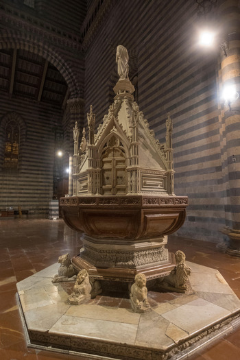
There is one outlier in this line-up of central Italian baptismal microarchitecture, the tent-shaped cover for the white and red marble font in the Duomo in Orvieto (see Figure 6).Footnote 33 Completed in 1407 by the cathedral's recently appointed capomaestro Sano di Matteo, the work assumes a decidedly late Gothic guise and, like its northern European counterparts, it rests directly on the rim of the font, completely concealing the bowl of the basin. Four of its sloping sides, including that giving access to the interior, are highlighted by miniaturised portals whose ogival (sham) doors are filled with cusped tracery, crowned by crocketed gablets and flanked by multi-stage pinnacles. Still essentially Trecentesque, the gate-cum-gable motif gave visual prominence to countless liturgical furnishings and church facades in Tuscany, Umbria and beyond, and recurs several times at Orvieto itself, for instance on Ugolino di Vieri's Reliquary of the Holy Corporal of Bolsena (1337–8), now in the Museo dell'Opera del Duomo there, and, on a much larger scale, on the cathedral's west front, completed in about 1380. It was given added iconographical agency when applied to the architectural setting of baptism, where it literally came to designate the ianua omnium mentioned in the epigraph to this article, the door or entryway to humankind's salvation.
Cathedral of the Assumption of the Virgin Mary, Orvieto, font canopy by Sano di Matteo, 1407. © Claudio Giovanni Colombo/Alamy Stock Photo.

The microarchitectural covers considered so far can all in some way be understood as scopic conduits that lured and led the viewer's eye upwards, across surfaces replete with visual wonders and into the midst of iconographical programmes whose meanings demanded to be unlocked. Placed directly onto the font and its consecrated water, and visually ‘emanating’ from both, the steeple covers and coperchi reviewed here generated a semantically redolent, vertical space within the church interior. Interspersed among the font cover landscapes considered so far were the font ciboria that, in addition to providing a cynosure for skyward glancing, also staked out a lateral space around the locus of baptism, effectively creating an honorific miniature arena for the performance of the first of sacraments. As with the font ciborium of St Peter Mancroft in Norwich, these intricate edifices, with their stepped socles and surrounding colonnades, dados or grilles, all circumscribing the pivotal furnishing of the font, involved and implicated the participants of the ceremony in a very tangible threshold experience. Beyond serving as a literal staging ground for an all-important rite of passage, a font ciborium like that of St Peter Mancroft represented an especially generous investment in the religious infrastructure and welfare of a town or parish and its community, and as such also functioned as a memorial of individual or collective identity. Font ciboria in particular were charged with dense significative potential, for not only did their design engage with cutting-edge formal ideas across a variety of scales, media and performative contexts, in contrast to the turriform font cover their plan and elevation also referenced a much older, indeed hallowed, type of structure – the late antique baptistery. As far as can be ascertained only seven pre-Reformation font ciboria have survived the ravages of time. All except one, a classicising work from the early Cinquecento, are of late Gothic facture and stand in parish churches. They are, in chronological order:
1. The 6-metre ciborium in the parish church of St Mary's in Luton, Bedfordshire, an octagonal structure created between 1330 to 1340 by a craftsman with detailed knowledge of the œuvre of William Ramsey, royal master mason to Edward i between 1336 and 1349.Footnote 34
2. The 8-metre triangular ciborium in the collegiate church of Our Lady in Ulm, Swabia, a possibly civic donation of c. 1420–30 with an eventually unfinished superstructure.Footnote 35
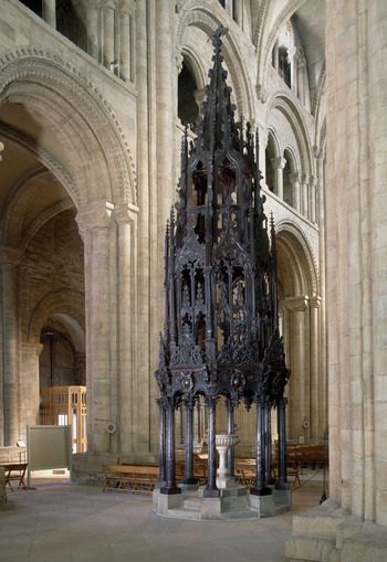
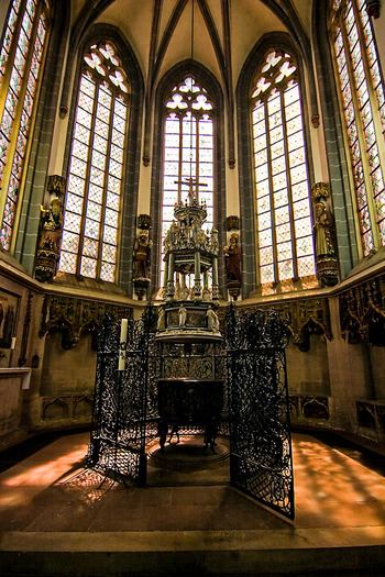
3. The 15-metre ciborium in the parish church of St Severus in Erfurt, Thuringia, which is also triangular in plan and was in all likelihood gifted in 1467 by Hermann Steinberg, canon at St Severus and dean of Erfurt University, and probably designed by Erfurt's Dom- und Stadtwerkmeister Hans Pfau of Strasbourg (see Figure 7).Footnote 36
4. The 7-metre marble ciborium in the Cathedral of Santa Maria Assunta at Atri, Abruzzo, a four-sided edifice erected in 1503 in all'antica forms by Paolo de Garviis, a Lombard-Swiss sculptor from Bissone in the Ticino also credited with other sculptural ensembles in the area.Footnote 37
5. The 6-metre wooden ciborium in the parish church of St Peter Mancroft, Norwich, Norfolk, largely of c. 1510–20, which transitions from a square to an octagonal plan in the first tier of the superstructure.Footnote 38
6. The 7-metre wooden ciborium in the parish church of St Botolph in Trunch, Norfolk, of c. 1500–20, which rests on six supports and is surmounted by an intricately canopied, coroniform pyramid.Footnote 39
7. The 6-metre wooden ciborium in the parish church of Notre-Dame at Trédrez-Locquémeau, Brittany, of c. 1532–40, whose eight-sided spire in restrained Flamboyant forms is carried on four columns above the octagonal font enclosure.Footnote 40
How many font ciboria have been lost to iconoclastic activities or the post-medieval reconstruction of churches is difficult to ascertain with any degree of accuracy,Footnote 41 although if it is assumed that their survival rate is about the same as that of the pyramidal font covers and also if the geographical scattering of the extant pieces is taken into account, especially on the Continent, then it seems that even during the later Middle Ages the bankrolling and erection of a font ciborium constituted a particularly rare and locally significant event. Even more singular would have been the commissioning of a giant font ciborium like that in the collegiate church of St Severus at Erfurt, which eclipses all others in its dimensions and visual elaboration and probably represents by far the most extravagant and expensive microarchitectural tribute to the sacrament of baptism ever undertaken. Costing the colossal sum of 2,500 silver marks, the eye-catching structure impresses itself immediately on the viewer entering through the nearby north portal, forcefully drawing attention to the site at which spiritual access to the Church and its mysteries was mediated, granted and celebrated. If seen from up close, the ciborium's soaring silhouette dissolves into a maze of buttresses, flyers, bent pinnacles, curved gables, naturalistic branchwork and baldachins inhabited by the figures of holy protagonists. This astounding concoction of convoluted forms and monadic, ethereal spaces generates an abundance of ‘narratives of ornament’, to use a term introduced by Matt Kavaler,Footnote 42 which produce visual pathways both toward the vertex of the vault and toward the font in the ciborium's very midst.
Collegiate church of St Severus, Erfurt, font ciborium, probably by Hans Pfau, 1467. © Zoë Opačić.

The kinds of structures that are at the heart of this article were in constant dialogue with a multiplicity of other contemporary ritual furnishings, civic monuments and ecclesiastical architecture across a broad spectrum of scales.Footnote 43 At the smallest end of the scale, they reflected and refracted the numinous shapes of a broad range of liturgical and para-liturgical utensils and fittings used often on a daily basis in the medieval churches in which they stood, including monstrances, relic-ostensoria, the canopies of altarpieces and processional candlesticks, baldachins depicted in stained glass and, where present, turriform sacrament houses. As such they contributed toward producing a comprehensive morphological frame of reference for the late medieval viewer that clearly mapped out the coordinates of his or her salvation. Similar redemptive nodes, here inflected by a good dose of civic pride, also existed outside the physical envelope of church buildings, and in the form of pillories, fountains and market crosses, erected on what might be called a meso-scale, gave significance and urgency to the squares, thoroughfares and crossroads of late medieval cities and towns.Footnote 44 Surmounting nothing less than a facsimile of the fons vitae, baptismal microarchitecture in particular was in constant exchange with the design of the often spectacular fountains that rose on the market squares of the Continent (less so in England), as a comparison between the triangular font ciboria at Ulm and Erfurt and a group of three-sided late Gothic fountains in the south-west of the Germanic lands demonstrates.Footnote 45 Meanwhile, in England, the coroniform termination of the font ciborium at Trunch (and possibly also once its counterpart at St Peter Mancroft in Norwich as well) took its inspiration from a specific type of market cross that can still be seen at Salisbury (c. 1450), Malmesbury (c. 1490) and Chichester (1501).Footnote 46 At the same time the designer of the Trunch ciborium might also have been aware of a recent innovation that had been pioneered on a macro-scale a little further afield, namely the development of the crown steeple and its implementation on the towers of St Nicholas at Newcastle (c. 1448), St Giles in Edinburgh (c. 1490) and King's College in Aberdeen (1500–9).Footnote 47 On the whole, however, the relationship between late Gothic church towers and the microarchitectural setting of baptism appears to have been less mimetic than one might first assume, in part because the artificers of font covers and ciboria were not so tightly beholden to the laws of statics and material physics and could therefore create highly complex pyramids brimming with all manner of optical merveilles that left the comparatively simple and solid geometric forms of the average steeple or spire far behind.
In addition to being locked into a series of interconnected ritual topographies that eventually stretched across the entire urban landscape, font ciboria like that of St Peter Mancroft in Norwich were also engaged in another conversation, one that crucially sought out an artistic and (quasi-) liturgical dimension not of the present, but of the distant past. As colonnaded and sometimes vaulted enclosures, the font ciboria of this article were in fact the late medieval and pre-modern successors of the early Christian baptistery. Encountered as early as 233 ce in the domus ecclesiae of Dura Europos,Footnote 48 baptisteries, as architecturally articulated ‘initiation machines’, received a major boost with the issuing of the Edict of Milan (313) and thereafter became a common feature in many larger churches in the late Roman Empire, its far-flung provinces and successor states.Footnote 49 It may suffice here to draw attention to the surviving or archaeologically verifiable examples of San Giovanni alle Fonti in Milan (378–97),Footnote 50 San Giovanni in Laterano in Rome (c. 315, 432–40),Footnote 51 Nocera in Campania (sixth century)Footnote 52 and Cividale nel Friuli (730–40)Footnote 53 – all buildings whose eight-fold plan symbolised both regeneration, as the world had commenced on the eighth day of Creation, and resurrection, for Christ rose from the dead on the eighth day of his passion. In the Italian peninsula, large-scale baptisteries, in which the rite was achieved through immersion in a central piscina, were to remain popular well into the high and later Middle Ages, with those of Parma (from 1196 to the early fourteenth century)Footnote 54 and Chieri (last third of the thirteenth century)Footnote 55 among the last to be completed. Northern Europe, while initially also receptive to the idea of substantially autonomous baptisteries – Ristow lists some 139 documented casesFootnote 56 – by contrast witnessed a gradual diminution of the scale of its baptismal edifices. These were either transformed into font ciboria proper, with the ivory font cover of the Carolingian Drogo Sacramentary (after 844; Paris, Bibliothèque nationale, Paris, ms lat. 9428) depicting a particularly early instance,Footnote 57 or else became small ancillary chapels attached to the main body of the church, as at St Gereon and St Kunibert, both in Cologne and respectively erected between about 1227 and 1250, and around 1260–70.Footnote 58 Whenever and wherever a late medieval patron commissioned a font ciborium he or she made specific choices that at a certain point would also have necessitated some recognition of the ‘deep history’ of this type of furnishing, and the fact that most of the extant examples from the Gothic and later periods were erected in locations without a Roman or early Christian past should give us pause for thought. What, we may wonder, prompted the individuals and corporate bodies who backed the construction of the font ciboria at Luton, Ulm, Erfurt and Trunch – all post-Roman places at best – to opt for a genre of ritual prop that suggested a linkage to a religious past that none of these localities could actually lay claim to? Due to the dearth of documentary evidence we will never know for sure, and for the time being can only suspect that these ratiocinations had something to do with both the general reform of the western Church that took off in earnest with the conciliar movement of the early fifteenth century, and with an increased trend in the deliberate falsification of civic histories and identities that Christopher Wood has so brilliantly explored for many south German towns in the century or so leading up to the Lutheran Reformation.Footnote 59
From East Anglia to Brittany: font pyramids and font ciboria in an age of Reformations
Unlike many other medieval types of images and ecclesiastical furnishings, both font pyramids and font ciboria survived the upheavals of the Protestant Reformation. Indeed, during the century and a half that followed the schism initiated by Martin Luther and his fellow-reformers, baptismal microarchitecture went through a second ‘golden age’ – on both sides of the confessional divide. Significantly for Protestants, baptism remained one of two recognised sacraments (the second being the eucharist), though with time reformers gradually stripped the rite of its ‘popish trappings’, such as the performance of the ritual in Latin and a number of ceremonial additions without scriptural precedent, including the insufflation, the giving of salt, the unctions before and after the affusion or aspersion and the gift of the lighted candle.Footnote 60 At least from the mid-sixteenth century onwards, fonts in Protestant churches no longer held consecrated water from Sunday to Sunday but were instead filled afresh with pure water for each administration of the rite.Footnote 61 In theory, then, font covers of any form, indeed even the simplest of lids, should have been deemed liturgically superfluous, and those of the triumphalist kind downright suspicious and offensive. It therefore comes as a surprise not only to find Protestant bishops in both England and northern Germany repeatedly enquire whether their fonts were properly covered,Footnote 62 but also – and in particular – to discover that when canopies were commissioned for Anglican and Lutheran fonts they could be as ostentatious as their late medieval precursors. The reasons for this apparent disjunction between Protestant baptismal theology and its artistic manifestation were manifold, though continuing traditions of patronage and civic and individual self-representation were undoubtedly a major contributing factor.
Meanwhile, in the Roman Catholic camp, the orthodox tenets on baptism were reconfirmed at the Council of Trent, which in a series of fourteen canons declared all those supporting the alleged ‘heretical’ beliefs on this sacrament anathema (session vii, 1547). In addition, the council's Catechism to parish priests, published in 1566, reaffirmed the ceremonies and practices surrounding baptism that to Protestants smacked of superstition; these included the consecration of the water ‘with the oil of mystical union’; the exorcism ‘to expel the devil, to weaken and crush his power’; the touching of the infant's nostrils and ears with spittle; the anointing with chrism; the putting on of a white garment; and the placing of a lighted candle into the hands of the baptised or his sponsor ‘to signify … faith, inflamed by charity’.Footnote 63 Particularly important for our purposes was the publication in 1577 of the Instructiones fabricae et supellectilis ecclesiasticae, a treatise on church building and decoration authored by none other than St Charles Borromeo, archbishop of Milan (1564–84) and erstwhile instigator of the Tridentine Catechism, which offers detailed instructions on the construction of baptisteries and their furnishings.Footnote 64 Distinguishing between baptisteries intended for affusion or the Roman rite and for immersion or the Ambrosian rite, and those designed for cathedrals, archpresbyterate churches and parish churches, Borromeo envisages a number of different microarchitectural scenarios that invariably incorporate some kind of font cover and a surrounding colonnade with a surmounting canopy, and that are themselves nested, like Russian dolls, within the centralising space of a given type of baptistery. Where sufficient financial resources are available, the archbishop recommends that the font cover be made
of either marble or stone … [and] firmly supported by small columns or small pilasters which should hold it up to the height of two cubits [87.28 cm] so as to have a sufficiently convenient space between the columns. When the baptistery is according to the Roman rite, these columns or pilasters should be set on top of the ledge of the lower basin. Where it is for the Ambrosian rite, they should be attached to the ledge of the baptismal vase itself. At the top of these columns, suitable ornamentations should be applied such as an architrave, frieze and cornice, depending upon the judgement of the architect. The whole cover should be surmounted by a marble roof that is either spherical or pyramidal. On top of this there should be a statue of St John the Baptist baptizing Christ our Lord. The space between the pilasters should be closed with bronze, piously decorated panels that are so arranged that they may easily be removed when the baptistery is to be used.Footnote 65
In addition to being augmented by decorated covers, the kinds of fonts that Borromeo imagines being placed in the larger churches of his Counter-Reformation world are to be surrounded by colonnades of ‘eight single-row columns; or sixteen in a double-row, should the form be octagonal. If the form is hexagonal, then it may have six columns or twelve, in proportion to the shape’.Footnote 66
The effect that Borromeo's Instructiones fabricate had on the religious landscapes of the Counter-Reformation is difficult to ascertain. On the one hand, while including provisions for lesser churches, the treatise, with its evocation of the architectural glories of early Christian Rome, was probably simply too ambitious to gain much direct traction on the ground. Even Pellegrino Tibaldi's prodigious Mannerist font baldachin in Borromeo's own cathedral of Milan, constructed in about 1570–80 on the orders of the archbishop, is only supported by four columns and thus falls short of the numbers (8–16; 6–12) proposed in the Instructions.Footnote 67 On the other hand, there exist a number of more ambitious font ciboria from the post-Tridentine period – especially those of Erfurt Cathedral (1585–7) and some seventeenth-century ones in Brittany – that could conceivably have been patterned on at least some of Borromeo's recommendations, though this is difficult to prove with certainty since the design of all of these structures also taps into local microarchitectural traditions originating in the previous centuries.
The post-Reformation font cover landscape will now be surveyed in sequence, beginning in England before crossing over to northern Germany, Normandy and Brittany, where both Lutheran lands and those that had remained loyal to the Church in Rome will be traversed. Following the religious uncertainty of the fissiparous years of Queen Elizabeth's rule, during which font covers were simultaneously destroyed, restored and newly commissioned,Footnote 68 baptismal microarchitecture in England experienced a second phase of efflorescence during the Jacobean and Caroline reigns, a period of general renovation for the Church of England that famously also saw the publication of the King James Bible in 1611. High points in the development of the Stuart font canopy are the steeple covers in the Norfolk villages of Terrington St Clement and Walpole St Peter, which respectively date to the 1610s and 1620s.Footnote 69 Both sit directly on the rim of the font and have hinged shutters that can be opened, like a triptych, for the baptismal ritual.Footnote 70 But while Terrington's cover is more Gothic than Renaissance in its detailing – Pevsner calls it ‘Laudian Gothic’Footnote 71 – its counterpart at Walpole follows the latest all'antica style, with tapering pilasters, openwork arabesques, and a variety of fluted angle brackets all competing for the viewer's attention. Similar ornamental narrations, here enriched by the addition of spiky obelisks, also enliven the surfaces of John Turner's cover for St Mary's at Mendelsham in Suffolk (see Figure 8; 1630),Footnote 72 though here the structure, with its octagonal plan, Tuscan colonnade, pedimented architrave and coronal termination, resembles more a shrunken ciborium balancing on the top of the font than the kinds of pyramidal canopies so popular throughout Gothic and Renaissance East Anglia. Among the seventeenth-century baptismal baldachins, pride of place must undoubtedly be given to the magnificent piece in the nave of Durham Cathedral (see Figure 9), a hulking 12-metre micro-tower of octagonal plan and three telescopic tiers that represents, at least to my knowledge, the only extant font ciborium explicitly commissioned for Protestant use.Footnote 73 Like Terrington's cover, the Durham ciborium is essentially post-Gothic in style, though here the retro-medieval flavour is tempered through the admixture of early Baroque rather than high Renaissance elements. Gifted in 1663 by John Cosin, bishop of Durham (1660–72), the soaring structure ‘stands in the west end of the church as a signal proclamation of the Restoration’ – to borrow the words of Margaret Aston.Footnote 74 But more than monumentalising contemporary religio-politics, the installation of the font ciborium was also a literal act of restoration, for it replaces a predecessor erected by Cosin – then a young prebendary at Durham – nearly four decades earlier and demolished by Scottish soldiers during the Civil War.Footnote 75 The extent to which the current edifice replicates the appearance of its Caroline ancestor is uncertain, though judging from the words of a critic, Peter Smart, who in 1628 described the original baldachin as ‘a mausoleum, towering up the roph of the church’ and as being bedecked with ‘capricious and phantasticall device’,Footnote 76 we can assume that Durham's first font baldachin had likewise been conceived on a grand and visually opulent scale.
Parish church of St Mary, Mendelsham, font cover by John Turner, 1630. © John Salmon/Wikimedia Creative Commons.

Cathedral Church of Christ, Blessed Mary the Virgin and St Cuthbert, Durham, font ciborium, 1663. © Angelo Hornak/Alamy Stock Photo.

Corresponding to the renewed interest in the microarchitectural mise-en-scène of baptism in early seventeenth-century England was an upsurge in the commissioning of elaborate steeple covers in the Lutheran areas of northern Germany, particularly in the diocese of Lübeck and the duchy of Braunschweig-Lüneburg. As in East Anglia, the production of font baldachins in post-Reformation Holstein, Lower Saxony and Brandenburg built on, and expanded from, the vibrant medieval tradition of microarchitectural font covers in these areas as already considered. In contrast to their Gothic antecedents, which were often cast from bronze or brass, the later font pyramids of seventeenth-century Germany were all fabricated from wood and usually given a restrained semi-monochrome livery of black, white, grey and gold – the same kind of colour scheme that was also used for Lutheran altarpieces, pulpits, organ cases and epitaphs. Whereas many Stuart covers still sought to reproduce the tapering outlines of late Gothic church spires, as at Terrington St Clement and Walpole St Peter, their North German cousins were generally patterned on the silhouettes of multi-stage Renaissance lantern towers, such as that of St Kilian in Heilbronn, completed as early as 1529. Like their English peers, though, many German Protestant steeple covers were fitted over much older medieval fonts, a practice that effectively upgraded, validated and gave continuity to a sacred site that had served as a key pivot in the religious life of the local community since time immemorial. Consider, for instance, the spectacular late Mannerist tower of 1621 that hangs above a Romanesque bronze font in the church of St Gotthart at Brandenburg an der Havel,Footnote 77 or a similar structure of 1630 in the Jakobikirche at Lübeck that draws attention to the intricate font there created in 1466 by the celebrated Klaus Grude.Footnote 78 Even more impressive is the group in the Martinikirche at Braunschweig, where a turriform confection of 1618, garnished with Tuscan columns, pilasters and escutcheons, and animated by a plethora of figural sculpture, including a sequence of typological reliefs based on designs by Virgil Solis, surmounts a font cast and signed by the bronze founder Barthold Sprangken in 1441 (see Figure 10).Footnote 79 Surrounding the site is a six-sided forged-iron grille, installed in 1671, and decorated with cartouches and profuse scrollwork. Clearly an afterthought, the enclosure may have been primarily added to minimise physical access to the font and its baldachin, though in a secondary instance it also serves to showcase the ensemble as a ‘living relic’ of local history and identity.
Parish church of St Martin, Braunschweig, font canopy, 1618. © Achim Timmermann.

Dozens of pyramid covers were made in post-Protestant Germany, but to my knowledge only one font ciborium. This was gifted in 1585 by Konrad von Breyttenbach, canon and provost at Erfurt, and placed in a specially converted chapel in the nave of the cathedral there (see Figure 11).Footnote 80 Like the adjacent Severikirche, Erfurt Cathedral had seen a brief reformist interlude before being given over to Roman use again after the Treaty of Hammelburg (1530), which had divided the use of the city's numerous churches according to the needs of the two confessions. In tandem with its late Gothic counterpart at St Severus, the cathedral's font ciborium can be understood as a kind of triumphalist riposte to the ways with which Erfurt's sixteenth-century Protestants chose to celebrate their own seemingly reductionist version of baptism. It has also been argued that the inclusion in the structure's rich iconographical programme of the titular saints of the archbishopric of Mainz – among them Boniface, Adolar and Martin – was intended as a show of allegiance to the staunchly Catholic bishops of Erfurt's mother see.Footnote 81 Commissioned in 1587 from some of the city's foremost artists, including Hans Friedemann the Elder and Hieronymus Preusser, and fashioned in the latest classical idiom, the ciborium is both monumental and visually transparent, and its airy lower tier in particular an homage to the colonnaded font ciboria of early Christianity.
Collegiate church (now cathedral) of St Mary, Erfurt, font ciborium by Hans Friedemann the Elder, Hieronymus Preußer and others. © Zoë Opačić.

In northern France, especially in Normandy and Brittany, the construction of font ciboria reached an undisputed apogee during the decades bracketing the Wars of Religion between 1562 and 1598. Among the half dozen or so surviving Norman examples, those of Notre-Dame of Bretagnolles in the diocese of Évreux and of Notre-Dame de Nativité at Magny-en-Vexin, situated in the pre-modern boundaries of the bishopric of Rouen, stand out in particular. They date to the final decades of the reign of François i (1515–47), but while the former, carved from wood and octagonal, flaunts at once late Flamboyant and all'antica elements, the latter, a six-sided limestone work attributed to Jean Grappin of Gisors, comes with all the trappings of the French high Renaissance, its architecture showcasing a sophisticated cycle of emblematic, narrative and allegorical imagery calibrated to enhance the viewer's deeper understanding of the theological and moral significance of baptism.Footnote 82 What distinguishes both pieces is the intricacy of their detailing rather than their monumentality, as neither is crowned by the kind of ostentatious, multi-tiered superstructure found for instance at St Severus in Erfurt or Trunch – or for that matter, on the majority of font architectures in Brittany, the next and final port of call.
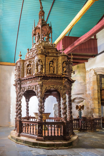
An especially dense cluster of font ciboria can be found here in the modern département of Finistère, which is roughly synonymous with the old bishoprics of Léon and Cornouaille; there are also a number of outliers in the regions of Ille-et-Vilaine in the east, centred on the cathedral city of Rennes, and the Côtes d'Armor in the north, which partially incorporates the lands of the pre-Revolutionary dioceses of Saint-Malo, Saint-Brieuc and Tréguier.Footnote 83 Brittany's impressive corpus of font ciboria is largely comprised of examples fashioned in a variety of adaptations of the Baroque style, though there is at least one exception. This is the wooden ciborium in the parish church of Trédrez-Locquémeau in the former diocese of Tréguier, which assumes a resplendently Flamboyant guise and is by far the oldest member of the group.Footnote 84 On account of its decoration with both the Breton heraldic ermine or breizh, and the French fleur-de-lys, it can be dated to the decade or so after the Act of Union between France and Brittany, passed in 1532. With its four lissome corner buttresses, traceried flyers and eight-sided, openwork spire, this edifice presents itself as a polychrome and rather more sumptuous miniature version of the slightly earlier steeple that rises over the west tower of the church in which the structure stands.Footnote 85 The elevation of contemporary church towers also provided the model for the font ciborium in the parish church of Notre-Dame at Bodilis in the old bishopric of Léon, though in this case the inspiration came from one of the numerous late Renaissance dômes à lanternes in the immediate vicinity, that of the Chapel of Notre-Dame of Berven-Plouzédévé, completed in 1576, being a chief case in point. Constructed from kersanite, a local magmatic stone with properties similar to granite, the Bodilis ciborium ascends in three telescopic tiers transitioning from a hexagonal to a circular plan and adorned with austere all'antica ornament, which includes fluted Doric columns, pilasters, egg-and-dart friezes as well as a variety of profiled architraves and cornices. The date of this structure is somewhat of a mystery: while its design and architectural language places it in the late sixteenth century – the church of Bodilis having only been commenced in 1564Footnote 86 – its now incomplete cycle of statuary, which featured, among other figures, the four Evangelists and the four Church Fathers, is thought to have emerged from the prodigious workshop of Roland Doré of Landerneau (1618–60), to whom over sixty other sculptural ensembles in parish churches and chapels in the region have been ascribed.Footnote 87 Contrasting with the restrained classicism of the baldachin at Bodilis is the font ciborium of St-Miliau at Guimiliau (dated 1675), an eight-metre wonderwork of carpentry festooned with the playful opulence of the high Baroque (see Figure 12). Eight Solomonic columns inhabited by a fauna of snails, serpents and birds support here a garlanded and historiated tambour or drum accentuated by cylindrical corner turrets topped by vases and cartouches.Footnote 88 The dome above is likewise eight-sided and sports more ornament in the form of dolphins and rosettes before becoming a platform for the topmost tier, an airy aedicule crowned by a miniature lantern and staging, perhaps in accordance with Borromeo's Instructiones, a carved group of the Baptism of Christ.
Parish church of St Millau, Guimiliau, font ciborium, 1675. © Hemis/Alamy Stock Photo.

The reasons for the emergence of this extraordinary font ciborium landscape in Counter-Reformation Brittany have never been studied or explained. It is certainly safe to assume that its creation formed part and parcel of the post-Tridentine reorganisation of parish life which in Brittany lasted well into the 1680s.Footnote 89 On the one hand, this entailed the implementation of the council's liturgical and doctrinal rulings through more enlightened bishops, conscientious recteurs or parish priests, and a number of missionary religious orders. On the other hand, the restructuring involved a concomitant and sometimes extensive modification of existing parish churches and chapels or the construction of entirely new ones whose spaces and furnishings reflected the new pastoral and ecclesiological priorities. Typical features of a seventeenth-century Breton parish church complex included a substantial walled enclosure, the enclos paroissial, a multi-figured Calvary group, an ossuary and the often sprawling church itself, with its prominent western tower and large south porch. Upon entering the church through the latter, parishioners would have found themselves in a nave with clear sightlines toward the high altar, locus of the celebration of the mass, whose place as ‘the central intercessory institution for the living and for departed souls’Footnote 90 had been reconfirmed by the Council of Trent in its twenty-second session (1562). Often accentuated by an elaborate retable and a crowning baldachin, the high altar, site of the confection of the eucharistic body of Christ, was the semantic fulcrum of every parish church, though since it was screened off from the nave by a low partition, it remained physically inaccessible to most lay audiences. The font ciborium, by contrast, was located in medio navis, often near the south porch, where it formed a sort of ‘western sacramental pendant’ to the high altar at the opposite end of the building.
Harnessing the visual magic of microarchitecture, the font pyramids and font ciboria of this article were physical and symbolic pivots in the lives of generations of parishioners across much of the length and breadth of later medieval and early modern Europe. In contrast to the high altarpiece retable or sacrament house, which were often placed behind screens in the church choir and therefore experienced by most at some remove, the monuments considered here stood almost without exception in the nave, often near the principal entrance, and were thus exposed to the repeated gazes of a particularly large segment of the population. Even when fenced in, the font ensembles of East Anglia or the Brabant could be examined at close quarters. Their playful, inhabited pyramids in particular sent audiences on voyages of discovery that were imaginative, empowering and – when experienced in conjunction with the baptismal ceremony – deeply significative. While much recent scholarship on the ritual and social use of Gothic, Renaissance and Baroque church interiors has been focused on the furnishings in the choir, in light of the above it seems clear that the space of the nave, especially the west end with its font and occasional magnificent microarchitectural cover, deserves much more attention than it has received so far. As the example of St Peter Mancroft in Norwich shows, the font canopy was often the first instance of expensive high-end art that viewers came across after entering the church building. It was here, beneath the coruscations of buttresses, pinnacles and canopied statues, beneath this simulacrum of the Edenic fons et origo, that important viewing habits were first formed and fashionable tastes exhibited, and identities proclaimed, consolidated and perpetuated.
Much work remains to be done before we can fully assess the visual-cultural significance of this genre of microarchitecture. First and foremost, more raw data from the archives is needed, and where found, such data should not disappear down the rabbit hole of some arcane local journal, but be published online and shared with the wider scholarly community. We also need to subject the monuments themselves to closer and more extensive scrutiny. This could be undertaken, for instance, as part of a dissertation project that investigates a wider font cover landscape, with that of the eastern parts of England representing a particular desideratum. An especially pressing issue is that of patronage, another that of artistic collaboration and workshop organisation. Any study of this material should ultimately strive toward integrating its findings into a broader analysis of what may be called the microarchitectural horizon – that is the totality of nodes of miniaturised architecture that were created and used in the production of social and cultic space at a specific time and place.