

Street signs are an everyday part of our lives. Yet their language and form reveal important aspects of written English. The aim of this article is to open the reader's eyes to some common features of English street signs by looking at some of the signs in a typical street, Leazes Park Road in Newcastle upon Tyne. On one side of Leazes Park Road the buildings are three-storey nineteenth-century brick townhouses, on the other assorted modern brick and concrete offices, shops and clubs. It is a mixed street of dentists, offices, shops, restaurants, flats and clubs; its signs are typical of English city streets. The paper forms part of a research programme looking at street signs in England from different perspectives (Cook, Reference Cook2013); a complementary short paper looks at the signs of the traffic junction in Leazes Park Road.
Numbers
Buildings must be numbered and their numbers displayed so that ambulances and fire engines can locate them; names are an optional extra (Department of Transport, 1993).

Some numbers are screwed on to the walls or house-doors as in 50 and 54, some are painted as in 21 on a restaurant sign or 20 on the glass of a fanlight. The form of the letters is clearly serif in 50, 21 and 20 with the characteristic varying line width and serifs at end of strokes very evident in 21. This sign uses a capital letter I rather than a numeral 1, a confusion most famous from 10 Downing Street where the mistaken use of a capital O for a numeral 0 has become a tradition. 20 uses gilt shadow letters emulating the shadows cast in stone signs. The number signs try to assert quality through the metal they are made of or the elegance and skill of their forms. In Leazes Park Road, odd numbers are on one side of the road, even numbers on the other, typical of most English streets apart from the continuous numbering in cul-de-sacs, such as indeed Downing Street where the Prime Minister's official residence No 10 is next door to the Chancellor's No 11. Odd numbers occur on the left-hand side of the road facing away from the town centre, even numbers on the right. English house-number signs have then a system and logic of their own.
Brassplates
To comply with the requirements of The Companies (Trading Disclosures) Regulations (2008), businesses in England have to display their name at their registered address.
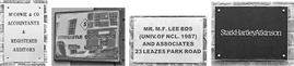
Brassplates in Leazes Park Road include those for accountants, clubs, dentists and design consultancies. Often these signs are made of brass, hence the name brassplate, as in McCowie & Co and Newcastle Companions. This does not always help their legibility as well-polished brass reflects the surrounding scene, for example in Newcastle Companions. An alternative is the silver-looking dentist's plate Mr. M. F. Lee. The use of all capital letters is a traditional sign of quality, as on say war memorials, and often goes with serif letters as in McCowie & Co. The white on black StarkHartleyAtkinson sign deliberately breaches these conventions, and has a compound name with capital letters within the word, a modern fashion for business names; it has an elegant typeface with heavy serifs but with slight variation in line thickness, with distinctive ligatures connecting the serifs of tkin and artl – very much a one-off design asserting a unique modern identity. The appearance of these three signs then displays quality of material and cost of construction and so lays claims to permanence and respectability.
Shops
Shops often display their names horizontally on fascia boards at the top of their shop-fronts.
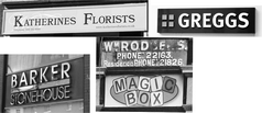
The convention is for large, strong-looking capital letters, presumably partly for visibility. The painted sign Katherines Florists shows a traditional-looking serif Times Roman print typeface; this Linotype version is subtly different from the Times New Roman Monotype version available on most computers, notably in the angled serifs in S and F. However Times New Roman was specifically designed for newspaper print; many argue that print typefaces do not transfer well to large street signs. The Barker & Stonehouse sign shows large, sans serif, silver-looking metal letters, contrasting a bold BARKER with a condensed STONEHOUSE; such three dimensional signs depend upon the light casting shadows; nor is the legibility here enhanced by the reflections in the shiny metal surfaces. Greggs shows a similar approach with bold individual capital letters; this branch was closed in 2015 but the company logo continues to be displayed at the 30 surviving branches in Newcastle and the hundreds nationally. The Magic Box sign is sans serif capitals in a one-off multi-coloured design. Above it is Wm. Rodgers, a defunct sign illustrating the traditional art of sign-making painting strong gilt letters with shadows. Fascia board signs suggest personality, whether respectable, forward-looking, lively or staid.
Restaurants
Restaurants attract their customers through their name signs, mostly on fascia boards at the top of the ground floor like shops.
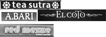
Leazes Park Road has a number of restaurants, mostly serving foreign cuisines – Chinese tea, Turkish mezze, Italian pizza and Spanish tapas. Tea sutra and red mezze have lower case, sans serif letters with no capitals in orange or red on black backgrounds, tea sutra varying line width, red mezze a fat line width. Both A.BARI and EL COTO have serif capitals dramatically contrasting with the red or black background; A.BARI has tightly spaced rough-looking letters where the serif has turned into a bulge rather than a flourish; EL COTO has elegant classical looking letters, essentially those of Times New Roman, with a striking word-medial, oversized capital T. The point of each is that they are non-standardised in subtle ways; signwriters are not tied by print typefaces but can vary and invent their own letters to present a unique identity, as with Wm Rodgers. The signs try to sell a restaurant experience. None of them however use letter forms representative of the letter forms of the ethnic groups they belong to. Indeed research has shown that restaurant signs projecting ethnic identity may put people off who are not from the ethnic groups themselves (Magnini, Miller & Kim, Reference Magnini, Miller and Kim2011).
Parking
Another group of prominent signs on Leazes Park Road are those controlling parking.
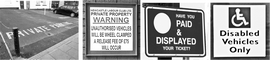
The Private Parking sign painted on the asphalt surface is needed because the terrace houses on the even-numbered side of Leazes Park Road have an area between the buildings and the pavement that was formerly front gardens but has now been turned into reserved parking. There are also small off-street car-parks on the odd-numbered side attached to clubs etc, such as the Warning sign, even a local authority carpark sign, Paid & Displayed. These three signs utilise sans serif capital letters: Warning has narrow sans serif in different sizes with WARNING and the border coloured red; Paid & Displayed has a meaningless white circle that skews the layout oddly. Disabled Vehicles has slightly widely-spaced sans serif letters with word-initial capitals. These signs are purely functional in that they convey a message with no individuality or frills, apart from the elegant layout of Warning: they suggest the voice of authority not individuality.
This sample of street signs then demonstrates some of the unique features of street signs, rather different from the written language of books and newspapers, for instance in use of capitals and lower case. The language of street signs is not free for people to use as they wish but is controlled by regulations and conventions. The materials the signs are made of have meaning as do their colours. The forms of the letters suggest aspects of identity, quality and respectability. All of these play a vital part in our understanding of the language of the street, even if we are seldom consciously aware of them.
 VIVIAN COOK is an emeritus Professor of Applied Linguistics at Newcastle University with interests in SLA and the English writing system. He was a founder of EUROSLA and of the journal Writing System Research. He has written about first and second language acquisition, language teaching, Chomsky, and writing systems, including popular books on English spelling and vocabulary and recent co-edited handbooks on multi-competence and the English writing system. He is currently writing a book on the language of the street. Email: vivian.cook@newcastle.ac.uk


