

INTRODUCTION
What’s the good of Mercator?Footnote 1
Following the pioneering voyages promoted by the Portuguese Infante Henrique – a grandson of John of Gaunt and better known as Henry the Navigator (1394–1460) – Christopher Columbus sailed to the Americas in 1492, Ferdinand Magellan (c 1480–1521) initiated the voyage that circumnavigated the world and Vasco da Gama (c 1460–1524) sailed around Africa to India. This Age of Discovery added impetus to ‘an immense upsurge of interest in geographical maps’, not only of the ‘exotic’ parts of the world, but also of areas closer to home.Footnote 2 During the sixteenth century, the process of printing from engraved plates became more widely practised and was suitable for maps. Following the success of Gerardus Mercator’s remarkable world map of 1569, Abraham Ortelius (1527–98; ODNB) from Antwerp is generally recognised as the creator of the first modern atlas, the Theatrum Orbis Terrarum (‘Theatre of the World’), which appeared in 1570 – a book so successful that it went into more than forty editions by 1641.Footnote 3 In 1573, Ortelius included in a supplementary volume, his Additamentum Theatri Orbis Terrarum, a map of England and Wales supplied by the Welsh antiquary Humphrey Lhuyd (1527–68; ODNB, sn Llwyd).Footnote 4 From this starting point, the number of maps of the British Isles included in large atlases gradually increased (notably in later issues of Mercator’s atlas, though not in Ortelius’s),Footnote 5 and it was but a further step to an atlas of Great Britain and Ireland.
Another of Ortelius’s contacts in England was William Camden (1551–1623, ODNB). Ortelius visited London in 1577 and urged Camden to draw up his notes on British antiquities into a book that would make Britain known to the scholars of Continental Europe.Footnote 6 The first edition of Camden’s Britannia sive Florentissimorvm Regnorvm, Angliæ, Scotiæ, Hiberniæ, et Insvlarvm adiacentium ex intima antiquitate Chorographica Descriptio appeared in 1586, with the first sentence acknowledging Ortelius’s inspiration; subsequent editions appeared in 1587, 1590, 1594, 1600 and 1607,Footnote 7 English translations in 1610 (by Philemon Holland)Footnote 8 and 1637,Footnote 9 a revised edition by Edmund Gibson in 1695,Footnote 10 a three-volume expanded edition by Richard Gough in 1789,Footnote 11 and a four-volume edition in 1806.Footnote 12
Before Camden, others in England had shown an interest in maps of the British Isles, including historical maps.Footnote 13 One of these forerunners, important for the present purposes because of his combined expertise in Anglo-Saxon and cartography, was the antiquary Laurence Nowell (1530–c 1570),Footnote 14 whose map of c 1564/5, titled ‘A General Description of England and Ireland with the costes adioyning’, shows a remarkably clear coastline that bears a strong resemblance to Mercator’s map of 1564,Footnote 15 a common source being indicated.Footnote 16 Nowell also compiled a series of maps that in essence comprise an atlas of the British Isles, now preserved as BL Cotton ms Domitian [A] xviii, fols 110v–123r.Footnote 17 He begins with Cornwall in the south west and then works across to Kent in the east, then moves north to cover the area stretching from south Wales in the west to Essex in the east, then north again to show the area from north Wales to Norfolk, and so on, finishing with two pages for the north of England up to the Firth of Forth. This arrangement has become standard and anyone using a modern road atlas of Great Britain will be familiar with it. Nowell adorned his maps with place names showing archaised ‘Anglo-Saxon’ spellings written in imitation Anglo-Saxon script.Footnote 18 As Keynes notes, the atlas ‘represents a dressing-up of sixteenth-century England in Anglo-Saxon costume’.Footnote 19 The information is essentially contemporary with a strong hint of being connected to the past.
Shannon concluded that Nowell was a polymath and also a dilettante.Footnote 20 But whatever about these aspects of his character, above all Nowell possessed flair. No doubt it was he who supplied the ‘Elizabethan Anglo-Saxon’ versions of laws that were found in manuscripts only in Latin, versions that misled Anglo-Saxon scholars for centuries into thinking they were genuinely Anglo-Saxon, so that it took a scholar of Kenneth Sisam’s calibre to show them for what they are.Footnote 21 At a time when there was no Anglo-Saxon grammar other than that by the Anglo-Saxon homilist Ælfric of Eynsham (c 950–c 1010; ODNB), which Nowell copied in Westminster Abbey ms 30, 3–90,Footnote 22 and the only Anglo-Saxon dictionary was the word-list that Nowell compiled himself,Footnote 23 he was able to compose in Old English, albeit imperfectly. Similarly, in his maps the plausibility of his names to some extent reflects his interest in collecting Anglo-Saxon place names; and probably the Dictionarium Angliae Topographicum et Historicum, BL Cotton ms Titus A.xiii, subsequently published in 1730 under Lambarde’s name, was largely Nowell’s work. Nowell’s interest in place names is also shown by the Old English glossary written by him in an interleaved copy of Richard Huloet’s Reference Huloet1552 Abcediarum Anglico Latinum, now in the Rare Book Room of the University of Illinois at Urbana;Footnote 24 some forty-seven pages contain place-name annotations. Shannon reports that the number of place names recorded in Nowell’s atlas – over 1,800 – is remarkable.Footnote 25 Yet, very few of them are actual Anglo-Saxon names, as opposed to archaised versions of the sixteenth-century name. Evidently, the use of archaised names was part of what Nowell was trying to achieve. It is no more than what Archbishop Parker called ‘counterfeiting in antiquity’, something also practised in Cecil’s household, where Nowell worked.Footnote 26 Archaised forms provided more than just a connection with the past: they conferred authenticity, verisimilitude and authority.Footnote 27
Following a proposal originally put forward by John Leland,Footnote 28 and published by John Bale in 1549 (STC 15445), Camden’s Britannia provided a chorographical description of Britain, starting from the records of Roman Britain and the Antonine Itinerary. He used the Roman description of the tribes in Britain as a framework for the divisions of Britain, into which the various counties were grouped. The study of topography necessitated a knowledge of place names, for which Anglo-Saxon was required, and Camden had the help of William Lambarde in trying to acquire it.Footnote 29 Although Camden’s philology, no match for Nowell’s, and described by George Boon as ‘etymological gymnastics’, was justifiably considered ‘pitiful’ by Sir Maurice Powicke,Footnote 30 his recognition of the importance of the historical study of linguistic forms, even if ‘affective’ rather than ‘effective’, helped to establish Anglo-Saxon as a necessary ingredient for the study of the past in England, and this laudable far-sightedness had notable repercussions. His approach was in the Continental tradition,Footnote 31 and the book was reprinted in Germany and Holland in 1616, 1617 and 1639.Footnote 32 It established Camden’s reputation for more than a century.
CAMDEN
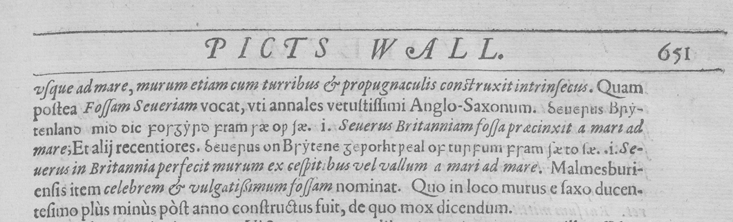
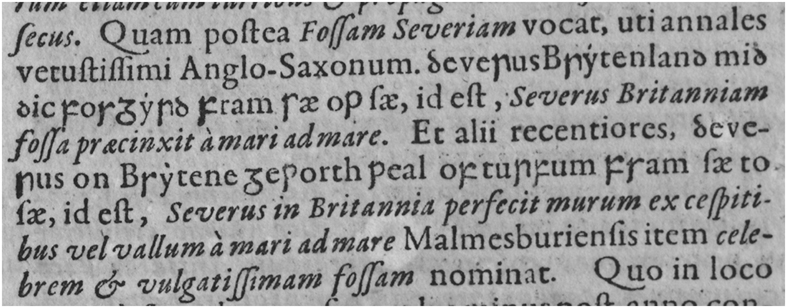
Camden’s Britannia showed this supposed knowledge of historical linguistic forms by using Anglo-Saxon types to give them apparent authenticity. The first six editions of Camden’s Britannia, from 1576 to 1607, and the first English translation of 1610 were printed by Eliot’s Court Press, whose use of Anglo-Saxon founts the author has discussed elsewhere.Footnote 33 For the present purposes a summary will suffice. The method of printing Anglo-Saxon developed by Archbishop Parker and his Latin Secretary John Joscelyn, and followed long afterwards, was to use the Anglo-Saxon forms of letters observed to differ from those in use in sixteenth- and seventeenth-century England, and to combine them with normal contemporary roman forms of the other letters. So, for example, the Parkerian Pica Anglo-Saxon (1576–1640) showed special sorts totalling twelve lower-case letters, eight capitals and three others (fig 1), the Lambardian Pica Anglo-Saxon (1576–1676) fourteen lower-case letters, five capitals and three others (for a sample, see fig 2).Footnote 34 That means that in any continuous Anglo-Saxon text, about half the lower-case letters and a majority of the capitals are roman, although in practice the amount of roman letters was more than half because most vowels, the letters occurring more frequently, were roman. These Anglo-Saxon founts were prestigious, developed by antiquaries, such as Parker and Lambarde, who put resources into them and tended to hold them, allowing only their chosen printers to use them.
The Parkerian Pica Anglo-Saxon type-design in the specimen on sig 23G4v/b (p 1,116) of Foxe’s Book of Martyrs, John Day, London, 1576 (STC 11224). The specimen shows how some letters are the usual roman ones and some are special sorts made to conform to their appearance in original manuscripts. Note the dotless i, which is distinctive in the Parkerian designs. By courtesy of the Master and Fellows of Peterhouse, Cambridge, shelfmark E.11.17

The Lambardian Pica Anglo-Saxon type-design shown in text containing two short extracts from the Anglo-Saxon Chronicle 188/189 C + F versions: ‘Severus sealed off Britain with a dike from sea to sea’ + ‘Severus built a wall of turf in Britain from sea to sea’. In the first passage  and
 are erroneous for and
 þ respectively. In the second passage
 is erroneous for . From Camden Reference Camden1607, sig 4Y4r (p 651). CUL L*.8.30(B) by permission

On the death of Archbishop Parker’s printer, John Day, in 1584, the Parkerian Pica Anglo-Saxon fount apparently went to another printer/publisher, Ralph Newbery, who proceeded to use it instead of the Lambardian Pica, which disappeared from use for ten years. Following the death of the printer Henry Bynneman in 1583, much of his printing materials went to the newly formed printing group known as Eliot’s Court Press,Footnote 35 with whom Newbery was associated. This press was to be of considerable importance in the printing of Anglo-Saxon for the next sixty years or so. For Ralph Newbery, the Eliot’s Court Press printed the first two editions of William Camden’s Britannia in 1586 and 1587, both utilising the Parkerian Pica Anglo-Saxon type-design;Footnote 36 Eliot’s Court Press also printed the third edition in 1590 for George Bishop, which also used the Parkerian Pica Anglo-Saxon.
In 1594, the appearance of the fourth edition of Camden’s Britannia, printed by Eliot’s Court Press for George Bishop, signals a change in the usage of the two Pica Anglo-Saxons: they appear mixed together.Footnote 37 Presumably, the Press acquired the Lambardian Pica Anglo-Saxon stock associated with Ralph Newbery (d. 1604) since nothing further came out under his name containing Anglo-Saxon. This mixed Parkerian-Lambardian fount appears again in the fifth edition of Camden’s Britannia (1600) printed at Eliot’s Court Press, probably by Edmund Bollifant (alias Carpenter) for George Bishop.Footnote 38 Meanwhile, the mixed fount appeared under the imprint of Thomas Wight and Bonham Norton in the sixth edition of Lambarde’s Eirenarcha (Reference Lambarde1599),Footnote 39 and again under the imprint of Thomas Wight in the seventh edition (1602).Footnote 40 Apart from the case of John Speed’s Theatre of The Empire, to be discussed below, this mixed fount occurs again only rarely.Footnote 41 With the exception of the printing associated with Thomas Wight, all of these instances relate to the Eliot’s Court Press.
In 1607 another change took place. Since there is no evidence that the Lambardian Pica Anglo-Saxon fount in its pure form (without admixture of Parkerian letter-sorts) was used between 1582 and 1607, this change perhaps reflects the casting of a new set of types from the matrices for Eliot’s Court Press.Footnote 42 The Lambardian Pica Anglo-Saxon designs occur exclusively (without any admixture of Parkerian designs) in the sixth edition of Camden’s Britannia printed by Eliot’s Court Press for George Bishop and John Norton 1 (Camden Reference Camden1607), and the English translation of Camden’s Britannia printed by Eliot’s Court Press for George Bishop and John Norton 1 (Camden Reference Camden1610). This sixth edition of Camden’s Britannia (Camden Reference Camden1607) differed from those that preceded it not only in the Anglo-Saxon fount used, but also cartographically. It showed not just one map for England, but one map for each county, altogether fifty-five double-leaf and two single-leaf maps. Based on the surveys of John Norden (1548–1625; ODNB) (BME 494–5), Christopher Saxton (1542(?)–1610(?); ODNB) (BME 585) and George Owen (1552–1613; ODNB), these maps were engraved by William Hole (fl. 1601–24; ODNB) (BME 324–5), an Englishman, and William Kip (fl. 1585–1618; ODNB) (BME 373–4), who, like Mercator and Ortelius before him, was probably Flemish in origin. Because the engraved plates had to be printed separately from type, the only way text and maps could be combined was to print them back to back, and this is what was done in Camden’s Reference Camden1607 Britannia. Wherever maps occur, they are printed with text on the reverse side; of course, there are many pages of text that do not have a map on the reverse.
SPEED
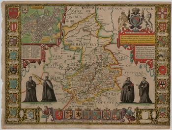
It is perhaps for this reason, that the maps are subservient to the text, that Camden’s work tends to be overlooked by map-historians, who credit John Speed (1552(?)–1629; ODNB) (BME 623–4) with ‘the first atlas of the British Isles’.Footnote 43 Yet, Camden’s Britannia was the forerunner of Speed’s ambitious two-volume magnum opus, The Theatre of The Empire of Great Britaine: Presenting an Exact Geography of the Kingdomes of England, Scotland, Ireland, and the Iles adioyning: With the Shires, Hundreds, Cities and Shire Townes, within Y e Kingdome of England, Divided And Described by John Speed, in four books (one each for England, Wales, Scotland and Ireland),Footnote 44 followed by The History of Great Britaine under the Conquests of y e Romans, Saxons, Danes and Normans. Their Originals, Manners, Warres, Coines & Seales: With y e Successions, Lives, Acts & Issues of the English Monarchs from Julius Cæsar, to our most Gracious Soueraigne King James, in a further six books, both volumes first published in 1611–12; there were several further editions through the seventeenth century.Footnote 45 Speed was evidently encouraged by Camden and for his Theatre of The Empire Speed used an abridged text of Camden’s Britannia.Footnote 46 Camden was also helpful in securing the services of Jodocus Hondius (Joost de Hondt, 1563–1612; ODNB) (BME 328–9) to engrave the majority (thirty-three) of the maps instead of Speed’s intended engraver, the Flemish-trained William Rogers (fl. 1584–1619; ODNB) (BME 565–6). Hondius, like Ortelius, came from Flanders, and took refuge from the political troubles in Ghent to set up business in London in 1584; he stayed until 1593, when he moved his business to Amsterdam. In a letter to Hondius dated 27 April [1607], Camden recommended Speed to Hondius.Footnote 47 It was a good recommendation: Hondius was the ‘head of the greatest firm of map engravers at Amsterdam’,Footnote 48 the premier engraver of his time who had bought the business of Mercator. His engravings, together with Camden’s text, helped to establish Speed’s Theatre as not only a pioneering work, but a work of quality, one that is still treasured with hand-coloured maps in modern editions;Footnote 49 fig 3 shows a proof sent from Amsterdam during the preparation of the work and then hand-coloured. We should note that this quality was achieved by combining maps printed from plates engraved in Amsterdam with text conceived and printed in London. Because the text of each county had to be printed on the back of the sheet containing the map on the front, the size of type used for that text varied according to the amount of text, so for most counties it is English-size or Pica, for some, such as Norfolk, contributed by the more wordy Sir Henry Spelman, it is the smaller Long Primer. The Anglo-Saxon sorts used are always Pica, whatever the size of the roman, so they look slightly small against the English-size roman and rather large against the Long Primer roman.
The map of Cambridgeshire from a proof of Speed (Reference Speed1611a) sent by Hondius from Amsterdam, showing the county and those adjoining, with a town plan of Cambridge in the top left-hand corner, the royal arms in the top right-hand corner and surrounded at the sides and the bottom by the crests of the colleges and noble families, all hand-coloured. CUL Atlas 2.61.1, map 12, by permission. Available at https://cudl.lib.cam.ac.uk/view/PR-ATLAS-00002-00061-00001/12 (accessed 7 June 2018)

Speed followed Camden’s lead in printing the supposed etymological form of English county names in Anglo-Saxon. We can briefly review the progress of these Anglo-Saxon types through the editions of Speed’s Theatre during the seventeenth century.Footnote 50 The second imprint, by John Beale (fl. 1611–43†), who was Hall’s associate in printing Speed’s Historie in 1611–12, occurred in 1614. Like the first edition of 1611–12, it too used a combination of the two Pica Anglo-Saxon type-designs, the Parkerian and the Lambardian. Evidently, they were passed on by Hall to Beale, probably under the watchful eye of the publisher, George Humble ((?)–1640; ODNB) (BME 335–6). In the 1616 edition, where Speed’s English text is translated into Latin by Philemon Holland (who had in 1610 produced the English version of Camden’s Latin text), again there appears a combination of the Parkerian and the Lambardian Pica Anglo-Saxon type-designs. The printer was Thomas Snodham (fl. 1609–25†) and the publisher was George Humble together with his uncle John Sudbury (fl. 1610–15). The 1627 edition of Speed’s Theatre was printed by John Dawson (fl. 1613–34(?)†), and the publisher again was George Humble. Here too we find the same combination of Pica Anglo-Saxon type-designs as before, and the common link again is George Humble the publisher. When Humble died in 1640 his rights to Speed’s Theatre etc, the plates, and probably the Anglo-Saxon types, were inherited by his eldest son William, later Sir William Humble (fl. 1640–59) (BME 336). He did nothing with them, but in 1659, when he ceased business, he sold them to one William Garrett (BME 255). He in turn did nothing with them, but they were evidently transferred to Roger Rea the Elder (1665†) and Roger Rea the Younger (fl. 1650–62(?)68) (BME 546). They were the publishers of the next edition of Speed’s Theatre,Footnote 51 published in 1650 according to the title page, yet in reality later (probably 1665),Footnote 52 printed by Mary Simmons (fl. 1656–67) and Samuel Simmons (fl. 1665–78). Once again, the same combination of Anglo-Saxon type-designs is used. The most obvious explanation of this successive use of the same Anglo-Saxon type-designs in combination is that they were passed down together with the plates made by Hondius.Footnote 53 The last edition to use Anglo-Saxon types came out in 1676 under the aegis of the publishers Thomas Basset (fl. 1658–96) (BME 57) and Richard Chiswell (fl. 1667–1711; ODNB) (BME 143–4), who had acquired the plates from Roger Rea the Younger. Presumably, they acquired the Anglo-Saxon types as well, as again the same combination of the Parkerian Pica and Lambardian Pica appears, now almost a century since they were first used. In this 1676 edition, both these Elizabethan type-designs make their last appearance of the century;Footnote 54 otherwise, the latest occurrence of the Parkerian Pica Anglo-Saxon is 1640, and the latest occurrence of the Lambardian Pica Anglo-Saxon is 1670.Footnote 55 Apparently, they were held by the successors to George Humble, even through the Great Fire of London in 1666. It is a remarkable story of a combination of specialist type-designs first found in 1594, and now found in 1676 mainly by virtue of their use in successive printings of one book. And this story complements the story of the plates engraved by Hondius in the first decade of the seventeenth century. Acquired by Humble after 1608, they went through a succession of owners and were used in a succession of editions of the same book up to 1676.Footnote 56
SOCIAL NETWORKS
Behind this collaboration and mutual encouragement lay a social intellectual network, a sort of club of scholarly gentlemen known as the Society of Antiquaries. Before this Elizabethan phase of the Society was effectively suppressed by King James i, William Camden, Richard Carew, Sir Robert Cotton, William Lambarde, John Stow, Sir Henry Spelman and Francis Thynne were all members of this Elizabethan Society of Antiquaries, which met regularly between 1584/1586 and 1606/1608, a period that more or less coincided with the time that elapsed between the first and last editions of the Britannia issued by Camden in his lifetime (1586/1607).Footnote 57 The social intellectual network extended to the Continent. As we have seen, Camden corresponded with Hondius in Amsterdam, and he and Spelman in particular had an extensive range of Continental correspondents.Footnote 58 Perhaps even more notably, as we shall see, the Latin text from Camden’s Britannia, complete with (inaccurate) Anglo-Saxon place-name etymologies and a short extract from the Anglo-Saxon Chronicle,Footnote 59 was used as the textual accompaniment to the Great Britain and Ireland volumes of the great multi-volume world atlases produced by the rival Amsterdam publishing houses of Blaeu and Janssonius.
By this time there was not only a social intellectual network supporting this kind of antiquarian publication, but also a small business network. Speed’s ambitious project needed trade support and he received it from the bookseller George Humble, who had a shop in Popes-head Alley in London. On 29 April 1608, Humble was granted a privilege to print Speed’s work for twenty-one years.Footnote 60 Humble seems to have enjoyed a virtual monopoly of map-publication in London until his death in 1640.Footnote 61 From the subsequent history of the editions it is evident that Humble must have held the plates, and almost certainly the Anglo-Saxon types as well. The amount required was small, so probably they were types, rather than matrices or punches. It was probably Humble who acquired these mixed special sorts from Elliot’s Court Press, the printers of Camden’s Reference Camden1594 and 1600 Britannia, and passed them on to Speed’s printer William Hall (fl. 1598–1614). Alternatively, Humble might have acquired them from the author or printers of the 1599 edition of Lambarde’s Eirenarcha; both printers, Thomas Wight and Bonham Norton, were also booksellers. Or the printers could have acquired them from each other. But these alternatives are probably more theoretical than real.
BLAEU
The Dutch equivalent of an atlas of the British Isles combined with Camden’s Latin textFootnote 62 first appears in 1645 in the form of Joan Blaeu’s Theatrum Orbis Terrarum sive Atlas Novus, Pars Qvarta (Joan Blaeu 1, Amsterdam, 1645).Footnote 63 It heralds quite an industry.Footnote 64 A second edition with the same title appeared in 1648,Footnote 65 and a third edition in 1662 with the title Geographiæ Blavianæ Volumen Quintum, quo Anglia, quæ est Europæ Liber Undecimus, continetur (= Atlas Maior, vol 5; Joan Blaeu 1, Amsterdam, 1662).Footnote 66 These were just the Latin editions. In the same year as the first Latin edition (1645), there appeared a French edition: Joan Blaeu, Le Theatre du Monde, ou Nouvel Atlas, mis en lumiere par Guillaume et Iean Blaeu, Quatriesme Partie (Joan Blaeu 1, Amsterdam, 1645).Footnote 67 And a second edition of the French edition appeared in 1662: Joan Blaeu, Cinqvième Volvme de la Geographie Blaviane, contenant L’Angleterre, qui fait l’onzième Livre de L’Europe (= Atlas Maior, vol 5; Joan Blaeu 1, Amsterdam, 1662).Footnote 68 The first Dutch edition appeared in 1647: Joan Blaeu, Toonneel des Aerdrycx, oft Nievwe Atlas, uytgegeven door Wilhelm en Johan Blaev. Vierde Deel (Joan Blaeu 1, Amsterdam, 1647).Footnote 69 The second Dutch edition appeared just a year later: Joan Blaeu, Vierde Stvck der Aerdrycks-Beschryving, welck vervat Engelandt (Joan Blaeu 1, Amsterdam, 1648).Footnote 70 At that time the southern part of the Low Countries was under Spanish control, so there is no surprise to see a Spanish edition, first published in 1659: Joan Blaeu, Nvevo Atlas del Reyno de Ingalaterra [sic] (= Atlas Mayor, vol 5; Joan Blaeu 1, Amsterdam, 1659).Footnote 71 Altogether, Blaeu’s new atlas appeared in nine editions in the space of eighteen years, three Latin, two French, two Dutch and one Spanish. In fact, there were ten editions, as there was also one in German: Joan Blaeu, Novus Atlas, Das ist Welt-Beschreibung mit schönen newen auszführlichen Land-Taffeln in Kupffer gestochen und an den Tag gegeben (= Atlas, vol IV; Joan Blaeu 1, Amsterdam, 1646).Footnote 72 But despite showing Anglo-Saxon in the specimen on sig. 2***1r, this book has the main text printed in a German Fraktur type-design, with Anglo-Saxon printed in roman (without special sorts) when required (for example, 7C2v (456)), so this has been left out of the account here.
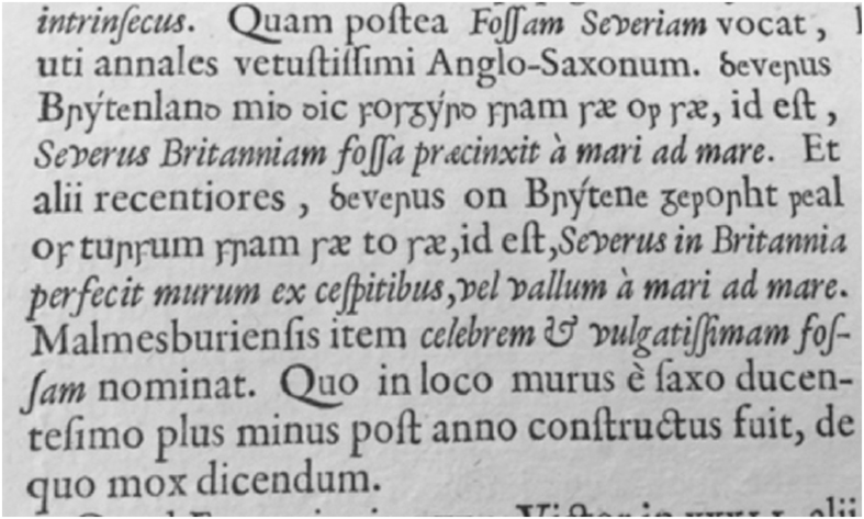
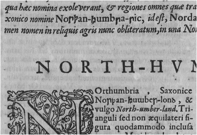
No doubt Blaeu’s interest in Camden’s Britannia began before 1645. His father, Willem Janszoon Blaeu (Mellot 545), had published an abridged version, in epitomen contracta by Reinier Telle of Zierikzee in 1617. The book was published again in 1639, still in the name of Willem Blaeu, even though he had died the previous year. Three years before his death, Willem Janszoon had become chief cartographer to the Dutch East India Company, a position inherited by his son. Evidently, Blaeu father and son worked together, as is reflected by both their names appearing in the title of the first French and Dutch editions of the Novus Atlas (1645 and 1647). Perhaps the little books published in 1617 and 1639 stimulated the market and the younger Blaeu decided to proceed with something far more ambitious. In his reproduction of maps, he followed the model of Speed. Skelton notes Blaeu’s indebtedness to Speed for fifty-three out of the fifty-nine maps in the 1645 Novus Atlas.Footnote 73 He also modelled his engraved title page on that in Speed, which was engraved by Hondius,Footnote 74 a striking instance of the wanderer returning home. He could have based his text on Speed, also. Speed’s Theatre of the Empire appeared in a Latin edition, the Theatrum Imperii Magnae Britanniae, translated by Philemon Holland (1532–1637; ODNB), printed, as we have already noted by Thomas Snodham in 1616. Latin being the international lingua franca of scholarship, and English being then little known on the Continent, Continental publishers naturally preferred a Latin text. However, the abridged version of 1617, reprinted in 1639, was not based on Speed, and there is no doubt that Blaeu preferred Camden’s own unabridged text. It is all there, including the section on the ‘Pictish Wall’ between Cumberland and Northumberland (fig 4), a section containing the quotations from the Anglo-Saxon Chronicle, which was cut out by Speed. A small example will illustrate how slavishly Blaeu followed the usage in Camden’s text. In Camden’s Britannia of 1607 on sig. O1 (p 153), the supposed Anglo-Saxon form of Dorset is cited as  (the first
 is erroneous for
 ) and then the form is repeated ten lines lower down as
 . These forms are taken over slavishly by Blaeu Reference Blaeu1662, sig. 2F1 (p 101)). By contrast, Speed conflates them into one (the second), which appears as
 (1611, sig. E1 (p 17)) and
 (1616, sig. N1 (p 17)), both with the additional error of final ‘’ for ‘n’. Speed was evidently regarded as authoritative in respect of the maps, but not in respect of the text.
The Blaeu/Voskens Pica Anglo-Saxon type-design in the same passages from the Anglo-Saxon Chronicle as in fig 2, whence the errors in the first (but not the second) passage are taken over. Note that the y has an acute accent over the right-hand stem rather than a dot over the centre of the letter. From Blaeu Reference Blaeu1662, 3rd Latin edn, sig 6Q1v (p 370). CUL Atlas 2.66.5 by permission

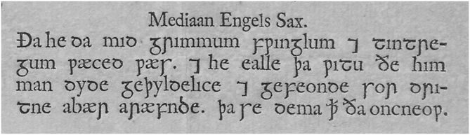
Like Camden’s Britannia and Speed’s Theatre, Blaeu’s atlases show Anglo-Saxon types. This Blaeu Anglo-Saxon was not imported from England. At this time, Dutch punchcutters led the world. Indeed, the first Anglo-Saxon type-designs produced in the seventeenth century were actually Dutch. Unfortunately, in response to a political situation, they were not as well planned or executed as they might have been.Footnote 75 Alongside Cristoffel van Dijck, who was the foremost punchcutter of the century, there were others who were also outstanding. In particular, there were the half-brothers, Bartholomeus Voskens (the elder; 1613/16–1669) and Reinier/Reinhard Voskens (1621–c 1670).Footnote 76 One of them is the probable cutter of this Blaeu Anglo-Saxon. First appearing in an atlas of 1645, it occurs fifty years later in the Heirs of Joan Blaeu type-specimen of 1695 as ‘Augustyn Engels-Saxische Letteren’ on sig. D1;Footnote 77 that is to say, it claims (misleadingly) to be English-size. The letters are shown in a single line, beginning with capitals. However, exactly the same design in the same size also occurs as ‘Anglo-Saxon Mediaan’ in the one of the Widow of Dirk Voskens & Sons type-specimens of c 1707 (fig 5); that is to say, it is described as a Pica.Footnote 78 Since the body-size can be estimated from the four lines printed in the Widow Voskens specimen as 80, the dimensions are body 80, face 80 × 1.6: 2.5; so technically it has to be a Pica. It seems reasonable to conclude that it was cut by one of the Voskens half-brothers, Bartholomeus and Reinier, as they were the two punchcutting members of the family who were active in the early 1640s. It shows twelve lower-case letters, d, e, f, g, h, i (in the Widow Voskens specimen only) r, s, t, þ ‘thorn’, ð ‘eth’,  ‘wynn’, seven upper-case letters, Æ ‘Ash’ (two designs), E, M, S (assuming this letter, which occurs at the end after the lower-case letters, is a capital, as in the Widow Voskens’ specimen it is used as lower-case d), Ð ‘ETH’, X, and two others,
 (abbreviation for ‘that’), and the Tironian sign
 for ‘and’. Notably, there is no special Anglo-Saxon lower-case y (used as a vowel in Old English) in these specimens.Footnote 79 The predominant model for them is undoubtedly the Lambardian Pica Anglo-Saxon found in the 1607 edition of Camden’s Britannia (see fig 2). Features recalling the Lambardian Pica Anglo-Saxon are the:Footnote 80
The Blaeu/Voskens Pica Anglo-Saxon type-design in the Widow Voskens specimen of c 1707. The passage is taken from Wheelock Reference Wheelock1643, sig G1 (p 33/38): OE Bede, I.7 (extract), as Miller 1890–Reference Miller8: I.36/33 to 38/2: ‘Then he [St Alban] was afflicted with grievous scourging and tortures, and for the Lord’s sake he suffered and endured patiently and with joy all the punishments that men did to him’. From Leiden, Rijksuniversiteitsbibliotheek, F. 11: 24 by permission. The whole sheet is reproduced in Hellinga Reference Hellinga1962, ii, pl 160

• letters e and h, which do not occur in the other sixteenth-century Anglo-Saxon type-designs (though the Lambardian h is very similar to the Parkerian capital H);
• broader bar of letters t and Ð (see fig 5);
• g with the link not projecting very far leftwards (see figs 4 and 5);
• capital M with left and right shoulder the same height; and
• use of capital S for lower-case d (see fig 5, aræfnde).
However, one feature recalls the Parkerian Great Primer Anglo-Saxon: the capital X, which occurs only in this design.Footnote 81 And another feature recalls either the Parkerian Great Primer Anglo-Saxon or the Parkerian Pica Anglo-Saxon: the letter i with no dot (see fig 1) is exclusive to these Parkerian designs. Evidently, the designs for the Blaeu Pica Anglo-Saxon were based primarily on the Lambardian Pica Anglo-Saxon with two features probably from the Parkerian Great Primer Anglo-Saxon. These English sixteenth-century models were used in the printed books by Camden, Speed, Lambarde and Parker. There is no distinctive trace of influence from the Anglo-Saxon type-designs made for seventeenth-century English books.Footnote 82
JANSSONIUS
Blaeu had a competitor, and the competition was so intense that his father, Willem Janszoon, adopted his grandfather’s nickname ‘Blaeu’ (‘blaewe Willem’) to distinguish his firm from that competition.Footnote 83 The competitor was Jan Janszoon (usually anglicised as Jansson; 1588–1664), better known under the Latinised form of his name used in his publications: Joannes Janssonius (fl. Amsterdam, 1613–64) (Mellot 2747). Janssonius was the son-in-law of Jodocus Hondius by virtue of his marriage to Elisabeth de Hondt (d. 1627), and had already been involved in producing atlases with Jodocus’s son Henricus Hondius.Footnote 84 His first atlas of the British Isles combined with Camden’s Latin text appeared a year after Blaeu’s:Footnote 85 Joannes Janssonius, Novus Atlas, sive Theatrum Orbis Terrarum, in quo Magna Britannia, seu Angliæ & Scotiæ Nec non Hiberniæ, Regna Exhibentur, vol iv (Joannes Janssonius, Amsterdam, 1646).Footnote 86 Again, the first edition was in Latin, and there was a second Latin edition published in 1659: Joannes Janssonius, Novus Atlas, sive Theatrum Orbis Terrarum, vol iv (Joannes Janssonius, Amsterdam, 1659).Footnote 87 In the same year as the first Latin edition, there appeared a French edition: Joannes Janssonius, Le Nouvel Atlas ou Theatre du Monde, auquel est representée La Grande Bretagne, contenant les Royaumes d’Angleterre, d’Escosse & d’Irlande, vol iv (Joannes Janssonius, Amsterdam, 1646);Footnote 88 it has, of course, the same maps as the Latin edition, but with a French translation of Camden’s text, and with some rearrangement in the order of counties and additional passages marking the introduction of south and north Wales and Yorkshire, and a new description of the Fens. The following year came the Dutch edition: Joannes Janssonius, Nieuwen Atlas, ofte Werelt-Beschrijvinghe vertonende Groot Britannien, vervattende de Koninghrijcken van Engelandt Schotlandt ende Yrlandt. Het vierde deel (Joannes Janssonius, Amsterdam, 1647).Footnote 89 Here some economy of scale or effort is shown by the lack of preface and the accounts of the counties are much abbreviated (without illustrations) so that most fit on two pages – that is, the other side of the sheets containing the maps – and the arrangement by Celtic tribes is abandoned; the text for some Welsh counties, and that for the Pictish Wall (including the quotations from the Anglo-Saxon Chronicle) are omitted. So, there were four editions of Janssonius’s Atlas, two Latin, one French and one Dutch. In fact, there were five, as there appeared also a German edition, again in 1647: Joannes Janssonius, Novus Atlas, oder Welt-Beschreibung, in welcher ausführlich abgebildet Die Königreiche Engelland, Schotland und Irland. Das vierdte theil (Joannes Janssonius, Amsterdam, 1647).Footnote 90 Despite showing Anglo-Saxon in the specimen on sig. 2*2v, this book has the main text printed in a German Fraktur, with Anglo-Saxon printed in roman (without special sorts) when required, so it has been left out of this account for the present purposes. After Janssonius died in 1664, the business was carried on by his son-in-law, Johannes Janssonius van Waesbergen.
Janssonius’s indebtedness to Speed is again shown in the maps, some forty-one out of fifty-six of them. But the text is generally unabridged from Camden. The instance of slavish copying of Anglo-Saxon forms cited above for Blaeu, involving and is repeated in Janssonius (Reference Janssonius1646, sig. 2P2v (p 128)). However, the Dutch edition of 1647 is different in that the accounts of the counties are much abbreviated (without illustrations) so that most fit on two pages; that is, the other side of the sheet containing the map for each county. The main text is printed in varying sizes, predominantly an English-size, but sometimes a larger Great Primer (Nottinghamshire on sig. 3C) and sometimes a smaller Pica (Norfolk on sig. 2Y),Footnote 91 and sometimes the size changes to a smaller one towards the bottom half of the b-column on the verso side (in order to fit material in on the page), for example, on sigs  2v, 3L2v, 3O2c1v, 3O4c1v. This arrangement recalls Speed’s Theatre of the Empire, although with inferior presswork. In fact, the text used is Speed’s, not Camden’s, as is clear, for example, when the text for Norfolk on sig. 2Y1 (p 131) is collated with Speed’s Theatrum Imperii (1616) sig. L1 (fol 13), where the text is the Latin version of that supplied for Speed by Sir Henry Spelman, now in Dutch translation. Why Janssonius made the Dutch edition differently is not clear. Perhaps he thought the Dutch atlas could be produced more quickly with Speed’s abridged text than with Camden’s full text. In this case it seems, in defiance of the common maxim, the more haste, the more Speed – and the less Camden.
Janssonius was a very busy man, an international entrepreneur with outposts of his business in Berlin, Copenhagen, Danzig, Frankfurt, Geneva, Königsberg and Lyon; in particular, he was summoned to Stockholm by Queen Christina of Sweden around this time.Footnote 92 So it is probably no surprise that Janssonius’s Novus Atlas of 1646 shows several signs of haste in production, as noted generally by Skelton.Footnote 93 There are instances of changing type-size in mid-column, and there is the use of different English-size italics in conjunction with Haultin’s English-size roman used for the main text. Mostly, Robert Granjon’s third English-size italic is used, but another italic is used on sigs 5I–5P, and yet another on sigs 5Q–5T, suggesting that different typesetters with different cases of type were at work simultaneously towards the end, thus maximising speed of completion, but without attention to aesthetic homogeneity. The same stricture applies to the Anglo-Saxon types used by Janssonius, which were evidently the result of insufficient forethought and preparation, and are of much lower quality than the Blaeu Pica Anglo-Saxon (figs 6, 7, 8, 9). They are not found in any type-specimen, not even Janssonius’s own (posthumous) type-specimen of 1666.Footnote 94 Each atlas has an Anglo-Saxon specimen, showing twenty-one sorts altogether, eleven lower-case letters, d, e, f, g, r, s, t, y, þ, ð, , eight capitals, Æ1, Æ2, E, H, M, S, Ð, X, and two others, the Tironian sign  and
 the punctus elevatus punctuation mark for a mid-pause. This specimen does not, however, show all the sorts, although it does show capital sorts that are not found in the text. In particular, Janssonius seems to have had two sizes made of ten letters: f, g, H, r, s, t, þ, , M, S. Caveats here are that (1) the two H-forms may have been intended to be lower-case and capital, but if that were so they were not so distinguished in use; (2) the forms of t are not in fact special sorts, but inverted 2s, a short-cut used previously by the Leiden printers of Selden’s Mare Clausum in 1636.Footnote 95 The majority of the sorts are English-size and combine well from the point of view of size with Haultin’s English-size roman used for the main text. The atlas also features head-notes set in François Guyot’s Great Primer italic (no. 1 in the Janssonius Reference Janssonius1666 specimen, A2v) in which Anglo-Saxon words occur using Anglo-Saxon sorts combined with a Great Primer roman (no. 2 in the Janssonius Reference Janssonius1666 specimen, A2v; see fig 6). In these instances, larger Anglo-Saxon sorts were desirable, so it seems reasonable to suppose that the seven lower-case larger sorts, which are Great Primer in size, were presumably made to fit with the Great Primer roman. This ambitious plan, if such it was, did not work out well in practice, because the two sizes of Anglo-Saxon sorts are mixed up in use.
The Janssonius ‘Pica’ Anglo-Saxon type-design in the same passages from the Anglo-Saxon Chronicle as in figs 2 and 4. The errors in both passages are taken over from fig 2. In the second passage,  is an additional mistake for
 . From Janssonius Reference Janssonius1646, 1st Latin edn, sig 5Z2v (p 336). CUL Atlas 3.65.4 by permission

The Janssonius Pica and English-size type-design showing the two sizes. The upper part, from an introductory passage set right across the page in the larger Great Primer type-size, shows three different letters r. The lower part from the left-hand column of text shows (appropriately) a smaller  ; note the inverted m. From Janssonius Reference Janssonius1646, 1st Latin edn, sig 6A1v (p 338). CUL Atlas 3.65.4 by permission

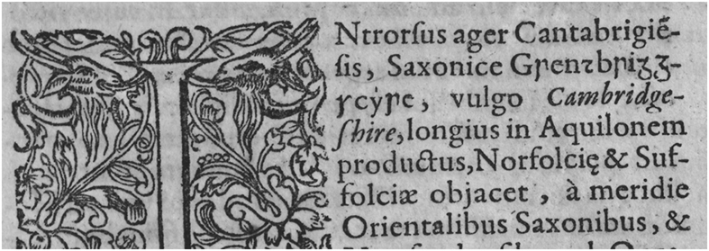
The Janssonius Pica Anglo-Saxon type-design in ‘Cambridgeshire’ showing two different gs side by side, two different rs and inverted 2 for t. From Janssonius Reference Janssonius1646, 1st Latin edn, sig 3R2v (p 200). CUL Atlas 3.65.4 by permission

(see previous page) The Janssonius Pica and English-size type-design showing images of individual special Anglo-Saxon sorts re-assembled in alphabetical order from Janssonius Reference Janssonius1646, 1st Latin edn, with abridged translation of text from Camden’s Britannia (1607). Many letter-forms do not match each other, and some letters show what looks like an attempt at two sizes, notably g, h, t and þ. CUL Atlas 3.65.4 by permission

When images of the various sorts are examined together (see fig 9), however, it is evident that the shapes of some letters and the varying thickness of the stems in particular show greater variation than the above account allows for. For example:
1. The f is rather large, sometimes with stem tapered to the left at the top, and sheared with a serif to the left at the base, sometimes without these refinements, and the length of the bar varies (see fig 6).
2. The letter g shows considerable variation: it occurs twice side by side in
 ‘Cambridgeshire’ on sig. 3R2v/a (see fig 8), the second being noticeably larger. In neither does the tail close right round to make a counter. Similarly, on sig. X1v/a and again on sig. 5Z2v/a there are two letters g, one with the tail closed round and one where it does not do so. On sig. N2 it is larger again and set like a capital in the middle of the name ‘Picts’; this time the tail does close right round.
3. The letter r shows variation in the straightness or slight curvature of the stem, in the thickness of the strokes and in the angle or straightness of the right arm (see fig 7).
4. Some letters s are good, showing a straight stem sheared at the top and turned to the left at the base, but on sig. X1v/a two instances occur side by side and the second looks relatively crude.
5. The letter ð occurs twice on sig. 3Q2v/b in the names
and ‘[Great] Yarmouth’, the first looking firm in outline with a cross-bar angled across the ascender, but that to the right of it has a smaller counter and the cross-bar is too long and too thick.6. The letter
occurs on sig. 2B1r/a in the word ‘marshmen’ where it is decently cut with a sheared top to the stem and a terminal at the base hooked to the left; it is set rather high on the line (also in fig 6); but on sig. Z1r/b in the name ‘Maidstone’ there is another with a larger counter. On sig. 5K2v/a, an italic p is used for .
 ‘Cambridgeshire’ on sig. 3R2v/a (see
 ‘Picts’; this time the tail does close right round.
 and
 ‘[Great] Yarmouth’, the first looking firm in outline with a cross-bar angled across the ascender, but that to the right of it has a smaller counter and the cross-bar is too long and too thick.
 occurs on sig. 2B1r/a in the word
 ‘marshmen’ where it is decently cut with a sheared top to the stem and a terminal at the base hooked to the left; it is set rather high on the line (also in
 ‘Maidstone’ there is another
 .
Evidently, Janssonius had some metal special Anglo-Saxon sorts, but in his quest for speed in a competitive situation he probably supplemented them with wooden sorts that do not exactly match each other and which, consequently, detract from the professional appearance of his text. Using wood for printing is centuries old (from the ninth century in China) and can be successful. Wood is freely available, easily cut and provides a good surface for accepting ink for printing. From the fifteenth century onwards, wood was used for capitals and set alongside metal letter-sorts. During the nineteenth century, wood was used for display types, especially for posters, a technique developed particularly in America.Footnote 96 These types were large, the smallest illustrated by Kelly showing an x-height of 5.5mm. While their quality is remarkable, it is much more difficult to produce smaller type in wood, and setting wooden sorts together with metal ones is problematic. Earlier in the nineteenth century, no less a scholar than Jacob Grimm had his printer use wooden sorts before special metal sorts could be sourced.Footnote 97 His Deutsche Grammatik first appeared in 1819Footnote 98 with no special sorts, using th for þ and ð. The second edition, which came out in four volumes (1822–37) shows wooden sorts in volume i (1822),Footnote 99 and metal sorts in volume ii (1826), though even here þ is a p modified by adding an ascender to the stem.Footnote 100 So even in the nineteenth century, when technology was more advanced (though punchcutters and typefounders were no doubt thin on the ground),Footnote 101 it took Grimm from 1818 to 1826 to get from wanting special sorts to actually obtaining them in metal. Since wooden sorts often appear side by side metal sorts in Janssonius’s Novus Atlas of 1646, there was presumably a problem with supply from a typefoundry who, despite possessing matrices, could not make more metal types fast enough. Janssonius’s priorities were speed and quantity rather than quality.
CONCLUSION
So, the process has come full circle. Jodocus Hondius brought his map-engraving skills to London and practised them there for several years. He enhanced English production by the quality of his work. This work was then combined with Camden’s text, itself a quality production much admired not only in England but also on the Continent, and the two in combination were exported back to Amsterdam, where they were reproduced in the great international atlases of Blaeu and Janssonius. But no English printer or printing materials went to Holland. For the special sorts required to print the Anglo-Saxon names and passage in the text that accompanied the maps, Dutch printers had to make their own arrangements. The house of Blaeu almost certainly availed of the skilled punchcutting services of a Voskens, while the house of Janssonius was less successful in this technical requirement. It is particularly notable that while the father-in-law Hondius brought quality to the imported maps in London, the son-in-law Janssonius later failed to match it for the imported text at home in Holland. In between much happened. When Camden, dubbed ‘the nourice of antiquitie’, wrote that ‘I have gained my ends if I have set others about the same work’,Footnote 102 little did he know to what extent and in what manner he had succeeded.
DEDICATION
This article is for Rolf H Bremmer Jr, Emeritus Professor of English Philology at Leiden University.
ACKNOWLEDGEMENTS
The author is grateful to the editor and her anonymous readers for helpful suggestions for improving this paper. The author’s thanks also to Chris Quy (PC-Support, University of Cambridge) for his assistance with the images for fig 9.
ABBREVIATIONS AND BIBLIOGRAPHY
Abbreviations
- Add
Additional manuscript
- BL
British Library, London
 , Parkerian f and Lambardian s in