

Introduction
How do designers find inspiration? Ullman (Reference Ullman2003) argued that the best way to discover a good design is to generate many ideas and to learn from previous designs, in saying “to steal ideas from one person is plagiarism, to be influenced by many is good design”. Researchers have looked at masters of many disciplines to decipher what specific traits differentiate them from amateurs or even less-skilled professionals (deGroot, Reference deGroot1978; Akin, Reference Akin1990). Famous music composers Mozart and Tchaikovsky describe creativity as coming randomly and unexpectedly, but experience and preparation are necessary to recognize the ideas as worth pursuing. Brilliant composers are defined by their previous knowledge and expertise, which allows them to recognize a creative idea and transform it into something beautiful (Akin, Reference Akin1990). Similar to composers, chess grandmasters were found to recognize winning positions by remembering previous games and their results, rather than robotically evaluating all possible moves (deGroot, Reference deGroot1978). In the space of athletics, Ericsson et al. (Reference Ericsson, Nandagopal and Roring2005) found that a return of a tennis ball by elite athletes is subject to “skilled anticipation of events by identification of early predictive cues” rather than an improved reaction time. Just like composers, chess masters, and elite athletes, designers can utilize experiences with analogous design, or analogies with fields that are different from that of the design problem (Gentner, Reference Gentner1988; Vosniadou and Ortony, Reference Vosniadou and Ortony1989). When experience does not provide sufficient inspiration, external inspiration (from the patent database, nature, or elsewhere) can be employed to serve a similar purpose. This approach is known as design-by-analogy (DbA).
DbA is a tool for innovation that has gained much attention in engineering design research, not only because it has led to many breakthrough innovations [i.e., cockle burr-inspired fabric fastener, gecko-inspired non-chemical adhesive (Lee et al., Reference Lee, Lee and Messersmith2007), and lotus leaf-inspired self-cleaning outdoor surface paint (Abbott and Ellison, Reference Abbott and Ellison2008)] but also because designers use analogical reasoning to explain design concepts and at times predict potential problems (Christensen and Schunn, Reference Christensen and Schunn2007). The process involves retrieving information or knowledge from one's memory or from an external repository of existing design solutions (source), mapping that information to one's engineering design problem (target), and finally evaluating how well the underlying relations match between the source and the target. The retrieval of analogical information, particularly from external sources, has been significantly studied using computational support to facilitate DbA in practice. However, nearly all DbA tools to date have focused on a query-based approach for retrieving analogies, in which a user inputs a search term or query function and is returned a set of algorithmically determined stimuli.
In this work, the analogical retrieval process is approached from a more designer-controlled position, allowing designers to explore a space of analogies that potentially holds useful and unexpected inspiration, rather than be constrained by what is retrieved by a query-based algorithm. In contrast to keyword-based searches where patents containing those keywords are returned, the proposed approach enables designers to retrieve a collection of patents that are related to topics of interest and explore a space of potential inspiration, the way one would explore the books surrounding a particular call number on a shelf at the library to find potential resources. With this research, we present a computational tool called VISION [Visual Interaction tool for Seeking Inspiration based On Nonnegative Matrix Factorization (NMF)] that enables designers to visually explore a patent repository for analogical inspiration in a user-driven manner. Leveraging the U.S. patent database as a source of inspiration, the computational tool uses hierarchical NMF (Du et al., Reference Du, Kuang, Drake and Park2017) for topic modeling of patent data and D3.js (Bostock et al., Reference Bostock, Ogievetsky and Heer2011) for interactive data visualization. D3.js is a JavaScript library used for turning arbitrary data into an interactive data visualization. The technical approaches used for the creation of VISION are detailed in this paper. In regard to the analogical retrieval process, we also characterize the effect of increasing data size (ranging from 100 to 3000 patents) on two performance aspects of VISION – the clustering quality of topic modeling results and the frame rate of interactive data visualization – and discuss their implications on the way designers retrieve analogies using the visual interaction tool.
Background
In looking at professional designers, Fricke (Reference Fricke1996) found three traits that directly lead to positive design results: good spatial imagination, solid engineering knowledge, and the ability to recognize and rank sub-problems. These three traits allow skilled designers to isolate good ideas from a series of options. Cross (Reference Cross2004) found that expert designers are solution-focused and narrow-minded, meaning that they follow a few key parallel ideas to completion (Razzouk and Shute, Reference Razzouk and Shute2012). Expert designers also create more detailed representations of the problem since they know exactly what information they need to evaluate potential solutions (Bjorklund, Reference Bjorklund2013). Novice designers, in contrast, are more likely to attempt trial-and-error techniques (Ahmed et al., Reference Ahmed, Wallace and Blessing2003) because they lack the experience necessary to cognitively evaluate ideas prior to testing. How can a novice designer take advantage of nonexistent past experience? One way is to use analogies.
DbA studies
The use of analogies has been an active research area in the fields of cognitive science and engineering design. Researchers have contributed to this area by understanding how the introduction of analogies affects the ideation process and outcomes (Dahl and Moreau, Reference Dahl and Moreau2002; Christensen and Schunn, Reference Christensen and Schunn2005; Goldschmidt and Smolkov, Reference Goldschmidt and Smolkov2006), with some studies specifically examining how the representation and modality of information (Linsey et al., Reference Linsey, Wood and Markman2008) and analogies of different levels of applicability (Tseng et al., Reference Tseng, Moss, Cagan and Kotovsky2008) affect resultant generated design solutions. A potential negative effect of introducing analogies and examples is also examined in the exploration of design fixation (Jansson and Smith, Reference Jansson and Smith1991; Smith and Blankenship, Reference Smith and Blankenship1991; Purcell and Gero, Reference Purcell and Gero1996; Chrysikou and Weisberg, Reference Chrysikou and Weisberg2005), which occurs when a designer stubbornly clings to a single design when better ideas are available. Jansson and Smith (Reference Jansson and Smith1991) showed that introducing examples can lead designers to generate solutions that mimic the examples, to the point of violating the design problem objectives. Studies also focused on ways to mitigate the effect of design fixation. The likelihood of fixation can be reduced by designers drawing inspiration, while they have an open goal, or a task that has yet to be completed (Tseng et al., Reference Tseng, Moss, Cagan and Kotovsky2008), or if they draw multiple ideas from multiple sources (Ullman, Reference Ullman2003). Fixation can also be reduced if the analogies are worded in a vague and functional manner, as opposed to a precise and surface-level manner (Linsey et al., Reference Linsey, Wood and Markman2008; Atilola et al., Reference Atilola, Tomko and Linsey2016). This study aims to develop a DbA tool that provides inspirational analogical information to designers in a useful format, with the goal of inducing positive effects of analogies on ideation process and outcomes.
The analogies can be further explored with the concept of near-field and far-field analogies. Near-field analogies are generally found in the same or similar domain and share a significant number of surface features with the target domain. Far-field analogies, on the other hand, tend to share few or no surface-level similarities and usually come from completely different domains; these are often identified by concepts that look nothing alike but share functional similarities (Fu et al., Reference Fu, Chan, Cagan, Kotovsky, Schunn and Wood2013b). For example, Gentner and Markman (Reference Gentner and Markman1997) describe the concept of functional similarities using Johannes Kepler's analogy of the farther planets orbiting the sun slower than nearer planets being analogous to light shining brighter on nearby objects and dimmer on far away objects. Light has zero physical similarity to planets in orbit, but the concept of the force acting over a distance and decreasing as the square of the distance remains. Some researchers point to far-field analogies as being more useful for creative design (Gentner and Markman, Reference Gentner and Markman1997; Chan et al., Reference Chan, Fu, Schunn, Cagan, Wood and Kotovsky2011; Chiu and Shu, Reference Chiu and Shu2012; Goncalves et al., Reference Goncalves, Cardoso and Badke-Schaub2013). Other studies demonstrated that far and near sources have equivalent effects (Malaga, Reference Malaga2000; Enkel and Gassmann, Reference Enkel and Gassmann2010) Similarly, Tseng et al. (Reference Tseng, Moss, Cagan and Kotovsky2008) demonstrated that both far and near sources resulted in ideas of similar levels of novelty. Fu et al. (Reference Fu, Chan, Cagan, Kotovsky, Schunn and Wood2013b) showed that there is such a thing as too far and the far-field analogies can result in lower novelty and quality of ideas than near-field analogies.
The analogies have also been explored with the concept of surface-similarity and functional-similarity. Fu et al. (Reference Fu, Cagan, Kotovsky and Wood2013a) explored the analogical relationships among patents using the functional content (verbs-only text) and surface content (nouns-only text) of patent documents. Their findings show that the transfer of knowledge based on functional similarities can be extracted from the functional content of patent data and even from its surface content as well, yielding insights into different interrelatedness of patents. As an extension of the work, we created hierarchical repositories of patents that are processed to contain only component content (What specific components have been integrated in the system?), behavior content (What are the attributes of the system that describe how it behaves?), and material content (What materials does the system use or consume?) and evaluated their effect on the design process (Song and Fu, Reference Song and Fu2019). These findings demonstrate that unique design insights can arise from different representations of a patent dataset. For instance, patents are interrelated by their functional similarities in the component-based repository and by their descriptive quality in the behavior-based repository. The patents in the material-based repository, however, exhibited weak interrelationships due to the limited material content in patent documents. The authors’ prior work of extracting different analogical relationships from patents provide a foundation for the DbA tool presented in the current work.
Patent data as a source of inspiration
The U.S. patent database has been considered an ideal source for retrieving analogies during DbA (Kang et al., Reference Kang, Na, Kim and Lee2007). The U.S. patent database is a valuable source of innovation; it is large and growing, and all successful patents must, by definition, be novel, non-obvious, and industrially applicable (World Intellectual Property Indicators, 2017). The U.S. Patent Office had over 2.8 million patents in force (still legally enforced) in 2016, plus all the millions of patents that have expired (Gentner, Reference Gentner1988; World Intellectual Property Indicators, 2017). The database grows continuously in a plethora of fields and promises designers substantial opportunities to explore for inspiration in multiple domains. The patent database uses Cooperative Patent Classification (CPC), which is a standard patent classification system, to categorize the patents into specific domains for efficient patent retrieval processes (Montecchi et al., Reference Montecchi, Russo and Liu2013). There are over 250,000 CPC categories with which every patent publication is assigned at least one classification term, indicating its field of application and details of the design content. Also, patents are structurally well formed with distinct partitions and sections (abstract, description, and claims) that contain the embedded design information. The characteristics of the patent database not only make it an ideal source of innovation but also an efficient means for retrieving analogies.
Computational supports for DbA
In attempts to access the wealth of knowledge contained within the patent database, researchers have developed computational tools to aid designers in retrieving patents for DbA. For instance, Murphy et al. developed a vector space model-based search engine to create a function-based vector representation of patents. The system allows users to retrieve patent results that are relevant to the functional description of a given design problem (Murphy, Reference Murphy2011). Fu et al. (Reference Fu, Cagan, Kotovsky and Wood2013a) employed latent semantic analysis and hierarchical Bayesian inference to structure the U.S. patent database for analogical retrieval purposes. Song and Luo (Reference Song and Luo2017) used citations within patents and the listed inventors of patents as a source of analogous relationships. Koch et al. (Reference Koch, Bosch, Giereth and Ertl2011) created PatViz, which allows for patent exploration using a visual analytic system to assist users in the iterative refinement of query search results of complex patent data and to enable user-generated graph views. The difference between PatViz and VISION presented in this work is that PatViz uses the visual analytic system to assist users in refining the patent search results, while VISION uses an interactive data visualization technique to support designers in the visual exploration of analogies in structured patent repositories.
Several researchers also focused on bio-inspired design or biomimicry, which is a particular kind of DbA, that uses nature as a source of inspiration to solve engineering design problems. SEABIRD is a tool for searching biological stimuli within large natural-language biological databases (Vandevenne et al., Reference Vandevenne, Verhaegen, Dewulf and Duflou2016). Chakrabarti et al. (Reference Chakrabarti, Sarkar, Leelavathamma and Nataraju2005) developed a computational tool called IDEA-INSPIRE, which uses inspiration from biological and artificial systems to enable a systematic biomimetic search. The software is founded on the SAPPhiRE model, which represents the causality between biological and artificial systems (Venkataraman and Chakrabarti, Reference Venkataraman and Chakrabarti2009; Keshwani and Chakrabarti, Reference Keshwani and Chakrabarti2017). DANE (Design-by-Analogy to Nature Engine) provides a database containing Structure–Behavior–Function models of biological and engineering systems, in which users can search for design cases or author a new system in the library (Goel et al., Reference Goel, Vattam, Wiltgen and Helms2012). AskNature is an open-source database for browsing biological inspiration that is categorized by their functional taxonomy (Deldin and Schuknecht, Reference Deldin and Schuknecht2014). Alternative biomimetic tools are summarized below:
• BioTRIZ identifies functional analogies using a biological TRIZ contradiction matrix (Vincent and Mann, Reference Vincent and Mann2002).
• In the Bioengineering space, BioPatentMiner creates a semantic web of biologically related patents using biomedical dictionaries (Mukherjea et al., Reference Mukherjea, Bamba and Kankar2005).
• Engineering-to-Biology Thesaurus provides a translation of engineering to biology at a functional level (Nagel et al., Reference Nagel, Stone and McAdams2010).
• Cheong and Shu (Reference Cheong and Shu2014) presented a causal-relation retrieval method in the bioengineering space.
• DRACULA is an analogy-finding algorithm and repository based on biomimicry (Lucero et al., Reference Lucero, Turner and Linsey2016).
Many of the DbA and biomimetic tools reviewed here use a query-based search, which requires a designer to input a query function or a keyword to retrieve a set of stimuli that are determined by the query algorithm. The query-based tools are useful for retrieving relevant analogies in an efficient manner. However, if little guidance is provided on how to input an appropriate query, the algorithm may rule out analogies that are potentially useful for solving design problems. In a case of the WordTree DbA method (Linsey et al., Reference Linsey, Markman and Wood2012), which systematically uses the knowledge of designers and information in the WordNetFootnote 1 database, it is important to derive the key problem descriptors (query input) from functions and customer needs of design problems to leverage the existing databases to identify potential sources of analogies. Designers with limited experience are more likely to attempt trial-and-error techniques to determine appropriate input queries (Ahmed et al., Reference Ahmed, Wallace and Blessing2003). On the other hand, methods that enable exploratory search enable designers to retrieve patents from a more user-controlled position, allowing them to explore for other relevant yet unexpected sources of analogies, that are not initially determined by query inputs. We conjecture that this type of interaction is more intuitive for designers and more thorough for the analogical retrieval process. With an explorable patent repository and data visualization that enables several user interaction capabilities, VISION enables designers to search for analogical inspiration in a user-tailored manner. VISION could help both novice and expert designers to retrieve a collection of patents based on a topic of interest. Also, it could assist inexperienced designers to explore other unexpected spaces of potential inspiration that are determined by its topic modeling method. These benefits are being evaluated scientifically in a forthcoming controlled human subjects study. The following sections describe computational approaches for the creation of VISION.
Computational approaches
VISION (based on Nonnegative Matrix Factorization) is a visual interaction tool for exploring analogical inspirations in the patent database. The tool employs hierarchical NMF (Du et al., Reference Du, Kuang, Drake and Park2017) for the topic modeling of patent data and D3.js (Bostock et al., Reference Bostock, Ogievetsky and Heer2011) for interactive data visualization.
Nonnegative matrix factorization
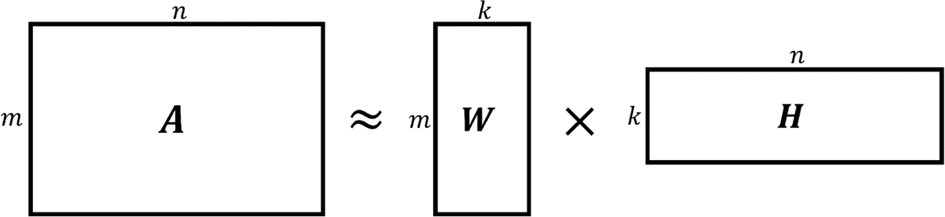
NMF is a topic modeling method by which data are analyzed (Paatero and Tapper, Reference Paatero and Tapper1994; Kim and Park, Reference Kim and Park2008, Reference Kim and Park2011). It takes an original matrix and splits it into two separate matrices based on localized features within the original. In mathematical terms, A ∈ R m×n is the original nonnegative data matrix. W ∈ R m×k and H ∈ R k×n are two daughter matrices such that k < n. The NMF algorithm shown in Figure 1 solves the optimization problem  $\min _{W\comma H}\Vert {A-WH} \Vert _F^2$, given W ij ≥ 0 and H ij ≥ 0 for each i and j (Pauca et al., Reference Pauca, Shahnaz, Berry and Plemmons2004).
Decomposition of A into W and H matrices.

As the name implies, none of these features can be negative, forcing the algorithm to isolate features that can be added together to remake the original image (Lee and Seung, Reference Lee and Seung1999). NMF has been most notably used in facial recognition (Lee and Seung, Reference Lee and Seung1999) and text mining (Pauca et al., Reference Pauca, Shahnaz, Berry and Plemmons2004; Choo et al., Reference Choo, Lee, Reddy and Park2013). NMF is particularly applicable to text mining because words can only appear in a document a positive number of times, which is the primary restraint of NMF. NMF is faster than other popular data analysis tools, such as latent semantic indexing and spectral clustering methods (Xu et al., Reference Xu, Liu and Gong2003), and NMF provides more consistent results than latent dirichlet allocation (Cichocki and Phan, Reference Cichocki and Phan2009; Choo et al., Reference Choo, Lee, Reddy and Park2013; Greene et al., Reference Greene, O'Callaghan and Cunningham2014). All of the literature up to this point consists of a “flat” analysis. In other words, the NMF approach splits the original matrix into two matrices with k topics. Either the user or some algorithm has to define k, which can be inconsistent and/or require surplus processing. One solution is to pick an arbitrary value for k and run the program multiple times.
Kuang and Park proposed a solution to this problem. Instead of performing extra analyses to determine the number of topics in the original matrix, they created a hierarchy of NMF clusters, in which each cluster included k = 2 topics. This not only increases the speed of the calculation but also provides intermediate hierarchical clusters to further sort the data (Kuang and Park, Reference Kuang and Park2013; Lim et al., Reference Lim, Du and Park2018). This hierarchical NMF approach is employed here, with VISION.
Data visualization
The data visualization tool used in this work called D3.js offers powerful interactive capabilities. The following section gives a brief overview of the programming methods and tools that make up D3.js. First, it is a web-based platform, so we start with the web itself.
The web
The World Wide Web (web) consists of pages and interactions that allow the user to view countless webpages. Each of these pages consists of a Hypertext Markup Language (HTML) script that provides an outline for the page. The user's browser retrieves the HTML file from the server and interprets the HTML information as an outline for what the page should look like (Murray, Reference Murray2017).
Hypertext Markup Language
HTML “is the World Wide Web's core markup language” (W3, 2017). It controls the physical outline of the document, but can also bring in other files to affect the user experience. This hierarchy and ability to link to other files is known as the Document Object Model (DOM) (Philippe Le Hégaret et al., Reference Philippe Le Hégaret and Wood2000; Mozilla Developer, 2019).
Document Object Model
The DOM allows improved readability and efficiency of the HTML code by allowing key aspects to be saved in separate files that are linked from the HTML hierarchy. Two key file formats that often accompany an HTML file are Cascading Style Sheets (CSS) and JavaScript (Duckett, Reference Duckett2010). These three formats (HTML, CSS, and JavaScript) make up the content, presentation, and behavior, respectively, of a document (Hyslop, Reference Hyslop and Wimpsett2010).
Cascading Style Sheets
CSS provides the visual presentation of an HTML document such as colors, sizes, and coordinates of texts, lines, and shapes (Murray, Reference Murray2017).
JavaScript
JavaScript provides the functionality for an HTML document. While JavaScript and the DOM are closely related, and some will mistakenly refer to them synonymously, they follow different standards and are distinct entities (Reid, Reference Reid2013). Without JavaScript, the DOM would load once and display a static page forever. JavaScript gives the user the ability to manipulate the DOM in real time (Murray, Reference Murray2017). For a non-programmer, JavaScript by itself can be quite overwhelming. D3.js is one of a plethora of libraries designed to make data visualization in JavaScript easier for nonprofessional web developers.
Data-Driven Documents (D3.js)
Written by Mike Bostock, Vadim Ogievetsky, and Jeff Heer in 2011, D3.js is a JavaScript library designed to improve flexibility and expressiveness in data visualization (Bostock et al., Reference Bostock, Ogievetsky and Heer2011). D3.js builds simple shapes (rectangles, lines, and circles) using simple commands, and the user puts those shapes together into the format they want based on the data. The size, location, color, and other attributes of the shapes created with D3.js can be mapped to the applicable data, as the user sees fit. This is significantly different from other visualization tools, which often provide a number of pre-designed visualizations that the user can choose from, with little to no customization available (Bostock and Heer, Reference Bostock and Heer2009).
Methods
Vision
There are three steps in the making of VISION. First, patent data are clustered via hierarchical NMF. Second, a patent network is visually presented based on the clustering result. Third, user interaction capabilities are enabled for data exploration. The second and third steps are performed with D3.js, which uses HTML, CSS, and JavaScript code to turn the clustering data into an interactive patent structure.
Topic modeling
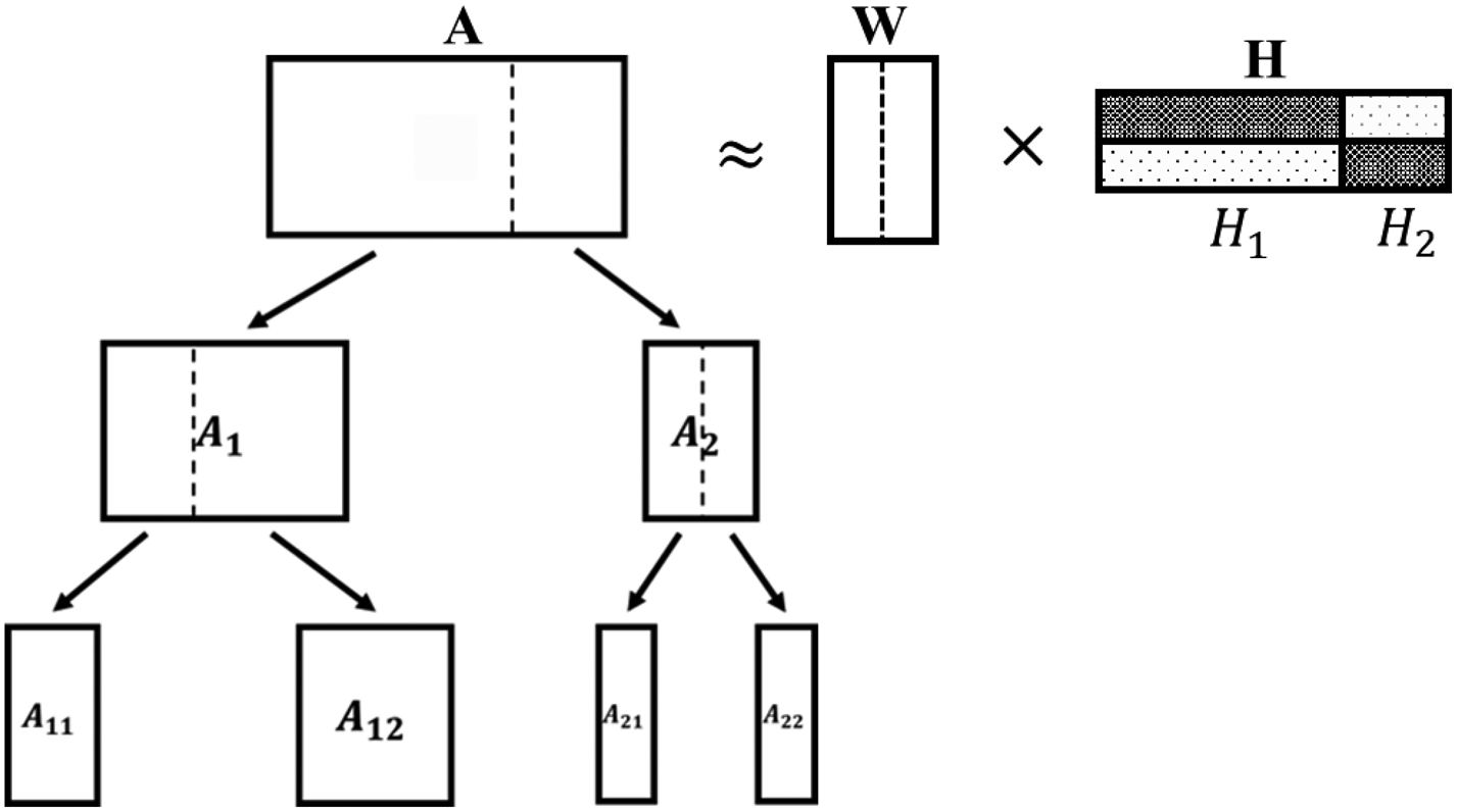
Topic modeling is implemented similar to Divide-and-Conquer NMF (DC-NMF) (Du et al., Reference Du, Kuang, Drake and Park2017). In the authors’ prior work, the topic modeling method was successfully implemented to cluster patent data by their semantic topics (Song and Fu, Reference Song and Fu2019). It has an advantage that it can efficiently process a large volume of data and it does not rely on the selection of an appropriate topic number k, which is considered a computational challenge when applying flat NMF on a given corpus. The technique can be illustrated by a binary hierarchy structure (see Fig. 2).
Illustration of rank-2 NMF iterations.

First, rank-2 NMF (NMF with k = 2) is performed on A dividing its columns into two submatrices A1 and A2. The rule is that the jth column of A gets assigned to A1 if H[1, j] > H[2, j] or vice versa. Note that this is equivalent to clustering documents into two groups by their semantic similarities. In the following steps, the same rank-2 NMF is performed on A1 and A2, and the iteration is continued until all output submatrices contain less than or equal to 10 documents (patents). This criterion differs from Du et al.'s scoring methods that select a cluster node to split when growing the hierarchy structure (Du et al., Reference Du, Kuang, Drake and Park2017); it could result in overly clustered documents if an unnecessary iteration is performed on well-clustered documents or partially clustered documents if the iteration is terminated too early. Yet, test runs have shown that the current criterion produces clustering results in which a set of analogous patents (e.g. bow patents that are intentionally chosen and included) are clustered together under a relevant topic (label containing “archery”, “bow”, “bowstring”, and “draw”).
The iterative operation of the topic modeling has two important implications. First, similar patents belong to a leaf cluster at the end of all iterations. Second, the topic of the similar patents within the cluster is well represented by the topic of the leaf cluster. To understand the semantically meaningful topic of the clustered patents at the leaf level, individual leaf clusters are labeled with five words, similar to the procedure followed by Fu et al. (Reference Fu, Cagan, Kotovsky and Wood2013a). Specifically, when the rank-2 NMF iterations are performed, five words are chosen that have the highest probabilistic distribution in W[*, i] and those words are used to describe the ith topic or cluster label. In this work, the top five words are deemed the label terms (e.g. “w 1”, “w 2”, “w 3”, “w 4”, and “w 5”), and a combination of those words are deemed the cluster label (e.g. “w 1, w 2, w 3, w 4, and w 5”).
Prior to the topic modeling, the input word-document matrix of patent data is pre-processed to improve the clustering quality. The pre-processing includes the following steps:
• Parse abstract, claim, and description sections of patent documents to capture words that characterize the patents’ design features.
• Remove “stop words” and any words common to 90% or more of the patents to emphasize the design contents of individual patents. The 90% cutoff was chosen through experimentation. The common words determined in this work are “view”, “form”, “portion”, “general”, “apparatus”, “tool”, “method”, “example”, “device”, “time”, “number”, “posit”, and “body”.
• Perform an inverse entropy weighting to assign higher weights to less common words and vice versa.
Data visualization
To visualize a patent network, D3.js is used, which is a JavaScript library that is useful for generating an interactive data visualization (Bostock et al., Reference Bostock, Ogievetsky and Heer2011). Its flexible design framework enables a wide range of functionalities and styles in web browsers. In addition, its capability of executing a dynamic animation enables smooth data exploration. VISION represents the patent network in a node-link diagram, in which the displayed nodes are patents and label terms. The visualization of the network includes the following steps:
1. For individual patents, identify their cluster labels at the leaf level.
2. Draw and connect patent nodes to their label term nodes. Since a patent's label consists of five terms, every patent node connects to five label term nodes. In the visualization, the label term nodes are displayed as a “blue cross”, while patent nodes are displayed as “circle” and color coded by their CPC sections.
The node-link diagram was visualized using D3.js's force layout. The force layout uses a physics-based simulator to position node and link elements in a visualization space (e.g. planets in the solar system). The node element has a “gravitational force” that makes nodes repel one another but attract to a center of gravity. The link element connects the nodes together, positioning the node elements at a fixed distance, thus preventing the expulsion of the nodes. When all patent nodes are connected to their corresponding five label term nodes under these circumstances, the simulator generates a patent network in which patents are clustered by their label terms; the location and mobility of the patent nodes are restrained by their links, while the proximity of the patent nodes is determined by the number of label terms that the patents share in common. Such a clustering method is useful in that the label terms are also part of the visualized structure that a designer can interact with.
Supported user interactions
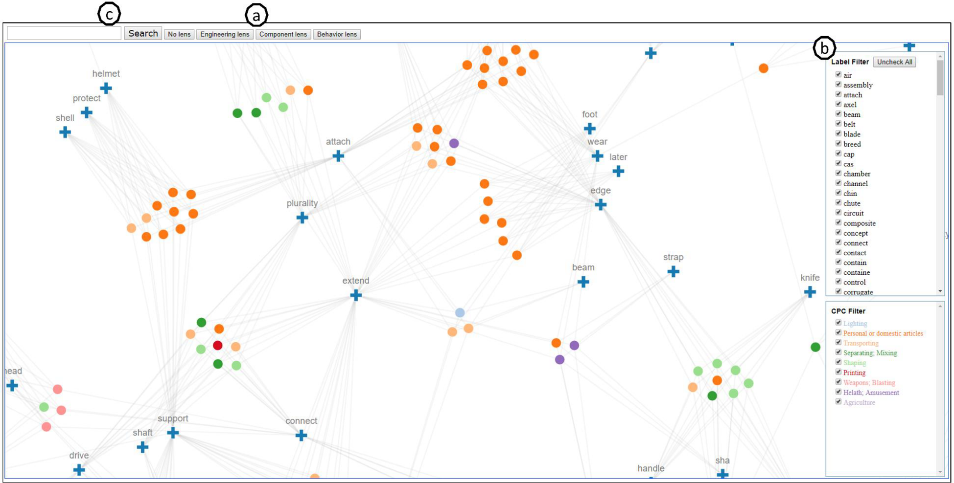
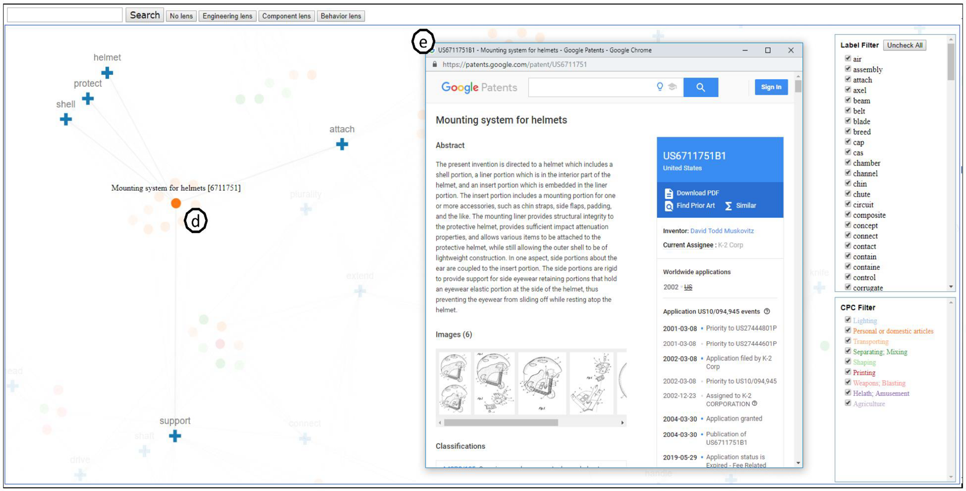
Even though the data visualization provides a meaningful representation of the patent network, it is nontrivial to support a set of user interactions for practical data exploration. The supported user interactions are as follows: (a) switching lenses, (b) filtering patents by label terms and CPC sections, (c) searching nodes by keywords, (d) highlighting adjacent nodes, and (e) accessing online patent documents. We describe each of the supported user interactions below (see Figs. 3, 4):
(a) Switching lenses: A designer may have different lenses through which she seeks inspirations. The various lenses may include engineering principles (What engineering principle does the system rely in order to work?), components (What specific components have been integrated to the system?), and behaviors (What are the attributes of the system that describe how it behaves?). These lenses are used to influence the way the patent data are structured, allowing the designer to re-represent the patent network. The multiple representations facilitate the patent retrieval process, as the designer explores the patent database along the proposed analogical properties. Various design insights can arise from the unique representations of the design repository (Song and Fu, Reference Song and Fu2019). This procedure is achieved by processing the word-document matrix of patent data. For instance, an engineering principle-based patent network is created by clustering patent data that are processed to contain only engineering terms [extracted from a glossary of engineering (Hanifan, Reference Hanifan2014)]. For more detail about how different structural representations of patent data were created, see Song and Fu (Reference Song and Fu2019).
(b) Filtering patents by label terms and CPC sections: The large dataset size and several edge crossings (geometric intersections of two or more edges) of the network can impose a challenge to a designer navigating around the spatial data. If the designer attempts to understand the semantic connections between patents in the large (unfiltered) structure, it would require extensive recalling and processing of information. Thus, the designer is able to filter patents by their label terms and CPC sections. The designer can use a top-down (starting with a full network then removing patents) or bottom-up (starting with an empty network then adding patents) method to scale down the patent structure.
(c) Locating a specific node in the structure: A designer can locate a specific node (patent or label term) in the structure using a keyword in an autocompleting search box. While the tool is meant to facilitate exploration, query-based searching is enabled for added convenience.
(d) Highlighting adjacent nodes: A designer can select a node (patent or label term) to highlight its adjacent nodes. For example, the designer can select a patent to view its label terms. Or, the designer can select a label term to view its linked patents.
(e) Accessing online patent documents: A designer can select a patent node to access the online patent document to review the technology for design inspiration.
Supported user interactions in VISION – (a) switching lenses, (b) filtering patents by label terms and/or CPC sections, and (c) searching nodes by keywords.

Supported user interactions in VISION (continued) – (d) highlighting adjacent nodes and (e) accessing online patent documents.

The user interaction capabilities of VISION assist designers in searching for and retrieving patents in a user-driven manner. A demonstration of the tool's usage is presented here. The designer first chooses a lens (engineering principle, component, or behavior) that influences the structure of the patent network allowing her to focus on analogies characterized by the lens. The designer switches between the provided lenses to explore more effective representation of the patent data or opt out any lens to view a full text-based patent network. After selecting a lens, the designer navigates through the network using drag and zoom to view the structure from different viewpoints and tooltips to view titles of nodes that are hovered over. The basic user interface elements are supported by VISION for added convenience. Next, the designer can perform a keyword search to locate a specific label term node in the network. The keyword can be a single word (engineering principle, component, behavior, or action verb) derived from a design problem's customer needs and functional requirements (Linsey et al., Reference Linsey, Markman and Wood2012). After locating the node, the designer can click on the label term node to view its linked patents. From there, the designer can select a patent node to highlight its other associated label terms uncovering more keywords relevant to the design problem. Alternatively, the designer can try a new keyword search to explore different regions on the patent network. Also, the designer can select (shift click) the patent node to view the full patent text and images (if available) online. If the designer finds it challenging to search patents in the full unfiltered structure, she may apply filters on label terms and CPC sections to view only patents that are relevant to the design problem.
Results of the performance test
Scaling up the patent dataset size is deemed useful, as it offers more opportunities for discovering inspiration. However, this raises the question of whether there exists any tradeoff – when, if ever, does the dataset become too big? To address this question, patent repositories of different sizes are generated, and two performance aspects of VISION are examined – clustering quality and frame rate.
Full patent data
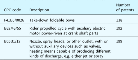
The full dataset for this study consists of 10,429 patents retrieved from the United States Patent and Trademark Office (USPTO); 9900 random patents from 35 CPC sections relating to mechanical design (see Appendix A), 138 bow patents, 192 electric bike patents, and 199 spray nozzle patents. Patents of known topics (bow, electric bike, and spray nozzle) are intentionally added in the dataset for the purpose of computing the clustering quality of the topic modeling results. See Table 1 for the descriptions of the three known topics. For performance testing, datasets of varying numbers of patents are created by reducing the full dataset using random selection. Furthermore, we have not influenced the patent data by any of the lenses (discussed in the “Supported User Interaction” section).
Description of bow, electric bike, and spray nozzle patents

Clustering quality
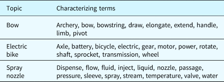
In the text mining field, clustering quality is measured with documents of ground-truth labels to benchmark various topic modeling algorithms (Basu and Murthy, Reference Basu and Murthy2015). In this work, we have taken a different approach to quantify the clustering quality, as the conventional method is not applicable for datasets that are randomly generated. First, topic modeling was performed on patent data that contain a number of known patents (e.g. bow patents). Then, the percentage of the known patents that are properly labeled was computed, for example, patents whose cluster labels contain three or more terms that characterize its known topic. For example, a bow patent is properly labeled if its cluster label contains “archery”, “bow”, and “limb”. Table 2 shows the full list of words (compiled from test runs of the topic modeling) that characterize each topic. The measured percentage value is used to represent the clustering quality, in which 1 means that all analogous patents (that are intentionally added) in the dataset are labeled with their predefined characterizing terms (in Table 2) and 0 means that none of the analogous patents are labeled properly.
List of words to characterize bow, electric bike, and spray nozzle patents

From the full dataset, patents were randomly selected to create smaller datasets of different sizes (100, 200, 300, 500, 800, 1000, 1500, 2000, and 3000 patents) containing different proportions (2%, 3%, and 4%) or fixed numbers (20, 30, and 40) of either bow, electric bike, or spray nozzle known patents. This resulted in 162 combinations of patent data. For each combination, the topic modeling was run on 10 unique patent datasets to compute the mean of the nondeterministic clustering results. The clustering quality of datasets containing the topics of unique characteristics and varying proportions was examined to determine whether the results are consistent for different cases.
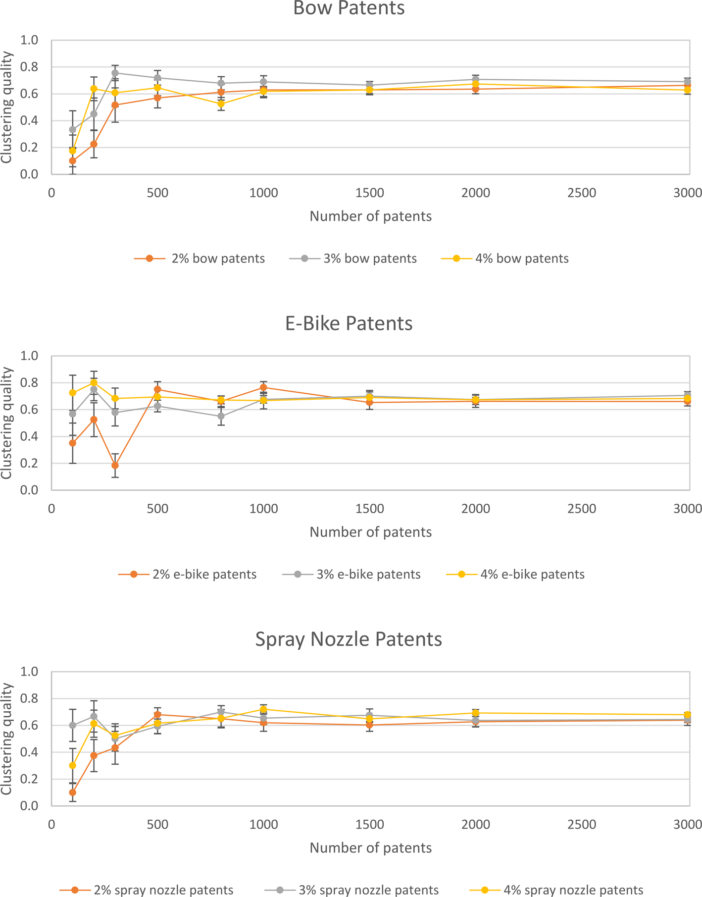
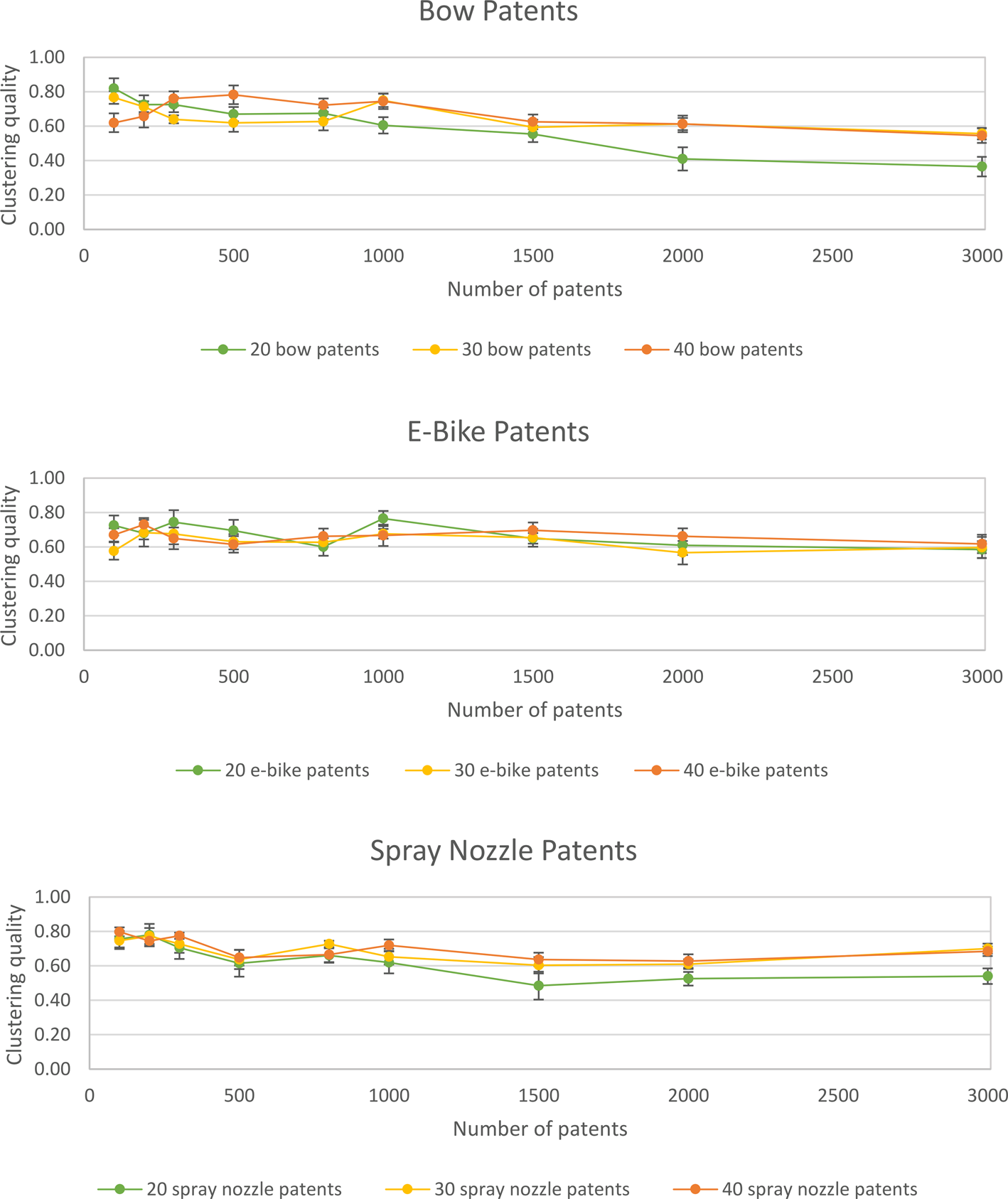
Figure 5 shows the clustering quality for datasets that contain a proportional number (e.g. 2%, 3%, and 4%) of known patents. The clustering quality is relatively low for smaller datasets (<500 patents) but improves with increasing data size. It remains constant at 0.6–0.7 for larger datasets (>500 patents). The trend is present in all datasets except for those that contain higher proportions (3% and 4%) of electric bike patents. On the contrary, Figure 6 shows the decreasing clustering quality for datasets that contain a fixed number of known patents. Again, datasets that contain electric bike patents exhibit different results, in which the clustering quality is consistent with varying data size.
Clustering quality of datasets containing a proportional number of bow patents (top), electric bike patents (middle), and spray nozzle patents (bottom).

Clustering quality of datasets containing a fixed number of bow patents (top), electric bike patents (middle), and spray nozzle patents (bottom).

Frame rate
For an interactive visualization tool, a smooth animation is important as a designer navigates around the spatial data. The quality of the animation was characterized by measuring the frame rate of the interactive visualization tool. Frame rate or frame per second (fps) measures the number of unique frames that a video game, film, or displayed screen captures in a unit second. Generally, a video game is played at 60 fps and a movie film is displayed at 24 fps (Sarkar, Reference Sarkar2014).
The frame rate was measured using Google Chrome's DevTools, which allows developers to run a built-in performance analysis to diagnose, debug, and improve web pages. The performance analysis was run using the “start profiling and reload page” function, which automatically records the performance of the web page, as the page reloads. Although this does not record the frame rate during the actual user interaction, this function was used for consistent data collection throughout the multiple runs. In this experiment, the mean frame rate values are reported, which is a total number of frames divided by a duration of recorded time.
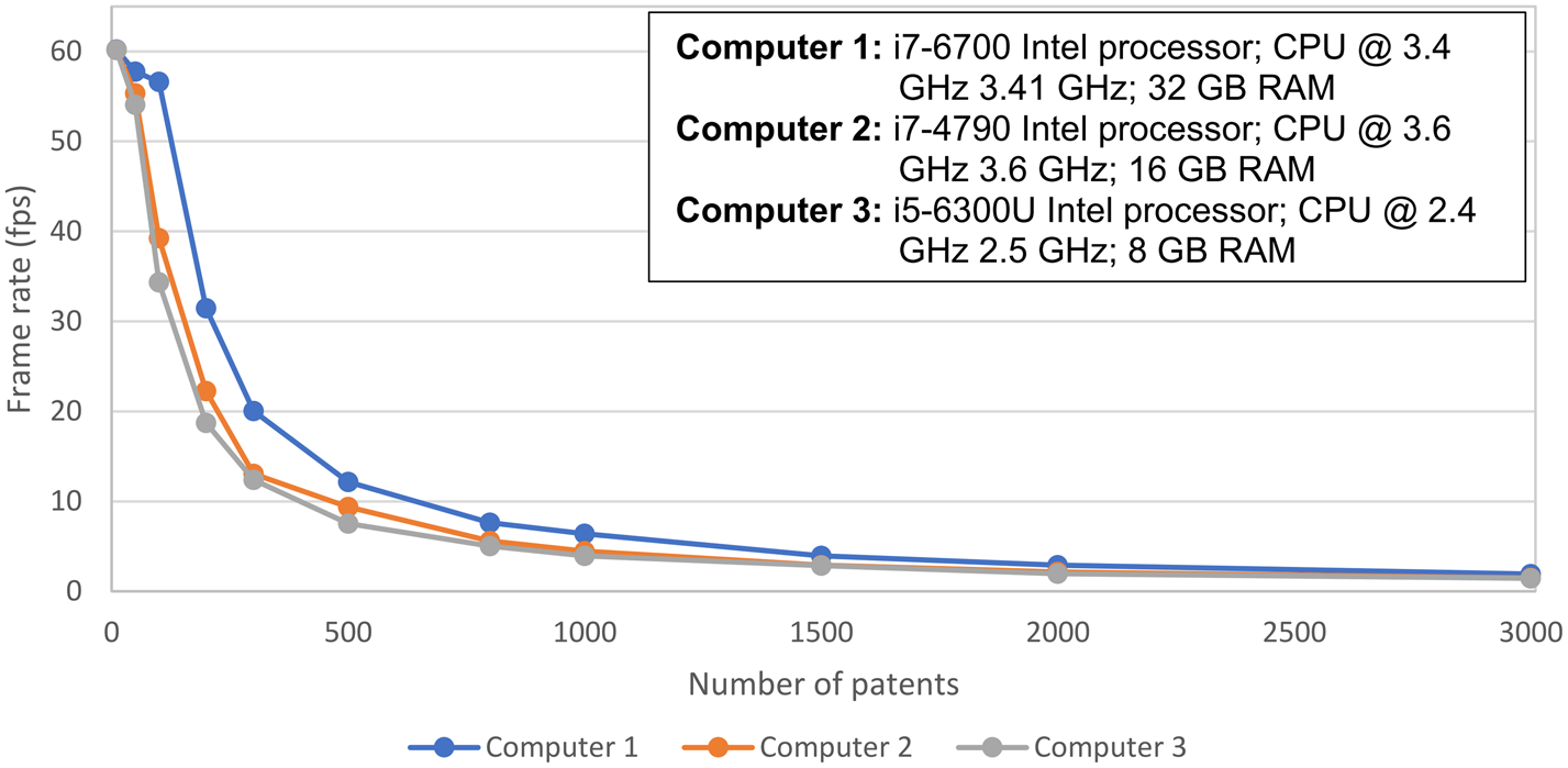
From the full dataset, datasets of different sizes (10, 50, 100, 200, 300, 500, 800, 1000, 1500, 2000, and 3000 patents) were randomly selected, and the frame rates were measured with computers of varying performance specs; Computer 1 (i7-6700 Intel processor; CPU @ 3.4 GHz 3.41 GHz; 32 GB RAM), Computer 2 (i7-4790 Intel processor; CPU @ 3.6 GHz 3.6 GHz; 16 GB RAM), and Computer 3 (i5-6300U Intel processor; CPU @ 2.4 GHz 2.5 GHz; 8 GB RAM).
Figure 7 shows that the frame rate decreases exponentially with increasing data size. The decline was larger for lower performance computers. The frame rate drops below 24 fps at approximately 250 patents for the highest performance computer and drops below 24 fps at 200 patents for the lower performance computers.
Frame rate measured with computers of different performance specifications.

Discussion
In the performance test, the effects of dataset size on different aspects of VISION are examined. First, the clustering quality is measured to examine the value of information provided by the topic modeling. Second, the frame rate is measured to examine the fluency of communicating information of the visualization tool. In this section, the results of the analysis and their implications on the usability of VISION are discussed.
Clustering quality
Figures 5 and 6 exhibit opposing clustering results for the same dataset size. To reiterate, the former shows increasing clustering quality for datasets containing a proportional number of similar patents, and the latter shows decreasing clustering quality for datasets containing a fixed number of similar patents. The finding implies that the clustering quality depends on not only the dataset size but also its composition. Considering that the user is more likely to explore a dataset containing probabilistically distributed topics, we argue that Figure 5 depicts more practical clustering results. In Figure 5, the clustering quality improves logarithmically with increasing dataset size. The dataset needs to be big enough for the topic modeling to recognize similar patents. However, when the dataset becomes too big containing more random patents, the positive effect is canceled out; Figure 6 shows that the clustering quality diminishes, as the portion of random patents in the dataset increases. Also, it is important to note that the size of the standard error bars diminishes with increasing dataset size. This implies that the consistency of the clustering result improves, as the dataset size increases.
Frame rate
The exponential decrease of the frame rate implies that the “jerkiness” (lack of smoothness) of the visualization is inevitable with large-scale patent datasets (see Fig. 7). The interruption can diminish the user's ability to navigate around the patent structure, which involves an iterative reconstruction of the information space (Bederson and Boltman, Reference Bederson and Boltman1998). In theory, a designer can improve the frame rate by scaling down the network using the proposed filtering method. However, we have not observed a notable improvement in the frame rate for the reduced patent structure in the follow-up experiments. Perhaps, a further computational improvement is needed to address the deficiency in the visualization tool. Note that the analysis does not evaluate the recommended frame rate for a visual interaction purpose. In future studies, it would be interesting to examine how the tool's frame rate affects the user's ability to explore spatial data for not just retrieving information but also gaining inspiration.
Summary
These results taken all together suggest that there are tradeoffs and usability issues if the dataset size is too large or too small. When the dataset size is too small, there are theoretically fewer opportunities for discovering useful inspirations from various disparate fields of patent data (near and far domains). Also, it is likely that the tool will exhibit more randomized and inconsistent clustering results. On contrary, if the dataset size is too large, the tool's low frame rate can affect the designer's ability to understand and recall information. Moreover, the vast information is difficult to understand without support for user interaction or automated tools. Our findings suggest that increasing the dataset size is not always beneficial for data exploration in DbA practice. It requires improved computational methods and environments that can support the fluent communication between the designer and the computational design repository. Research efforts to address the mining of large-scale data include Glier et al.'s work, which explored automated text classification to filter text passages that are more relevant to the design problem at hand (Glier et al., Reference Glier, McAdams and Linsey2014) and Keshwani and Chakrabarti's work to automatically classify natural-language descriptions of analogies into the SAPPhiRE model (Keshwani and Chakrabarti, Reference Keshwani and Chakrabarti2017).
It is important to note that the results in this work are dependent upon the patent data, the computational environment in which the analysis was conducted, and VISION, the visual interaction tool used in this study. Nevertheless, this study's contribution is that it challenges the notion that unbridled scaling up of the size of the design repository can only be beneficial for discovering more inspirations. In future studies, we hope to extend the current work to develop computational methods for evaluating the performance of visual interaction tools and ultimately develop improved visual interactive DbA tools for designers.
Conclusion and future work
In this work, we present VISION, an interactive visualization tool with which designers can explore for inspiration using patent data. To achieve this, a patent structure is visualized with the result of hierarchical NMF-based topic modeling, and support for user interactions is implemented to assist data exploration. Next, a performance analysis is presented in which the performance of VISION is evaluated with patent datasets of various sizes. The study suggests that scaling up of the size of the design repository is not always beneficial for exploring for inspiration in patent data. The computational approach for building the exploration-based DbA tool and the evaluation of the tool in regard to its performance for different data sizes provide a valuable basis to develop an automated visual interaction tool for supporting innovative idea generation.
In future work, VISION will be tested in human subjects studies to ascertain its value in the design process, including its impact on design output quality and novelty during early stage ideation (Shah et al., Reference Shah, Vargas-Hernandez and Smith2003). The study will focus on understanding how designers search for analogies in the exploratory repository and evaluate what factors determine the retrieval of source analogy and mapping between the source analogy and an engineering design problem. VISION will be assessed in comparison with the state-of-the-art patent search engine to determine how the interactive data visualization affects designers’ search strategies.
Acknowledgements
This work is supported by the National Science Foundation, under grant CMMI 1663204. The United States Government retains, and by accepting the article for publication, the publisher acknowledges that the United States Government retains, a non-exclusive, paid-up, irrevocable, worldwide license to publish or reproduce the published form of this work, or allow others to do so, for United States Government purposes.
APPENDIX A: List of CPC sections

Hyeonik Song is a graduate research assistant at the Georgia Institute of Technology pursuing a PhD in Mechanical Engineering. He received his MS (May 2018) and BS (May 2016) in Mechanical Engineering from Georgia Tech. His research focuses on studying computational supports for design-by-analogy practice to facilitate more effective and innovative concept development in engineering design process.
Jacob Evans is an undergraduate researcher at the Georgia Institute of Technology, pursuing a BS in Mechanical Engineering. His research interests include design, computation, and artificial intelligence.
Katherine Fu is an Assistant Professor of Mechanical Engineering at the Georgia Institute of Technology. Prior to this appointment, she was a Postdoctoral Fellow at the Massachusetts Institute of Technology and the Singapore University of Technology and Design. In 2012, she completed her PhD in Mechanical Engineering at Carnegie Mellon University. She received her MS in Mechanical Engineering from Carnegie Mellon in 2009 and her BS in Mechanical Engineering from Brown University in 2007. Her work focuses on studying engineering design through cognitive studies and extending those findings to the development of methods and tools to facilitate more effective, inspired design and innovation.