



1. Introduction
How does the mind work? Though this is, of course, the central question posed by cognitive science, one of the deepest insights of the last half-century is that the question does not have a single answer: There is no one way the mind works, because the mind is not one thing. Instead, the mind has parts, and the different parts of the mind operate in different ways: Seeing a color works differently than planning a vacation, which works differently than understanding a sentence, moving a limb, remembering a fact, or feeling an emotion.
The challenge of understanding the natural world is to capture generalizations – to “carve nature at its joints.” Where are the joints of the mind? Easily, the most natural and robust distinction between types of mental processes is that between perception and cognition. This distinction is woven so deeply into cognitive science as to structure introductory courses and textbooks, differentiate scholarly journals, and organize academic departments. It is also a distinction respected by common sense: Anyone can appreciate the difference between, on the one hand, seeing a red apple and, on the other hand, thinking about, remembering, or desiring a red apple. This difference is especially clear when perception and cognition deliver conflicting evidence about the world – as in most visual illusions. Indeed, there may be no better way to truly feel the distinction between perception and cognition for yourself than to visually experience the world in a way you know it not to be.
There is a deep sense in which we all know what perception is because of our direct phenomenological acquaintance with percepts – the colors, shapes, and sizes (etc.) of the objects and surfaces that populate our visual experiences. Just imagine looking at an apple in a supermarket and appreciating its redness (as opposed, say, to its price). That is perception. Or look at Figure 1A and notice the difference in lightness between the two gray rectangles. That is perception. Throughout this paper, we refer to visual processing simply as the mental activity that creates such sensations; we refer to percepts as the experiences themselves, and we use perception (and, less formally, seeing) to encompass both (typically unconscious) visual processing and the (conscious) percepts that result.
Examples of lightness illusions can be subjectively appreciated as “demonstrations” (for references and explanations, see Adelson Reference Adelson and Gazzaniga2000). (A) The two columns of gray rectangles have the same luminance, but the left one looks lighter. (B) The rectangles are uniformly gray, but they appear to lighten and darken along their edges. (C) Uniformly colored squares of increasing luminance produce an illusory light “X” shape at their corners. (D) The two central squares have the same objective luminance, but the left one looks lighter. (E) The two rectangles are identical segments of the same gradient, but the right one looks lighter. Similar demonstrations abound, for nearly every visual feature.

1.1. The new top-down challenge
Despite the explanatorily powerful and deeply intuitive nature of the distinction between seeing and thinking, a vocal chorus has recently and vigorously challenged the extent of this division, calling for a generous blurring of the lines between visual perception and cognition (for recent reviews, see Balcetis Reference Balcetis2016; Collins & Olson Reference Collins and Olson2014; Dunning & Balcetis Reference Dunning and Balcetis2013; Goldstone et al. Reference Goldstone, de Leeuw and Landy2015; Lupyan Reference Lupyan2012; Proffitt & Linkenauger Reference Proffitt, Linkenauger, Prinz, Beisert and Herwig2013; Riccio et al. Reference Riccio, Cole and Balcetis2013; Stefanucci et al. Reference Stefanucci, Gagnon and Lessard2011; Vetter & Newen Reference Vetter and Newen2014; Zadra & Clore Reference Zadra and Clore2011). On this increasingly popular view, higher-level cognitive states routinely “penetrate” perception, such that what we see is an alloy both of bottom-up factors and of beliefs, desires, motivations, linguistic representations, and other such states. In other words, these views hold that the mental processes responsible for building percepts can and do access radically more information elsewhere in the mind than has traditionally been imagined.
At the center of this dispute over the nature of visual perception and its relation to other processes in the mind has been the recent and vigorous proliferation of so-called top-down effects on perception. In such cases, some extraperceptual state is said to literally and directly alter what we see. (As of this writing, we count more than 175 papers published since 1995 reporting such effects; for a list, see http://perception.yale.edu/TopDownPapers.) For example, it has been reported that desiring an object makes it look closer (Balcetis & Dunning Reference Balcetis and Dunning2010), that reflecting on unethical actions makes the world look darker (Banerjee et al. Reference Banerjee, Chatterjee and Sinha2012), that wearing a heavy backpack makes hills look steeper (Bhalla & Proffitt Reference Bhalla and Proffitt1999), that words having to do with morality are easier to see (Gantman & Van Bavel Reference Gantman and Van Bavel2014), and that racial categorization alters the perceived lightness of faces (Levin & Banaji Reference Levin and Banaji2006).
If what we think, desire, or intend (etc.) can affect what we see in these ways, then a genuine revolution in our understanding of perception is in order. Notice, for example, that the vast majority of models in vision science do not consider such factors; yet, apparently, such models have been successful! For example, today's vision science has essentially worked out how low-level complex motion is perceived and processed by the brain, with elegant models of such processes accounting for extraordinary proportions of variance in motion processing (e.g., Rust et al. Reference Rust, Mante, Simoncelli and Movshon2006) – and this success has come without factoring in morality, hunger, or language (etc.). Similarly, such factors are entirely missing from contemporary vision science textbooks (e.g., Blake & Sekuler Reference Blake and Sekuler2005; Howard & Rogers Reference Howard and Rogers2002; Yantis Reference Yantis2013). If such factors do influence how we see, then such models and textbooks are scandalously incomplete.
Although such factors as morality, hunger, and language are largely absent from contemporary vision science in practice, the emergence of so many empirical papers reporting top-down effects of cognition on perception has shifted the broader consensus in cognitive science. Indeed, such alleged top-down effects have led several authors to declare that the revolution in our understanding of perception has already occurred, proclaiming as dead not only a “modular” perspective on vision, but often also the very distinction between perception and cognition itself. For example, it has been asserted that it is a “generally accepted concept that people tend to see what they want to see” (Radel & Clément-Guillotin Reference Radel and Clément-Guillotin2012, p. 233), and that “the postulation of the existence of visual processes being functionally encapsulated…cannot be justified anymore” (Vetter & Newen Reference Vetter and Newen2014, p. 73). This sort of evidence led one philosopher to declare, in an especially sweeping claim, that “[a]ll this makes the lines between perception and cognition fuzzy, perhaps even vanishing” and to deny that there is “any real distinction between perception and belief” (Clark Reference Clark2013, p. 190).
1.2. Our thesis and approach
Against this wealth of evidence and its associated consensus, the thesis of this paper is that there is in fact no evidence for such top-down effects of cognition on visual perception, in every sense these claims intend. With hundreds of reported top-down effects, this is, admittedly, an ambitious claim. Our aim in this discussion is thus to explicitly identify the (surprisingly few, and theoretically interesting) “pitfalls” that account for reports of top-down penetration of visual perception without licensing such conclusions.
Our project differs from previous theoretical challenges (e.g., Fodor Reference Fodor1984; Pylyshyn Reference Pylyshyn1999; Raftopoulos Reference Raftopoulos2001a) in several ways. First, whereas many previous discussions defended the modular nature of only a circumscribed (and possibly unconscious) portion of visual processing (e.g., “early vision”; Pylyshyn Reference Pylyshyn1999), we have the broader aim of evaluating the evidence for top-down effects on what we see as a whole – including visual processing and the conscious percepts it produces. Second, several pitfalls we present are novel contributions to this debate. Third, and most important, whereas past abstract discussions have failed to resolve this debate, our presentation of these pitfalls is empirically anchored: In each case, we show not only how certain studies could be susceptible to the pitfall (in principle), but also how several alleged top-down effects actually are explained by the pitfall (in practice, drawing on recent and decisive empirical studies). Moreover, each pitfall we present is perfectly general, applying to dozens more reported top-down effects. Research on top-down effects on visual perception must therefore take the pitfalls seriously before claims of such phenomena can be compelling.
The question of whether there are top-down effects of cognition on visual perception is one of the most foundational questions that can be asked about what perception is and how it works, and it is therefore no surprise that the issue has been of tremendous interest (especially recently) – not only in all corners of psychology, but also in neighboring disciplines such as philosophy of mind (e.g., Macpherson Reference Macpherson2012; Siegel Reference Siegel2012), neuroscience (e.g., Bannert & Bartels Reference Bannert and Bartels2013; Landau et al. Reference Landau, Aziz-Zadeh and Ivry2010), psychiatry (e.g., Bubl et al. Reference Bubl, Kern, Ebert, Bach and Tebartz van Elst2010), and even aesthetics (e.g., Nanay Reference Nanay2014; Stokes Reference Stokes2014). It would be enormously exciting to discover that perception changes the way it operates in direct response to goings-on elsewhere in the mind. Our hope is thus to help advance future work on this foundational question, by identifying and highlighting the key empirical challenges.
2. A recipe for revolution
The term top-down is used in a spectacular variety of ways across many literatures. What do we mean when we say that cognition does not affect perception, such that there are no top-down effects on what we see? The primary reason these issues have received so much historical and contemporary attention is that a proper understanding of mental organization depends on whether there is a salient “joint” between perception and cognition. Accordingly, we focus on the sense of top-down that directly addresses this aspect of how the mind is organized. This sense of the term is, for us, related to traditional questions of whether visual perception is modular, encapsulated from the rest of cognition, and “cognitively (im)penetrable.”Footnote 1 At issue is the extent to which what and how we see is functionally independent from what and how we think, know, desire, act, and so forth. We single out this meaning of top-down not only because it may be the most prominent usage of the term, but also because the questions it raises are especially foundational for our understanding of the organization of the mind.
Nevertheless, there are several independent uses of top-down that are less revolutionary and do not directly interact with these questions.
2.1. Changing the processing versus (merely) changing the input
On an especially permissive reading of “top-down,” top-down effects are all around us, and it would be absurd to deny cognitive effects on what we see. For example, there is a trivial sense in which we all can willfully control what we visually experience, by (say) choosing to close our eyes (or turn off the lights) if we wish to experience darkness. Though this is certainly a case of cognition (specifically, of desire and intention) changing perception, this familiar “top-down” effect clearly isn't revolutionary, insofar as it has no implications for how the mind is organized – and for an obvious reason: Closing your eyes (or turning off the lights) changes only the input to perception; it does not change perceptual processing itself.
Despite the triviality of this example, the distinction is worth keeping in mind, because it is not always obvious when an effect operates by changing the input. To take one fascinating example, facial expressions associated with fear (e.g., widened eyes) and disgust (e.g., narrowed eyes) have recently been shown to reliably vary the eye-aperture diameter, directly influencing acuity and sensitivity by altering the actual optical information reaching perceptual processing (Lee et al. Reference Lee, Mirza, Flanagan and Anderson2014). (As we will see later, the distinction between input and processing also arises with regard to perceptual vs. attentional effects.)
2.2. Descending neural pathways
In systems neuroscience, some early models of brain function were largely feedforward, with various brain regions feeding information to each other in a unidirectional sequence. In contrast, there is now considerable evidence that brain regions that were initially considered “higher up” in a processing hierarchy can modulate “lower” regions, through so-called re-entrant processing from descending neural pathways – and these sorts of modulation are often also commonly called top-down effects (e.g., Gilbert & Li Reference Gilbert and Li2013; Rolls Reference Rolls2008; Zhang et al. Reference Zhang, Xu, Kamigaki, Hoang Do, Chang and Jenvay2014). Though extremely interesting for certain questions about functional neuroanatomy, this type of “top-down” influence has no necessary implications for cognitive penetrability. One reason is that nearly all brain regions subserve multiple functions. Even parts of visual cortex, for example, are involved in imagery (e.g., Kosslyn Reference Kosslyn2005), recall (e.g., Le Bihan et al. Reference Le Bihan, Turner, Zeffiro, Cuénod, Jezzard and Bonnerot1993), and reward processing (Vickery et al. Reference Vickery, Chun and Lee2011) – so that it is almost never clear which mental process a descending pathway is descending to (or if that descending pathway is influencing the input or the processing of whatever it descends to, per sect. 2.1).
At any rate, we do not discuss descending pathways in the brain in this target article, for two reasons. First, the implications of this body of work for issues of modularity and cognitive penetrability have been addressed and critiqued extensively elsewhere (e.g., Raftopoulos Reference Raftopoulos2001b). Second, our aim here is to focus on that recent wave of work that promises a revolution in how we think about the organization of the mind. And whatever one thinks of the relevance of descending neural pathways to issues of whether cognition affects perception, they certainly cannot be revolutionary today: The existence of descending neural pathways has been conclusively established many times over, and they are now firmly part of the orthodoxy in our understanding of neural systems.
2.3. Top-down effects versus context effects and “unconscious inferences” in vision
Visual processing is often said to involve “problem solving” (Rock Reference Rock1983) or “unconscious inference” (Gregory Reference Gregory1980; Helmholtz Reference Helmholtz1866/1925). Sometimes these labels are applied to seemingly sophisticated processing, as in research on the perception of causality (e.g., Rolfs et al. Reference Rolfs, Dambacher and Cavanagh2013; Scholl & Tremoulet Reference Scholl and Tremoulet2000) or animacy (e.g., Gao et al. Reference Gao, McCarthy and Scholl2010; Scholl & Gao Reference Scholl, Gao, Rutherford and Kuhlmeier2013). But more often, the labels are applied to relatively early and low-level visual processing, as in the perception of lightness (e.g., Adelson Reference Adelson and Gazzaniga2000) or depth (e.g., Ramachandran Reference Ramachandran1988). In those cases, such terminology (which may otherwise evoke notions of cognitive penetrability) refers to aspects of processing that are wired into the visual module itself (so-called “natural constraints”) – and so do not at all imply effects of cognition on perception, or “top-down” effects. This is true even when such processing involves context effects, wherein perception of an object may be influenced by properties of other objects nearby (e.g., as in several of the lightness illusions in Fig. 1). In such cases, the underlying processes continue to operate reflexively (based solely on their visual input) regardless of your cognitive inferences or problem-solving strategies (for discussion, see Scholl & Gao Reference Scholl, Gao, Rutherford and Kuhlmeier2013) – as when lightness illusions based on “unconscious inferences” persist in the face of countervailing knowledge (Fig. 1). (For further discussion of why vision being “smart” in such ways does not imply cognitive penetrability, see Kanizsa Reference Kanizsa1985; Pylyshyn Reference Pylyshyn1999.)
2.4. Cross-modal effects
What we see is sometimes affected by other sense modalities. For example, a single flash of light can appear to flicker when accompanied by multiple auditory beeps (Shams et al. Reference Shams, Kamitani and Shimojo2000), and two moving discs that momentarily overlap are seen to bounce off each other (rather than stream past each other) if a beep is heard at the moment of overlap (Sekuler et al. Reference Sekuler, Sekuler and Lau1997). However, these cases – though interesting for many other reasons – do not demonstrate cognitive penetrability, for much the same reason that unconscious inferences in vision fail to do so. For example, such crossmodal integration is itself a reflexive, apparently impenetrable process: The sounds' effects occur “whether you like it or not,” and they occur extremely quickly (e.g., in less than 100 ms; Shams et al. Reference Shams, Kamitani and Shimojo2002). Collectively, such results are consistent with the entire process being contained within perception itself, rather than being an effect of more central cognitive processes on perception.
At any rate, we do not discuss crossmodal effects here. As with descending neural pathways, whatever one thinks of the relevance of this work to the issues we discuss, they certainly cannot be revolutionary today in the way promised by the work we review in section 3 – if only because the existence of crossmodal effects has been conclusively established and is common ground for all parties in this discussion.
2.5. Input-driven changes in sensitivity over time
Despite encapsulation, input may sometimes change visual processing by increasing sensitivity over time to certain visual features. For example, figure–ground assignment for ambiguous stimuli is sometimes biased by experience: The visual system will more likely assign figure to familiar shapes, such as the profile of a woman with a skirt (Peterson & Gibson Reference Peterson and Gibson1993; Fig. 2A). However, such changes don't involve any penetration because they don't involve effects of knowledge per se. For example, inversion eliminates this effect even when subjects know the inverted shape's identity (Peterson & Gibson Reference Peterson and Gibson1994). Therefore, what may superficially appear to be an influence of knowledge on perception is simply increased sensitivity to certain contours. Indeed, Peterson and Gibson (Reference Peterson and Gibson1994) volunteer that their phenomena don't reflect top-down effects, and in particular that “the orientation dependence of our results demonstrates that our phenomena are not dependent on semantic knowledge” (p. 561). Thus, such effects aren't “top-down” in any sense that implies cognitive penetrability, because the would-be penetrator is just the low-level visual input itself. (Put more generally, the thesis of cognitive impenetrability constrains the information modules can access, but it does not constrain what modules can do with the input they do receive; e.g., Scholl & Leslie Reference Scholl and Leslie1999.)
Diagrams or depictions of various possible top-down effects on perception: (A) Figure–ground assignment is biased toward familiar shapes, such as the profile of a woman (Peterson & Gibson Reference Peterson and Gibson1993). (B) Being thirsty (as a result of eating salty pretzels) makes ambiguous surfaces look more transparent (Changizi & Hall Reference Changizi and Hall2001). (C) Morally relevant words are easier to see than morally irrelevant words (Gantman & Van Bavel Reference Gantman and Van Bavel2014). (D) Wearing a heavy backpack makes hills look steeper (Bhalla & Proffitt Reference Bhalla and Proffitt1999). (E) Holding a wide pole makes apertures look narrower (Stefanucci & Geuss Reference Stefanucci and Geuss2009). (F) Accuracy in dart throwing biases subsequent estimates of the target's size (Cañal-Bruland et al. Reference Cañal-Bruland, Pijpers and Oudejans2010; Wesp & Gasper 2004). (G) Positive words are seen as lighter than negative words (Meier et al. Reference Meier, Robinson, Crawford and Ahlvers2007). (H) Scary music makes ambiguous images take on their scarier interpretation (Prinz & Seidel Reference Prinz and Seidel2012). (I) Smiling faces appear brighter (Song et al. Reference Song, Vonasch, Meier and Bargh2012). (J) Learning color–letter associations makes identically hued numbers and letters appear to have their categories' hues (e.g., the E will look red and the 6 will look blue, even though they are equally violet; Goldstone Reference Goldstone1995). (K) A grayscale banana appears yellow (Hansen et al. Reference Hansen, Olkkonen, Walter and Gegenfurtner2006). (L) Conceptual similarity enhances size-contrast illusions (Coren & Enns Reference Coren and Enns1993). (M) Labeling certain blocky figures as “2” and “5” makes them easier to find in a visual search array (Lupyan & Spivey Reference Lupyan and Spivey2008). (N) Calligraphic knowledge (e.g., of the direction of the sixth stroke of a Chinese character) affects the direction of apparent motion when that stroke is flashed (Tse & Cavanagh Reference Tse and Cavanagh2000). (O) Reflecting on unethical actions makes the world look darker (Banerjee et al. Reference Banerjee, Chatterjee and Sinha2012). (P) Desired objects are seen as closer, as measured by beanbag throws (Balcetis & Dunning Reference Balcetis and Dunning2010). (Q) The middle traffic light is called gelb (yellow) in German and oranje (orange) in Dutch, which influences its perceived color (Mitterer et al. Reference Mitterer, Horschig, Müsseler and Majid2009). (R) You may be able to intentionally decide which interpretation of a Necker cube to see (cf. Long & Toppino Reference Long and Toppino2004).

3. Contemporary top-down effects
What remains after setting aside alternative meanings of “top-down effects” is the provocative claim that our beliefs, desires, emotions, actions, and even the languages we speak can directly influence what we see. Much ink has been spilled arguing whether this should or shouldn't be true, based primarily on various theoretical considerations (e.g., Churchland Reference Churchland1988; Churchland et al. Reference Churchland, Ramachandran, Sejnowski, Koch and Davis1994; Firestone Reference Firestone2013a; Fodor Reference Fodor1983; Reference Fodor1984; Reference Fodor1988; Goldstone & Barsalou Reference Goldstone and Barsalou1998; Lupyan Reference Lupyan2012; Machery Reference Machery, Zeimbekis and Raftopoulos2015; Proffitt & Linkenauger Reference Proffitt, Linkenauger, Prinz, Beisert and Herwig2013; Pylyshyn Reference Pylyshyn1999; Raftopoulos Reference Raftopoulos2001b; Vetter & Newen Reference Vetter and Newen2014; Zeimbekis & Raftopoulos Reference Zeimbekis and Raftopoulos2015). We will not engage those arguments directly – largely, we admit, out of pessimism that such arguments can be (or have been) decisive. Instead, our focus will be on the nature and strength of the empirical evidence for cognitive penetrability in practice.
Though recent years have seen an unparalleled proliferation of alleged top-down effects, such demonstrations have a long and storied history. One especially visible landmark in this respect was the publication in 1947 of Bruner and Goodman's “Value and need as organizing factors in perception.” Bruner and Goodman's pioneering study reported that children perceived coins as larger than they perceived worthless cardboard discs of the same physical size, and also that children from poor families perceived the coins as larger than did wealthy children. These early results ignited the New Look movement in perceptual psychology, triggering countless studies purporting to show all manner of top-down influences on perception (for a review, see Bruner Reference Bruner1957). It was claimed, for example, that hunger biased the visual interpretation of ambiguous images (Lazarus et al. Reference Lazarus, Yousem and Arenberg1953), that knowledge of objects' typical colors influenced online color perception (Bruner et al. Reference Bruner, Postman and Rodrigues1951), and that meaningful religious iconography dominated other symbols in binocular rivalry (Lo Sciuto & Hartley Reference Lo Sciuto and Hartley1963).
However, the New Look movement's momentum eventually stalled as its findings buckled under methodological and theoretical scrutiny. For example, follow-up studies on the value-based size-distortion effects could replicate them only when subjects made judgments from memory rather than during online viewing (Carter & Schooler Reference Carter and Schooler1949; see also Landis et al. Reference Landis, Jones and Reiter1966), and other critiques identified theoretically puzzling moderating variables or reported that many other valuable objects and symbols failed to produce similar results (e.g., Klein et al. Reference Klein, Schlesinger and Meister1951; McCurdy Reference McCurdy1956). Other confounding variables were eventually implicated in the original effects, leading several researchers to conclude that “[o]nly when better experiments have been carried out will we be able to determine what portion of the effect is due to nonperceptual factors” (Landis et al. Reference Landis, Jones and Reiter1966, p. 729). By the next decade, the excitement surrounding such ideas had fizzled, and “the word ‘artifact’ became the descriptive term par excellence associated with the New Look” (Erdelyi Reference Erdelyi1974, p. 2).
The last two decades have seen the pendulum swing again, away from a robust division between perceptual and cognitive processing and back toward the previously fashionable New Look understanding of perception. The driving force in recent years has been a tidal wave of studies seeming to show influences on perception from all corners of the mind. However, the particular theoretical motivations behind these various results are nonuniform, so it will be useful to understand these studies in groups. Roughly, today's alleged top-down effects on perception are effects of motivation, action, emotion, categorization, and language.
3.1. Motivation
Those recent results with the greatest overlap with the New Look movement concern influences of motivation (desires, needs, values, etc.) on perception. For example, it has recently been reported that desirable objects such as chocolate look closer than undesirable objects such as feces (Balcetis & Dunning Reference Balcetis and Dunning2010; see also Krpan & Schnall Reference Krpan and Schnall2014); that rewarding subjects for seeing certain interpretations of ambiguous visual stimuli actually makes the stimuli look that way (Balcetis & Dunning Reference Balcetis and Dunning2006; see also Pascucci & Turatto Reference Pascucci and Turatto2013); that desirable destinations seem closer than undesirable ones (Alter & Balcetis Reference Alter and Balcetis2011; see also Balcetis et al. Reference Balcetis, Dunning and Granot2012); and even that women's breasts appear larger to sex-primed men (den Daas et al. Reference den Daas, Häfner and de Wit2013). Other studies have focused on physiological needs. For example, muffins are judged as larger by dieting subjects (van Koningsbruggen et al. Reference van Koningsbruggen, Stroebe and Aarts2011), food-related words are easier to identify when observers are fasting (Radel & Clément-Guillotin Reference Radel and Clément-Guillotin2012), and ambiguous surfaces are judged as more transparent (or “water-like”) by subjects who eat salty pretzels and become thirsty (Changizi & Hall Reference Changizi and Hall2001; Fig. 2B). Morally relevant words reportedly “pop out” in visual awareness when briefly presented (Gantman & Van Bavel Reference Gantman and Van Bavel2014; Fig. 2C), and follow-up studies suggest that the effect may arise from a desire for justice. Many of these contemporary studies explicitly take inspiration from the New Look, claiming to study the same phenomena but “armed with improved methodological tools and theories” (Dunning & Balcetis Reference Dunning and Balcetis2013, p. 33).
3.2. Action
Another class of recent top-down effects concerns action-based influences on perception. Physical burdens that make actions more difficult reportedly make the environment look more imposing: wearing a heavy backpack inflates estimates of distance (Proffitt et al. Reference Proffitt, Stefanucci, Banton and Epstein2003), as does throwing a heavy ball (Witt et al. Reference Witt, Proffitt and Epstein2004); fatigued or unfit individuals overestimate slant and distance relative to rested or fit individuals (Bhalla & Proffitt Reference Bhalla and Proffitt1999; Cole et al. Reference Cole, Balcetis and Zhang2013; Sugovic & Witt Reference Sugovic and Witt2013; Fig. 2D); fixing weights to subjects' ankles increases size estimates of jumpable gaps (Lessard et al. Reference Lessard, Linkenauger and Proffitt2009); holding one's arms out decreases width estimates of doorway-like apertures (Stefanucci & Geuss Reference Stefanucci and Geuss2009; Fig. 2E); and standing on a wobbly balancing board reduces width estimates of a walkable beam (Geuss et al. Reference Geuss, Stefanucci, de Benedictis-Kessner and Stevens2010). Conversely, improvements in ability are reported to shrink the perceived environment to make actions look easier: Subjects who hold reach-extending batons judge targets to be closer (Witt et al. Reference Witt, Proffitt and Epstein2005; see also Abrams & Weidler Reference Abrams and Weidler2015); subjects who drink a sugary beverage (rather than a low-calorie alternative) estimate hills as shallower (Schnall et al. Reference Schnall, Zadra and Proffitt2010); and swimmers who wear flippers judge underwater targets as closer (Witt et al. Reference Witt, Schuck and Taylor2011). Similarly, exceptional athletic performance is reported to alter the perceived size of various types of sporting equipment, yielding perceptual reports of larger softballs (Gray Reference Gray2013; Witt & Proffitt Reference Witt and Proffitt2005), wider football goal posts (Witt & Dorsch Reference Witt and Dorsch2009), lower tennis nets (Witt & Sugovic Reference Witt and Sugovic2010), larger dartboards (Cañal-Bruland et al. Reference Cañal-Bruland, Pijpers and Oudejans2010; Wesp et al. Reference Wesp, Cichello, Gracia and Davis2004; Fig. 2F), larger golf holes (Witt et al. Reference Witt, Linkenauger, Bakdash and Proffitt2008), and (for parkour experts) shorter walls (Taylor et al. Reference Taylor, Witt and Sugovic2011). This approach emphasizes the primacy of action in perception (inspired in many ways by Gibson Reference Gibson1979), holding that action capabilities directly alter the perceived environment (for reviews, see Proffitt Reference Proffitt2006; Proffitt & Linkenauger Reference Proffitt, Linkenauger, Prinz, Beisert and Herwig2013; Witt Reference Witt2011a). (Though it is not entirely clear whether action per se is a truly cognitive process, we mean to defend an extremely broad thesis regarding the sorts of states that cannot affect perception, and this most definitely includes action. Moreover, in many of these cases, it has been proposed that it is not the action that penetrates perception but rather the intention to act – e.g., Witt et al. Reference Witt, Proffitt and Epstein2005 – in which case such effects would count as alleged examples of cognition affecting perception after all.)
3.3. Affect and emotion
A third broad category of recently reported top-down effects involves affective and emotional states. In such cases, the perceived environment is purportedly altered to match the perceiver's mood or feelings. For example, recent studies report that thinking negative thoughts makes the world look darker (Banerjee et al. Reference Banerjee, Chatterjee and Sinha2012; Meier et al. Reference Meier, Robinson, Crawford and Ahlvers2007; Fig. 2G); fear and negative arousal make hills look steeper, heights look higher, and objects look closer (Cole et al. Reference Cole, Balcetis and Dunning2012; Harber et al. Reference Harber, Yeung and Iacovelli2011; Riener et al. Reference Riener, Stefanucci, Proffitt and Clore2011; Stefanucci & Proffitt Reference Stefanucci and Proffitt2009; Stefanucci & Storbeck Reference Stefanucci and Storbeck2009; Stefanucci et al. Reference Stefanucci, Gagnon, Tompkins and Bullock2012; Storbeck & Stefanucci Reference Storbeck and Stefanucci2014; Teachman et al. Reference Teachman, Stefanucci, Clerkin, Cody and Proffitt2008); scary music makes ambiguous images (e.g., an ambiguous figure that might be an alligator or a squirrel) take on their scarier interpretations (Prinz & Seidel Reference Prinz and Seidel2012; Fig. 2H); social exclusion makes other people look closer (Pitts et al. Reference Pitts, Wilson and Hugenberg2014); and smiling faces appear brighter (Song et al. Reference Song, Vonasch, Meier and Bargh2012; Fig. 2I). Here, the effects are either thought to accentuate one's emotional state – perhaps because affect is informative about the organism's needs (e.g., Storbeck & Clore Reference Storbeck and Clore2008) – or to energize the perceiver to counteract such negative feelings.
3.4. Categorization and language
A final class of contemporary top-down effects concerns categories and linguistic labels. A popular testing ground for such effects has involved the perception of color and lightness. For example, it has been reported that learning color–letter associations biases perceptual judgments toward the learned hues (Goldstone Reference Goldstone1995; Fig. 2J); categorizing faces as Black or White alters the faces' perceived skin tones, even when the faces are in fact equally luminant (Levin & Banaji Reference Levin and Banaji2006); and knowledge of an object's typical color (e.g., that bananas are yellow) makes grayscale images of those objects appear tinged with their typical colors (Hansen et al. Reference Hansen, Olkkonen, Walter and Gegenfurtner2006; Witzel et al. Reference Witzel, Valkova, Hansen and Gegenfurtner2011; e.g., Fig. 2K). Conceptual categorization is also reported to modulate various visual phenomena. For example, the Ebbinghaus illusion, in which a central image appears smaller when surrounded by large images (or larger when surrounded by small images), is reportedly stronger when the surrounding images belong to the same conceptual category as the central image (Fig. 2L; Coren & Enns Reference Coren and Enns1993; see also van Ulzen et al. Reference van Ulzen, Semin, Oudejans and Beek2008).
Similar effects may arise from linguistic categories and labels. For example, the use of particular color terms is reported to affect how colors actually appear (e.g., Webster & Kay Reference Webster and Kay2012), and labeling visual stimuli reportedly enhances processing of such stimuli and may even alter their appearance (Lupyan & Spivey Reference Lupyan and Spivey2008; Lupyan et al. Reference Lupyan, Thompson-Schill and Swingley2010; Lupyan & Ward Reference Lupyan and Ward2013; Fig. 2M). Other alleged linguistic effects include reports of visual motion aftereffects after reading motion-related language (e.g., “Google's stock sinks lower than ever”; Dils & Boroditsky Reference Dils and Boroditsky2010a; Reference Dils and Boroditsky2010b; see also Meteyard et al. Reference Meteyard, Bahrami and Vigliocco2007), and differences in the apparent motion of a Chinese character's stroke depending on knowledge of how such characters are written (Tse & Cavanagh Reference Tse and Cavanagh2000; though see Li & Yeh Reference Li and Yeh2003; Fig. 2N).
Note that the effects cited in this section are not only numerous and varied, but also they are exceptionally recent: Indeed, the median publication year for the empirical papers cited in section 3 is 2010.
4. The six “pitfalls” of top-down effects on perception
If there are no top-down effects of cognition on perception, then how have so many studies seemed to find such rich and varied evidence for them? A primary purpose of this paper is to account for the wealth of research reporting such top-down effects. We suggest that this research falls prey to a set of “pitfalls” that undermine their claims. These pitfalls have four primary features:
-
1. They are few in number. We suggest that nearly all of the recent literature on top-down effects is susceptible to a surprisingly small group of such pitfalls.
-
2. They are empirically anchored. These are not idle suspicions about potential causes of such effects, but rather they are empirically grounded – not just in the weak sense that they discuss relevant empirical evidence, but in the stronger sense that they have demonstrably explained several of the most prominent apparent top-down effects on perception, in practice.
-
3. They are general in scope. Beyond our concrete case studies, we also aim to show that the pitfalls are broadly applicable, with each covering dozens more top-down effects.
-
4. They are theoretically rich. Exploring these pitfalls raises several foundational questions not just about perception and cognition, but also about their relationships with other mental processes, including memory, attention, and judgment.
We contend that any apparent top-down effect that falls prey to one or more of these pitfalls would be compromised, in the sense that it could be explained by deflationary, routine, and certainly nonrevolutionary factors. It is thus our goal to establish the empirical concreteness and general applicability of these pitfalls, so that it is clear where the burden of proof lies: No claim of a top-down effect on perception can be accepted until these pitfalls have been addressed.
We first discuss each pitfall in general terms and then provide empirical case studies of how it can be explored in practice, along with suggestions of other top-down effects to which it may apply. In each case, we conclude with concrete lessons for future research.
4.1. Pitfall 1: An overly confirmatory research strategy
In general, experimental hypotheses can be tested in two sorts of ways: Not only should you observe an effect when your theory calls for it, but also you should not observe an effect when your theory demands its absence. Although both kinds of evidence can be decisive, the vast majority of reported top-down effects on perception involve only the first sort of test: a hypothesis is proffered that some higher-level state affects what we see, and then such an effect is observed. Though it is perhaps unsurprising that these studies only test such “confirmatory predictions,” in our view this strategy essentially misses out on half of the possible decisive evidence. Recently, this theoretical perspective has been made empirically concrete by studies testing certain kinds of uniquely disconfirmatory predictions of various top-down phenomena.
4.1.1. Case studies
To make the contrast between confirmatory and disconfirmatory predictions concrete, we conducted a series of studies (Firestone & Scholl Reference Firestone and Scholl2014b) inspired by an infamous art-historical reasoning error known as the “El Greco fallacy.” Beyond appreciating the virtuosity of his work, the art-history community has long puzzled over the oddly elongated human figures in El Greco's paintings. To explain these distortions, it was once supposed that El Greco suffered from an uncommonly severe astigmatism that effectively “stretched” his perceived environment, such that El Greco had simply been painting what he saw. This perspective was once taken seriously, but upon reflection it involves a conceptual confusion: If El Greco had truly experienced a stretched-out world, then he would also have experienced an equally stretched-out canvas, canceling out the supposed real-world distortions and thus leaving no trace of them in his reproductions. The distortions in El Greco's paintings, then, could not reflect literal perceptual distortions (Anstis Reference Anstis2002; Firestone Reference Firestone2013b).
We exploited the El Greco fallacy to show that multiple alleged top-down effects cannot genuinely be effects on perception. Consider, for example, the report that reflecting on unethical actions makes the world look darker (Banerjee et al. Reference Banerjee, Chatterjee and Sinha2012; Fig. 2O). The original effect was obtained using a numerical scale: After reflecting on ethical or unethical actions, subjects picked a number on the scale to rate the brightness of the room they were in. We replicated this effect with one small change: Instead of a numerical scale, subjects used a scale of actual grayscale patches to rate the room's brightness. According to the view that reflecting on negative actions makes the world look darker, this small change drastically alters the study's prediction: If the world really looks darker, then the patches making up the scale should look darker too, and the effects should thus cancel each other out (just as the alleged distortions in El Greco's experience of the world would be canceled out by his equally distorted experience of his canvas). However, the follow-up study succeeded: subjects still picked a darker patch to match the room after reflecting on an unethical action (Firestone & Scholl Reference Firestone and Scholl2014b, Experiment 5). This effect, then – like the distortions in El Greco's work – must not reflect the way the world actually looked to subjects.
This approach is in no way limited to the particulars of the morality/brightness study. Indeed, to apply the same logic more broadly, we also explored a report of a very different higher-level state (a subject's ability to act in a certain way) on a very different visual property (perceived distance). In particular, holding a wide rod across one's body (Fig. 2E) reportedly makes the distance between two poles (which form a doorway-like aperture) look narrower, as measured by having subjects instruct the experimenter to adjust a measuring tape to visually match the aperture's width. The effect supposedly arises because holding the rod makes apertures less passable (Stefanucci & Geuss Reference Stefanucci and Geuss2009). We successfully replicated this result, but we also tested it with one critical difference: Instead of adjusting a measuring tape to record subjects' width estimates, the experimenter used two poles that themselves formed an independent and potentially passable aperture. Again, the El Greco logic applies: If holding a rod really does perceptually compress apertures, then this variant should “fail,” because subjects should see both apertures as narrower. But the experiment did not “fail”: Subjects again reported narrower apertures even when responding with an aperture (Firestone & Scholl Reference Firestone and Scholl2014b, Experiment 2). Therefore, this effect cannot reflect a true perceptual distortion – not because the effect fails to occur, but rather because it occurs even when it shouldn't. (In later experiments, we determined the true, nonperceptual, explanation for this effect, involving task demands; see Pitfall 3.)
4.1.2. Other susceptible studies
As an example of testing disconfirmatory predictions, the El Greco fallacy applies to any constant-error distortion that should affect equally the means of reproduction (e.g., canvases, grayscale patches) and the item reproduced (e.g., visual scenes to be painted, bright rooms). The studies that fail to test such predictions are too numerous to count; essentially, nearly every study falls into this category. However, some studies of top-down effects on perception may have tested such predictions inadvertently – and, given their results, perhaps committed the El Greco fallacy.
Consider, for example, the report that after repeatedly viewing one set of red and violet letters and a second set of blue and violet numbers, subjects judged token violet letters to look redder than they truly were and token violet numbers to look bluer than they truly were (Goldstone Reference Goldstone1995; Fig. 2J). This effect was measured by having subjects adjust the hue of a stimulus to perceptually match the symbol being tested. However, the adjusted stimulus was a copy of that symbol! For example, after viewing a red “T,” a reddish-violet “L,” and a violet “E,” subjects judged the E to be redder – as measured by adjusting the hue of a second E. This commits the El Greco fallacy: if Es really look redder after one sees other red letters, then both the to-be-matched E and the adjustable E should have looked redder, and the effects should have canceled one another out. That such an effect was nevertheless obtained suggests it cannot be perceptual.
Similarly, consider the following pair of results, reported together: Subjects judged gray patches to be darker after reading negative (vs. positive) words, and subjects judged words printed in gray ink to be darker if the words were negative (vs. positive), as measured by selecting a darker grayscale patch to match the word's lightness (Meier et al. Reference Meier, Robinson, Crawford and Ahlvers2007; Fig. 2G). Here too is an El Greco fallacy: if, per the first result, reading negative words makes gray patches look darker, then the gray patches from the second result should also have looked darker, and the effects of one should have canceled out the other.
The El Greco fallacy may also afflict reports that linguistic color categories alter color appearance (Webster & Kay Reference Webster and Kay2012). For example, a color that is objectively between blue and green may appear either blue or green because our color terms single out those colors when they discretize color space, creating clusters of perceptual similarity. However, such studies use color spaces specifically constructed for perceptual uniformity, such that each step through the space's parameters is perceived as equal in magnitude. This raises a puzzle: If color terms affect perceived color, then such effects should already have been assimilated into the color space, leaving no room for color terms to exert their influence in studies using such color spaces. That these studies still show labeling effects suggests an alternative explanation.Footnote 2
4.1.3. A lesson for future research
To best determine the extent to which cognition influences perception, future studies should proactively employ both confirmatory and disconfirmatory research strategies; to do otherwise is to ignore half of the predictions the relevant theories generate. In pursuing disconfirmatory evidence, El Greco–inspired research strategies in particular have three distinct advantages. First, they can rule out perceptual explanations without relying on null effects and their attendant interpretive problems; instead, this strategy can disconfirm top-down interpretations through positive replications. Second, the El Greco strategy can fuel such implications even before researchers determine the actual (nonperceptual) culprit (just as we know that astigmatism does not explain El Greco's distortions, even if we remain uncertain what does explain them). Finally, this strategy is broadly relevant – being applicable any time a scale can be influenced just as the critical stimuli are supposedly influenced (e.g., in nearly all perceptual matching tasks).
4.2. Pitfall 2: Perception versus judgment
Many alleged top-down effects on perception live near the border of perception and cognition, where it is not always obvious whether a given cognitive state affects what we see or instead only our inferences or judgments made on the basis of what we see. This distinction is intuitive elsewhere. For example, whereas we can perceive the color or size of some object – say, a shoe – we can only infer or judge that the object is expensive, comfortable, or fashionable (even if we do so based on how it looks). Top-down effects on perception pose a special interpretive challenge along these lines, especially when they rely on subjects' verbal reports. Whereas expensiveness can only be judged (not perceived), other properties such as color and size can be both perceived and judged: We can directly see that an object is red, and we can also conclude or infer that an object is red. For this reason, any time an experiment shifts perceptual reports, it is possible that the shift reflects changes in judgment rather than perception. And whereas top-down effects on perception would be revolutionary and consequential, many top-down effects on judgments are routine and unsurprising, carrying few implications for the organization of the mind. (Of course, that is not to say that research on judgment in general is not often of great interest and import – just that some effects on judgment truly are routine and universally accepted, and those are the ones that may explain away certain purported top-down effects of cognition on perception.)
Though the distinction between perception and judgment is often clear and intuitive – in part because they can so clearly conflict (as in visual illusions) – we contend that judgment-based alternative explanations for top-down effects have been severely underappreciated in recent work. Fortunately, there are straightforward approaches for teasing them apart.
4.2.1. Case studies
It has been reported that throwing a heavy ball (rather than a light ball) at a target increases estimates of that target's distance (Witt et al. Reference Witt, Proffitt and Epstein2004). One interpretation of this result (favored by the original authors) is that the increased throwing effort actually made the target look farther away, and that this is why subjects gave greater distance estimates. However, another possibility is that subjects only judged the target to be farther, even without a real change in perception. For example, after having such difficulty reaching the target with their throws, subjects may have simply concluded that the target must have been farther away than it looked.
A follow-up study tested these varying explanations and decided the issue in favor of an effect on judgment rather than perception. Whereas the original study asked for estimates of distance without specifying precisely how subjects should make such estimates, Woods et al. (Reference Woods, Philbeck and Danoff2009) systematically varied the distance-estimation instructions, contrasting cases (between subjects) asking for reports of how far the target “visually appears” with cases asking for reports of “how far away you feel the object is, taking all nonvisual factors into account” (p. 1113). In this last condition, subjects were especially encouraged to separate perception from judgment: “If you think that the object appears to the eye to be at a different distance than it feels (taking nonvisual factors into account), just base your answer on where you feel the object is.” Tellingly, the effect of effort on distance estimation replicated only in the “nonvisual factors” group, and not in the “visually appears” group – suggesting that the original results reflected what subjects thought about the distance rather than how the distance truly looked to them.
Similarly, it was reported that accuracy in throwing darts at a target affected subsequent size judgments of the target, which was initially assumed to reflect a perceptual change: Less-accurate throwing led to smaller target-size estimates, as if one's performance perceptually resized the target (Wesp et al. Reference Wesp, Cichello, Gracia and Davis2004; Fig. 2F). However, the same researchers rightly wondered whether this was genuinely an effect on perception or whether these biased size estimates might instead be driven by overt inferences that the target must have been smaller than it looked (perhaps to explain or justify poor throwing performance). To test this alternative, the same research group (Wesp & Gasper Reference Wesp and Gasper2012) replicated the earlier result – but then ran a follow-up condition in which, before throwing, subjects were told that the darts were faulty and inaccurate. This additional instruction eliminated the correlation between performance and reported size. With a ready-made explanation already in place, subjects no longer needed to “blame the target”: Rather than conclude that their poor throwing resulted from a small target, subjects instead attributed their performance to the supposedly faulty darts and thus based their size estimates directly on how the target looked.
Note that this is a perfect example of the kind of judgment that can only be described as “routine.” Even if other sorts of top-down effects on judgment more richly interact with foundational issues in perception research, blaming a target for one's poor performance is not one of them.
4.2.2. Other susceptible studies
Many alleged top-down effects on perception seem explicable by appeal to these sorts of routine judgments. One especially telling pattern of results is that many of these effects are found even when no visual stimuli are used at all. For example, factors such as value and ease of action have been claimed to affect online distance perception (e.g., Balcetis & Dunning Reference Balcetis and Dunning2010; Witt et al. Reference Witt, Proffitt and Epstein2005), but those same factors have been shown to affect the estimated distance of completely unseen (and sometimes merely imagined) locations such as Coney Island (Alter & Balcetis Reference Alter and Balcetis2011) or one's work office (Wakslak & Kim Reference Wakslak and Kim2015). Clearly such effects must reflect judgment and not perception – yet their resemblance to other cases that are indeed claimed as top-down effects on perception suggests that many such cases could reflect judgmental processes after all.
Other cases seem interpretable along these lines all on their own. For example, another study also demonstrated an effect of dart-throwing performance on size judgments – but found that the effect disappeared when subjects made their throws while hanging onto a rock-climbing wall 12 feet above the ground (Cañal-Bruland et al. Reference Cañal-Bruland, Pijpers and Oudejans2010). Though this phenomenon was interpreted as an effect of anxiety on action-specific perception, the finding could easily be recast as an effect on judgment instead: Subjects who performed poorly while clinging to the rock-climbing wall had an obvious explanation for performing poorly and so had no need to explain their misses by inflating target-size estimates.
In other cases, the inference to judgment rather than perception can be more straightforward. For example, politically conservative subjects rated darkened images of Barack Obama as more “representative” of him than lightened images, whereas liberal subjects showed the opposite pattern (Caruso et al. Reference Caruso, Mead and Balcetis2009), and this effect was interpreted as an effect of partisan attitudes on perceived skin tone. However, it seems more likely that darker photos (or darker skin tones) seemed more negative to subjects, and that conservatives deemed them more representative (and liberals less representative) for that reason – because conservatives think more negatively about Obama than liberals do. (By analogy, we suspect that conservative subjects would also rate a doctored image of Obama with bright red horns on his forehead as more “representative” than an image of Obama with a halo, and that liberals would show the opposite pattern; but clearly such a result would not imply that conservatives literally see Obama as having horns!) Other purported top-down effects that seem similarly explicable include effects on visually estimated weight (Doerrfeld et al. Reference Doerrfeld, Sebanz and Shiffrar2012), the estimated looming of spiders (Riskind et al. Reference Riskind, Moore and Bowley1995), and the rated anger in African-American or Arab faces (Maner et al. Reference Maner, Kenrick, Becker, Robertson, Hofer, Neuberg, Delton, Butner and Schaller2005).
4.2.3. A lesson for future research
The distinction between perception and judgment is intuitive and uncontroversial in principle, but it is striking just how few discussions of top-down effects on perception even mention judgmental effects as possible alternative explanations. (For some exceptions see Alter & Balcetis Reference Alter and Balcetis2011; Lupyan et al. Reference Lupyan, Thompson-Schill and Swingley2010; Witt et al. Reference Witt, Proffitt and Epstein2010.) Future work relying on subjective perceptual reports must attempt to disentangle these possibilities. It would of course be preferable for such studies to empirically distinguish perception from judgment – for example, by using performance-based measures in which subjects' success is tied directly to how they perceive the stimuli (such as a visual search task; cf. Scholl & Gao Reference Scholl, Gao, Rutherford and Kuhlmeier2013). Or, per the initial case study reviewed above, future work can at least ask the key questions in multiple ways that differentially load on judgment and perception.
At a minimum, given the importance of distinguishing judgment from perception, it seems incumbent on any proposal of a top-down effect to explicitly and prominently address the distinction, even if only rhetorically – because a shift from perception to judgment may dramatically reduce such an effect's potential revolutionary consequences. And at the same time, we note that certain terms may actively obscure this issue and so should be avoided. For example, many papers in this literature advert to effects on “perceptual judgment” (e.g., Meier et al. Reference Meier, Robinson, Crawford and Ahlvers2007; Song et al. Reference Song, Vonasch, Meier and Bargh2012; Storbeck & Stefanucci Reference Storbeck and Stefanucci2014), which can only invite confusion about this foundational distinction.
4.3. Pitfall 3: Demand and response bias
Vision experiments occur in a variety of controlled environments (including the laboratory), but any such environment is also inevitably a social environment – which raises the possibility that social biases may intrude on perceptual reports in a more specific way than we saw in Pitfall 2. Whereas judgments of various visual qualities are often sincerely held even when they are subject to top-down influence (such that, e.g., inaccurate dart-throwers may truly believe that the target must be smaller than it looks), other sorts of biases may reflect more active modulation of responses by participants – such that this pitfall is conceptually distinct from the previous one. In particular, the social nature of psychology experiments can readily lead to reports (of anything, including percepts) being contaminated by task demands, wherein certain features of experiments lead subjects to adjust their responses (either consciously or unconsciously) in accordance with their assumptions about the experiment's purpose (or the experimenters' desires). (For a review of the power and pervasiveness of such effects, see Rosenthal & Rubin Reference Rosenthal and Rubin1978.)
Contamination by demand characteristics seems especially likely in experiments involving a single conspicuous manipulation and a single perceptual report. But even more so than with the previous pitfall, it seems especially easy to combat such influences – for example, by asking subjects directly about the experiment and/or by directly manipulating their expectations.
4.3.1. Case studies
Consider the effect of wearing a heavy backpack on slant estimates (Bhalla & Proffitt Reference Bhalla and Proffitt1999; Fig. 2D). One possibility is that backpacks make hills look steeper, and that the subjects faithfully reported what they saw. But another explanation is that subjects modified their responses to suit the experimental circumstances, in which a very conspicuous manipulation (a curiously unexplained backpack) was administered before obtaining a single perceptual judgment (regarding the hill's slant).
A recent series of studies shows that the experimental demand of wearing a backpack can completely account for the backpack's effect on slant estimates. When backpack-wearing subjects were given a compelling (but false) cover story to justify the backpack's purpose (to hold heavy monitoring equipment during climbing), the effect of heavy backpacks on slant estimation completely disappeared (Durgin et al. Reference Durgin, Baird, Greenburg, Russell, Shaughnessy and Waymouth2009; see also Durgin et al. Reference Durgin, Klein, Spiegel, Strawser and Williams2012). With a plausible cover story, subjects had very different expectations about the experiment's purpose (expectations that they articulated explicitly during debriefing), which no longer suggested that the backpack “should” modulate their responses. Similar explanations have subsequently been confirmed for other effects of action on perceptual reports, including effects of aperture “passability” on spatial perception (Firestone & Scholl Reference Firestone and Scholl2014b) and energy on slant perception (Durgin et al. Reference Durgin, Klein, Spiegel, Strawser and Williams2012; Shaffer et al. Reference Shaffer, McManama, Swank and Durgin2013). For example, no effect of required climbing effort is found without a transparent manipulation – such as when subjects estimate the slant of either an (effortful) staircase or an (effort-free) escalator in a between-subjects design (Shaffer & Flint Reference Shaffer and Flint2011).
Other studies have implicated task demands in very different top-down effects. For example, it has been reported that, when subjects can win a gift card taped to the ground if they throw a beanbag closer to the gift card than their peers do, subjects undershoot the gift card if it is worth $25 but not if it is worth $0 – suggesting (to the original authors) that more desirable objects look closer (Balcetis & Dunning Reference Balcetis and Dunning2010; Fig. 2P). However, in addition to the value of the gift card, the demands of the task differed across these conditions in an especially intuitive way: Whereas subjects may employ various throwing strategies in earnest attempts to win a $25 gift card, they may not try to “win” a $0 gift card (which is a decidedly odd task). For example, subjects who are genuinely trying to win the $25 gift card might undershoot the card if they believed it would be awarded to the closest throw without going over, or if they anticipated that the beanbag would bounce closer to the gift card after its first landing. However, they may not show those biases for the $0 gift card, which wouldn't have been worth any such strategizing. A follow-up study (Durgin et al. Reference Durgin, DeWald, Lechich, Li and Ontiveros2011a) tested these possibilities directly and found that slightly changing the instructions so that the challenge was to hit the gift card directly (rather than land closest) led subjects to throw the beanbag farther (perhaps because they were no longer worried that it would bounce or that they would be disqualified if they overshot), just as would be expected if differences in strategic throwing (rather than differences in actual perception) explained the initial results.
4.3.2. Other susceptible studies
Perhaps no pitfall is as generally applicable as demand and response bias, especially for studies relying entirely on observer reports. A great many reported top-down effects on perception use very salient manipulations and ask for perceptual judgments that either give subjects ample opportunity to consider the manipulation's purpose or make the “right” answer clear. For example, it has been reported that, when shown a range of yellow-orange discs superimposed on a traffic light's middle bulb, German subjects (for whom that light's color is called gelb, or yellow) classified more discs as “yellow” than did Dutch subjects (who call it oranje, or orange; Mitterer et al. Reference Mitterer, Horschig, Müsseler and Majid2009; Fig. 2Q). Though interpreted as an effect of language on perception – the claim being that the German subjects visually experienced the colored discs as yellower – it seems just as plausible that the subjects were simply following convention, assigning the yellow-orange discs the socially appropriate names for that context.
Many other studies use salient manipulations and measures in a manner similar to the backpacks and hills experiments (Bhalla & Proffitt Reference Bhalla and Proffitt1999). For example, similar explanations seem eminently plausible for reported effects of desirability on distance perception (e.g., the estimated distance of feces vs. chocolate; Balcetis & Dunning Reference Balcetis and Dunning2010), of racial identity on faces' perceived lightness (Levin & Banaji Reference Levin and Banaji2006), of stereotypes on the identity of weapons and tools (Correll et al. Reference Correll, Wittenbrink, Crawford and Sadler2015), of tool use on the perceived distance to reachable targets (Witt et al. Reference Witt, Proffitt and Epstein2005), of scary music on the interpretation of scary or nonscary ambiguous figures (Prinz & Seidel Reference Prinz and Seidel2012; Fig. 2H), and of fear of heights on perceived height (Clerkin et al. Reference Clerkin, Cody, Stefanucci, Proffitt and Teachman2009; Stefanucci & Proffitt Reference Stefanucci and Proffitt2009).
4.3.3. A lesson for future research
In light of recent findings concerning task demands in studies of top-down effects on perception (especially Durgin et al. Reference Durgin, Baird, Greenburg, Russell, Shaughnessy and Waymouth2009), it is no longer possible to provide compelling evidence for a top-down effect on perception without considering the experiment's social context. Yet, so many studies never even mention the possibility of demand-based effects (including several studies mentioned above, e.g., Mitterer et al. Reference Mitterer, Horschig, Müsseler and Majid2009; Prinz & Seidel Reference Prinz and Seidel2012). (For some exceptions, see Levin & Banaji Reference Levin and Banaji2006; Schnall et al. Reference Schnall, Zadra and Proffitt2010; Witt Reference Witt2011b.) This is especially frustrating because assessing demand effects is often easy and cost-free. In particular, although demand effects can be mitigated by nontransparent manipulations or indirect measures, they can also often be assessed by simply asking the subjects about the experiment – for example, during a careful postexperiment debriefing. For example, before the experiment's purpose is revealed, researchers can carefully ask subjects what they thought the experiment was about, what strategies they used, and so forth. These sorts of questions can readily reveal (or help rule out) active demand factors.
Such debriefing was especially helpful, for example, in the case of backpacks and reported slant, wherein many subjects explicitly articulated the experimental hypothesis when asked – and only those subjects showed the backpack effect (Durgin et al. Reference Durgin, Baird, Greenburg, Russell, Shaughnessy and Waymouth2009). In this way, we believe Durgin et al.'s Reference Durgin, Baird, Greenburg, Russell, Shaughnessy and Waymouth2009 report has effectively set the standard for such experiments: Given the negligible costs and the potential intellectual value of such careful debriefing, we contend that claims of top-down effects (especially in studies using transparent manipulations) can no longer be credible without at least asking about – and reporting – subjects' beliefs about the experiment.
4.4. Pitfall 4: Low-level differences (and amazing demonstrations!)
Whereas many studies search for top-down effects on perception by manipulating states of the perceiver (e.g., motivations, action capabilities, or knowledge), many other top-down effects involve manipulations of the stimuli used across experimental conditions. For example, one way to test whether arousal influences spatial perception could be to test a high-arousal group and a low-arousal group on perception of the same stimulus (e.g., a precarious height; Teachman et al. Reference Teachman, Stefanucci, Clerkin, Cody and Proffitt2008). However, another strategy could be to measure how subjects perceive the distance of arousing versus nonarousing stimuli (e.g., live tarantulas vs. plush toys; Harber et al. Reference Harber, Yeung and Iacovelli2011). Though both approaches have strengths and weaknesses, one difficulty in manipulating stimuli across experimental conditions is the possibility that the intended top-down manipulation (e.g., the evoked arousal) is confounded with changes in the low-level visual features of the stimuli (e.g., as live tarantulas might differ in size, color, and motion from plush toys) – and that those low-level differences might actually be responsible for perceptual differences across conditions.
We have suggested (and will continue to suggest) that many of the pitfalls we discuss here have been largely neglected by the literature on top-down effects, but this pitfall is an exception: Studies that manipulate stimuli often do acknowledge the possibility of low-level differences (and on occasion actively attempt to control for them). Nevertheless, we contend that such low-level differences are even more pervasive and problematic than has been realized, and that simple experimental designs can reveal when such differences are responsible for apparent top-down effects.
4.4.1. Case studies
One especially compelling and currently influential top-down effect on perception is a report that Black (i.e., African-American) faces look darker than White (i.e., Caucasian) faces, even when matched for mean luminance, as in Figure 3A (Levin & Banaji Reference Levin and Banaji2006). This finding is today widely regarded as one of the strongest counterexamples to modularity (e.g., Collins & Olson Reference Collins and Olson2014; Macpherson Reference Macpherson2012; Vetter & Newen Reference Vetter and Newen2014) – no doubt because, in addition to the careful experiments reported in the paper, the difference in lightness is clearly apparent upon looking at the stimuli. In other words, this top-down effect works as a “demonstration” as well as an experiment.
(A) The face stimuli (matched in mean luminance) from Experiment 1 of Levin and Banaji (Reference Levin and Banaji2006). (B) The blurred versions of the same stimuli used in Firestone and Scholl (Reference Firestone and Scholl2015a), which preserved the match in mean luminance but obscured the race information.

That last point is worth emphasizing given the prevalence of “demos” in vision science. In our field, experimental data about what we see are routinely accompanied by such demonstrations – in which interested observers can experience the relevant phenomena for themselves, often in dramatic fashion. For example, no experiments are needed to convince us of the existence of phenomena such as motion-induced blindness, apparent motion, or the lightness illusions depicted in Figure 1. Of course, that is not to say that demos are necessary for progress in vision science; most experiments surely get by without them. But effective demos can provide especially compelling evidence, and they may often directly rule out the kinds of worries we expressed in discussing the previous two pitfalls (i.e., task demands and postperceptual judgments).
In this context, the demonstration of race-based lightness distortions (Levin & Banaji Reference Levin and Banaji2006) is exceptional, insofar as it is one of the only such demos in this large literature. Indeed, it strikes us as an awkward fact that so few such effects can actually be experienced for oneself. For example, the possibility that valuable items look closer is testable not only in a laboratory (e.g., Balcetis & Dunning Reference Balcetis and Dunning2010) but also from the comfort of home: Right now you can place a $20 bill next to a $1 bill and see for yourself whether there is a perceptual difference. Similarly, knowledge of an object's typical color (e.g., that bananas are yellow) reportedly influences that object's perceived color, such that a grayscale image of a banana is judged to be more than 20% yellow (Hansen et al. Reference Hansen, Olkkonen, Walter and Gegenfurtner2006; Olkkonen et al. Reference Olkkonen, Hansen and Gegenfurtner2008); however, if you look now at a grayscale image of a banana (Fig. 2K), we predict that you will not experience this effect for yourself – even though the reported effect magnitudes far exceed established discrimination thresholds (e.g., Hansen et al. Reference Hansen, Giesel and Gegenfurtner2008; Krauskopf & Gegenfurtner Reference Krauskopf and Gegenfurtner1992). (You may notice that many of the top-down effects in Figure 2 are caricatured, e.g., with actual luminance differences for positive vs. negative words and smiling vs. frowning faces. This is because when the effects weren't caricatured in this way, readers could not understand the claims – because they could not experience the effect!) Figure 2.
All of this makes the reported lightness difference much more compelling: As you may experience in Figure 3A, the Black face truly looks darker than the luminance-matched White face. But is this a top-down effect on perception? Though the face stimuli were matched for mean luminance, there are of course many visual cues to lightness that are independent of mean luminance. For example, in many lightness illusions, two regions of equal luminance nevertheless appear to have different lightnesses because of depicted patterns of illumination and shadow (as in Fig. 1). Indeed, a close examination of the face stimuli in Figure 3A suggests that the Black face seems to be under illumination, whereas the White face doesn't look particularly illuminated or shiny – a difference that has long been known to influence perceived lightness (Adelson Reference Adelson and Gazzaniga2000; Gilchrist & Jacobsen Reference Gilchrist and Jacobsen1984). And the Black face has a darker jawline, whereas the White face has darker eyes. Of course, there must exist some low-level differences between the images, because otherwise they would be identical; nevertheless, the question remains whether such lower-level visual factors are responsible for the effect, rather than the meaning or category (here, race) that is correlated with that low-level difference. Figure 3.
To test whether one or more such low-level differences – rather than race, per se – explain the difference in perceived lightness, we replicated this study with blurred versions of the face stimuli, so as to eliminate race information while preserving many low-level differences in the images (including the match in average luminance and contrast) – as in Figure 3B (Firestone & Scholl Reference Firestone and Scholl2015a). After blurring, the vast majority of observers asserted that the two faces actually had the same race (or were even the same person). However, even those observers who asserted that the faces had the same race nevertheless judged the blurry image derived from the Black face to be darker than the blurry image derived from the White face. This result effectively shows how the lightness difference can derive from low-level visual features – which, critically, are present in the original images – without any contribution from perceived race. (And note that such results are unlikely to reflect unconscious race categorization; it would be a distinctively odd implicit race judgment that could influence explicit lightness judgments but not explicit race judgments.) And although the original effect (with unblurred faces) could of course still be explained entirely by race (rather than by the lower-level differences now shown to affect perceived lightness), it is clear that further experiments would be needed to show this – and so we conclude that the initial demonstration of Levin and Banaji (Reference Levin and Banaji2006) provides no evidence for a top-down effect on perception.Footnote 3
Many other effects that initially seemed to reflect high-level factors have been shown to reflect lower-level visual differences across conditions. Consider, for example, reports that categorical differences facilitate visual search with line drawings of animals and artifacts – e.g., with faster and more efficient searches for animals among artifacts, and vice versa (Levin et al. Reference Levin, Takarae, Miner and Keil2001). This result initially appeared to be a high-level effect on a fairly low-level perceptual process, given that efficient visual search is typically considered “preattentive.” However, on closer investigation (and to their immense credit), the same researchers discovered systematic low-level differences in their stimuli – wherein the animals (e.g., snakes, fish) had more curvature than the artifacts (e.g., chairs, briefcases) – which sufficiently explained the search benefits (as revealed by follow-up experiments directly exploring curvature).
4.4.2. Other susceptible studies
The possibility of such low-level confounds is a potential issue, almost by definition, with any top-down effect that varies stimuli across conditions. For example, size contrast is reportedly enhanced when the inducing images are conceptually similar to the target image – such that a central dog image looks smaller when surrounded by images of larger dogs versus images of larger shoes (Coren & Enns Reference Coren and Enns1993). However, dogs are also more geometrically similar to each other than they are to shoes (for example, the shoe images were shorter, wider, and differently oriented than the dog images; Fig. 2L), and size contrast may instead be influenced by such geometric similarity. (Coren and Enns are quite sensitive to this concern, but their follow-up experiments still involve important geometric differences of this sort.)
Other investigations of top-down effects on size contrast also manipulate low-level properties, for example contrasting natural scenes with different distributions of color and complexity (e.g., van Ulzen et al. Reference van Ulzen, Semin, Oudejans and Beek2008). Or, in a very different case, studies of how fear may affect spatial perception often involve stimuli with very different properties (e.g., a live tarantula vs. a plush toy; Harber et al. Reference Harber, Yeung and Iacovelli2011), or even the same stimulus viewed from very different perspectives (e.g., a precarious balcony viewed from above or below; Stefanucci & Proffitt Reference Stefanucci and Proffitt2009).
4.4.3. A lesson for future research
Manipulating the actual stimuli or viewing circumstances across experimental conditions is a perfectly viable methodological choice, but it adds a heavy burden to avoid low-level differences between the stimuli. Critically, this burden can be met in at least two ways. One possibility is to preserve the high-level factor while eliminating the low-level factor. (In other contexts looking at fearful stimuli, for example, images of spiders have been contrasted not with plush toys, but with “scrambled” spider images, or even images of the same line segments rearranged into a flower; e.g., New & German Reference New and German2015.) Another possibility – as in our study of race categories and lightness (Firestone & Scholl Reference Firestone and Scholl2015a) – is to preserve the low-level factor while eliminating the high-level factor. For top-down effects, this latter strategy is often more practical because it involves positively replicating the relevant effect; in contrast, the former strategy may require a null effect (which raises familiar concerns about statistical power, etc.). In either case, however, such strategies show how this pitfall is eminently testable.
4.5. Pitfall 5: Peripheral attentional effects
We have been arguing that there are no top-down effects of cognition on perception, in the strong and revolutionary sense wherein such effects violate informational encapsulation or cognitive impenetrability and so threaten the view of the visual system as a functionally independent (modular) part of the mind. However, we have also noted some other senses of top-down effects that carry no such implications (see sect. 2). Chief among these is the notion of changing what we see by changing the input to perception, as when we close (or move) our eyes based on our desires (see sect. 2.1).
Other ways of changing the input to perception, however, are more subtle. Perhaps most prominently, shifting patterns of attention can change what we see. Selective attention is obviously closely linked to perception – often serving as a gateway to conscious awareness in the first place, such that we may completely fail to see what we do not attend to (as in inattentional blindness; e.g., Most et al. Reference Most, Scholl, Clifford and Simons2005b; Ward & Scholl Reference Ward and Scholl2015). Moreover, attention – which is often likened to a “spotlight” or “zoom lens” (see Cave & Bichot Reference Cave and Bichot1999; though cf. Scholl Reference Scholl2001) – can sometimes literally highlight or enhance attended objects, making them appear (relative to unattended objects) clearer (Carrasco et al. Reference Carrasco, Ling and Read2004) and more finely detailed (Gobell & Carrasco Reference Gobell and Carrasco2005).
Attentional phenomena relate to top-down effects simply because attention is at least partly under intentional control – insofar as we can often choose to pay attention to one object, event, feature, or region rather than another. When that happens – say, if we attend to a specific flower and it looks clearer or more detailed – should that not then count as our intentions changing what we see?
In many such cases, changing what we see by selectively attending to a different object or feature (e.g., to people passing a basketball rather than to a dancing gorilla, or to black shapes rather than white shapes; Most et al. Reference Most, Scholl, Clifford and Simons2005b; Simons & Chabris Reference Simons and Chabris1999) seems importantly similar to changing what we see by moving our eyes (or turning the lights off). In both cases, we are changing the input to mechanisms of visual perception, which may then still operate inflexibly given that input. A critical commonality, perhaps, is that the influence of attention (or eye movements) in such cases is completely independent of your reason for attending that way. Having the lights turned off has the same effect on visual perception regardless of why the lights are off, including whether you turned them off intentionally or accidentally; in both cases it's the change in the light doing the work, not the antecedent intention. And in similar fashion, attention may enhance what you see regardless of the reasons that led you to deploy attention in that way, and even whether you attended voluntarily or through involuntary attentional capture; in both cases, it's the change in attention doing the work, not the antecedent intention. Put differently, such attentional (or light-turning-off) effects may be occasioned by a relevant intention or belief, but they are not sensitive to the content of that intention or belief.
Moreover, such attentional effects are already part of the “orthodoxy” in vision science, which currently studies and models such attentional effects and readily accepts that shifts in attention can affect what we see. By contrast, a primary factor that makes other top-down effects (e.g., effects of morality, hunger, language, etc. on perception) potentially revolutionary in the present context is precisely that they are not part of this traditional understanding of visual perception.
Of course, not all attentional effects must be so peripheral in nature. In other contexts, attention may interact in rich and nuanced ways with unconscious visual representations to effectively mold and choose a “winning” percept – changing the content of perception rather than merely influencing what we focus on. (For an elaboration of how such attentional dynamics may interact with issues of modularity, see Clark Reference Clark2013). However, our contention in this pitfall is that the merely peripheral sorts of attention – involving simple changes in which locations, features, or objects we focus on – can account for a wide variety of apparent top-down effects on perception. As a result, we focus on such peripheral forms of attention in the rest of this section, while not denying that attention can also interact with perception in much richer ways as well.
In light of such considerations, it seems especially important to determine for any alleged top-down state (e.g., an intention, emotion, or desire) whether that state is influencing what we see directly (in which case it may undermine the view that perception is a functionally independent module) or whether it is (merely) doing so indirectly by changing how we attend to a stimulus in relatively peripheral ways – in which case it may simply change the input to visual processing but not how that processing operates.
4.5.1. Case studies
Attention has a curious status in the long-running debate about top-down effects. On the one hand, perhaps based on its prominence in previous discussions (especially Pylyshyn Reference Pylyshyn1999), the kinds of thoughts noted in the previous section are almost always recognized and accepted in most modern discussions of top-down effects – including recent discussions reaching very different conclusions than our own (e.g., two of the most recent literature reviews of top-down effects, which concluded that top-down effects have been conclusively established many times over; Collins & Olson Reference Collins and Olson2014; Vetter & Newen Reference Vetter and Newen2014). Nevertheless, these recent discussions happily agree that, to be compelling, top-down effects must not merely operate through attention. (Collins and Olson draw their conclusions based largely on contemporary top-down effects – including Levin and Banaji Reference Levin and Banaji2006 – that, unlike earlier results, “cannot be easily attributed to the influences of attention,” p. 843. And Vetter and Newen even define the question in terms of top-down effects obtaining “while the state of the sensory organs (in terms of spatial attention and sensory input) is held constant,” p. 64.)
On the other hand, given this prominence in theoretical discussions of top-down effects, it is curious that attention is almost never empirically explored in this literature – curious especially given that such effects are often straightforwardly testable. In particular, for a possible influence of intention on perception (for instance), it is almost always possible to separate intention from attention – most directly by holding one constant while varying the other. For example, to factor attention out, one can impose an attentional load, often by means of a secondary task (which is common in many other contexts, e.g., in exploring scene perception or feature binding without attention; Bouvier & Treisman Reference Bouvier and Treisman2010; Cohen et al. Reference Cohen, Alvarez and Nakayama2011). Or, in a complementary way, one can assess attention's role directly by actively manipulating the locus of attention while holding intention constant. This is what was done in one of the only relevant empirical case studies of attention and top-down effects.
Perhaps the most intuitively compelling evidence for intentional effects on perception comes from studies of ambiguous figures. For example, inspection of a Necker cube (Fig. 2R) reveals that one can voluntarily switch which interpretation is seen (in particular, which face of the cube seems to be in front), and such switching is also possible with many other such figures (such as the famous duck–rabbit figure). Several early defenders of top-down influences on perception essentially took such intuitions at face value and rejected the cognitive impenetrability of visual perception from the get-go. For example, Churchland (Reference Churchland1988) argued that one controls which interpretations of these ambiguous images one sees by “changing one's assumptions about the nature of the object,” and thus concluded that “at least some aspects of visual processing, evidently, are quite easily controlled by the higher cognitive centers” (p. 172).
However, several later studies showed that such voluntary switches from one interpretation to another are occasioned by exactly the sorts of processes that uncontroversially do not demonstrate top-down penetration of perception. For example, switches in the Necker cube's interpretation are driven by changes in which corner of the cube is attended (Peterson & Gibson Reference Peterson and Gibson1991; Toppino Reference Toppino2003), and the same has been found for other ambiguous figures (for a review, see Long & Toppino Reference Long and Toppino2004). (Such effects are driven by the fact that attended surfaces tend to be seen as closer.) In other words, though one may indeed be “changing one's assumptions” when the figure switches, that is not actually triggering the switches. Instead, the mechanism is that different image regions are selectively processed over others, because such regions are attended differently in relatively peripheral ways.
Evidence has recently emerged pointing to a similar explanation for certain effects of action on spatial perception. It has been reported that success in a golfing task inflates perception of the golf hole's size (Witt et al. Reference Witt, Linkenauger, Bakdash and Proffitt2008), and more generally that successful performance makes objects look closer and larger (Witt Reference Witt2011a). However, follow-up studies suggest that the mere deployment of attention may be the mediator of these effects. For example, diverting attention away from the hole at the time the golf ball is struck (by occluding the hole, or by making subjects putt around the blades of a moving windmill) eliminates the effect of performance on judged golf-hole size (Cañal-Bruland et al. Reference Cañal-Bruland, Zhu, van der Kamp and Masters2011), and the presence of the hole-resizing effect is associated with a shift in the location of subjects' attentional focus (e.g., toward the club vs. toward the hole; Gray & Cañal-Bruland, Reference Gray and Cañal-Bruland2015; see also Gray et al. Reference Gray, Navia and Allsop2014 for a similar result in the context of a different action-specific top-down effect). Moreover, the well-documented effects of action-planning on spatial judgments (e.g., Kirsch & Kunde Reference Kirsch and Kunde2013a; Reference Kirsch and Kunde2013b) also arise from the deployment of visual attention alone, even in the absence of motor planning (Kirsch Reference Kirsch2015). That visual attention may be both necessary and sufficient for such effects suggests that apparent effects of action on perception may reduce to more routine and well-known interactions between attention and perception.
4.5.2. Other susceptible studies
There have been fewer case studies of this sort of peripheral attention and its role in top-down effects, and as a result this pitfall is not on the sort of firm empirical footing enjoyed by the other pitfalls presented here. Nevertheless, it seems that such explanations could apply broadly. Most immediately, many recently reported top-down effects on perception use ambiguous figures but do not rule out relevant attention mechanisms. For example, it has been reported that scary music biased the interpretation of ambiguous figures (such as an alligator/squirrel figure; Fig. 2H) toward their scarier interpretation (Prinz & Seidel Reference Prinz and Seidel2012), and that subjects who are rewarded every time a certain stimulus is shown (e.g., the number 13) report seeing whichever interpretation of an ambiguous stimulus (e.g., a B/13 figure) is associated with that reward (Balcetis & Dunning Reference Balcetis and Dunning2006). However, such studies fail to measure attention, or even (in the case of Prinz & Seidel) to mention it as a possibility.
The effects of attention on appearance pose an even broader challenge. For example, findings suggesting that attended items can be seen as larger (Anton-Erxleben et al. Reference Anton-Erxleben, Henrich and Treue2007) immediately challenge the interpretation of nearly every alleged top-down effect on size perception, including reported effects of throwing performance on perceived target size (e.g., Cañal-Bruland et al. Reference Cañal-Bruland, Pijpers and Oudejans2010; Fig. 2F), of balance on the perceived size of a walkable beam (Geuss et al. Reference Geuss, Stefanucci, de Benedictis-Kessner and Stevens2010), of hitting ability on the perceived size of a baseball (Gray Reference Gray2013; Witt & Proffitt Reference Witt and Proffitt2005), of athletes' social stature on their perceived physical stature (Masters et al. Reference Masters, Poolton and van der Kamp2010), and even of sex primes on the perceived size of women's breasts (den Daas et al. Reference den Daas, Häfner and de Wit2013). In this last case, for example, if sex-primed subjects simply attended more to the images of women's breasts, then this could explain why they (reportedly) appeared larger. And this is to say nothing of attentional effects on other visual properties – such as the fact that voluntary attention perceptually darkens transparent surfaces (Tse Reference Tse2005), which could explain the increase in perceived transparency among thirsty observers (Changizi & Hall Reference Changizi and Hall2001; Fig. 2B) if nonthirsty observers simply paid more attention during the task (being less distracted by their thirst).
4.5.3. A lesson for future research
Attention is a rich and fascinating mental phenomenon that in many contexts interacts in deep and subtle ways with foundational issues in perception research. However, there also exist more peripheral sorts of attention that amount to little more than focusing more or less intently on certain locations (or objects, or features) in the visual field. And because such peripheral forms of attention are ubiquitous and active during almost every waking moment, future work must rule out peripheral forms of attention as mediators of top-down effects in order to have any necessary implications for the cognitive impenetrability of visual perception.
Given how straightforward such tests are in principle (per sect. 4.5.1), studies of attention could play a great role in advancing this debate – either for or against the possibility of truly revolutionary top-down effects. Some top-down effects might be observed even when attention is held constant or otherwise occupied, and this would go a long way toward establishing them as counterexamples to the modularity of perception. Or, it could be shown that the deployment of visual attention alone is insufficient to produce similar effects. For example, if it were shown that attending to a semitransparent surface does not make it look more opaque, this could rule out the possibility that attention drove thirst-based influences on perceived transparency (Changizi & Hall Reference Changizi and Hall2001). Similarly, if moving one's attention from left to right fails to bias apparent motion in that direction, then such attentional anticipation may not underlie alleged effects of language on perceived motion (as in Meteyard et al. Reference Meteyard, Bahrami and Vigliocco2007; Tse & Cavanagh Reference Tse and Cavanagh2000). Such studies would be especially welcome in this literature, given the seemingly dramatic disparity between how often attention is theoretically recognized as relevant to this debate and how seldom it is empirically studied or ruled out.
4.6. Pitfall 6: Memory and recognition
Top-down effects on perception are meant to be effects on what we see, but many such studies instead report effects on how we recognize various stimuli. For example, it has been reported that assigning linguistic labels to simple shapes improves reaction time in visual search and other recognition tasks (Lupyan & Spivey Reference Lupyan and Spivey2008; Lupyan et al. Reference Lupyan, Thompson-Schill and Swingley2010; Fig. 2M), and that, when briefly presented, morally relevant words are easier to identify than morally irrelevant words (the “moral pop-out effect” as in Fig. 2C; Gantman & Van Bavel Reference Gantman and Van Bavel2014; see also Radel & Clément-Guillotin Reference Radel and Clément-Guillotin2012). Such reports often invoke the revolutionary language of cognitive penetrability (Lupyan et al. Reference Lupyan, Thompson-Schill and Swingley2010) or claim effects on “basic awareness” or “early” perceptual processing (Gantman & Van Bavel Reference Gantman and Van Bavel2014; Radel & Clément-Guillotin Reference Radel and Clément-Guillotin2012). However, by its nature, recognition necessarily involves not only visual processing per se, but also memory: To recognize something, the mind must determine whether a given visual stimulus matches some stored representation in memory. For this reason, any top-down improvement in visual recognition could reflect a “front-end” effect on visual processing itself (in which case such effects would indeed have the advertised revolutionary consequences), or instead a “back-end” effect on memory access (in which case they would not, if only because many top-down effects on memory are undisputed and even pedestrian).
Of course, other sorts of top-down effects on memory may interact with perception in richer and more intimate ways. For example, simply holding an item in visual working memory may speed awareness of that object – as when a stimulus that matches a target held in memory is quicker to escape continuous flash suppression (Pan et al. Reference Pan, Lin, Zhao and Soto2014) or motion-induced blindness (Chen & Scholl Reference Chen and Scholl2013). But our contention is that even those phenomena of “back-end” memory with no intrinsic connection to seeing or cognitive penetrability – such as spreading activation in semantic memory – can explain many alleged top-down effects on perception. And often, this contrast between front-end perception and mere back-end memory is directly testable.
4.6.1. Case studies
Consider again the “moral pop-out effect” – the report that morally relevant words are easier to see than morally irrelevant words, supposedly because moral stimuli are “privileged” in the mind (Gantman & Van Bavel Reference Gantman and Van Bavel2014). Subjects were shown very briefly (40–60 ms) presented words and nonwords one at a time and had to decide whether each presented stimulus was a word or a nonword (see Fig. 4A). Some words were morally relevant (e.g., “illegal”), and some were morally irrelevant (e.g., “limited”). Subjects more accurately identified morally relevant words than morally irrelevant words. However, by virtue of being related to morality, the morally relevant words were also related to each other (e.g., the moral words included not only “illegal” but also “law,” “justice,” “crime,” “convict,” “guilty,” and “jail”), whereas the non-moral words were not related to anything in particular (including, in addition to “limited,” words such as “rule,” “exchange,” “steel,” “confuse,” “tired,” and “house”). In that case, it could be that the moral words simply primed each other and were easier to recognize for that reason rather than because of anything special about morality. Figure 4.
(A) Experimental design for detecting “enhanced visual awareness” of various word categories. After fixation, a word or nonword appeared for 50 ms and then was masked by ampersands for 200 ms. (B) Results comparing “popout effects” for fashion, transportation, and morality (from Firestone & Scholl Reference Firestone and Scholl2015b).

Crucially, such semantic priming would not be a top-down effect on perception. For example, in more traditional lexical decision tasks (e.g., Meyer & Schvaneveldt Reference Meyer and Schvaneveldt1971), in which visual recognition of a word (e.g., “nurse”) is speedier and more accurate when that word is preceded by a related word (e.g., “doctor”) than by an unrelated word (e.g., “butter”), many follow-up experiments and modeling approaches have shown that this improvement in recognition occurs not because of any boost to visual processing per se, but rather because the relevant memory representations are easier to retrieve when evaluating whether a visual stimulus is familiar (e.g., because “doctor” activates semantically related lexical representations in memory, including “nurse”; Collins & Loftus Reference Collins and Loftus1975; Masson & Borowsky Reference Masson and Borowsky1998; Norris Reference Norris1995). Thus, just as “doctor” primes semantically related words such as “nurse,” words such as “illegal” may have primed related words such as “justice” (whereas words such as “limited” would not have primed unrelated words such as “exchange”).
One unique prediction of this alternative account is that, if the results are driven simply by semantic relatedness and its effect on memory, then any category should show a similar “pop-out effect” in similar circumstances – including completely arbitrary categories without any special importance in the mind. To test this possibility, we replicated the “moral pop-out effect” (Firestone & Scholl Reference Firestone and Scholl2015b), but instead of using words related to morality (e.g., “hero,” “virtue”), we used words related to clothing (e.g., “robe,” “slippers”). The effect replicated even with this trivial, arbitrary category: Fashion-related words were more accurately identified than non-fashion-related words (see Fig. 4B). (A second experiment replicated the phenomenon again, with transportation-related words such as “car” and “passenger.”) These results suggest that relatedness is the key factor in such effects, and thus that memory, not perception, improves detection of words related to morality. In particular, the work done by moral words in such effects (i.e., increased activation in memory) may be complete before any subsequent stimuli are ever presented – just as the spreading activation from “doctor” to “nurse” is complete before “nurse” is ever presented.
Similar investigations have implicated memory in other top-down effects. For example, labeling simple shapes reportedly improves visual detection of those shapes (Lupyan & Spivey Reference Lupyan and Spivey2008). When a certain blocky symbol () appeared as an oddball item in a search array populated by mirror images of that symbol (), subjects who were told to think of the symbols as resembling the numbers 2 and 5 were faster at finding a among s than were subjects who were given no such special instruction. However, it is again possible that such “labeling” doesn't actually improve visual processing per se but instead makes retrieval of the relevant memory representation easier or more efficient. Indeed, in similar contexts, the prevention of such labeling by verbal shadowing impairs subjects' ability to notice changes to objects' identities (e.g., a Coke bottle changing into a cardboard box) but not to their spatial configuration (e.g., a Coke bottle moving from one location in the scene to another), suggesting that the work done by such labels is to enhance contentful memories rather than visual processing itself (Simons Reference Simons1996).
In a follow-up, Klemfuss et al. (Reference Klemfuss, Prinzmetal and Ivry2012) reasoned that if memory – rather than vision – was responsible for improved detection of a among s, then removing or reducing the task's memory component would eliminate the labeling advantage. To test this account, subjects completed the same task as before, except this time a cue image of the search target was present on-screen during the entire search trial, such that subjects could simply evaluate whether the (still-visible) cue image was also in the search array, rather than whether the search array contained an image held in memory. Under these conditions, the label advantage disappeared, suggesting that memory was the culprit all along. (For another case study of perception vs. memory – in the context of action capabilities and spatial perception – see Cooper et al. Reference Cooper, Sterling, Bacon and Bridgeman2012.)
4.6.2. Other susceptible studies
Many top-down effects involve visual recognition and so may be susceptible to this pitfall. For example, under continuous flash suppression in a binocular-rivalry paradigm, hearing a suppressed image's name (e.g., the word kangaroo when a kangaroo image was suppressed) increased subjects' sensitivity to the presence of the object (Lupyan & Ward Reference Lupyan and Ward2013) – which they described in terms of the cognitive penetrability of perception. But this too seems readily explicable as an entirely “back-end ” memory effect: Hearing the name of the suppressed stimulus activates stored representations of that stimulus in memory (including its brute visual appearance; Léger & Chauvet Reference Léger and Chauvet2015; Yee et al. Reference Yee, Ahmed and Thompson-Schill2012), making the degraded information that reaches the subject easier to recognize – whereas, without the label, subjects may have seen faint traces of an image but might have been unable to recognize it as an object (which is what they were asked to report). (Note that this example might thus be explained in terms of spreading activation in memory representations, even with no semantic priming per se.) In another example, hungry subjects more accurately identified briefly presented food-related words relative to subjects who were not hungry (Radel & Clément-Guillotin Reference Radel and Clément-Guillotin2012); but if hungry subjects were simply thinking about food more than nonhungry subjects were, then it is no surprise that they better recognized words related to what they were thinking about, having activated the relevant representations in memory even before a stimulus was presented.
4.6.3. A lesson for future research
Given that visual recognition involves both perception and memory as essential but separable parts, it is incumbent on reports of top-down effects on recognition to carefully distinguish between perception and memory, in part because effects on back-end memory have no implications for the nature of perception. (If they did, then the mere existence of semantic priming would have conclusively demonstrated the cognitive penetrability of perception back in the 1970s, rendering the recent bloom of such studies unnecessary.) Yet, it is striking how many recent studies of recognition (including nearly all of those mentioned in sect. 4.6) do not even acknowledge that such an interpretation is important or interesting. (Lupyan & Ward [2013] attempted to guard against semantic priming by claiming that semantic information is not extracted during continuous flash suppression, but recent work now demonstrates that this is not the case; e.g., Sklar et al. Reference Sklar, Levy, Goldstein, Mandel, Maril and Hassin2012. Moreover, Lupyan and Ward worry about semantic priming, but they do not acknowledge the possibility of spreading activation among nonsemantic properties such as visual appearance; see Léger & Chauvet Reference Léger and Chauvet2015.) Even just highlighting this distinction can help, for example by making salient relevant properties such as relatedness (as in Firestone & Scholl Reference Firestone and Scholl2015b) when they would be obscure in a purely perceptual context (as in Gantman & Van Bavel Reference Gantman and Van Bavel2014). And beyond the necessity of highlighting this distinction, the foregoing case studies also make clear that this is not a vague theoretical or definitional objection but rather a straightforward empirical issue.
5. Discussion and conclusion
There may be no more foundational distinction in cognitive science than that between seeing and thinking. How deep does this distinction run? We have argued that there is a “joint” between perception and cognition to be “carved” by cognitive science, and that the nature of this joint is such that perception proceeds without any direct, unmediated influence from cognition.
Why have so many other scholars thought otherwise? Though many alternative conceptions of what perception is and how it works have deep theoretical foundations and motivations, we suspect that the primary fuel for such alternative conceptions is simply the presence of so many empirical reports of top-down influences on perception – especially in the tidal wave of such effects appearing over the last two decades. (For example, the median publication year of the many top-down reports cited in this paper – which includes New-Look-era reports – is only 2010.) When so many extraperceptual states (e.g., beliefs, desires, emotions, action capabilities, linguistic representations) appear to influence so many visual properties (e.g., color, lightness, distance, size), one cannot help feeling that perception is thoroughly saturated with cognition. And even if one occasionally notices a methodological flaw in one study and a different flaw in another study, it seems unlikely that each top-down effect can be deflated in a different way; instead, the most parsimonious explanation can seem to be that these many studies collectively demonstrate at least some real top-down effects of cognition on perception.
However, we have now seen that only a small handful of pitfalls can deflate many reported top-down effects on perception. Indeed, merely considering our six pitfalls – uniquely disconfirmatory predictions, judgment, task demands, low-level differences, peripheral attention, and memory – we have covered at least nine times that many empirical reports of top-down effects (and of course that includes only those top-down effects we had space to discuss, out of a much larger pool).
5.1. Vague theoretical objections and Australian stepbrothers
This is, of course, not the first discussion of potential alternative explanations for top-down effects. Indeed, from the beginning, New Look proponents faced similar criticisms. For example, Bruner and Goodman (Reference Bruner and Goodman1947) note in their original paper on coin-size perception that critics tended to dismiss those findings “by invoking various dei ex machina” (p. 33) as alternatives. However, Bruner and Goodman waved these criticisms off: “Like the vengeful and unannounced stepbrother from Australia in the poorer murder mysteries, they turn up at the crucial juncture to do the dirty work.… To shift attention away from [perception] by invoking poorly understood intervening variables does little service” (p. 33). We think this was a perfectly reasonable response: Vague criticisms are cheap and too easy to generate, and it is not a researcher's responsibility to address every far-flung alternative explanation dreamed up off the cuff by anyone who doesn't like some finding. This, however, is where our approach differs sharply and categorically from Bruner and Goodman's would-be Australian stepbrothers. Our six pitfalls are not “poorly understood intervening variables”: On the contrary, for each alternative explanation we have offered here, we reviewed multiple case studies suggesting not only that it could matter (in principle), but also that it actually does matter (in practice) – and applies to many of the most prominent reported top-down effects on perception.
5.2. A checklist for future work
It is our view that no alleged top-down effect of cognition on perception has so far successfully met the challenges collectively embodied by the pitfalls we have reviewed. (No doubt our commentators will educate us otherwise.) Moreover, in the vast majority of cases, it's not that the relevant studies attempted to address these pitfalls but failed; rather, it's that they seem never to have considered most of the pitfalls in the first place. To make progress on this foundational question about the nature of perception, we think future work must take these pitfalls to heart. To this end, we propose that such studies should consider them as a checklist of sorts, wherein each item could be tested (or at least considered) before concluding that the relevant results constitute a top-down effect on perception:
-
1. Uniquely disconfirmatory predictions: Ensure that an effect not only appears where it should, but also that it disappears when it should – for example in situations characterized by an “El Greco fallacy.”
-
2. Perception versus judgment: Disentangle postperceptual judgment from actual online perception – for example by using performance-based measures or brief presentations.
-
3. Demand and response bias: Mask the purpose of otherwise-obvious manipulations and measures, and always collect and report subjects' impressions of the experiment's purpose.
-
4. Low-level differences (and amazing demonstrations): Rule out explanations involving lower-level visual features – for example by careful matching, by directly testing those features without the relevant higher-level factor, or by manipulating states of the observer rather than the stimuli. (And always strive for compelling “demos” of perceptual effects in addition to statistically significant results.)
-
5. Peripheral attentional effects: Either by measuring patterns of attention directly or by imposing an attentional load to attenuate such influences, examine whether higher-level states directly influence lower-level visual processes, or if instead the effect is due to simple changes in which locations, features, or objects are focused on.
-
6. Memory and recognition: When studying top-down influences on recognition, always distinguish “front-end” perception from “back-end” memory, for example by directly varying reliance on memory or actively testing irrelevant categories of stimuli.
Of course, it may not be feasible for every study of top-down effects to conclusively rule out each of these pitfalls. However, such a checklist can be usefully employed simply by taking care to explicitly discuss (or at least mention!) each potential alternative explanation, if only to clarify which alternatives are already ruled out and which remain live possibilities. Doing so would be useful both to opponents of top-down effects (by effectively organizing the possible lines of response) and to their proponents too (by effectively distancing their work from deflationary alternatives). After all, proponents of top-down effects on perception will want their effects not to be explained by these pitfalls: If it turns out, for example, that reported effects of desires on perceived size are explained simply by increased attention to the desired object, then such an effect will go from being a revolutionary discovery about the nature of perception to being simply a demonstration that people pay attention to objects they like.
The possibility of top-down effects on perception is tremendously exciting, and it has the potential to ignite a revolution in our understanding of how we see and of how perception is connected to the rest of the mind. Accordingly, though, the bar for a suitably compelling top-down effect should be high. Until this high bar is met, it will remain eminently plausible that there are no top-down effects of cognition on perception.
ACKNOWLEDGMENT
For helpful conversation or comments on earlier drafts, we thank Emily Balcetis, David Bitter, Ned Block, Andy Clark, Frank Durgin, Ana Gantman, Alan Gilchrist, Dan Levin, Gary Lupyan, Dan Simons, Jay Van Bavel, Emily Ward, and the members of the Yale Perception and Cognition Laboratory.
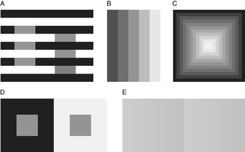
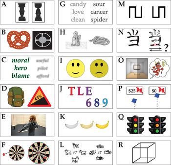
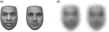
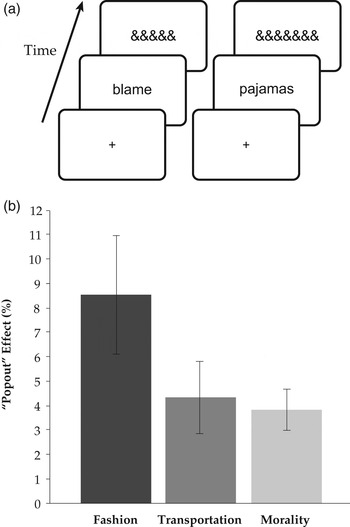



Target article
Cognition does not affect perception: Evaluating the evidence for “top-down” effects
Related commentaries (34)
Acting is perceiving!
Action valence and affective perception
An action-specific effect on perception that avoids all pitfalls
Attention alters predictive processing
Attention and memory-driven effects in action studies
Attention and multisensory modulation argue against total encapsulation
Behavior is multiply determined, and perception has multiple components: The case of moral perception
Beyond perceptual judgment: Categorization and emotion shape what we see
Bottoms up! How top-down pitfalls ensnare speech perception researchers, too
Carving nature at its joints or cutting its effective loops? On the dangers of trying to disentangle intertwined mental processes
Cognition can affect perception: Restating the evidence of a top-down effect
Convergent evidence for top-down effects from the “predictive brain”1
Crossmodal processing and sensory substitution: Is “seeing” with sound and touch a form of perception or cognition?
Firestone & Scholl conflate two distinct issues
Fundamental differences between perception and cognition aside from cognitive penetrability
Gaining knowledge mediates changes in perception (without differences in attention): A case for perceptual learning
Hallucinations and mental imagery demonstrate top-down effects on visual perception
How cognition affects perception: Brain activity modelling to unravel top-down dynamics
Memory colours affect colour appearance
Not even wrong: The “it's just X” fallacy
Oh the irony: Perceptual stability is important for action
On the neural implausibility of the modular mind: Evidence for distributed construction dissolves boundaries between perception, cognition, and emotion
Perception, as you make it
Perception, cognition, and delusion
Representation of affect in sensory cortex
Studies on cognitively driven attention suggest that late vision is cognitively penetrated, whereas early vision is not
Task demand not so damning: Improved techniques that mitigate demand in studies that support top-down effects
The anatomical and physiological properties of the visual cortex argue against cognitive penetration
The distinction between perception and judgment, if there is one, is not clear and intuitive
The El Greco fallacy and pupillometry: Pupillary evidence for top-down effects on perception
The folly of boxology
The myth of pure perception
Tweaking the concepts of perception and cognition
What draws the line between perception and cognition?
Author response
Seeing and thinking: Foundational issues and empirical horizons